WooCommerce comes with a built-in checkout page, but it isn’t optimized for conversions. By replacing the default design with a custom checkout page, you can get more sales and improve your conversion rates.
In our 16+ years of experience, we have helped thousands of eCommerce users optimize their sites for conversions and customize the checkout page. From what we learned, the easiest way to do this is to use a plugin. After testing multiple plugins, we found that the 2 best options are FunnelKit and SeedProd.
In this article, we’ll show you how to easily customize your WooCommerce checkout page, step-by-step without writing any code.
Why Customize WooCommerce Checkout Page in WordPress?
Studies show that customers abandon between 70-85% of all shopping carts. In other words, most customers will leave your checkout page without spending any money.
With that in mind, you’ll want to do everything you can to convince customers to complete their purchase.
The problem is that the built-in WooCommerce checkout isn’t optimized for sales.
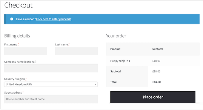
By replacing this default design with a custom WooCommerce checkout page, you can often improve your conversion rates and get more money.
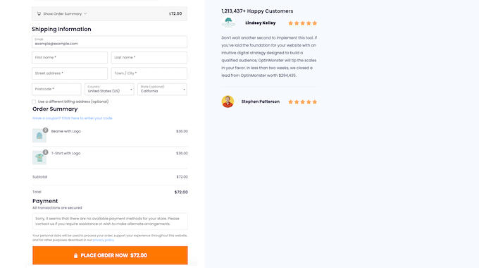
For example, you might add social proof to the checkout page, such as customer reviews and five-star ratings. This can encourage people to trust your business, even if they haven’t bought from you before.
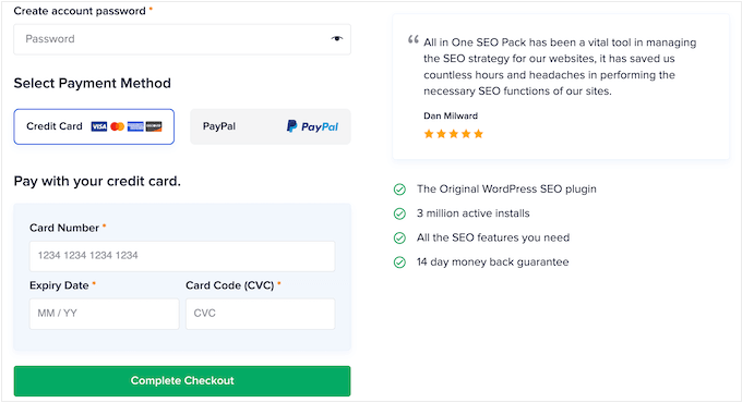
You can also show related products that shoppers often purchase together and optimize the layout to make the checkout process as easy as possible.
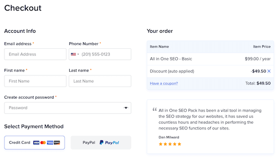
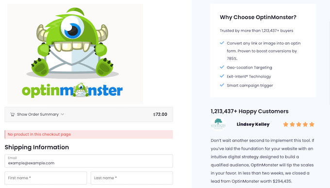
In the following image, you can see an example of an optimized checkout page taken from the AIOSEO site.
With that said, let’s take a look at how you can easily customize your WooCommerce checkout page and make more money from your online store.
Simply use the quick links below to jump straight to the method you want to use.
Method 1. Customize Your WooCommerce Checkout Page Using FunnelKit Builder
The easiest way to create a custom WooCommerce checkout page is by using FunnelKit Builder. This plugin comes with ready-made checkout templates and forms.
It also has built-in ‘optimizations’ that are designed to help you get more sales.
Note: There’s also a FunnelKit Pro that comes with more advanced optimizations and checkout templates. However, we’ll be using the free version of FunnelKit builder as it has everything you need to replace the default WooCommerce checkout with a custom design.
The first thing you need to do is install and activate the plugin. For more details, see our step-by-step guide on how to install a WordPress plugin.
Choose a Professionally-Designed Template
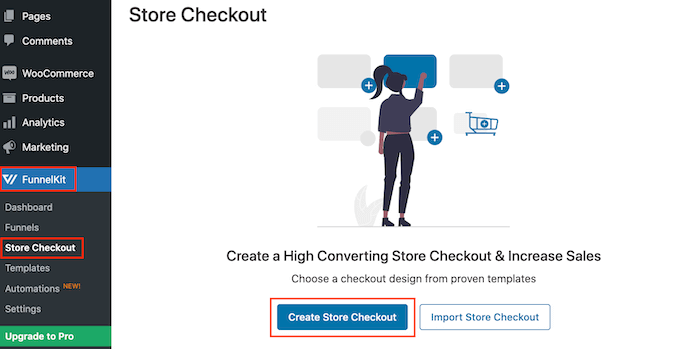
Upon activation, go to FunnelKit » Store Checkout. On this screen, click the ‘Create Store Checkout’ button.
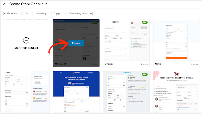
You can now choose from any of FunnelKit’s professionally designed checkout page templates or select ‘Start from scratch.’ We recommend using a template to help you create a high-converting checkout page quickly.
To take a closer look at any template, simply hover your mouse over it and then click on the ‘Preview’ button when it appears.
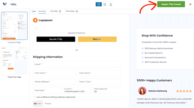
In our images, we’re using the Hific template, which has a section where you can talk about what you offer and a section where you can show customer testimonials.
When you find a template you want to use, click on ‘Import This Funnel.’
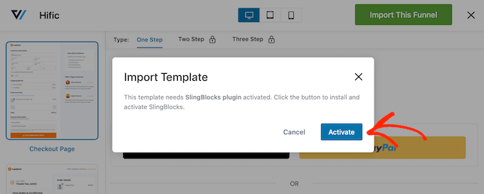
At this point, FunnelKit may ask you to install some extra plugins such as their SlingBlocks plugin for the block editor.
If you see this message, then click on ‘Activate’ to get the plugins you need.
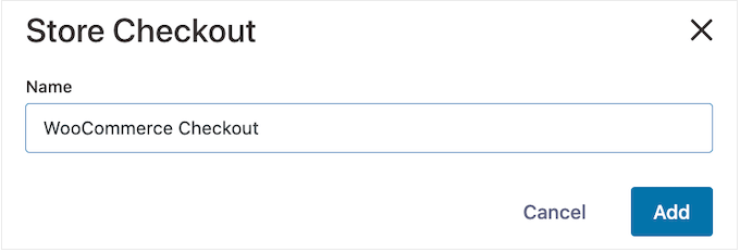
After that, you can type in a name for the store checkout page. This is just for your reference so you can use anything that will help you identify the page in the WordPress dashboard.
With that done, click on the ‘Add’ button.
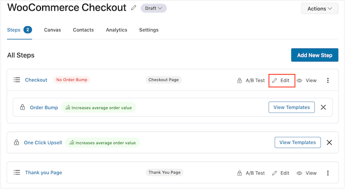
On the next screen, you’ll see all the steps that are included in this template. You can unlock extra steps by upgrading to FunnelKit Pro.
Since you’re using the free version of FunnelKit, the template includes a Checkout page and a custom WooCommerce Thank you page.
Create a Custom Checkout Design
To go ahead and customize the checkout page, click on its ‘Edit’ link.
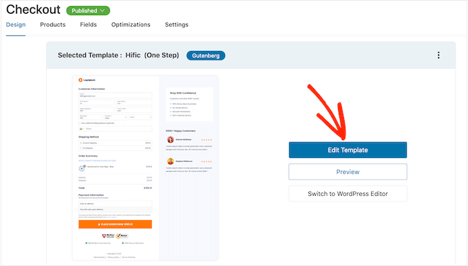
You can now click on ‘Edit Template’ to open the template in the WordPress block editor.
Note: If you’re using a page builder plugin, then FunnelKit may open the template in a different editor. If this happens, then you’ll need click on ‘Switch to WordPress editor’ instead of ‘Edit Template.’
You can now customize the template in exactly the same way you build any WordPress page. Simply click on any block and then fine-tune it using the settings in the right-hand menu and the mini toolbar.
For example, you’ll typically want to replace the placeholder logo with your own custom logo. To do this, click to select the Image block and then select ‘Replace’ in the mini toolbar.
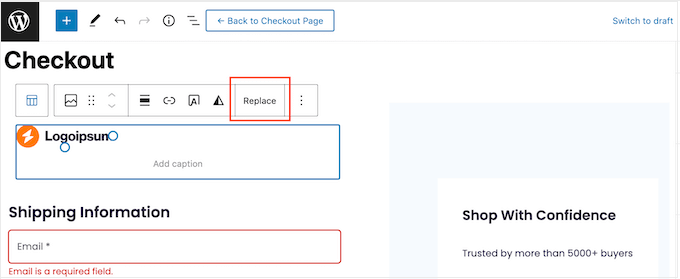
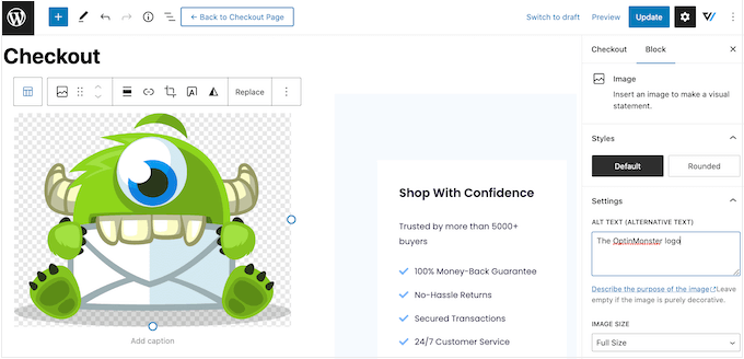
Now, either select Open Media Library and choose an image from the WordPress media library, or click on ‘Upload’ and select a file from your computer.
After choosing an image, you can add image alt text, change the width, and even add rounded corners using the settings in the right-hand menu.
You’ll also want to replace the placeholder text with information about your own online marketplace and customer testimonials. Simply click on any text block to make it editable, in exactly the same way you work with text in the standard WordPress block editor.
With that done, you can style the text using the settings in the right-hand menu. For example, you can use borders and box shadows to make the text stand out, change the font family, or change the text color in WordPress.
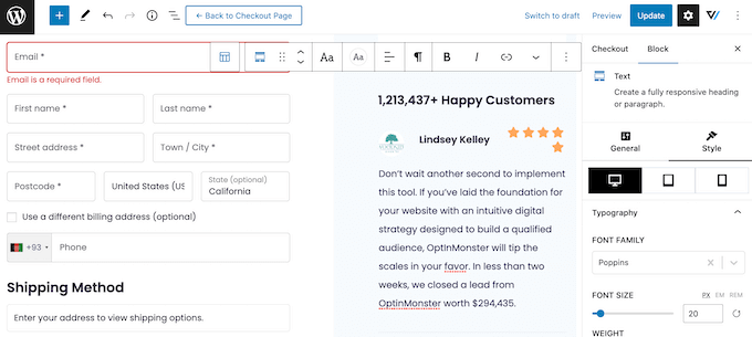
Simply repeat these steps to customize all the standard blocks in the FunnelKit Builder template. You can also add more blocks by clicking on the ‘+’ icon or delete any blocks you don’t need.
Most of these blocks should be familiar, but FunnelKit does come with some custom blocks. Since you’re using a checkout template, the design will already have a FunnelKit Checkout block, so click to select this block.
In the right-hand menu, you’ll see a list of all the different sections in the Checkout block, such as Form Header, Coupon, and Payment Gateways.
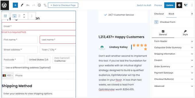
Simply click to expand each section and then make your changes.
Typically, if the section has a heading, subheading, or button label then you can change it by typing in the new text.
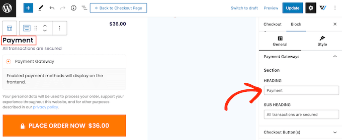
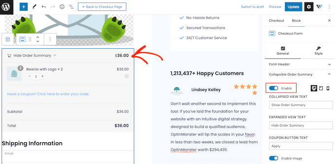
Some sections are optional, so you can enable and disable them using a toggle.
For example, you may want to add a collapsible order summary so the shopper can see all the items in their cart.
You can add more fields to the checkout form, or remove any you don’t need. For example, if you’re using WooCommerce to sell digital downloads then you typically don’t need to collect any shipping information.
Customize the Checkout Form
When you’re happy with how the checkout page looks, it’s time to take a closer look at the form fields and make any necessary changes.
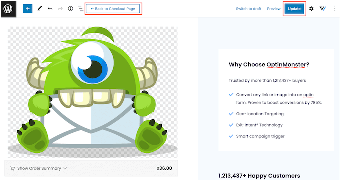
To do this, click on ‘Update’ to save your changes and then select ‘Back to checkout page.’
Now, click on the ‘Fields’ tab to see all the different sections and fields that make up the checkout form.
You can re-order these fields using drag and drop.
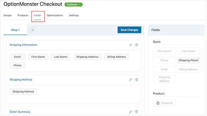
To add more fields, simply drag them from the right-hand section and then drop them onto your form.
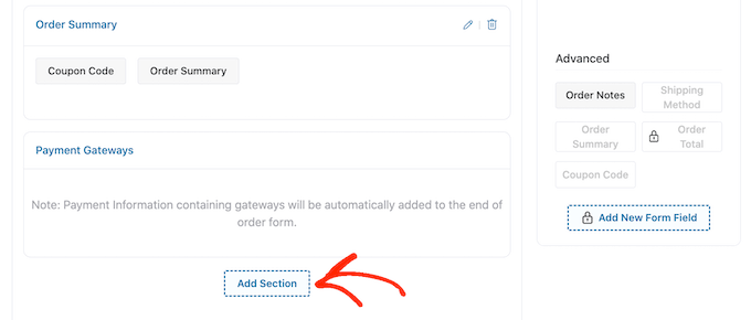
You can also organize these fields into sections by clicking on the ‘Add Section’ button.
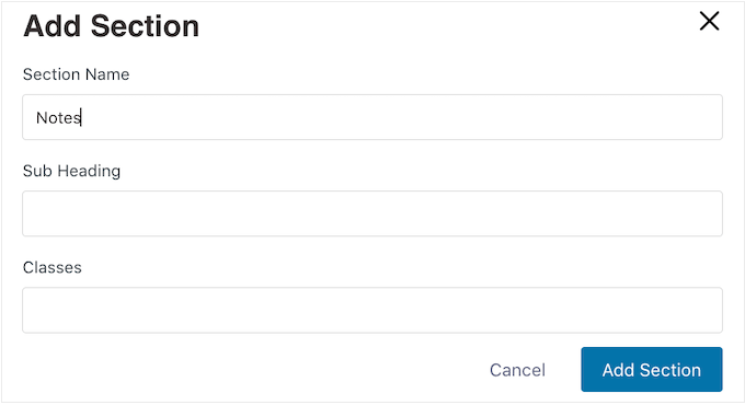
In the popup that appears, simply type in a name for the section. Since customers will see this, it’s a good idea to add a descriptive, useful heading.
With that done, click on ‘Add.’
You can now add fields to the section using drag and drop.
Do you want to remove a field from the checkout form? Then simply hover your mouse over the field and click on the red ‘x’ icon when it appears.
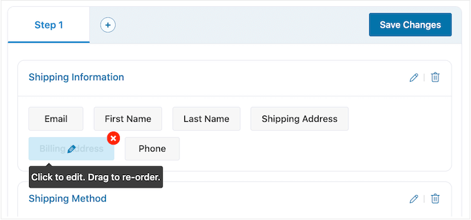
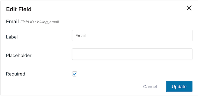
To customize any of the FunnelKit fields, simply click on that field.
The settings you see may vary depending on the field, but you can typically change its label, add a placeholder value, or make the field mandatory by checking the ‘Required’ box.
When you’re happy with how the checkout fields are configured, don’t forget to click on ‘Save Changes’ to store your settings.
Get More Sales with FunnelKit Optimizations
To get more sales, it’s a good idea to enable some of FunnelKit’s optimizations by clicking on the ‘Optimizations’ tab.
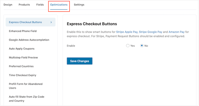
Here, you’ll see all the different optimizations that can make the checkout process easier.
The free FunnelKit plugin comes with express checkout buttons for all the best WooCommerce payment gateways. This allows shoppers to click on their preferred express checkout button and pay using an existing account, similar to a buy now button.
Since the customer doesn’t have to fill out the checkout form, this can reduce cart abandonment rates and help you get more sales.
To set up express checkout, select ‘Express Checkout Buttons’ from the left-hand menu. Then, click on the ‘Enable’ button and use the ‘Choose Position’ dropdown to change where the button appears on the checkout page.
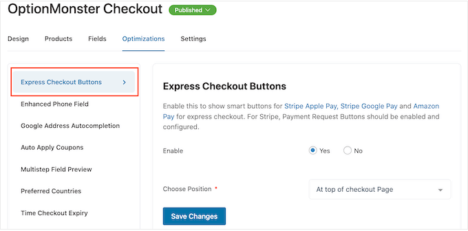
Just be aware that you’ll need to enable Payment Request Buttons in order to use the Stripe Apple Pay button.
Next, you may want to enable the enhanced phone field. When a customer types in their shipping address, FunnelKit can show a country flag next to the phone field.
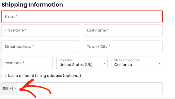
This lets shoppers know they’ve typed in the right address.
To add this feature, select ‘Enhanced Phone Field’ from the left-hand menu and then click on the ‘Yes’ button next to ‘Enable.’
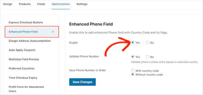
On this screen, you can also validate the phone number using the shopper’s selected country. This is a way to check that the customer has typed in a valid phone number.
To enable this check, simply select the ‘Yes’ button next to ‘Validate Phone Number.’
Finally, you can choose whether to save the phone number with the country code or without the country code. If you sell to an international audience, then it usually makes sense to select ‘With country code.’
When you’re happy with how the optimizations are set up, click on ‘Save changes.’
As you can see, FunnelKit has lots more optimizations that can help you get more sales. This includes autocompleting the shopper’s billing and shipping address, auto-applying coupons, and prefilling the checkout form for returning customers.
To unlock these powerful WooCommerce optimizations, you’ll need to upgrade to FunnelKit Builder Pro.
Publish the Custom WooCommerce Checkout Page
The free FunnelKit plugin has lots more settings and features that can help you create a high-converting checkout page. However, this is all you need to create a custom WooCommerce checkout page.
When you’re happy with how the checkout page is set up, it’s time to make it live by clicking on the ‘Draft’ button.
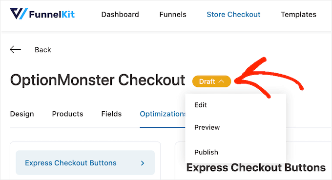
If you want to preview the page before publishing it then click on ‘Preview.’ This opens the custom checkout page in a new tab.
To make the page live, click on ‘Draft’ but this time select ‘Published.’ Now if you visit your WordPress website you’ll see the custom checkout page live.
Method 2. Customize Your Checkout Page Using SeedProd
You can also create a custom WooCommerce checkout page using SeedProd.
SeedProd is the best landing page builder used by over 1 million websites. It comes with more than 180 professionally-designed templates, including eCommerce templates that you can use to create sales pages and lead squeeze pages.
Even better, SeedProd has full support for WooCommerce and even comes with special WooCommerce blocks that you can use to create a custom checkout page quickly.
Since it lets you create all kinds of pages, SeedProd is a great choice if you want to customize other pages, or even create a custom WordPress theme for your online store.
The first thing you need to do is install and activate the plugin. For more details, see our step-by-step guide on how to install a WordPress plugin.
Note: There is a free version of SeedProd, but for this guide, we’ll use the Pro version because it has the built-in WooCommerce blocks we need. It also integrates with the email marketing services you may already be using to get more sales and conversions.
Upon activation, go to SeedProd » Settings and enter you license key.
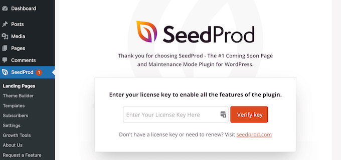
You can find this information under your account on the SeedProd website. After entering the license, click on the ‘Verify Key’ button.
Choose a SeedProd Template
After that, go to SeedProd » Landing Pages and click on ‘Add New Landing Page.’
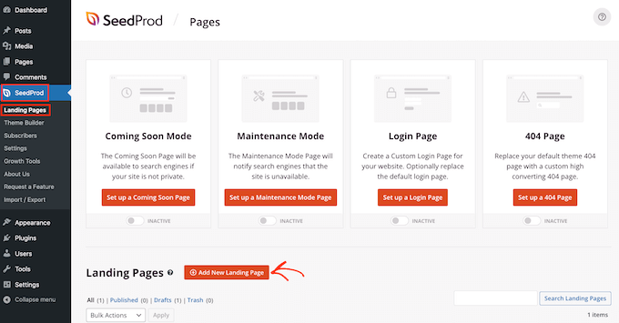
Next, you need to choose a template for your custom checkout page.
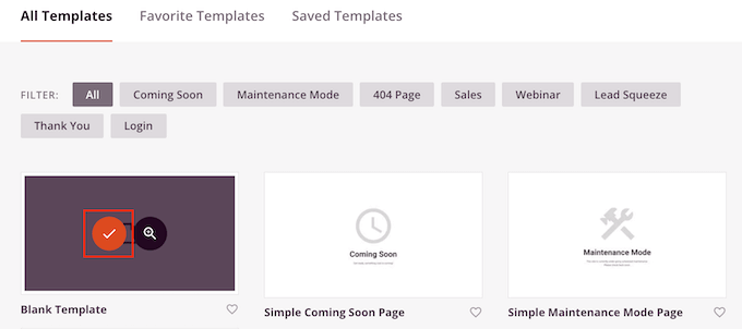
SeedProd’s templates are organized into different campaign types, such as coming soon and 404 pages. You can click on the tabs at the top of the screen to filter SeedProd’s templates based on campaign type.
Choosing a design that matches the type of page you want to create will help you build the page faster. However, every template is fully customizable so you can always fine-tune the design to better fit your online store.
For this guide, select the ‘Blank Template’ so you can start with a clean slate.
To select a template, hover your mouse over it and then click the ‘Checkmark’ icon.
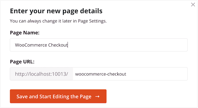
Next, go ahead and type in a name for your custom checkout page. SeedProd will automatically create a URL based on the page’s title, but you can change this URL to anything you want. For example, you may be able to improve your WordPress SEO by adding some relevant keywords.
To learn more, please see our detailed guide on how to do keyword research for your WordPress blog.
When you’re happy with the information you’ve entered, click on the ‘Save and Start Editing the Page’ button.
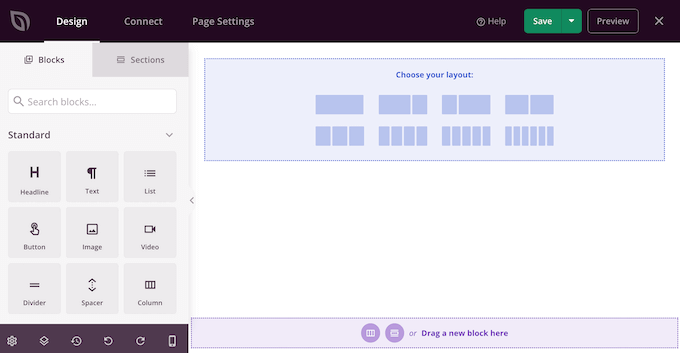
This will take you to the drag-and-drop editor, where you can build your custom WooCommerce checkout page.
Design a High-Converting Checkout Page
The SeedProd editor shows a live preview of your checkout page to the right, and some block settings on the left.
Just start by creating a branded header.
Here, you can use a section, which is a collection of blocks that are often used together. Simply click on the ‘Sections’ tab and then select the ‘Header’ category.
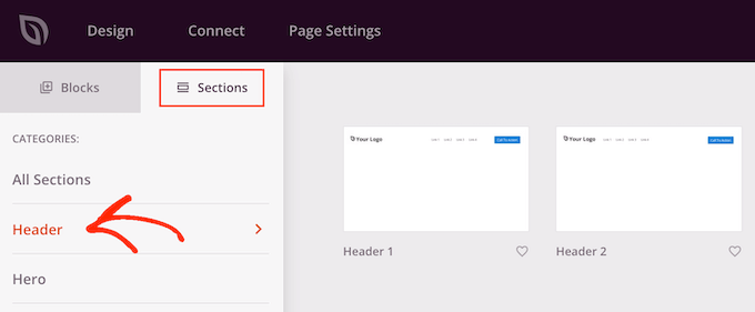
After that, hover your mouse over the ‘Header 1’ section and click the ‘Plus’ icon.
This adds a Header section to your layout.
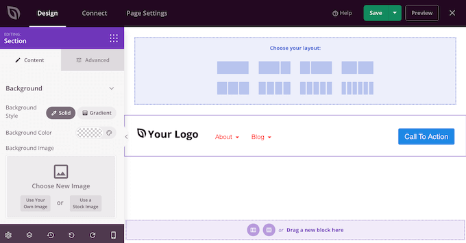
To start, you’ll want to replace the placeholder ‘Your Logo’ by clicking to select that block.
Then, click on the ‘Select Image’ icon in the left-hand menu.
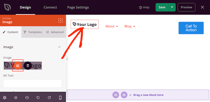
You can now choose an image from the media library or upload a new file from your computer.
The Header 1 section comes with a navigation menu. However, this encourages visitors to abandon the checkout page without making a purchase, so it’s a good idea to remove it.
To delete the Nav Menu block, simply click to select that block. Then, click on the ‘Delete Block’ option.

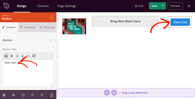
Once you’ve done that, click on the call to action button.
It’s smart to give shoppers a way to go back to the cart page and add more items or change the quantity. With that in mind, type in the call to action that you want to use for this button, such as ‘View Cart’ or similar.
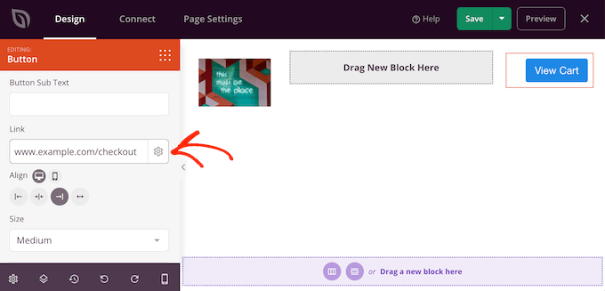
Next, type the URL of your WooCommerce cart page into the ‘Link’ field.
Now, shoppers can visit the cart page by clicking this button.
Add Upsell and Cross-Sell Content
After that, it’s time to choose a layout for the rest of your checkout page.
It’s a good idea to show some recommended products in a sidebar section, as this encourages shoppers to add more items to their cart. With that in mind, click on the content and sidebar layout under ‘Choose your layout.’
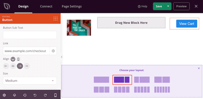
Once you’ve done that, find the ‘Checkout’ block in the left-hand menu and drag it over to your layout.
You can completely customize how your checkout looks using the settings in the left-hand menu, including changing the color scheme, font choice, link color, buttons, and more.
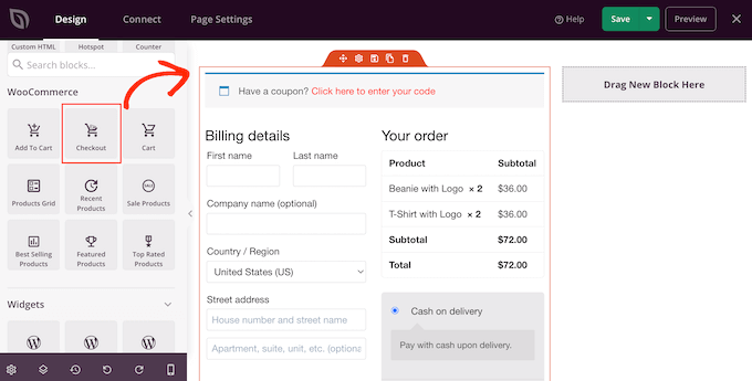
When you’re happy with how the checkout section looks, it’s time to add a popular products or recommended products section. This can get you more sales by promoting additional products that shoppers might want to buy.
To create this section, simply drag a ‘Best Selling Products’ block onto your page.
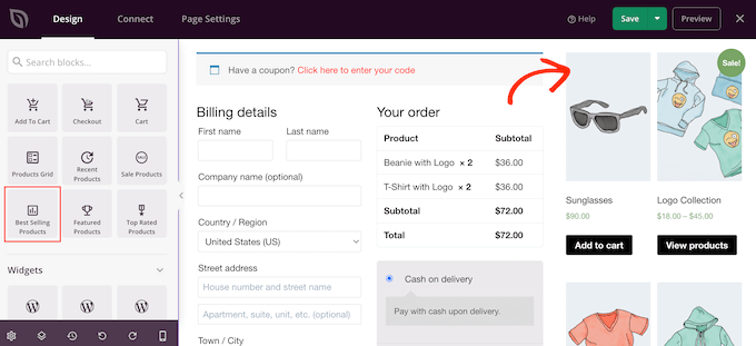
You can now configure this block using the settings in the left-hand menu. For more details, please see our guide on how to display popular products in WooCommerce.
Next, it’s a good idea to add a headline above the popular products. Simply drag the ‘Headline’ block over to your page and drop it above the popular products block.
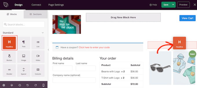
Then, click to select the ‘Headline’ block and type in the heading that you want to use.
Display Customer Reviews and Ratings
Once you’ve done that, we recommend showing social proof by adding a customer testimonials block. Simply find the ‘Testimonials’ block and drag it onto your layout.
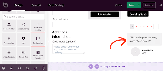
You can now change how the testimonials look on your online store.
For example, in the left-hand menu, you’ll see settings to change the color of the comment bubble, change the alignment, and add more customer testimonials.
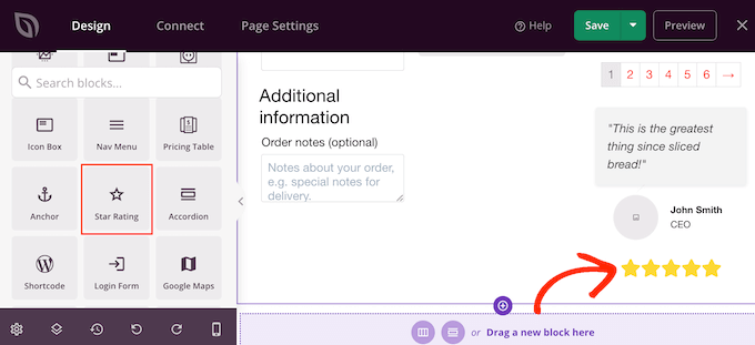
Another great idea is to show a star rating underneath your testimonials. This is a great choice if you already have lots of positive reviews.
To do this, simply find the ’Star Rating’ block and drag it under the testimonial block.
Publish the WooCommerce Checkout Page
When you’re happy with how the WooCommerce checkout page looks, it’s time to publish it by clicking on the dropdown arrow next to ‘Save.’
Then, select the ‘Publish’ option.
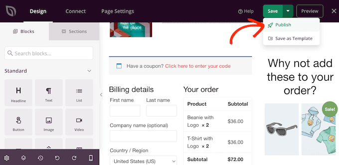
Now, if you visit your store you’ll see the checkout page live.
Pro tip: Conversion tracking can help you see what’s working on your checkout page and what isn’t. You can then use this insight to fine-tune your checkout page using SeedProd. For more details, see our guide on how to set up WooCommerce conversion tracking.
Assign Your Checkout Page to WooCommerce
At this point, you’ve published the custom checkout page, but your WordPress blog or website is still using the default design. You’ll need to change the default URL settings so WooCommerce sends customers to the new checkout page instead of the default one.
To do this, go to WooCommerce » Settings and click on the ‘Advanced’ tab.
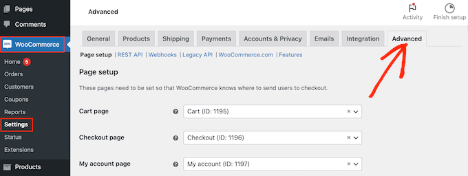
After that, open the ‘Checkout page’ dropdown and start typing in the URL of the custom checkout page you just created.
When the right page shows up, click to select it.
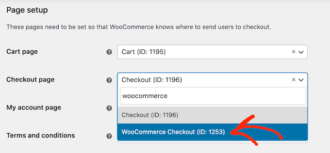
With that done, scroll to the bottom of the page and click on ‘Save changes’ to store your settings. WooCommerce will now use the custom checkout page.
Bonus: How to Reduce Checkout Page Abandonment
Checkout page abandonment happens when a customer starts the checkout process but doesn’t complete their payment.
Similar to cart abandonment, it’s a big problem for online stores.
When it comes to reducing checkout abandonment rates, creating a custom page is a great start. However, there are lots more ways to increase your sales.
Avoid Adding Any Extra Checkout Charges
When a customer goes to checkout, they expect the total price to be similar to the total product price. If they get to the checkout page and see taxes, high shipping costs, and other additional fees, then there’s a good chance they won’t complete the purchase.
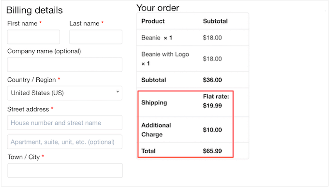
Some customers might continue with the purchase if they think the costs are justified. However, it’s far better to be upfront about your pricing so customers know what to expect.
If you have lots of extra fees, then we recommend adding these to your product prices. This is much less confusing for the customer.
Whenever possible, it’s also a good idea to offer free shipping.
Make Account Creation Optional or Simpler
Forcing shoppers to create an account at checkout adds a lot of friction to the buying process and can increase the checkout abandonment rates.
You can allow user registration to your WordPress site, but you should avoid making it mandatory. Instead, you might allow shoppers to checkout as guests but offer them a coupon code if they create an account.
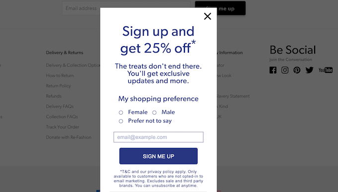
In this way, you can generate leads and grow your email list without losing out on sales.
Offer More Checkout Payment Options
Most people have a preferred payment method. This may be the PayPal account that’s saved on the shopper’s computer or the credit card that’s physically close to hand.
Shoppers may abandon your checkout page if you don’t support their favorite payment method. While it’s impossible to offer every single method, you should aim to offer the most common payment options.
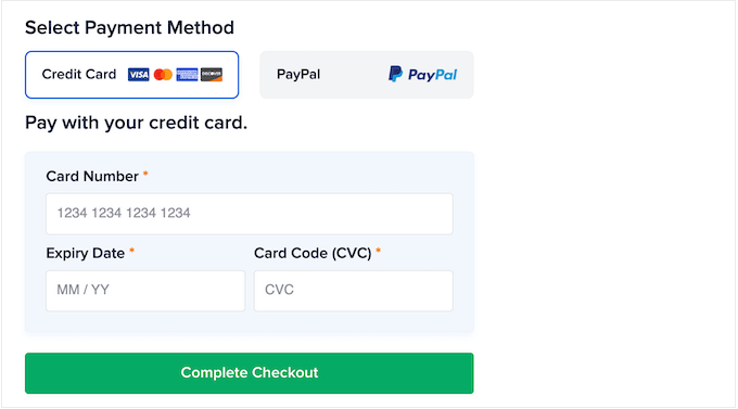
For more details, see our list of the best WooCommerce payment gateways for WordPress.
Display a Timed Popup
You can also reduce cart abandonment with a timed popup.
OptinMonster is the best WordPress popup plugin and has a unique Exit-Intent® technology that can display popups exactly when a shopper is about to leave the checkout page.
You can even use OptinMonster to offer shoppers a special discount code if they complete the purchase now.
Set up Abandoned Cart Push Notifications
Another great way to reduce cart abandonment is by setting up web push notifications.
These notifications are displayed on users’ mobile and desktop browsers, even when they’re not on your website. This makes it easy to reach shoppers and remind them to check out.
PushEngage is used by 25,000+ smart business owners, and it’s the best web push notification software on the market. It allows you to easily create WooCommerce cart abandonment campaigns.

You can also set up browse abandonment campaigns, price drop alerts, new product announcements, inventory alerts, and more.
Create a Custom WooCommerce Cart Page
After optimizing the WooCommerce checkout page, you may also want to consider customizing your WooCommerce cart page.
By optimizing both the cart and checkout pages, you can make the entire buying process feel effortless so you don’t miss out on any sales. You can also design both pages to have the same branding so visitors get a consistent checkout experience.
For detailed step-by-step instructions, please see our guide on how to create a custom WooCommerce cart page.
We hope this article helped you customize the WooCommerce checkout page easily. You may also want to see our guide on how to create a WooCommerce popup to increase sales and our expert pick of the best WooCommerce plugins for your store.
If you liked this article, then please subscribe to our YouTube Channel for WordPress video tutorials. You can also find us on Twitter and Facebook.



Jiří Vaněk
So much information in one place, it’s absolutely amazing. I love WooCommerce because it gives me great flexibility in personalizing my store. Thanks to your guides, I’ve already managed to modify and style many things to fit my brand, and I want to keep going so that the entire website reflects my brand rather than the default WooCommerce or theme. Thank you so much for more practical tips on how to customize even the checkout page.