A well-crafted sales page can be a game-changer for your business, turning casual visitors into paying customers and boosting your bottom line.
At WPBeginner, we’ve helped countless WordPress users create various types of pages, but sales pages consistently stand out as one of the most impactful.
Many of our readers have asked about our preferred method for building high-converting sales pages in WordPress. While there are several ways to create one, our go-to method is to use a page builder like SeedProd.
In this tutorial, we’ll walk you through how to create a sales page in WordPress that not only looks professional but also drives conversions.
What Is a Sales Page?
A sales page has a single purpose: get people to buy your products or services.
You might create a sales page for your new ebook, upcoming conference, subscription box, eCommerce product, or consultancy services. But the goal is always the same: to get more sales for your small business.
Every sales page is unique. However, most high-converting pages pitch a product or service and then follow it with a call to action (CTA).
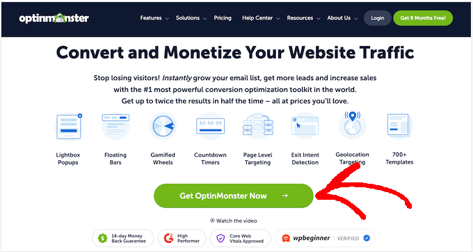
For example, the OptinMonster sales page below has a clear CTA. This CTA button uses a contrasting color to stand out from the rest of the page. It also draws attention to the CTA by using an arrow.
This may all sound very familiar. In fact, at this point, you may be wondering: isn’t this just a landing page?
Sales pages and landing pages have lots of things in common. Sometimes, landing pages are created to sell products and services.
But not always. You might create a WordPress landing page to increase newsletter signups or to promote your upcoming webinar. However, a sales page is always about making a sale.
That said, let’s take a look at how you can create a sales page in WordPress that converts. We will show you 2 methods, so simply click the links below to jump to the method you prefer:
Pro Tip: Need help with your WordPress website design? Our WPBeginner Pro Services team can design a website that matches your vision. No hard work is needed on your part. Schedule a call with us today for more information.
Method 1: Creating a WordPress Sales Page Using SeedProd (Recommended)
This method is the easiest and recommended for all WordPress users.
For this method, we will be using SeedProd. It is the best landing page builder for WordPress. SeedProd allows you to easily create beautiful page layouts that will help you get more sales.
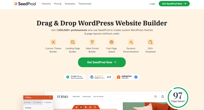
SeedProd works with many popular third-party tools that you may already be using to drive sales. These include top email marketing services, WooCommerce, Google Analytics, and more.
We have used it to create their entire websites and we’ve been super impressed. To learn more, see our detailed SeedProd review.
The first thing you need to do is install and activate the SeedProd plugin. For more details, see our step-by-step guide on how to install a WordPress plugin.
Note: There is a free version of SeedProd available on WordPress.org, but we will be using the Pro version since it offers more powerful features. These include a wide selection of professionally designed sales page templates and landing page templates.
After activating the plugin, SeedProd will ask for your license key.
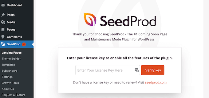
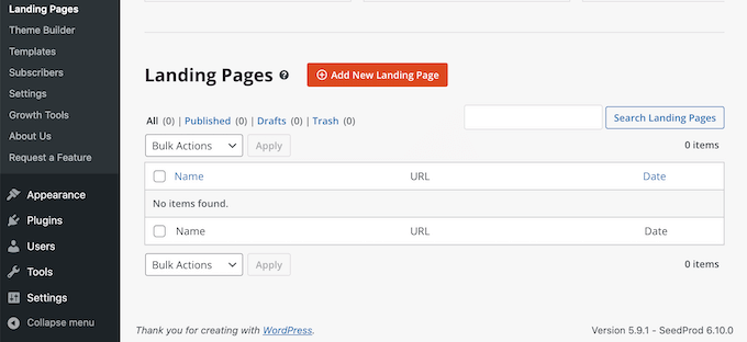
You can find this information in your account on the SeedProd website. After entering your license key, go to SeedProd » Landing Pages in your WordPress dashboard.
Here, click on the ‘Add New Landing Page’ button.
SeedProd comes with hundreds of professionally designed templates for different campaign types, such as lead squeeze and coming soon campaigns. Since we want to boost our sales, go ahead and click on the Sales filter.
You can now check out all of SeedProd’s templates. To take a closer look at any design, simply hover your mouse over that template. Then, click on the magnifying glass icon.
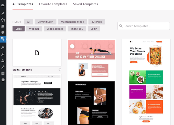
When you find a sales page theme that you want to use, click on ‘Choose This Template’. You can now give your sales page a catchy title and enter its URL. This is the web address where your sales page will appear.
A descriptive URL can help search engines understand your page’s contents. This can make it easier for them to deliver your page to the right users. With that said, it’s a good idea to include relevant keywords in your URL.
Next, click on ‘Save and Start Editing the Page’. This will load the SeedProd drag-and-drop page builder plugin interface.
This simple drag-and-drop builder shows a live preview of your page to the right and a toolbar on the left.
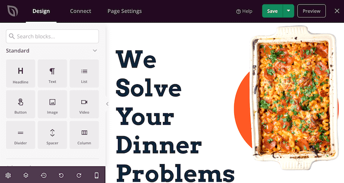
Blocks are the core components of all SeedProd layouts. You can build an entire sales page simply by adding these ready-made blocks to your layout, including headlines, buttons, and images.
You can also use SeedProd blocks like spacers, columns, and dividers to help organize and structure your sales page.
It’s easy to customize any SeedProd block. Simply click on the block, and the toolbar will display all of the settings for that block.
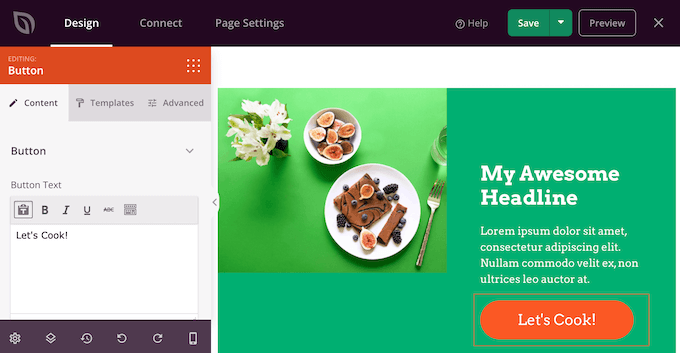
SeedProd comes with many blocks that are perfect for building a sales page that converts.
For example, you can add testimonials, pricing tables, star ratings, and countdown blocks.
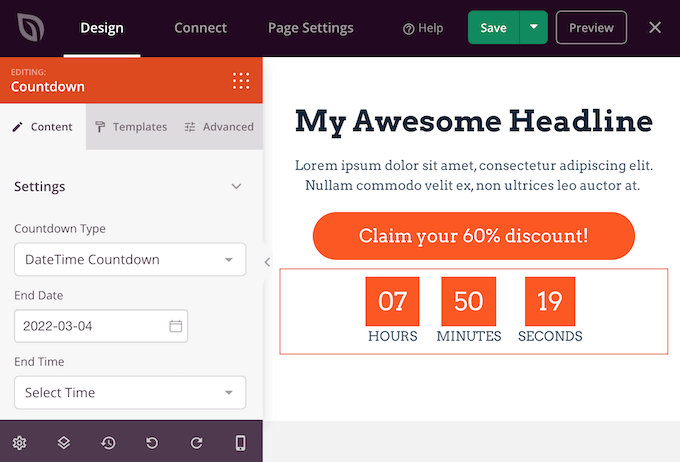
You can also move blocks around your layout by dragging and dropping them. This makes it easy to create a beautiful and engaging sales page with a totally custom layout.
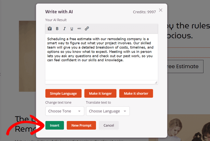
For some blocks like text, headline, and image, you may be able to use SeedProd’s AI feature to generate content. This can be useful if you work on your website alone but need resources to add a creative touch to your sales page.
For more information, check out our guide on how to use AI to boost your marketing and how to use AI to generate images in WordPress
SeedProd comes with ‘Sections’ too. These are rows and block templates that can help you quickly create a sales page. To boost your sales, you may want to take a look at sections such as Hero, Call To Action, Features, and FAQ.
You can see all of these sections by clicking on the Sections tab.
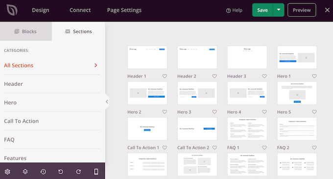
From here, you can preview any section by hovering over it. When the magnifying glass icon appears, give it a click.
To add this section to your page, click on ‘Choose This Section’. SeedProd will now create the section at the very bottom of your sales page.
SeedProd even provides a number of WooCommerce blocks. These include a handy Add To Cart block, plus blocks where you can showcase your Top Rated Products and Best Selling Products.
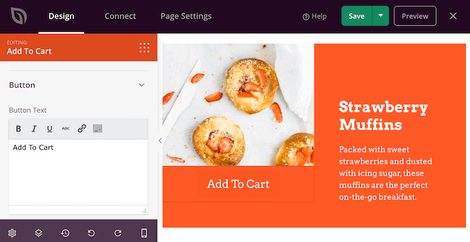
This makes it easy to create a sales page that promotes your WooCommerce products, services, or events. By choosing SeedProd, you can also design a sales page without being restricted by your WooCommerce theme.
While you are working on your sales page, you can preview your design by clicking on the ‘Preview’ button. This launches your sales page in a new tab.
When you are happy with your design, you can click on the ‘Save’ button and then choose ‘Publish’.
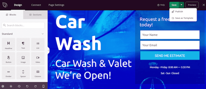
Your sales page will now go live on your WordPress website.
You can even use the SeedProd drag-and-drop builder to create completely custom WordPress themes without writing any code.
💡Pro Tip: Looking for an alternative to SeedProd? Thrive Architect can help you build WordPress sales pages in minutes with 350+ landing page and sales page templates, pre-built conversion blocks, and more.
Method 2: Creating a WordPress Sales Page Using the Block Editor
WordPress has a built-in block editor that makes it easy to create unique designs using ready-made blocks.
If you want professionally designed templates, plus blocks that are optimized for conversions, then we still recommend using a page builder. Having said that, it is possible to create a sales page using only the WordPress block editor if you’re on a tight budget and just getting started.
When working with the block editor, a flexible and user-friendly WordPress theme is a must-have. In this post, we will be using the multipurpose free Hestia theme. Since it’s multipurpose, Hestia is the perfect theme for a wide range of websites.
First, create a new page by going to Pages » Add New in your WordPress dashboard. You can now give your sales page a title.
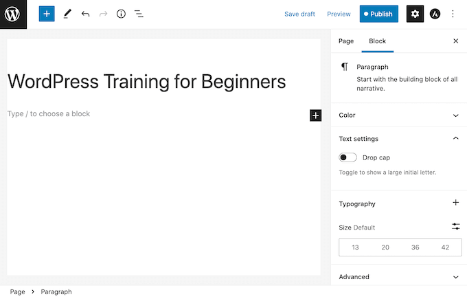
We’ll start at the top with our page’s header. In the header, you’ll typically want to establish your brand identity using elements like your company logo and your color scheme.
Let’s get started by adding a logo. Simply click on the black ‘+’ icon and then search for Site Logo.
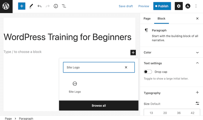
After adding the Site Logo block to your design, either upload a new image or select a graphic from your WordPress Media Library.
The Cover block is another good choice for the top of your sales page. This block lets you add a background image and an overlay or wash of color that you add to your background image. An overlay can be an easy way to add your brand colors to an image.
The Cover block also has space where you can add some text. This is perfect for pitching your brand to potential customers.
To add a Cover block to your design, click on the black ‘+’ icon. Then, search for Cover. When this block appears, you need to add it to your sales page.
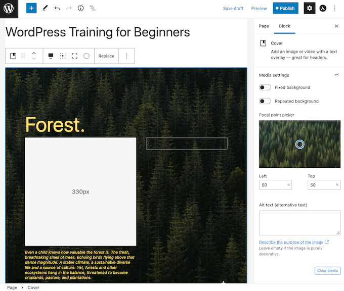
You can now customize the Cover block using the Block sidebar. This is your chance to add a background image and optional colored overlay, plus some text. To make your words stand out, you may want to try different colors and sizing.
Most sales pages contain a pitch for the product or service. You’ll also often want to include an image, such as a photo of your product.
WordPress has a block where you can display both text and images in a nice layout. This Media & Text block creates a two-column layout with an image on one side and text on the other.
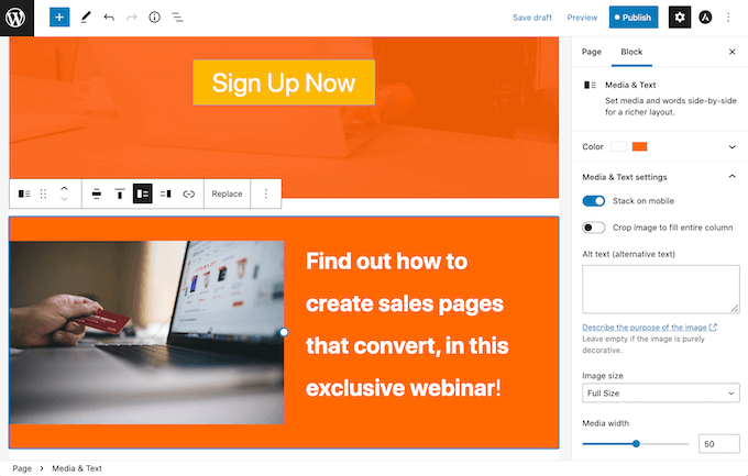
For a sales page, you’ll typically need a way to accept payments. By default, WordPress does not support credit card payments, but there are plenty of plugins and tools that can help solve that.
You can create a payment button using WP Simple Pay. This plugin gives you an easy way to accept credit card payments, bank transfers, and more.
Another option is to create an order form using WPForms and embed it on your sales page. WPForms is the simplest way to accept payments in WordPress without setting up a shopping cart.
You can now keep adding blocks to build your perfect sales page.
When you are happy with your design, just click on the ‘Publish’ button. Your sales page is now live and ready to start converting your traffic into paying customers.
What Elements Should a Sales Page Have to Convert?
A well-designed sales page should include several key elements to ensure it stands out, engages visitors, and ultimately drives conversions:
- A compelling headline and subheadline that communicates the benefit of a product or service to the visitor. It should be concise, persuasive, and snappy enough to catch the visitor’s attention.
- Engaging product or service visuals, like photos or graphics, that demonstrate the benefits for the target audience.
- Detailed product descriptions that cover the main values of the product or service and how it solves the visitor’s problem.
- The product or service’s pricing information, and if applicable, what’s included in the price and any special offers.
- Social proof to win the visitors’ trust, such as testimonials, reviews, case studies, or statistics.
- A clear call-to-action button that guides visitors toward making a purchase and taking the next step, such as requesting a quote.
- A FAQ section that answers the most frequently asked questions about the product or service and addresses visitors’ main concerns.
As you design your sales page, make sure to think of these elements and A/B test them so that you can see what works best to win your target audience.
You can also check out our expert insight article on how to grow pricing page conversions by 30% for more inspiration. Thomas Griffin, the co-founder of OptinMonster, shares some top tips to increase revenue for pricing pages, but they are also applicable to sales pages, too.
Taking Your Sales Page to the Next Level
A beautiful, professionally-designed sales page can boost your sales. However, there is always room to improve your conversion rates.
With that in mind, here are some other useful WordPress plugins that can help you get even more sales:
- All in One SEO (AIOSEO). This beginner-friendly search engine optimization toolkit can help you drive more people to your sales page from search engines. More traffic means more chances to convert visitors into customers.
- MonsterInsights. Monitoring your page’s stats can help you find out what’s working and not working on your sales page. The easiest way to find out is with MonsterInsights. It’s the best WordPress analytics plugin and is used by over 3 million websites.
- OptinMonster. OptinMonster’s exit-intent popups can convert abandoning visitors into paying customers. This popup plugin tracks the visitor’s mouse movements, so it can detect the precise moment the visitor is about to leave and prompt them with a personalized campaign.
- TrustPulse. TrustPulse is the best WordPress social proof plugin on the market. It uses the FOMO effect by displaying real-time notifications of activities that users are taking on your sales page.
We hope this article helped you learn how to create a sales page in WordPress that converts. You can also go through our article on whether WordPress is good for eCommerce and our step-by-step guide on how to create a services section in WordPress.
If you liked this article, then please subscribe to our YouTube Channel for WordPress video tutorials. You can also find us on Twitter and Facebook.





Dennis Muthomi
Love this post on sales pages in WordPress! The section on essential elements was super helpful.
From my experience as a small business owner I’ve found that adding social proof (customer testimonials) has increased my conversions and it is very important to include them. One more thing I’d add is to use heat mapping tools to see where visitors are looking on your sales page. This will help you see where to optimize your page layout for better results.
Moinuddin Waheed
integrating sales pages in our website increase the chances of conversion.
Seedprod comes with a lot of options and rescue with such needs.
I have used seedprod and found it very useful in making the landing pages and maintenance pages.
it is lightweight and very easy to use drag and drop options.
do we need to have a single sales pages website for single product websites like having a landing page only or full fledged website that comes with sales page or pages?
WPBeginner Support
You can use it on either type of site and it is up to testing for what works best for your audience.
Admin
Jiří Vaněk
It depends on the product and the target audience it’s intended for. I’ve often seen websites that were just a single landing page focused on conversions, attracting users through social media advertising. Such a site didn’t need anything more than a well-thought-out landing page, which, thanks to the ads, led to many conversions. On the other hand, if it’s a product from a company that also wants to present itself and build a customer community, then it’s good to have a comprehensive website along with a product landing page. This site often includes additional information about the company, contacts, support, and much more. So, it really depends on the specific case which approach is better.
Uche Nwonye
Thank you for all the educational articles your editorial team has always delivered to us.
I NEED to know whether it’s ideal to use one Sales Page for an e-commerce website(that displays multiple products) or build individual Sales Pages for each of the products?
WPBeginner Support
There is no best case for every site at the moment. It would depend on how you design your site, what you are selling, and your audience for what works best for you.
Admin