Have you ever wanted to make your WordPress categories stand out? Maybe you want your ‘News’ section to look different from your ‘Tutorials’ or ‘Reviews’ categories 🎨
To be honest, styling categories differently isn’t a pressing issue for most blogs. We don’t even do it ourselves at WPBeginner.
But we understand that every blog has unique needs, and how important it is to engage your readers. And for some sites, having distinct styles and features for each category page can really help readers find content more easily.
The good news is that styling category pages individually is actually pretty easy. We’ve come up with several code-free ways to do it: with the full site editor, a page builder, and a visual CSS editor.

Is It That Important to Style Your WordPress Category Pages Differently? 🧐
While it’s not necessary for every WordPress site, there are some situations where custom categories can really improve your readers’ experience.
If your WordPress post topics vary a lot, you might want to style individual categories uniquely.
For example, if your WordPress blog covers both news and tutorials, then you could style these categories differently. This helps readers know what kind of content they’re looking at right away.
Or, take a review site. You could style a single category for product reviews differently from your comparison category. This makes it easier for visitors to find what they want on your WordPress site.
Some sites might also want to style certain categories to stand out more to emphasize their importance. On a news site, you might want to give your ‘Breaking News’ category a more attention-grabbing style compared to your regular news categories in WordPress.
Remember, the main reason to style categories in WordPress differently is to make your site easier to use. If you think it would help your readers find what they want faster, then implementing this WordPress design tip might be a good idea.
With that in mind, let’s take a look at 3 ways to style individual categories in WordPress. You can use the quick links below to skip to your preferred method:
- Method 1: Use a Page Builder to Style Category Pages (Custom Themes)
- Method 2: Use the Full Site Editor to Style Category Pages (Block Themes)
- Method 3: Use CSS Hero to Style Category Pages (All Themes)
Method 1: Use a Page Builder to Style Category Pages (Custom Themes)
If you’re willing to switch themes or create a custom WordPress theme from scratch, then using a page builder can be an excellent way to style categories in WordPress.
This method is ideal for those who want more control over their site’s design and are comfortable using third-party tools.
After testing various options, we’ve found that Thrive Architect is one of the best page builders for styling individual categories.
It offers a user-friendly drag-and-drop interface, allowing you to create custom categories and style them uniquely without coding knowledge. You can learn more about the plugin in our Thrive Architect review.
However, it’s important to note that this approach isn’t suitable for everyone.
If you are happy with your current WordPress theme and don’t want to switch, you might want to consider Method 2 with the full site editor or Method 3 with the visual CSS editor (which we will cover later).
But if you are looking to change your theme, then we recommend reading our guide on how to properly change WordPress themes.
Another thing to note is that Thrive Architect has no free version. But you can use our Thrive Themes coupon code to get up to 50% off your first purchase.
Step 1: Install Thrive Architect
Let’s start by setting up Thrive Architect. After purchasing a plan, you can go and log in to the Thrive Themes website.
There, you will find the Thrive Product Manager plugin. Simply download the file, and install it on your WordPress admin. If you’re not sure how to do this, check out our guide on installing WordPress plugins for beginners.
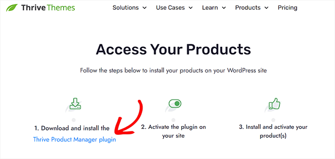
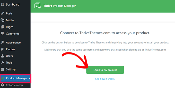
Once you’ve activated the plugin, open the Product Manager menu item in your WordPress dashboard.
Click on ‘Log into my account’ to connect your WordPress site to your Thrive Themes account.
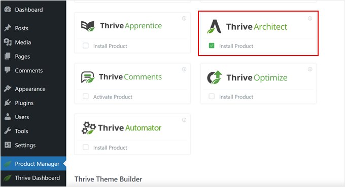
Now, you should see a list of Thrive Themes products you can use.
Find ‘Thrive Architect’ and check the box next to ‘Install Product’.
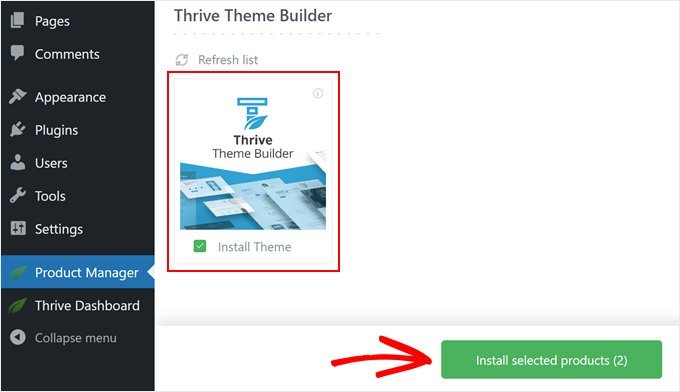
Scroll down until you see ‘Thrive Theme Builder’ and pick the ‘Install Theme’ option.
Then, hit ‘Install selected products’. We need to do this because Thrive Architect works together with Thrive Theme Builder.
The next page will show the Thrive Product Manager setting up Thrive Architect and Thrive Theme Builder.
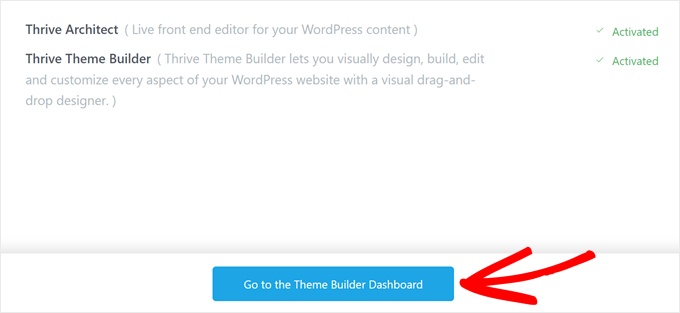
When it’s done, click on the ‘Go to the Theme Builder Dashboard’ button.
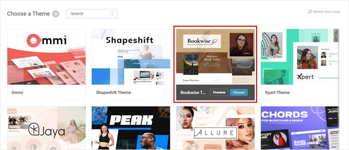
Now it’s time to pick a starting design for your site from Thrive’s theme collection.
If you’re not sure which one to pick, just use the ‘Preview’ button to see how each theme looks. When you’ve found one you like, click ‘Choose’.
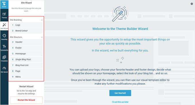
Next, you’ll start the Theme Builder Wizard. This wizard will help you add your logo, pick your brand colors, and set up different parts of your theme.
Make sure you finish the setup wizard before moving on to the next step.
Step 2: Create a Category Archive Template
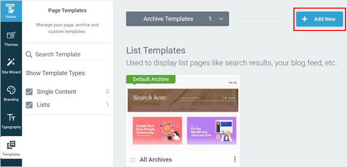
With your theme set up, let’s switch to the ‘Templates’ tab. This is where you’ll see the default templates used by your theme to design your web pages. In this case, the template used for category archives is called ‘All Archives.’
Since we want to style individual WordPress categories, we have to create a new category archive template first. To do this, click ‘+ Add New.’
A new popup window will appear. First, enter your new category template name. You can use something simple and include the category name there.
Below that, select ‘List’ because we want to create a page that lists all of the posts in a specific category.
In List Type, select ‘Archives,’ and choose ‘Categories’ in the ‘Archive Type.’
In the Defined for field, choose the name of the category you’re creating the template for. For the sake of example, we chose ‘Blogging.’
At the end, you can either choose ‘Start from Scratch’ or ‘Choose Template.’
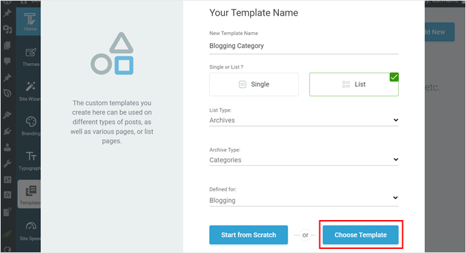
We will go with the second option because a lot of the ready-to-use Thrive Themes templates already look well-designed.
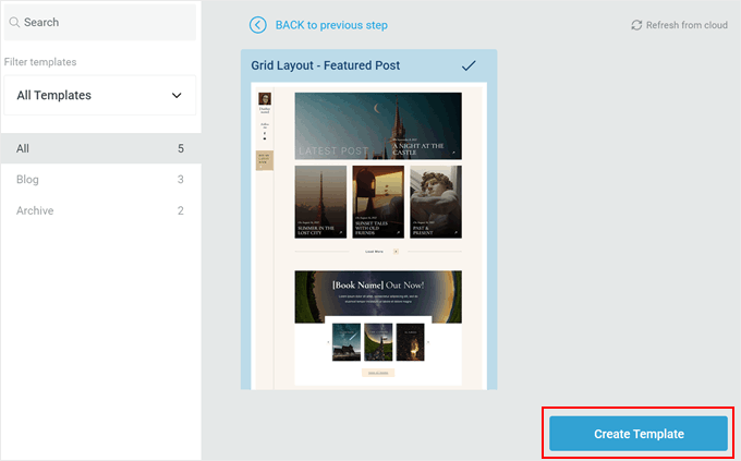
On the next popup, you can choose one of the available templates. For illustration, we will choose ‘Grid Layout – Featured Post.’
Once you’ve made your pick, click the ‘Create Template’ button.
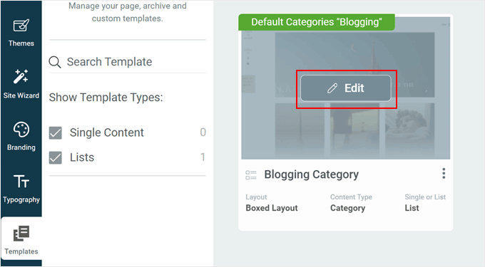
You should now see your new template added to the list of templates.
Hover over it, and click ‘Edit’ to start customizing it.
Step 3: Customize Your Category Template Page
Thrive Architect offers plenty of ways to customize your page.
It works similarly to the block editor in that you can drag and drop elements on your page, select one to customize, and you’re good to go. The difference is that there are a lot more customization options to play around with.
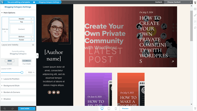
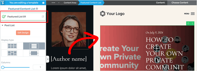
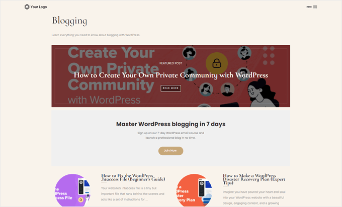
Let’s take a look at an example. In our category archive template, there is a huge featured post at the top, with the rest of the posts in the same category below it. By default, the featured post is the latest post published in that category.
If you want to change the layout of this element, click on the ‘Featured List 01’ element. Then, click on the external icon button at the top of the left sidebar.
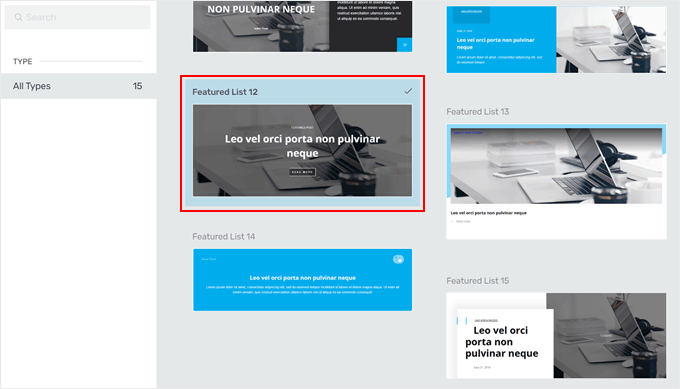
A popup will appear, asking you to choose a different featured post design.
There are several to choose from, and you can always change it again if you’re not happy with your current pick. Just click on your desired layout, and Thrive Architect will automatically implement it in your page template.
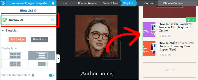
You can also do the same thing with the list of posts below.
Just select the ‘Blog List’ element. After that, click on the external icon at the top of the left sidebar, and you’ll find other templates to display your list of posts like before.
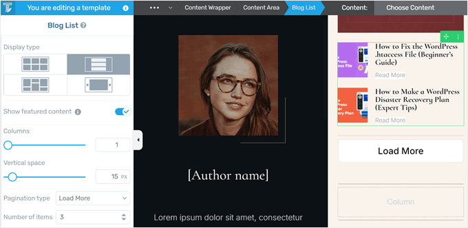
If you want to change the category list’s design further, then scroll down the sidebar.
There, you’ll find settings to change the display type (like turning it into a carousel), disable the featured post, switch the pagination type (like from numerical to ‘Load More’), increase/decrease the number of posts displayed, and so much more.
You can also add other elements, like a big headline to tell visitors which category page they’re on and a description along with it.
To do this, you can click the ‘+’ button on the right side of the builder. Then, select the ‘Text’ element and drop it wherever suits the page best.
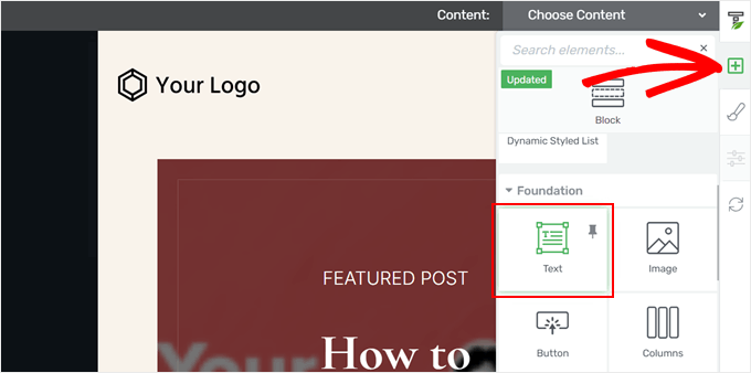
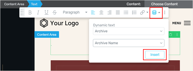
On the text element, click the dynamic text icon on the far right side of the text toolbar. Once done, select ‘Archive’ in the Dynamic text field and then choose ‘Archive name’ in the field below it.
Now, click ‘Insert.’ Thrive Architect will then add your category name. Since this feature adds dynamic content, the category name will get adjusted automatically if you ever change it in the future.
From here, you can change the text’s style, format, alignment, and more.
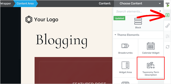
To add the category description, just click on the ‘+’ button again.
After that, select the ‘Taxonomy Term Description’ element.
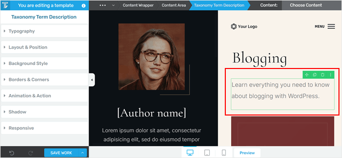
If you have added a description to your category in the WordPress admin » Posts » Categories, then the description should automatically appear here.
Otherwise, you could go back to that page and update it later. You can follow our tutorial on how to display category descriptions in WordPress for more information.
One cool thing about styling your categories differently in WordPress is that you can add various elements that are specifically tailored to each category.
For example, if you have a lead magnet or an opt-in form that is only suitable for a particular topic, then adding it to this category page is a great way to target interested readers.
Thankfully, Thrive Architect has blocks specifically for that purpose.
For example, you could click on the ‘+’ button and add the ‘Call to Action’ element anywhere on your page. It’s an excellent tactic to break up a long list of posts in a category page.
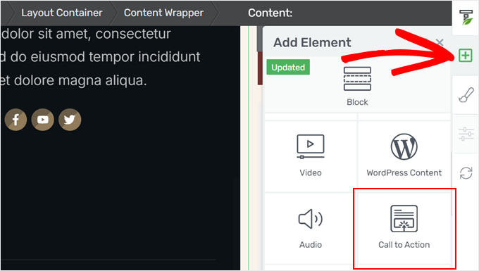
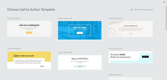
From here, you could choose a call-to-action template.
If you don’t like any of the existing designs, you could pick the one you like best and change the style later.
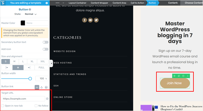
Now, you can change the text of the call-to-action elements.
To add the target URL for the call-to-action button, just click on the button itself. Then, insert the URL and choose whether to make it open in a new tab and nofollow.
After that, feel free to change the call-to-action element further by modifying its typography, adding a background color, inserting animations, and so on.
Once you’re happy with how the category page looks, click ‘Save Work.’
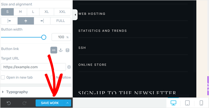
With your category page done, you can now preview your website on mobile, desktop, or tablet to make sure everything looks good.
Then, you can either repeat the same steps as before to create individual category pages with their own styles. Or, just style your main categories and let the rest use the default category archive template from Thrive Themes.
Here’s what ours looks like on our demo site:
Method 2: Use the Full Site Editor to Style Category Pages (Block Themes)
This second method is for block theme users. The full site editor provides an easy way to create a custom WordPress template for category archive pages and style individual categories differently.
The good thing about this method is that it doesn’t need a plugin. That being said, make sure you’re happy with the customization options provided by your WordPress theme and the full site editor because that’s all you’ll be working with.
First, let’s open the full site editor by going to Appearance » Editor in your WordPress admin.
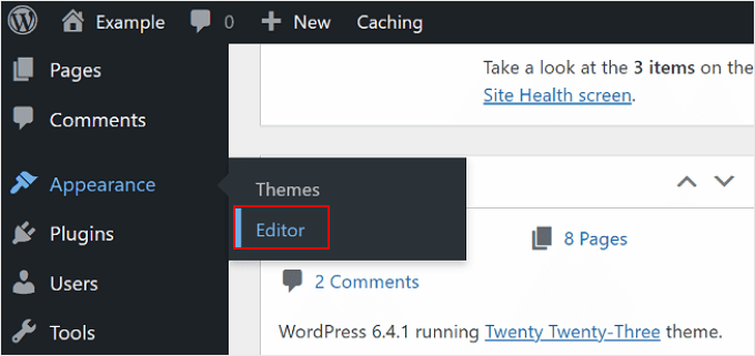
You will now see the main settings to customize your block theme.
To create a custom category template, click ‘Templates.’
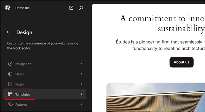
Now, you will see several default templates that your theme offers. This will vary by the WordPress theme, but typically, a theme will include a template used for all of your category archive pages. The theme developer would specify what that is in the description.
In our case, the default template for category archive pages is called ‘All Archives.’ Besides categories, this template is also used for other types of archives like tags, custom taxonomies, custom post types, and so on.
To create a new template for your category archive pages, click ‘Add New Template’ in the top-right corner.
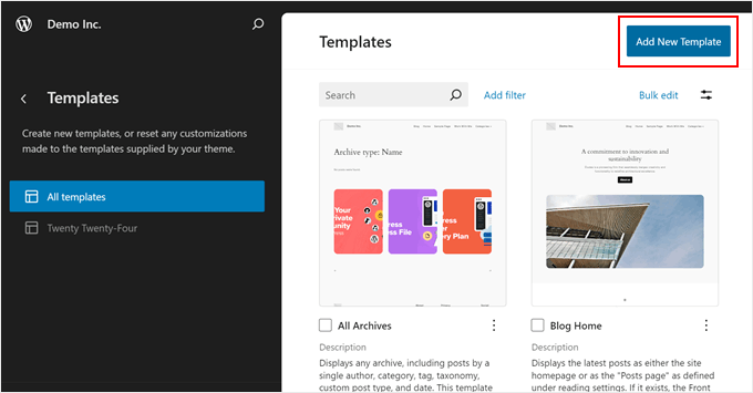
A popup window will now appear, asking you to choose what type of template to create.
Here, just choose ‘Category Archives.’
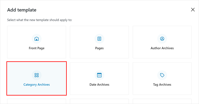
At this stage, you can choose whether to create a new custom category archive template for all categories or just a specific category.
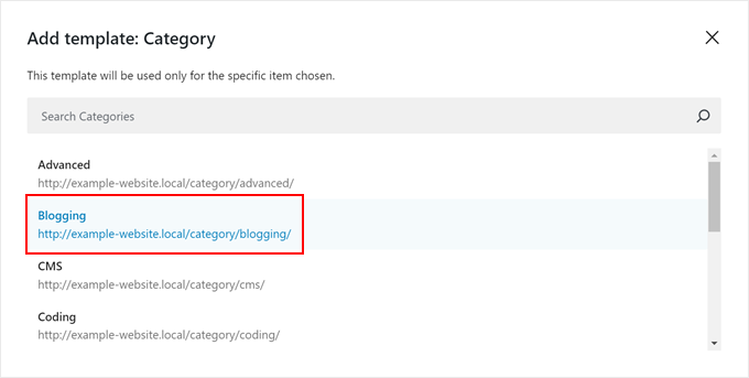
Since we’re trying to style individual categories differently, we will choose ‘Category For a specific item.’

All you need to do now is choose the category you want to create a template for.
In this case, we will pick the ‘Blogging’ category.
You will now enter the full site editor. A popup should appear, asking you to choose a block pattern to use for the category archive page.
You can either choose a pattern or skip this step if you want to start from scratch.
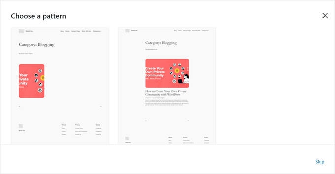
For the sake of example, we will start from scratch and give you examples of how to differently style your category page in WordPress.
Now, if you don’t want to completely start from a blank slate and find other patterns to use, here’s what you can do.
You can click on the black ‘+’ sign in the top left corner to add a block. Then, switch to the ‘Patterns’ tab and scroll down to the ‘Posts’ option. You should now see some patterns for displaying multiple WordPress posts.
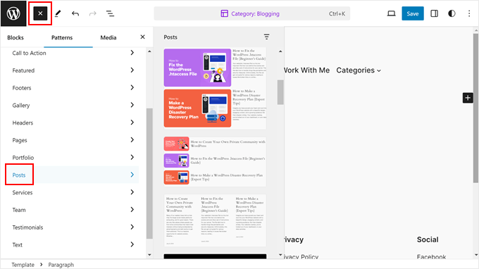
If you’re unhappy with the default options, then you can just create your own design. The process is simple with the full site editor, as you’re just dragging and dropping blocks like usual in the block editor.
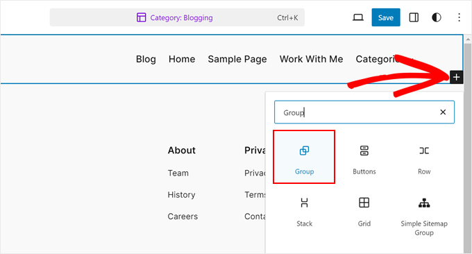
That being said, we recommend using the Group block first so that you can manage parts of the template as one block. Go ahead and click the ‘+’ button anywhere on the page and choose ‘Group.’
Now, select a layout for the group block.
There are four to choose from, and you can choose whichever works best for your WordPress site.

We suggest adding the Archive Title block to the group block first. This will automatically display the title of your category.
So if you change the category name in the future, the title will also automatically get adjusted. You can find it by clicking the ‘+’ button anywhere on the page and selecting ‘Archive Title.’
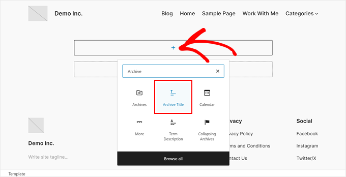
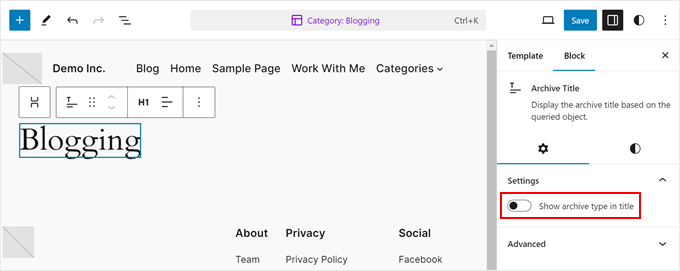
By default, this block will show the title in the ‘Archive Type: Archive Title’ format.
But you can disable the archive type in the title by going to the block settings sidebar and deactivating the ‘Show archive type in title’ button.
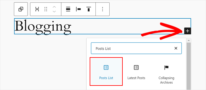
Another thing you should add is a block that displays all the posts in the category.
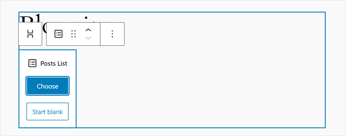
To do this, click the ‘+’ button and choose ‘Posts List.’
Now, you can choose whether to use a premade design or start blank.
To illustrate, we will use the ‘Start blank’ option.
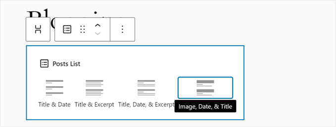
At this stage, you can choose a layout to display the posts.
There are 4 options: Title & Date; Title & Excerpt; Title, Date, & Excerpt; and Image, Date, & Title.
Once you have chosen a layout, you should now see the list of all of your posts.
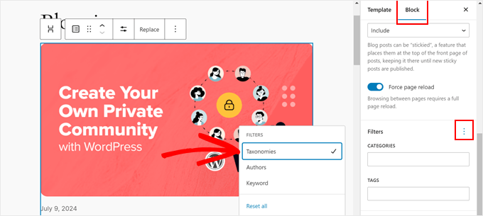
You should now filter the posts based on the category. To do this, switch to the ‘Block’ tab in the block settings sidebar. Then, scroll down to the ‘Filters’ section and click on the three-dot menu.
Here, choose ‘Taxonomies.’
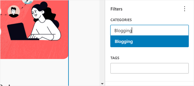
Simply enter the category name to filter the list of posts in the appropriate field.
Make sure to hit the ‘Enter’ key after that.
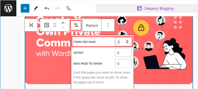
To change how many posts are displayed, you can click on the ‘Posts List’ block and select the ‘Settings’ icon.
Now, you can change the number in the ‘Items Per Page’ field.
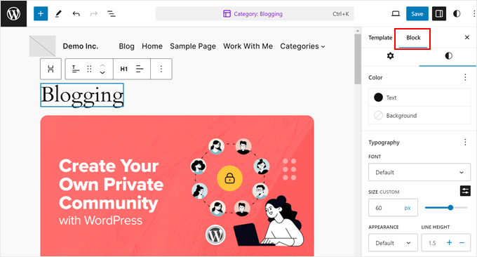
To change the appearance of the page, you can choose one of the blocks on the page. Then, switch to the ‘Block’ tab in the settings sidebar and navigate to the ‘Style’ tab.
You will now see the available styling options for that specific block. Feel free to change the text color or link color, change the fonts, adjust the padding and margin, and so on.
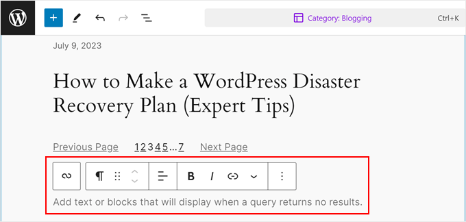
At this point, you can move down the page and locate the block that says, ‘Add text or blocks that will display when a query returns no results.’
Here, you can type in some text or add blocks that will appear in case the category doesn’t have any posts in it yet.
And that’s all for the basics of editing a category page in the full site editor. You can now add more blocks to it to make it more distinctive from the other category archive pages.
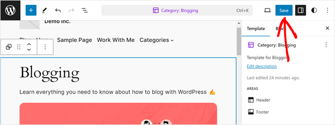
Then, just click ‘Save.’
After that, you can repeat the same steps as before to create custom WordPress pages for all of your categories. You can also just edit your main categories, and the rest will use the default archives template in your theme.
If you want more tips and tricks on using the full site editor, check out our complete beginner’s guide to WordPress full site editing.
We also recommend checking out our list of the best Gutenberg block plugins so that you can add a lot more elements to your category page.
Here’s what our simple category page looks like:
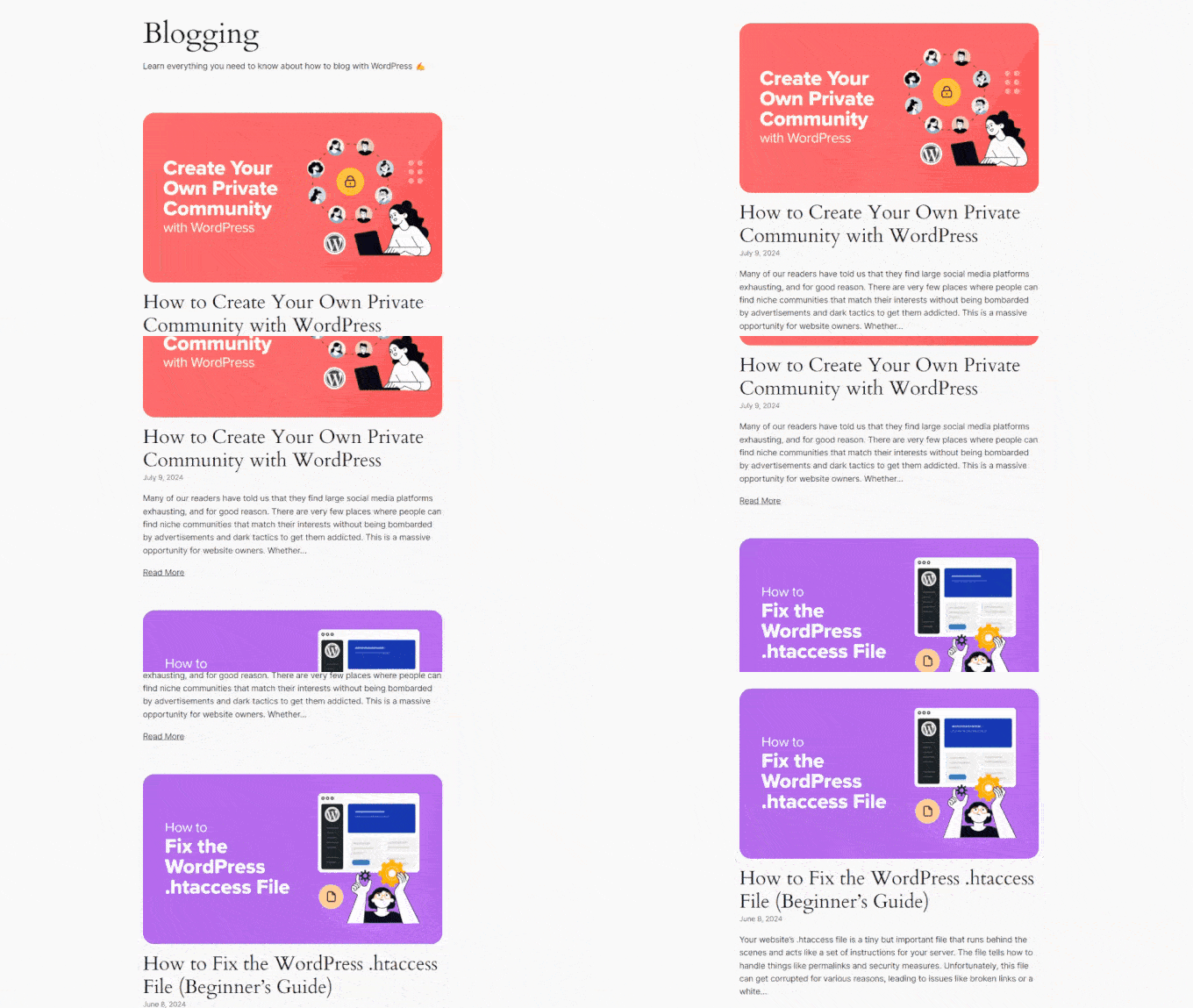
Method 3: Use CSS Hero to Style Category Pages (All Themes)
This third method is recommended for WordPress classic theme users, though block theme users can do it, too.
The reason is that not a lot of classic themes offer the option to individually style your category archive pages. And if you don’t want to go with Method 1, then the alternative is to use custom CSS.
The trick with CSS is that you need to know how to code. If you’re a complete beginner with no technical background, then coding may not be the most user-friendly option for you.
Thankfully, we’ve found an easy way to customize your theme using CSS without coding at all, which is using CSS Hero.
CSS Hero is a plugin that lets you customize your existing theme with a visual CSS editor. All you need to do is select an element on your site, change its style, and CSS Hero will change the CSS code of that element.
That being said, compared with the previous methods, we recommend using CSS only if you want to make minor changes to your category archive pages. While an overhaul is possible, it may take longer.
Also, the plugin doesn’t come with a free version, though you can use our CSS Hero coupon code to get a 40% discount.
For more information, you can check out our full CSS Hero review.
Once you have purchased and downloaded CSS Hero, you can install and activate it on your WordPress admin. For step-by-step instructions, just check out our beginner’s guide to installing WordPress plugins.
Then, you should see a CSS Hero button at the top of your admin bar. Click on it to start editing your site.
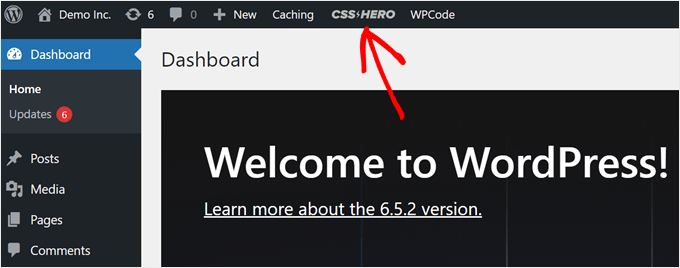
The screenshot below shows what your page should look like now.
On the left side is a sidebar where you can modify the individual elements on your page. At the top, you’ll find buttons to view your page on different devices, switch to the Navigate mode, and undo changes.
At the bottom, you can save your work.
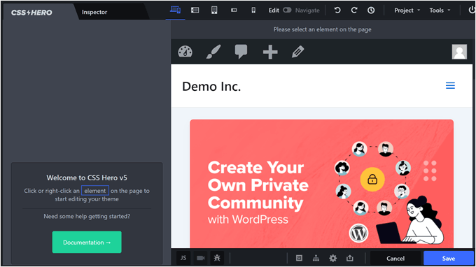
By default, you will see your homepage.
To customize a category archive page, switch from the ‘Edit’ mode to ‘Navigate’ mode on the top right corner of the page. Then, go to the category you want to customize.

Once you’re on the right page, you can go back to ‘Edit’ mode.
To ensure that your edits only affect this specific category page and not the rest, change the ‘Selection Mode’ setting to ‘Category.’

Now, you can go ahead and select an element to edit.
In this example, we’ve clicked on the group of blocks that display the category title and description. The left sidebar now has settings to change that element.
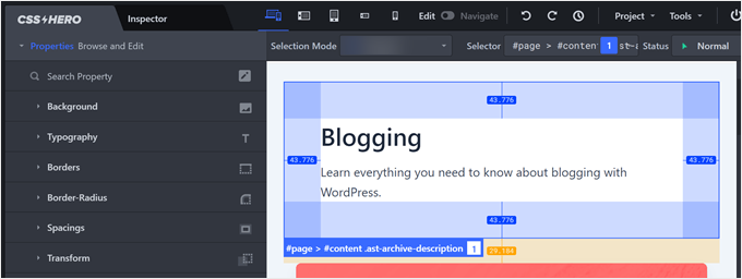
Let’s try an example. If you want to change the background color, then click on the ‘Background’ option.
Then, you can click on the color picker icon and select the color that suits your taste. It’s also possible to add a gradient or an image as the background.
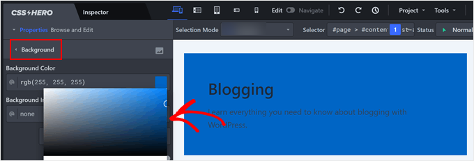
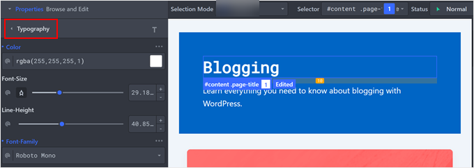
Since we picked a rather dark color, the text isn’t readable now. Thankfully, CSS lets you click on the individual text elements inside this group of blocks.
To change the text color, you could switch to the ‘Typography’ setting and select your desired color. You can also customize the font size, line height, and even the font family.
Another cool thing you can do is add a box shadow to your elements so that they stand out even more.
To do this, click on any element that you want to add a shadow to. Then, navigate to the ‘Extra’ tab and click ‘Make Shadow.’
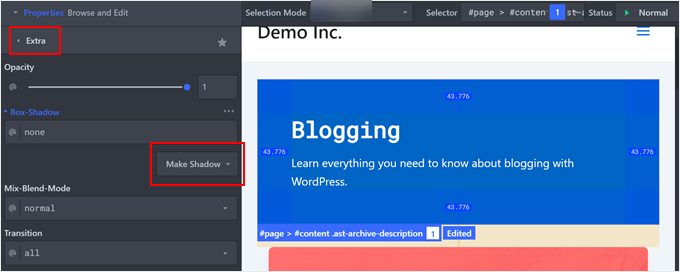
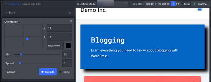
Now, start dragging the dot to where you want the shadow to appear. You will automatically see a shadow below the element.
Once done, you can adjust the shadow’s blur, spread, position, and color.
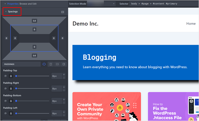
If you find that the elements are too close together (like you need to add line breaks) or too far apart, then you can adjust them in the ‘Spacings’ settings.
Here, you can change the padding and margin of each element so that they look more proportional.
There’s actually a lot more that you can do with CSS Hero. If you want to learn more, check out these guides:
- How to Add Custom Styles to WordPress Widgets
- How to Style WordPress Navigation Menus (Updated)
- How to Add Image Hover Effects in WordPress (Step by Step)
- How to Change the Sidebar Side in WordPress
Once you’re happy with how the category page looks, then just click ‘Save.’
That’s it. Now, you can repeat the same steps with the other category pages so that they look more unique.
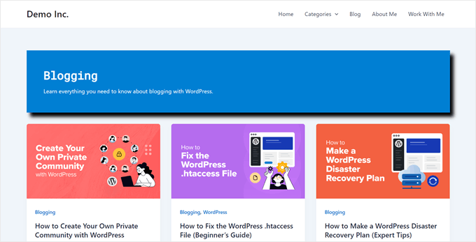
Here’s the end result of our category page, made with CSS Hero:
Bonus Tip: Use a Different Theme for Specific Category Pages
Want to make a big change to how some of your categories look? You might consider using a completely different theme for certain categories.
This can be great if you want a group of category pages to look the same but different from everything else.
Keep in mind, though, that you can’t style each category. Instead, you’re creating two distinct looks for your site.
While this gives you a lot of freedom to change things up, remember that it’s still important to keep your site looking somewhat consistent. Even if some categories look different, try to maintain some common elements.
This helps visitors feel comfortable as they move around your site. You can keep your WordPress site engaging and easy to use by finding a balance between unique designs and consistency.
For more details on how to do this, see our guide on how to use multiple themes on your WordPress website.
We hope this article has helped you learn how to style individual categories differently in WordPress. You may also want to check out our expert picks of the best WordPress theme builders and our ultimate guide on how to edit a WordPress website.
If you liked this article, then please subscribe to our YouTube Channel for WordPress video tutorials. You can also find us on Twitter and Facebook.



Dennis Muthomi
I have experimented with custom category styling and I’d like to add that it’s crucial to maintain a balance between uniqueness and consistency.
While it’s tempting to make each category drastically different, it’s important to retain some common elements to ensure a cohesive user experience across the site.
ofir
is it possible to change style of all the post under the category and not just the category archive page, with the css option ?
i want to display:none of an element only on specific category pages
WPBeginner Support
It is possible but you would need to add some code for adding the category target to posts as that is not a default addition from WordPress.
Admin
Caroline
Thanks for your article!
Let say I want to style all posts in category “Reviews” but only the child-categories in reviews are selected for the post.
How can I style all the child categories in the category Review?
WPBeginner Support
For what it sounds like you’re wanting, you would want to target the individual subcategories.
Admin
Caroline
Yes that’s correct! Is it possible?
WPBeginner Support
Apologies for the confusion by what we meant, we would mean following this guide for each of the subcategories and if you wanted to have the subcategories grouped you can add a comma for the CSS to affect an additional target.
Caroline
Hello,
thank you for the article.
What is going on if an article belongs to two or more categories ?
Carosch
AB
The question is how to assign a custom category template layout from the admin dashboard to multiple other categories.
for example I’ve created a template called Category-grid.php . how do assign it to multiple categories in my wordpress ?
Kat S.
Fantastic Article!
I am a Wordpress newbie and have been trying to figure out a way to do exactly this. I did run into some problems when following your steps though. Our Wp site is set up on a Windows server running iis 7, so I do not know if that is causing my issue, but I’m sure the issue is on my end, not with your instructions.
I tried both methods; copying category.php to a new php file named after one of my categories, and CSS. CSS worked like a charm, but with the first method, I received an error telling me that a call to a certain function in the original php category file was duplicated in my custom category file. I created the new php file in my child theme directory (I am using Avada). The original category.php was also not found in the location you mention, but in the wp-includes folder. My blog page has been working fine though; and so have my categories. Not sure how to deal with this as there was SO much coding in the original category php file; I have no idea what, if anything, I should have deleted from my custom category php file.
A lot of information I know. Many thanks for responding if you have further suggestions.
Love this site!