Offering a clunky, desktop-style menu on a phone is a surefire way to frustrate visitors. And a confusing mobile menu can make them leave just as fast.
A slide-out panel menu solves this by giving your site a clean, app-like feel that works beautifully on smaller screens. It makes finding content easy and keeps visitors engaged.
After testing several plugins for this exact task, we found a fantastic free option that’s both powerful and easy to set up. You can create a professional-looking slide menu without touching a single line of code.
In this guide, we’ll show you exactly how to add a slide panel menu to your WordPress theme, step by step. 🎨
Why Add a Slide Panel Menu in WordPress Themes?
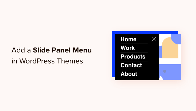
A slide panel menu makes navigation on mobile devices smoother and more intuitive. It gives your WordPress site a clean, app-like feel, helping visitors find what they’re looking for quickly without feeling lost or frustrated.
Well-designed menus help your visitors find their way around your WordPress site. Many of your visitors will be using mobile devices, so it’s important to preview the mobile version of your WordPress site to see how your navigation menu looks on smaller screens.
Luckily, many WordPress themes come with built-in styles that automatically show mobile-friendly menus when viewed on a small screen.
However, you may want to customize your mobile navigation even more and add a fullscreen responsive menu or an animated slide panel menu.
With that in mind, we’ll show you how to add a slide panel menu in WordPress themes. Here’s a quick overview of all the topics we’ll share in this guide:
- How to Add a Slide Panel Menu in WordPress Themes
- Frequently Asked Questions About Slide Panel Menus
- Further Reading: More Resources Around Customizing Site Menus
Let’s get started.
How to Add a Slide Panel Menu in WordPress Themes
The first thing you need to do is install and activate the Responsive Menu plugin. If you need any, then you can see our step-by-step guide on how to install a WordPress plugin.
💡 Note: You can follow this tutorial using the free plugin. If you want extra themes and advanced features like conditional logic, you can upgrade to the premium version of the Responsive Menu plugin.
Upon activation, let’s navigate to Responsive Menu » Menus from your WordPress dashboard. Once there, you should click the ‘Create New Menu’ button at the top of the screen.

You will then see 4 themes you can use for your new responsive menu. Additional themes are available for purchase.
For this tutorial, we’ll use the automatically selected theme. You can then click the ‘Next’ button.

This will take you to the ‘Menu Settings’ page.
Here, you can enter a name for your responsive menu and then select which WordPress menu you’d like to be displayed in the panel. For example, we chose the ‘Navigation’ menu.
If you need to create a new menu, then you can learn how by following our guide on how to add a navigation menu in WordPress.
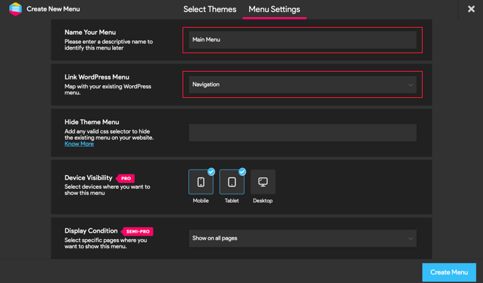
You can also hide the normal menu that comes with your WordPress theme so that your users will only see the new slide panel menu. You do this by entering CSS code into the ‘Hide Theme Menu’ field.
The code you need to enter here varies from theme to theme, and you can learn more details by clicking the ‘Know More’ link.
📝 Note: Users with the Pro version have a few additional settings. For example, Pro users can select the devices and pages where the menu should be shown.
Once you’re happy with the settings, you should click the ‘Create Menu’ button at the bottom of the page. This will take you to a page where you can finish customizing your menu.
You will see a preview of your website on the right side of the screen, and there are buttons at the bottom to switch between phone, tablet, and desktop views. You’ll also find customization options on the left.
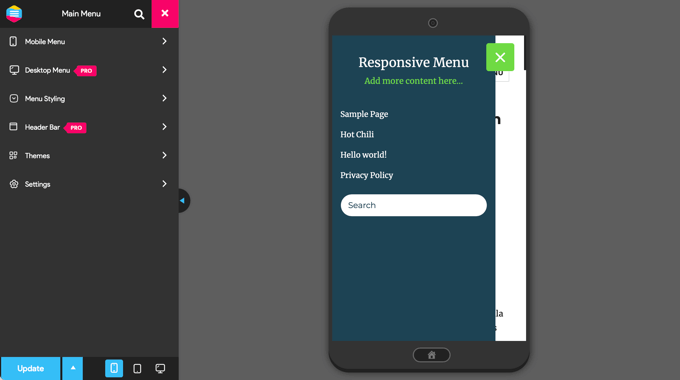
You might notice that some text is displayed above the menu. This is the menu’s title and a line of text that the plugin calls ‘additional content’.
You can edit or hide the text by clicking on ‘Mobile Menu’ and then ‘Container’ in the menu on the left of the page.
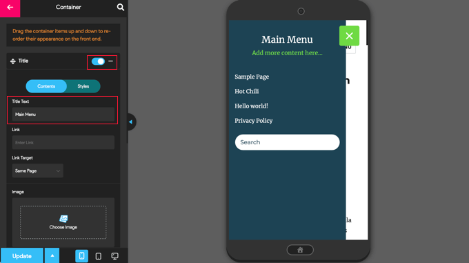
Additionally, you can type anything you like into the ‘Title Text’ field, such as ‘Main Menu’ or ‘Navigation.’ If you don’t want to display a title, then simply slide the ‘Title’ switch to the off position.
After that, you’ll want to scroll down to the ‘Additional Content’ setting.
From here, you can toggle this setting off or type alternate content. In the screenshot below, you’ll notice that the switch has been toggled off, so the words ‘Add more content here…’ are now hidden.
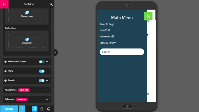
Once you’re happy with the menu settings, let’s make sure you click the ‘Update’ button at the bottom of the page to store your settings.
The Responsive Menu plugin offers many other options for changing the behavior and appearance of your slide panel menu. You can explore these options on the plugin’s settings page and adjust them as needed.
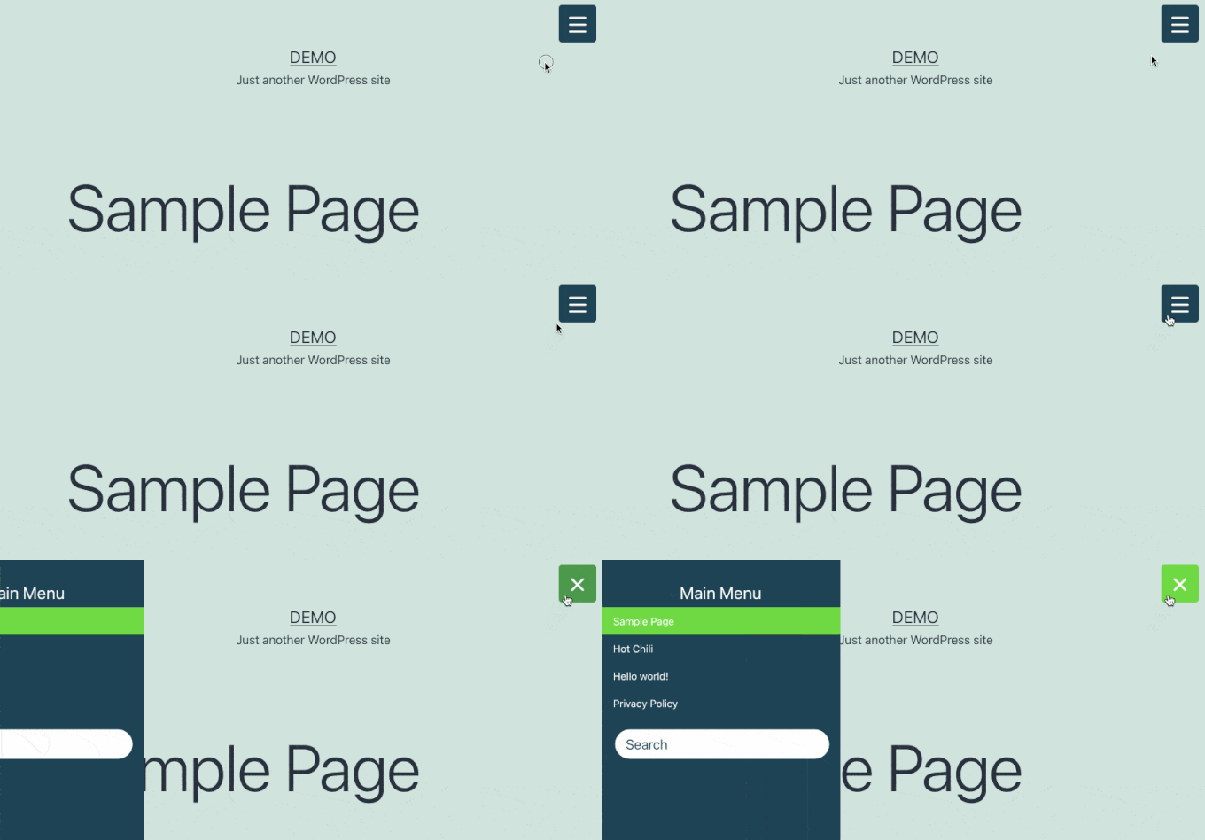
Now, you can visit your website to see the menu in action. Here’s how it looks on our demo website. Note that if the current page is in the menu, it is highlighted with a color band.
✋ Expert Tip: Styling your WordPress navigation menu can enhance your site’s appearance and usability. A well-designed menu helps visitors easily find what they need and encourages clicks.
For more on this topic, check out our guide on different ways to style your WordPress navigation menu.
Frequently Asked Questions About Slide Panel Menus
Still need clarifications on how slide panel menus work on WordPress? Here are answers to some common questions.
Do all WordPress themes come with a mobile menu?
Most modern WordPress themes are responsive, so they include a mobile-friendly menu. That said, it’s usually just a basic dropdown. If you want a sleek, slide-out panel menu, you’ll need a plugin.
Will adding a slide panel menu plugin slow down my site?
Not if you choose a well-coded plugin like Responsive Menu. These plugins are designed to be lightweight and shouldn’t noticeably affect your site’s speed.
Can I show a different menu on mobile versus desktop?
Yes! You can create a separate mobile menu using a plugin like WP Mobile Menu or custom CSS, so your mobile visitors see a different navigation than desktop users. This lets you simplify links, highlight promotions, or improve conversions specifically for mobile devices.
Further Reading: More Resources Around Customizing Site Menus
We hope this tutorial helped you learn how to add a slide panel menu in WordPress themes.
To improve your user experience even further, check out our other helpful guides on :
- How to Create a Sticky Floating Navigation Menu in WordPress
- How to Add a Mega Menu on Your WordPress Site (Step by Step)
- How to Add Specific Posts to WordPress Navigation Menu
- How to Add a Search Bar to WordPress Menu (Step by Step)
- How to Create a Dropdown Menu in WordPress (Beginners’ Guide)
- How to Show Different Menus to Logged-in Users in WordPress
- How to Add Custom Navigation Menus in WordPress Themes
If you liked this article, then please subscribe to our YouTube Channel for WordPress video tutorials. You can also find us on Twitter and Facebook.


Jiří Vaněk
I created a slide menu using Elementor and pop-up windows with a sliding menu effect. It works great, but unfortunately, I can’t have Elementor PRO on all the websites I manage due to its price. This is a fantastic alternative for creating such a menu, and if it’s possible to use the plugin in a free version, that’s truly amazing. For websites without Elementor, this is a lifesaver for me.
Moinuddin Waheed
This is a saviour for me as I have been struggling to get slide out panel for mobile responsive menu.
Earlier I used code snippets and inserted in wp code for this.
But this plugin offers more customisation and the pro version seems more powerful in terms of customisation control.
I will definitely try this plugin.
Mohammad Kashif
Awesome!
Can i add close button in the popout?
Luke Marshall
I’m still waiting on a support ticket reply from you guys regarding this exact need! the one you offer is on the right side only with no apparent way to change it to the left, I’m glad I’ve found this.
Cynthia
Change the function “left” to “right” in the two spots it is used in the function code.
Ru
Do you have demo for this?
I want to check it before
Daniel Jarosz
clean & simple, thank You for this tutt!
Ann
Hi, this code works perfectly when I run my website locally but not once it’s live. Is there any possible explanation to this? I updated the image links not sure what else needs to be updated as the folders have not changed.
Madiha
its not working on my site plz visit and tell the solution
http://www.dailynewscompany.com
Mattia
Hi, interesting article… Do you have a DEMO of this, or a URL to an online site in which you implemented it? It would be interesting to see it in a real case, before trying to use it! Many thanks
Jim
Is it possible to show how the script could be modified so the close event can be triggered by clicking anywhere else but on the navigation?
In other words, so the user doesn’t need to just click on the toggle menu icon to close the navigation sidebar?
Thanks.
Karl
I am searching high and low for a plugin or the ability to implement the type of menu you have currently running at the top of your page. You have a “Play” button on the right side of your header. Upon pressing it a content area slides out from your header section. I really want to use this type of menu in my site. If you could point me even to a link where this type of menu is explained I’ll take it from there and thanks. This is an awesome tutorial!
WPBeginner Support
Karl you can right click on the play button and select inspect element and study our source code. We will also try to cover it soon at WPBeginner as a tutorial.
Admin
Shubham Dubey
Sorry for replying here,(Comments is not available)
Hey! I’m using Genesis framework, with its child theme, i’m unable to find header.php file there,
i just copied the header.php file from genesis to my child themes folder, but after opening header.php file didn’t found any lines
hOW TO DO THIS WITH CHILD THEMES, PLEASE EXPLAIN.
Jim
Excellent guide. I’m almost there with a test implementation, however I’m wondering…can I use a relative path in the sidepanel.js file instead of the absolute path?
I’ve tried to do so but I cannot figure it out. Should the relative path be relative to the html file calling the javascript?
Thanks
krish
It’s good and useful content. The screenshot and coding easily understand and apply to my website. Good job man!!!
Håkon Stillingen
Interesting article. How would I go about replacing default header in Genesis Framework?