Adding Halloween effects to your website might seem like a small thing, but it can make a big difference. In our experience, it can boost user engagement, increase time spent on your site, and even drive more conversions.
Simply put, embracing the holiday spirit shows your audience that your brand is up-to-date and fun. And the good news is, with the right WordPress plugins, adding Halloween effects is easier than you might think. For instance, you can easily create spooky popups with OptinMonster or run Halloween giveaways with RafflePress.
In this guide, we’ll show you our go-to ways to bring Halloween effects to your WordPress site. We’ll cover simple design changes and some clever marketing ideas.
Does Adding Halloween Effects to Your WordPress Site Make a Difference?
Adding Halloween effects to your WordPress website can make a big difference during the spooky season. It’s not just about making your page scary. It’s about creating a themed environment that resonates with your audience’s current interests and experiences.
By bringing Halloween elements to your pages, you can create a memorable experience that sets your site apart from the rest. This seasonal update can help keep your content fresh and relevant, encouraging visitors to spend more time exploring your WordPress blog.
Seasonal changes like Halloween effects can also boost user engagement. Visitors are more likely to interact with and share content that feels timely and festive. This increased engagement can lead to a better user experience, SEO, and potentially more conversions.
With that in mind, let’s look at some great ways to add Halloween effects to your WordPress site. In this article, we’ll split our ideas into 2 main groups: making your design more festive and using Halloween for marketing.
You can use the quick links below to navigate through the article:
- Use Halloween-Themed Fonts
- Switch to a Darker Color Scheme for Your WordPress Theme
- Create a Custom Halloween '404 Error' Page
- Add an Animated Halloween-Themed Background
- Add Spooky Sounds With an Autoplay Audio Player
- Add a Halloween Countdown Timer
- Add a Halloween-Themed Hero Image to Your Homepage
- Switch to a Spooky WordPress Theme
- Create a Halloween-Themed Website Banner
- Create a Halloween Landing Page for Your Marketing Campaigns
- Run Halloween-Themed Popup Campaigns
- Gamify Your Site With a Spooky Wheel of Fortune
- Add a 'Spooktacular Savings' Pricing Page
- Skyrocket Your Email List With Halloween Giveaways
- Run a Halloween-Themed Contest
Make Your Website Spooky With WordPress Halloween Elements
Let’s dive into how you can make your website spooky with WordPress Halloween elements. These design changes will help create a festive atmosphere that your visitors will love.
1. Use Halloween-Themed Fonts
One easy way to add Halloween effects to your WordPress site is by using spooky typography during the holiday season. Doing this can instantly give your site a more haunting look without much effort.
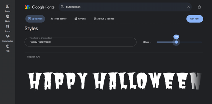
Google Fonts has some really cool, free fonts that you can use, though they can be hard to find because they don’t have a Halloween category. But don’t worry, we’ve found some fun ones you can check out:
- Butcherman
- Creepster
- Eater
- Nosifer
The great thing about Google Fonts is you can preview how your text will look using that font before downloading it. This way, you can make sure the font matches your site’s Halloween vibe before making any changes.
To install fonts that are not available in your theme, check out our article on how to add custom fonts in WordPress.
One important tip: a lot of these Halloween fonts usually look great as headings, but we don’t recommend using them for paragraph text.
Using them for smaller text can make it hard to read, which might frustrate your visitors. Stick to using spooky fonts for titles and headings to create impact without sacrificing readability.
Additionally, we recommend making Google Fonts privacy-friendly to ensure your website is always GDPR-compliant.
2. Switch to a Darker Color Scheme for Your WordPress Theme
With Halloween approaching, why not change the colors of your WordPress theme? You can easily revert back when Halloween is over, making this a flexible way to update your site’s look.
Our guide on how to customize colors on your WordPress website can walk you through the technical steps. But how do you find the right color scheme that fits both Halloween and your brand?
The typical Halloween colors are orange, black, purple, and green. You can replace one of the colors in your current color scheme with one of these classic Halloween hues to use as your signature Halloween color. We also recommend using darker tones to create a spooky atmosphere.
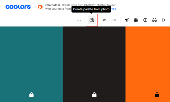
If you want to explore more color options, you can use a color picker tool like Coolors. This tool is really handy for creating Halloween-themed color schemes that still work with your brand.
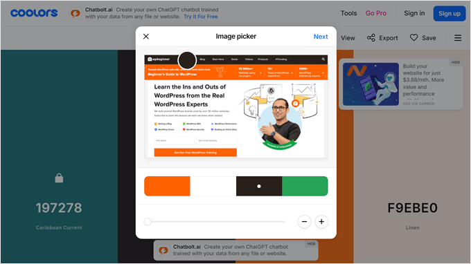
First, open the Coolors website. Then, you can enter the HEX codes of your current website’s color scheme. You can also upload a screenshot of your website by clicking on the camera icon if that’s easier.
Once done, just click on the ‘Browse or drop image’ button.
Then, upload your website screenshot there.
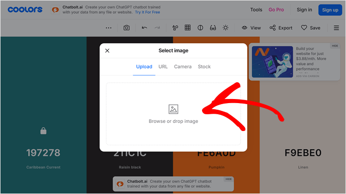
The tool will detect which colors are most prominent in the screenshot. But you can always drag the picker tools to select your own colors from the image.
Once done, just click ‘Next.’
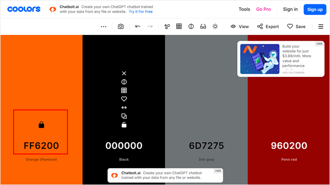
Now, you can click on the lock icon next to the color(s) you want to keep in your website design.
After that, you can press the space bar to let the tool generate new colors based on your selected color(s).
This way, you can find Halloween-inspired shades that complement your existing brand colors.
3. Create a Custom Halloween ‘404 Error’ Page
Want to make every corner of your website spooky? How about creating a Halloween-themed 404 error page?
Doing this adds a fun touch to your site without changing your entire theme. Plus, 404 pages are a great opportunity to keep visitors on your site, as you can send them back to an important page or help them find what they were looking for in the first place.
The easiest way to do this is with a page builder.
We’ve tried a lot of page builders over the years, but we recommend using SeedProd, as it comes with tons of useful templates, including for 404 error pages. This way, you don’t have to start from scratch.
Our guides on how to improve your 404 error page in WordPress and the best 404 error page design examples can give you more ideas and show you how to set this up step by step.
Now, what are some Halloween effects you can add to a 404 error page? One idea is to add a fun, on-brand text like ‘Hmm, your page is missing’ or something similar, but with a Halloween twist.
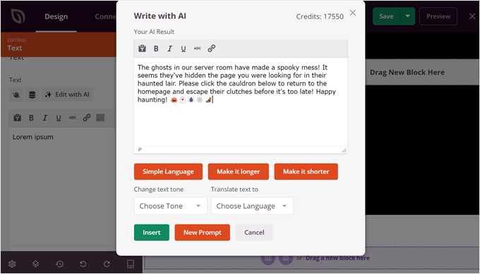
If you’re not sure what to write, SeedProd has an AI text generator. You can use the prompt: ‘Write a Halloween-themed 404 error text to add a spooky twist to the website’s error page and encourage users to go back to the homepage.’
Here’s the result we got after using this prompt:
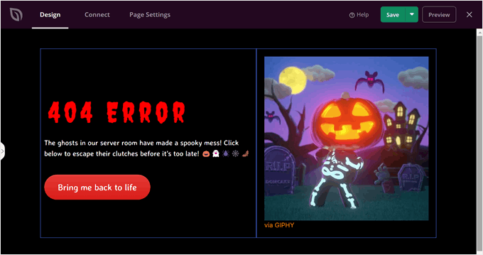
Another way to spice up your 404 page is to add a fun Halloween-themed GIF image. This way, you can bring some movement and humor to your error page.
In the example below, we added a GIF from Giphy, which is a popular source for animated images. A playful Halloween GIF can turn a potentially frustrating moment for your visitor into an entertaining one, encouraging them to explore your site further.
4. Add an Animated Halloween-Themed Background
Another easy way to transform your WordPress site for Halloween is by adding an animated background. This simple change can instantly set a spooky mood and grab your visitors’ attention. Plus, you don’t need to be a coding expert to do this.
We actually have an article on how to add an animated background in WordPress. This guide will show you how to add a festive particle background using SeedProd.
With SeedProd, you can create a custom page with a Halloween-themed particle background, which comes included with the page builder.
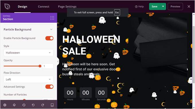
We recommend adding this background in the above-the-fold section of your page to leave a strong first impression on your visitors.
Alternatively, you could install Weather Effect, a free WordPress plugin that specializes in holiday-themed animated effects. With this tool, you can apply a Halloween-themed animated background across your entire website, not just a single page.
Once you’ve installed the WordPress plugin, you can go to ‘Weather Effect.’ Then, select ‘Enable’ and choose ‘Halloween’ for the weather or occasion.
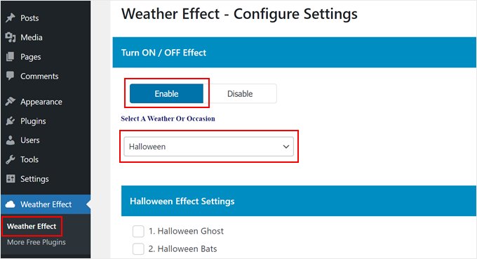
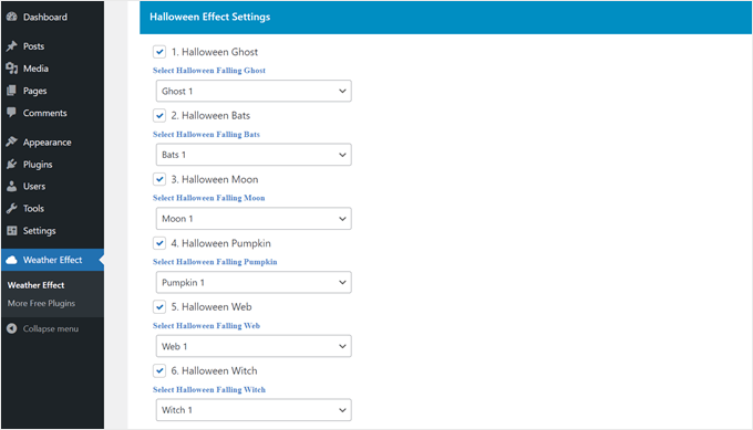
Scrolling down to the ‘Halloween Effect Settings,’ you can select which falling images to display as your animated background.
There are 6 options to choose from: ghost, bat, moon, pumpkin, web, and witch.
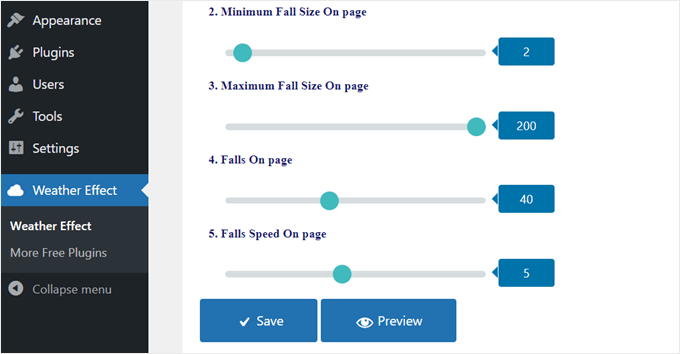
Next, you can customize the minimum and maximum fall size of each image on the page. The closer the minimum and maximum fall sizes, the more uniform the images will look.
The ‘Falls On page’ setting controls the number of images that will appear in the background. The lower the number, the more sparse the animated effect will look.
Lastly, you can change how fast or slow the animation should run.
Feel free to play around with these settings until you’re happy with the animated background. Once you’re satisfied, just click ‘Save.’
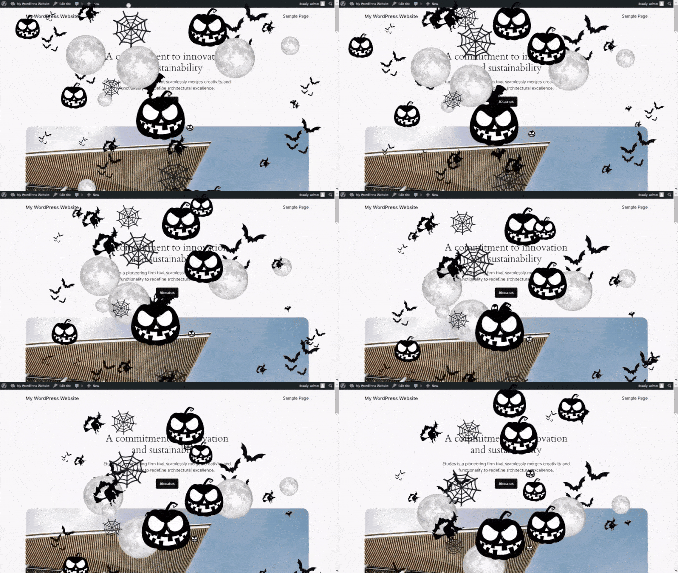
You should now see a Halloween-themed animated background across your entire website.
Here’s what ours looks like:
5. Add Spooky Sounds With an Autoplay Audio Player
It’s not enough to just focus on visuals when creating a Halloween atmosphere. To really get the spooky vibe going, consider adding sounds to your site with an autoplay audio player. This can create a more immersive experience for your visitors and really set the mood for Halloween.
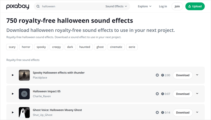
There are plenty of royalty-free sources where you can find Halloween sound effects. Pixabay, for example, offers a wide range of spooky sounds that you can use on your WordPress site.
If you prefer music, you can find Halloween-themed songs on platforms like Spotify or SoundCloud and embed them directly on your site.
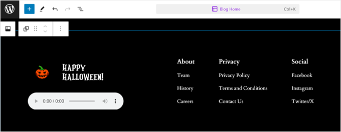
To make the audio music player placement more user-friendly, we recommend adding it to your footer section.
This way, the sound won’t interfere with your main content, and the user can easily pause or adjust the volume if they wish.
For more information on how to set this up, check out our step-by-step guide on how to add an audio music player in WordPress.
6. Add a Halloween Countdown Timer
If Halloween and spooky stuff is a huge part of your brand, or if you have an upcoming Halloween sales event, then you may want to add a countdown timer to your WordPress site.
This can create excitement and urgency among your visitors, encouraging them to engage with your content or take advantage of special offers before time runs out.
We have written a step-by-step guide on how to add a countdown timer widget in WordPress. This resource covers multiple methods, making it easy for you to choose the one that best fits your needs.
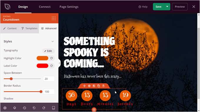
Out of all the methods explained in that article, we recommend using SeedProd. This theme builder not only lets you set the date to Halloween but also allows you to change the appearance of the countdown timer and make it more spooky.
You can customize colors and fonts and change the countdown timer template to your preferences.
But if you want to add a countdown timer to a marketing campaign like a popup, then the guide also shows you how to add it using OptinMonster. This powerful tool can help you create attention-grabbing popups with countdown timers, perfect for promoting Halloween deals.
We’ll talk more about this popup plugin in a later section of this article.

7. Add a Halloween-Themed Hero Image to Your Homepage
A hero image is the large, eye-catching banner image that visitors see when they first land on your website. Adding a Halloween-themed hero image can instantly transform your homepage for the spooky season.
If you want to add a custom Halloween hero image, you can use Canva to create one. It’s a great, easy-to-use tool that offers plenty of Halloween-themed templates and elements. You don’t need to be a graphic designer to create something impressive.
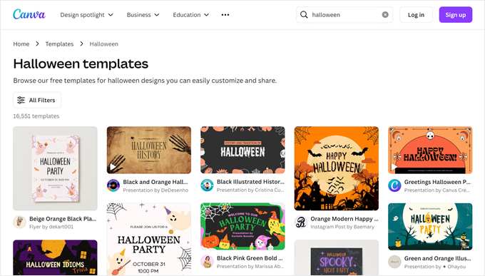
We also have a list of Canva alternatives if you prefer to explore other options.
Or, you can use a spooky, full-width image from a stock photo site. Check out our list of sources for public domain and CC0-licensed images to find the perfect Halloween picture for your hero section.
You may want to look for images with jack-o’-lanterns, haunted houses, or autumn scenes to create the right mood.
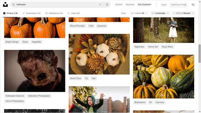
When choosing or creating your Halloween hero image, make sure it aligns with your brand and doesn’t clash with your site’s color scheme. You want it to be festive but still professional.
8. Switch to a Spooky WordPress Theme
This is a bit drastic, and we don’t recommend doing it unless you know how to change your WordPress theme properly. Plus, we think that you can still bring some Halloween vibes to your website just by following the tips above.
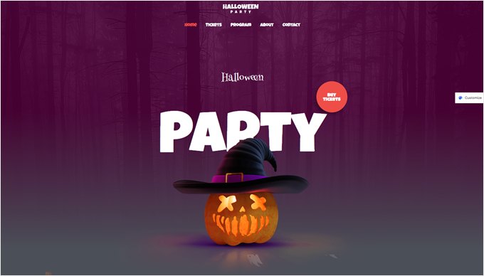
However, if your website is strongly associated with Halloween or similar concepts, then you might want to pick a WordPress theme with a darker color scheme.
For example, Astra has a Halloween Party Template that you can use:
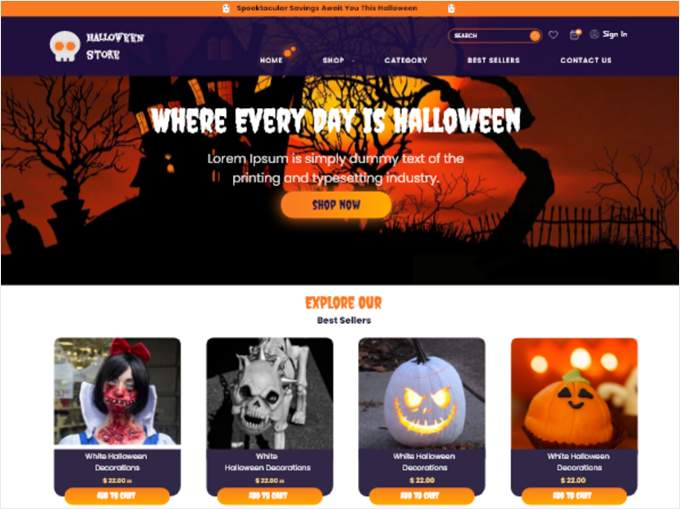
We also found a free Halloween Shop template from the official WordPress theme directory.
This can be great if you’re running an online store:
For more recommendations, check out our list of dark WordPress themes.
Halloween Marketing Ideas to Boost Conversions
Holidays like Halloween are the perfect time to run special promotions and events. Let’s look at some ways you can use Halloween-themed marketing to boost your conversions and engage your audience.
9. Create a Halloween-Themed Website Banner
A website banner is a graphic element that appears at the top, bottom, or side of your webpage. It’s a great way to draw attention to special Halloween offers or events. Think of it as the digital equivalent of hanging a Halloween party banner in your store window.
We have a tutorial on how to make a website banner that can show you the general process, but our recommended approach is using OptinMonster, which is what we use to create eye-catching banners and popups on our websites.
The great thing about OptinMonster is that you can create different types of banners with its Halloween-themed templates. You can choose between a floating banner that stays visible as users scroll or an inline banner that sits neatly within your content.
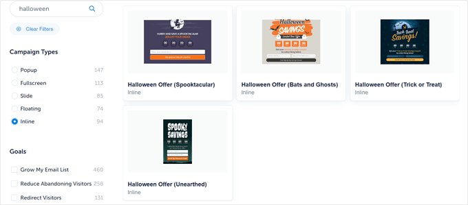
These templates also already include important elements like a countdown timer and opt-in form, so you don’t have to start from scratch.
For example, you could create a banner announcing a ‘Spooktacular Halloween Sale’ with a countdown to when the offer ends, encouraging visitors to take action.
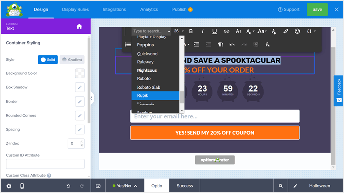
Using OptinMonster’s drag-and-drop editor, you can easily customize the colors, text, and images to match your brand while still capturing the Halloween spirit.
10. Create a Halloween Landing Page for Your Marketing Campaigns
If you’re running an ad or special promotion for Halloween, then you most likely need a landing page to match the Halloween vibe. By creating a dedicated Halloween landing page, you can ensure a consistent experience for visitors coming from your ads or promotional links.
This consistency can help build trust and encourage visitors to take the desired action, whether it’s making a purchase, signing up for an event, or joining your email list.
We have several tutorials on how to create landing pages that may interest you. All of them include a tutorial with SeedProd, so they’re easy to follow:
- How to Create a Landing Page in WordPress
- How to Create a Squeeze Page in WordPress
- How to Create a Google Ad Landing Page in WordPress
- How to Create a Viral Waitlist Landing Page in WordPress
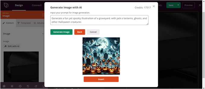
If you use SeedProd, you may notice that it doesn’t have a Halloween-specific theme. But don’t worry! You can use its AI image generation tool to add Halloween-themed illustrations.
You can read more on how to use it in our tutorial on how to generate images with AI in WordPress. But, essentially, all you need to do is describe what you want the AI to make, and it will do it for you.
11. Run Halloween-Themed Popup Campaigns
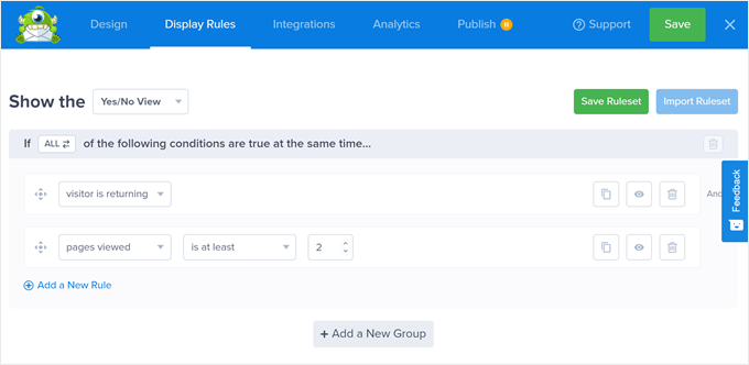
Just like a jumpscare in a spooky movie, a popup can suddenly appear on your website. But the goal here is not to scare users away, but to capture their attention and encourage engagement.
A well-designed Halloween-themed popup can be an effective way to promote special offers, collect email addresses, or highlight seasonal content.
With OptinMonster, you can use the same website banner templates from earlier and turn them into various banners, including popups. So you won’t have to start from scratch.
That being said, popups can be pretty tricky to use because if not done right, they can annoy visitors and hurt your user experience. But the key thing is to be strategic with your placement and timing.
One of the reasons why we keep coming back to OptinMonster is it allows us to time and trigger our popups effectively.
For example, you can use exit-intent popups. These appear when a user is about to leave your site, giving you one last chance to engage them.
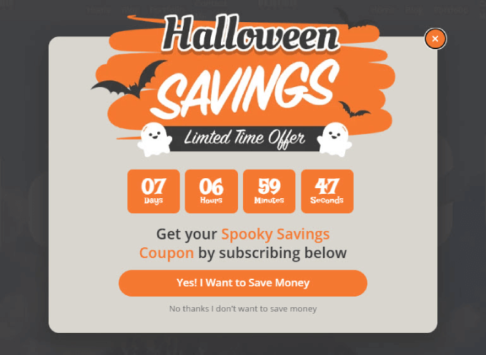
OptinMonster also lets you personalize popups based on user behavior. For example, you could show different Halloween offers to new visitors versus returning customers or display specific popups based on which pages a user has viewed.
To dive deeper into creating effective popups, check out our article on how to use the psychology of popups to boost conversions. This guide will help you understand the principles behind successful popups and how to apply them to your Halloween campaigns.
12. Gamify Your Site With a Spooky Wheel of Fortune
Spooky wheel-of-fortune campaigns can add an exciting, interactive element to your Halloween marketing strategy. You can use these spin-to-win opt-in campaigns to engage visitors and collect email addresses while keeping with the Halloween theme.
Here’s how it works: a wheel pops up at any point during a user’s visit. Users spin the wheel to see what type of prizes they can win. Once they land on a prize, they can only access their treat by entering their email address. It’s like trick-or-treating but on your website!
OptinMonster comes with a Halloween-themed spin-to-win campaign template. It already includes an opt-in email field, a call-to-action button, and a wheel with different prizes. You can easily customize the prizes and the copy to match your Halloween offers or brand message.
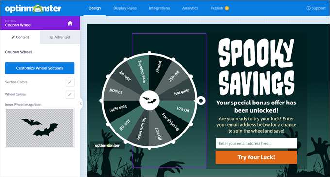
For example, you could offer discount coupons on different products, free shipping, or exclusive access to Halloween content.
Remember to keep the prizes relevant to your business and valuable to your audience. You want users to feel excited about participating and satisfied with their treat when they win.
You can learn more about how to add a spin-to-win campaign in WordPress in our step-by-step guide.
13. Add a ‘Spooktacular Savings’ Pricing Page
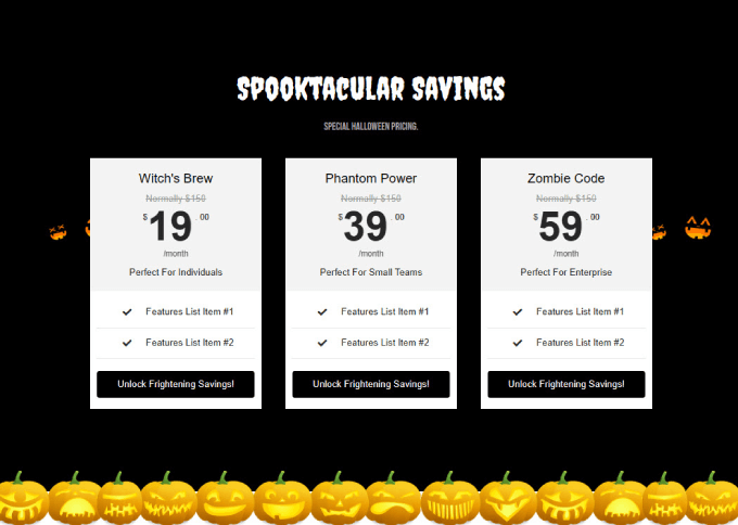
Adding Halloween effects to your pricing page is a good way to drive home the point that you’re offering special discounts and deals.
With SeedProd, you can add a pricing table that helps customers see how much they are saving. You can follow our instructions on how to add beautiful pricing tables in WordPress for more information.
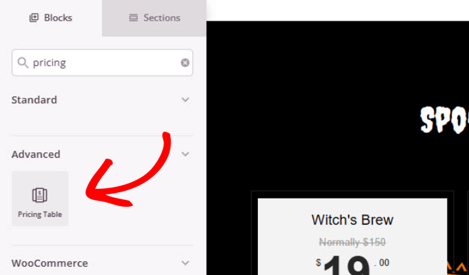
You can also use one of the Google Fonts from earlier to add a gothic style to your header text. Then, all you need to do is find a simple Halloween background to use.
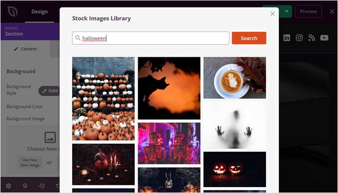
SeedProd is integrated with Unsplash, which is a great royalty-free resource where you can find Halloween images to add as a background.
14. Skyrocket Your Email List With Halloween Giveaways
If you’re not sure how to kickstart your marketing campaign, you can try doing a Halloween-themed giveaway.
This is where participants must complete a task for a chance to win a prize. Often, you’ll ask participants to submit a photo, follow your social media accounts, or share your post.
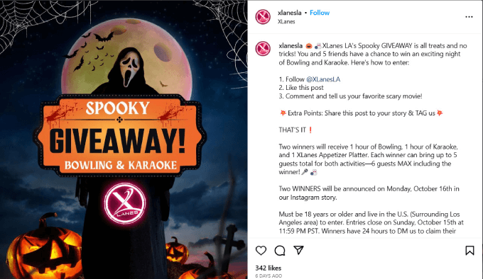
Many small businesses run online giveaways as part of their marketing campaigns. That’s because it’s much more cost-effective than running paid advertisements.
Also, giveaways can help brands grow their audience and generate leads. When you give freebies, your audience feels compelled to return the favor with purchases.
If you want to add a giveaway to your website, RafflePress is the best giveaway and contest plugin for WordPress. It has a drag-and-drop interface, so you can design the giveaway how you like.
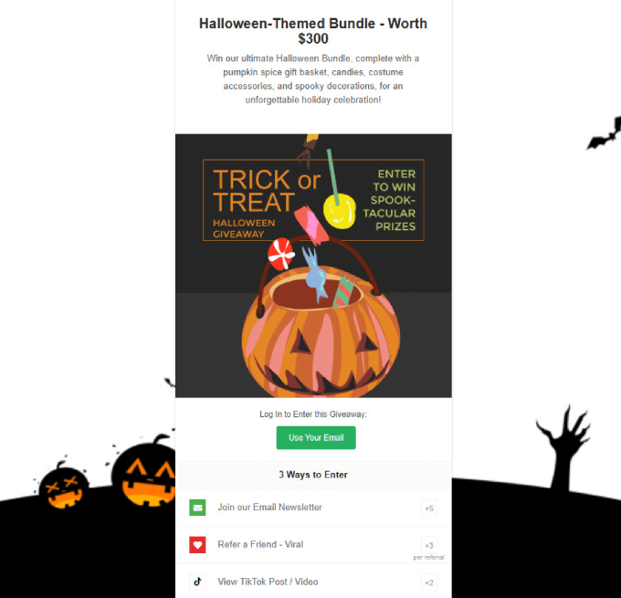
For more details, head over to our article on how to run a giveaway in WordPress to grow your email list by 150%.
15. Run a Halloween-Themed Contest
Halloween is the perfect time to tap into people’s creativity and competitive spirit. So why not turn it into a game that helps you make more sales and engage your audience?
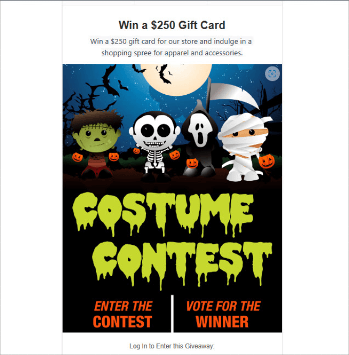
A Halloween-themed contest, such as a costume contest or a photo contest, can be a fantastic way to encourage user-generated content, which can be shared on your site and social media.
You can also increase brand awareness by having participants share their entries with friends and family, creating a sense of community among your customers or readers, increasing website traffic, and potentially generating more sales.
With RafflePress, setting up an online contest is simple. Simply choose the prize you want to give, add a description of the prize, and include a Halloween-related image with text explaining what the contest is about.
Check out our guide on how to run a contest in WordPress with RafflePress if you need some guidance.
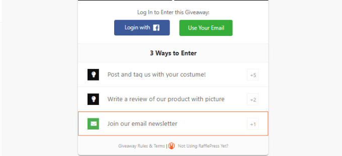
In our example, we’ve given people 3 ways to enter: post and tag our account with a costume, write a review of our product with a picture, and join an email newsletter.
Each method has a different amount of points. This point system encourages people to enter in multiple ways, increasing their chances of winning and boosting your engagement across different channels.
Even better, you can run the contest on social media to expand your reach. Encourage participants to use a specific hashtag when they post their entries. This not only makes it easier for you to track entries but also increases your brand visibility on social platforms.
Remember to clearly state the rules, deadline, and how winners will be chosen. You might consider having your audience vote for their favorites or a panel of judges to select winners.
We hope this article helped you find new ways to bring Halloween effects to your WordPress site. You may also want to see our guide on how to plan a holiday sale for your WooCommerce store or our list of ways to spread the holiday spirit with your WordPress site.
If you liked this article, then please subscribe to our YouTube Channel for WordPress video tutorials. You can also find us on Twitter and Facebook.




Dennis Muthomi
One additional tip I’ve found successful is I added a “ghost” cursor effects with CSS animations! It’s a subtle touch that adds to the spooky vibe and doesn’t slow down your site at all. I recently used this with a Halloween countdown timer on a client’s page. Their engagement numbers went up right away!
It’s amazing how these small touches (subtle animations + practical marketing features) can make such a big difference.
Jiří Vaněk
I am in charge of one website that belongs to a kindergarten for children. Every winter, especially during Christmas, I put a plugin on their website that simulates snowfall. Now I can extend this fun to Halloween as well. Cool. Sometimes it’s nice to see that even the web admin has a sense of humor.