We used to think footers were just an afterthought. You know, that space at the bottom for copyright notices and random links. But after building hundreds of WordPress sites, we’ve learned better. A good footer design can make a real difference to your site’s success.
We’ve analyzed tons of successful WordPress websites to see what works. Through our testing, we found that the right footer keeps visitors browsing longer. It helps with SEO too and can boost your email signups.
That’s why we put together this guide to the best WordPress footer designs. We looked at dozens of successful sites across different industries. Now we’re sharing the most effective footer examples and tips that get results.
Why Is Good WordPress Footer Design Important?
The footer is the area of your website that appears at the very bottom of the page. It will normally be on every page of your WordPress website.
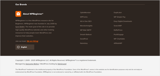
Here’s an example of our footer on WPBeginner that millions of readers see every month.
We include links to our free tools and product sites and ways for users to learn about us, find jobs with us, change the website’s language, and more.
Most beginners forget to optimize this area since it’s located at the bottom of the website.
However, your website footer is an important area because it lets you show important details and final takeaways in one place.
By customizing your footer, you can improve the overall user experience of your website and even optimize your site for WordPress SEO.
Plus, visitors who scroll to the bottom of the page are very engaged, so you can capture their attention with a call to action, email subscribe box, or send them to the most important pages on your website.
That being said, let’s show you some of the best footer design examples and best practices to optimize your WordPress footer. Here is the full list, and you can use the quick links below to navigate through this article:
1. WPForms
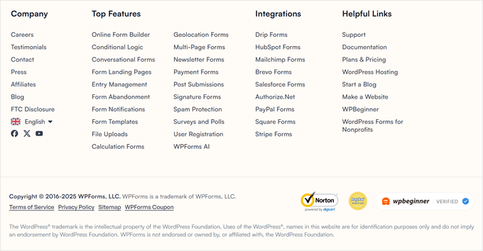
WPForms has a footer with all kinds of useful links. You will find links that go to the most helpful company pages, the top features of the plugin, and some useful WordPress links.
This ensures that when the reader gets to the bottom of the page and still has questions, they will find the exact resources they need.
At times, you may also see a floating alert bar at the bottom of the page with a call to action.
2. OptinMonster
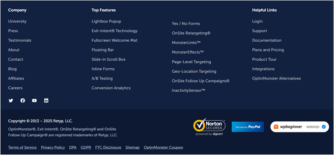
OptinMonster is the best lead generation and conversion optimization software in the world. Their website has a footer that offers readers links to important company pages, top features, helpful product links, and much more.
The footer also includes simple social media icons, trust icons, and a company logo for branding purposes.
3. Neil Patel

Neil Patel has a compact and straightforward footer that offers readers quick navigation links. The footer menu is the same as the navigation menu at the top of the site.
Plus, readers have the option to follow Neil Patel on social media as well.
4. Full Focus
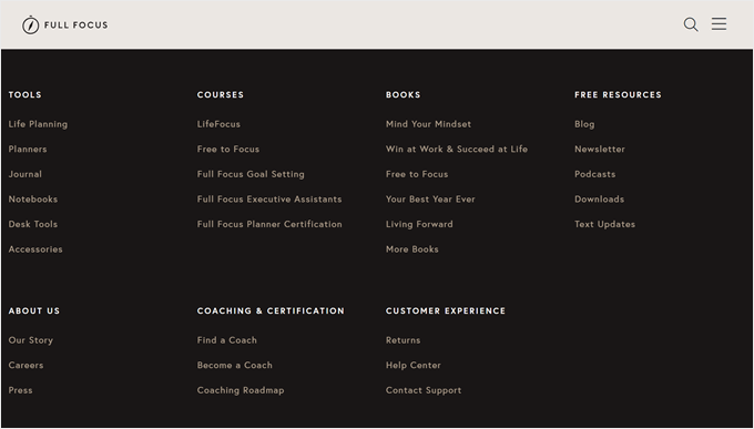
Full Focus has another simple and compact footer. It highlights the copyright date, easy social sharing buttons, and links to pages like terms of service and the privacy policy.
Directly above the footer, you will see a call to action for downloading a free guide, which can convert a lot of visitors who make it to the bottom of the page.
5. ReddBar
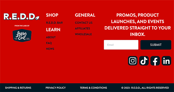
ReddBar is a WooCommerce store with a footer that encourages email sign-ups. Directly above the footer links, there’s a massive sign-up box for readers.
Some of the helpful links include a link to their FAQ page, contact page, wholesale pricing page, and more.
6. Reader’s Digest

The Reader’s Digest footer contains a lot of information for visitors. You will find links to their category pages, other company brands, social media sharing buttons, and more.
Plus, there’s an eye-catching email sign-up box to encourage visitors to join their email list.
7. IsItWP
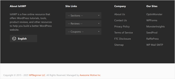
The IsItWP footer has a quick section on what the website is about and links to other sites and company pages.
It also has a unique site links drop-down menu that lets readers click to find the exact type of content they’re looking for on the blog.
8. MonsterInsights
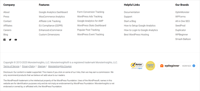
MonsterInsights is the best WordPress Google Analytics plugin. It has a simple footer that focuses on helping readers find the information they need.
There are links to their premium features, company resources, and other brand links. Plus, there are social icons and trust badges to boost people’s trust in the brand.
9. Printing New York

Printing New York is an online store that ships worldwide. The footer highlights their address, services, and popular products.
They use the structure of their links to help boost their local SEO and search engine rankings.
10. Nalgene
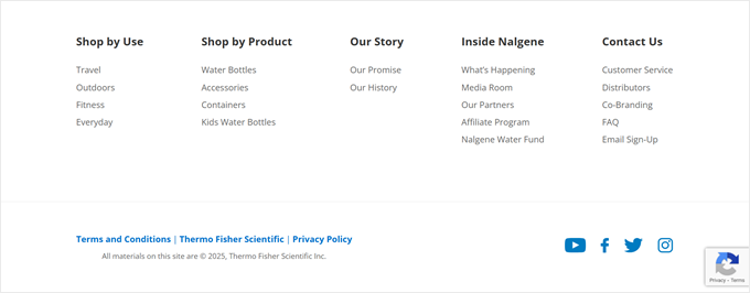
Nalgene has a clean and well-organized footer section. Directly above the footer, there’s a simple email sign-up form.
After that, there are well-organized links to help visitors find the exact products they’re looking for, along with company-related links.
11. ProBlogger
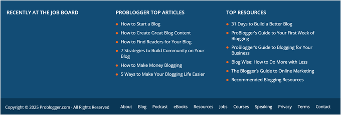
The ProBlogger footer has links to their most popular posts, top resources, and new jobs posted on their job board.
There’s also a small footer navigation menu with the same menu options as the header navigation.
12. TrustPulse
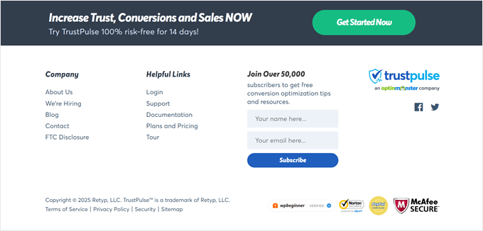
TrustPulse is the best WordPress social proof plugin on the market. Instead of including multiple navigation menus or page links, they feature an email newsletter sign-up box.
Although it’s different from most other brands, a minimalist footer like this can convert well since there are fewer distractions or actions the visitor can take.
13. The Next Web
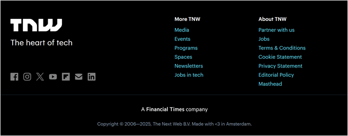
The Next Web has a footer that stands out from the rest of the website. It has social media sharing buttons, links to important pages, and more.
You will see a social proof section directly above the footer where they feature logos from popular brands and websites where they have been mentioned or featured.
WordPress Footer Design – Tips and Best Practices
There are a lot of ways you can improve your user experience and create a better footer for your WordPress blog.
Let’s take a quick look at some of the best practices to keep in mind as you edit your website footer.
Include Your Business Contact Information
Having contact information listed on your site is essential. You should have a separate contact form page on your website so your visitors can get in touch.
However, the footer is also an excellent place to include your contact information, especially if you have local customers who will be looking for your physical address.
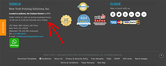
For local businesses, the more ways you can feature your contact information, address, and even business hours, the better.
Add Links to Important Website Pages
It’s important to have clear navigation across your entire website. That’s why it’s common for websites to include links in their footers.
You can add links for your most important product pages, top blog posts, about pages, and more.
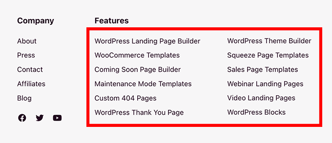
Think about the most valuable pages on your website and what your visitors will find the most useful.
Adding and optimizing your links can also give you an SEO benefit and boost your search engine rankings.
Add Social Proof to Improve Conversions
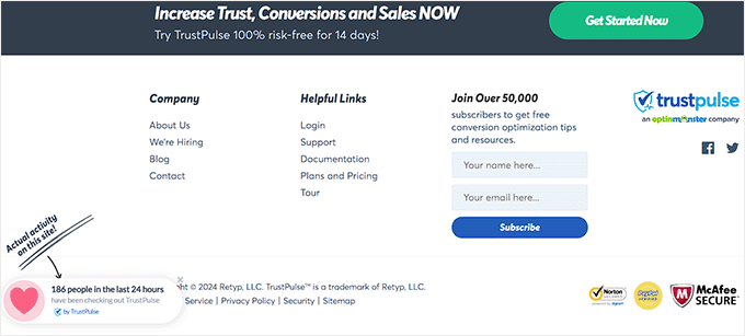
One thing you may have seen certain websites do in their footer is to add social proof. This can help you earn your customers’ trust and position you as an expert in your space.
It can be as simple as a customer testimonial or a collection of logos of popular websites you have been featured on.
For example, TrustPulse displays a popup in its website footer that shows the number of people who have bought the plugin over 24 hours.
Add a Call to Action
When your visitors get to the bottom of your website, you will want to tell them the exact action they should take and how they should do it.
For some websites, this will be a call to action to sign up for their email newsletter. For others, it will be links to explore popular product features or even a call to action button.
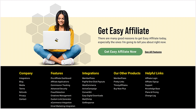
Your footer is the last chance to get your visitors’ attention and encourage them to become subscribers and customers or simply spend more time on your website.
Related Guides to the WordPress Footer
- How to Remove the Powered by WordPress Footer Links
- How to Edit the Footer in WordPress
- Checklist: Things to Add to the Footer on Your WordPress Site
- How to Add Custom Header, Footer, or Sidebar for Each Category
- How to Create a “Sticky” Floating Footer Bar in WordPress
- How to Add a Dynamic Copyright Date in WordPress Footer
- Key Design Elements for an Effective WordPress Website
We hope this article has helped you discover the best WordPress footer design examples. You may also want to check out our expert picks of the best drag-and-drop page builders for WordPress and our list of contact form page design examples and best practices.
If you liked this article, then please subscribe to our YouTube Channel for WordPress video tutorials. You can also find us on Twitter and Facebook.




Mrteesurez
I am like WPbeginner footers as it included short site description, links to important pages and list of some other products. I have replicated such footer in my website because it is the footer I find appreciate to me, one has to include a short description of his site and what it does. The description can even be picked up by search engines to understand your site more, as in my case, the description I added is what Google used to describe my site when I search it on Google.
Dennis Muthomi
well…my footer design is quite simple on my software affiliate blog. I have the logo and address on the left side. In the middle section, I’ve hand-picked 5 links to my “money pages” articles, which are my most valuable content. On the right part, I’ve placed links to important pages like Contact Us and About Us.
for the Contact Us page, I’ve added CSS to make it appear bold, so potential sponsors who want to reach out will be attracted to the bold “Contact Us” link. I’ve also included links to legal pages like the Privacy Policy, Affiliate Disclosure, Cookie Policy, and Terms of Service.
i just love keepping things simple
Moinuddin Waheed
Footer area is one of the most focused and go to place on the website by the visitors.
Many of the useful navigation does come there only as we can’t include all of the navigation directly in the header.
Also good footer design is always consistent with the overall design of the website.
Thanks for all the mentioned footers for inspiration.