When it’s time to update or make changes to a WordPress site, it’s important to keep visitors in the loop. A simple, friendly maintenance page can go a long way in setting clear expectations.
From our experience helping WordPress users with updates, redesigns, and technical fixes, we’ve seen how a well-crafted maintenance page can do more than just explain what’s happening.
It can build trust, grow your audience, and keep your momentum going, even while the site is offline.
Luckily, you don’t need advanced skills to make it work. 💡
In this guide, we’ll share 6 WordPress maintenance page ideas to help you keep visitors informed, engaged, and excited about what’s coming next. Whether you’re making a quick tweak or planning a full relaunch, let’s make your downtime feel like progress, not a setback.

Why and When Do You Need a Maintenance Page in WordPress?
You need a maintenance page in WordPress any time you’re making changes that could break key site functionality or create a confusing experience for visitors.
A maintenance page helps you:
- Clearly tell visitors that your site is temporarily unavailable.
- Prevent them from seeing broken layouts, errors, or half-finished changes.
- Protect important actions like purchases, form submissions, or logins during updates.
Normally, you can do most things on your WordPress website without ever taking it offline. However, there are situations when you’ll need to put your site into maintenance mode to avoid conflicts or poor user experience.
For example, a maintenance page is helpful when you’re updating or changing your WordPress theme or making major design changes that could temporarily break your layout or features.
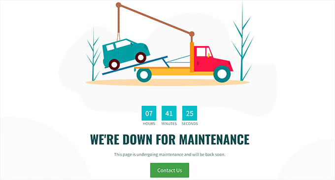
You will also need a maintenance page if you run an eCommerce store or a membership site whenever you’re doing work that could interrupt checkout, payment processing, order submissions, or member logins and account actions.
This helps prevent lost orders and a frustrating experience for your users.
Similarly, you’ll need a maintenance page when migrating your site.
For example, this includes moving WordPress from a local server to a live site or switching from one hosting server to another. In these cases, a maintenance page keeps visitors from seeing your site while it’s in an incomplete or unstable state.
This will help prevent users from seeing your website while it’s under construction and can also protect it from potential security issues. Plus, adding an attractive maintenance page can mitigate potential harm to your SEO during website downtime.
With that in mind, we’ll show you how to easily create a maintenance page in WordPress. Here’s a quick overview of all the topics we’ll cover in this guide:
- How to Create a Maintenance Page in WordPress
- The Best Maintenance Pages From Across The Web
- Short and Sweet
- Be Compassionate
- Be Funny and Entertaining
- Familiar Look and Feel
- Countdown for Return
- Progress and Updates
- Find the Best Day for Scheduled Maintenance on Your Website
- More Tips for Scheduled WordPress Site Maintenance
- FAQs: WordPress Maintenance Page
- Additional Resources for WordPress Maintenance
Let’s get started.
How to Create a Maintenance Page in WordPress
You can easily create a maintenance page in WordPress using SeedProd, which is the best WordPress landing page builder on the market.
It is super easy to use and comes with a drag-and-drop builder that allows you to create attractive themes and landing pages without using any code. Plus, some of our partner brands use it. You can learn more about it in our full SeedProd review.
To start, let’s create a SeedProd account. On the SeedProd website, click the ‘Get SeedProd Now’ button, pick a plan, and complete the steps for checkout.

📝 Note: SeedProd has a free version that you can use for this tutorial. However, upgrading to the paid plan will give you access to advanced blocks, WooCommerce integrations, use on unlimited sites, and more.
With that done, you’ll land in your own SeedProd account dashboard. Here, you can find your SeedProd Pro license key, which you will need for the next part of this tutorial.
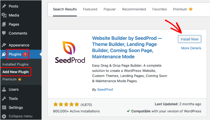
Now, you need to install and activate the SeedProd plugin.
In your WordPress dashboard, go to Plugins » Add New Plugin.
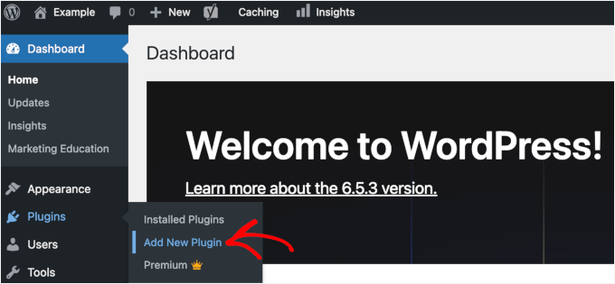
After that, you can use the search bar to find the plugin quickly.
Once found, click the ‘Install Now’ button and one more time on ‘Activate’ when it appears. For details, see our step-by-step guide on how to install a WordPress plugin.
Upon activation, visit the SeedProd » Settings page from the WordPress admin sidebar to enter the license key.
You can find this information in your account on the SeedProd website.

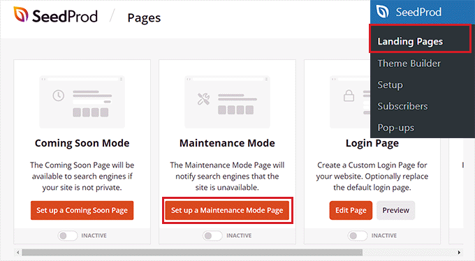
Once you have done that, visit the SeedProd » Landing Pages screen from the admin sidebar.
From here, click the ‘Set up a Maintenance Mode Page’ button to start building your maintenance page.
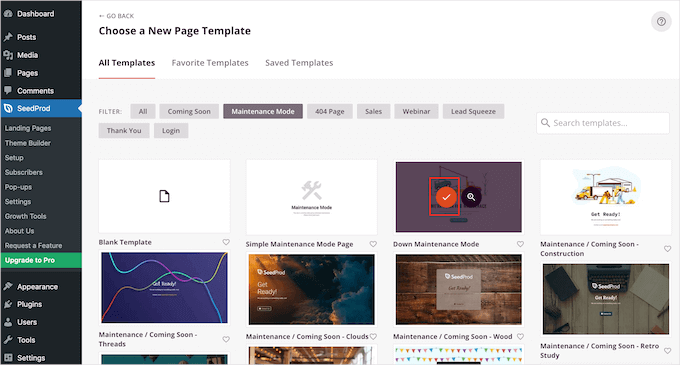
This will direct you to the ‘Choose a New Page Template’ screen, where you can select a pre-made SeedProd template for your maintenance page.
Once you do that, the template of your choice will be launched in SeedProd’s drag-and-drop builder.
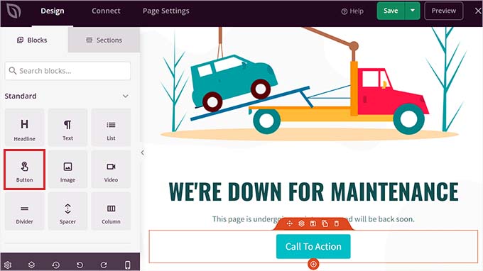
You can now use the template as it is or customize it by dragging and dropping blocks of your choice from the left column.
For example, if you want to add a CTA button on your maintenance page that directs users to a contact form or to pages that are not under construction, you can simply drag and drop the Button block onto the page.
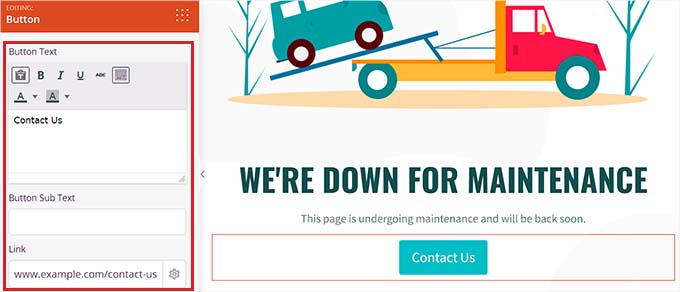
Once you’ve done that, click on the Button block again to open its settings in the left column.
You can then change the button text and add a link to any page that is not under construction.
Additionally, feel free to change the button block template and further customize it by switching to the ‘Templates’ and ‘Advanced’ tabs in the left column.
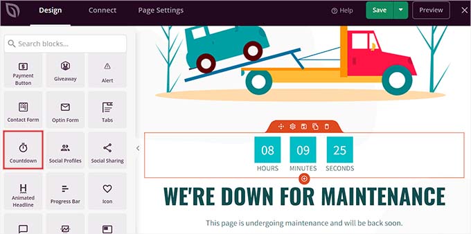
With the ‘Countdown‘ block, you can show your users how much time is left before your site is back online. Plus, you can add social media icons to direct users to your social media handles.
Once you are done, just click the ‘Save’ button at the top to store your settings.
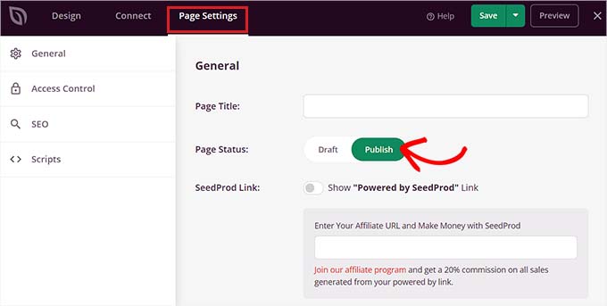
To publish your website maintenance page, go to the ‘Page Settings’ tab at the top and toggle the ‘Page Status’ switch to ‘Publish.’
After that, click on the ‘X’ icon in the top left corner of the screen to exit the drag-and-drop builder.
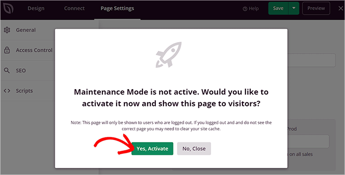
This will display a ‘Maintenance Mode is not active’ prompt on your screen, asking you to activate maintenance mode so the landing page can be displayed to users.
From here, simply click the ‘Yes, Activate’ button to make your maintenance page live.
You can now visit your website in an Incognito browser window to see the maintenance page in action.
This is what it looked like on our demo website:

For more details, you may want to see our tutorial on how to put your WordPress site into maintenance mode.
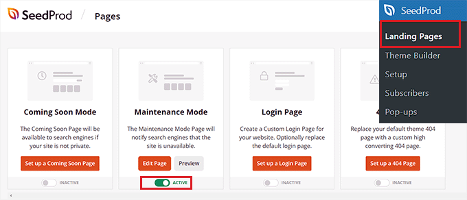
Now, if you want to deactivate the maintenance mode once your website is ready, then you can do that by visiting the SeedProd » Landing Pages screen from the WordPress dashboard.
Once you’re there, simply toggle the ‘Active’ switch to ‘Inactive’ in the Maintenance Mode section. Your maintenance mode page will now be deactivated and removed from the front end of your website.
The Best Maintenance Pages From Across The Web
Even though maintenance pages are only visible for a short time, they still have a big impact on how people see your brand.
For instance, an ugly error page can hurt your brand image by making users think that your website is broken.
On the other hand, a creative maintenance page can be memorable, strengthen your brand identity in the user’s mind, and even get them excited about whatever new development you’re launching on your website.
Here are some ideas that popular brands use when creating their maintenance mode pages.
1. Short and Sweet
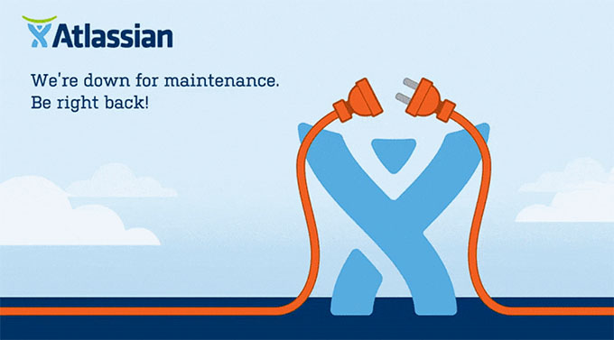
Instead of giving detailed explanations about what’s going on, you can keep your message short and simple. This approach avoids confusion among your users and delivers the message effectively.
One of the most nostalgic examples is Twitter’s iconic ‘Fail Whale.’
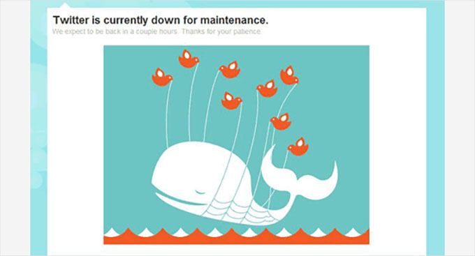
There were many variations of this famous illustration. Twitter also used the Fail Whale as its overcapacity page and 404 error page for some time, which confused its users because the error message didn’t properly communicate the issue.
We recommend always using a different page template to display the 404 error so that users can differentiate when your site is under maintenance or has an error. Here are examples of great 404-page designs.
Another example of a short and simple page is Atlassian’s maintenance page.
2. Be Compassionate
It’s frustrating when users want to visit their favorite website and can’t.
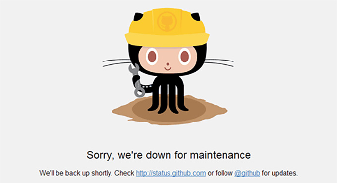
Another tip to keep in mind when designing a maintenance page is to acknowledge the inconvenience caused by the maintenance, apologize for the trouble, and promise that you are working hard to restore your website as soon as possible.
For instance, the GitHub maintenance page starts with an apology and offers a way for users to check the website’s status.
This technique shows that you care about your users and want to make the experience as smooth as possible. It also helps build trust and reduces user frustration.
3. Be Funny and Entertaining
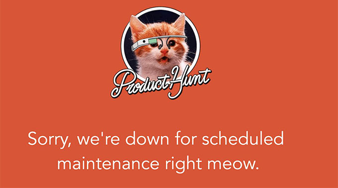
Downtime is annoying, and your users may feel frustrated by it. That is why a little humor can go a long way and even motivate users to check out whatever is coming next on your website.
Here is how Product Hunt used cat puns on their maintenance page.
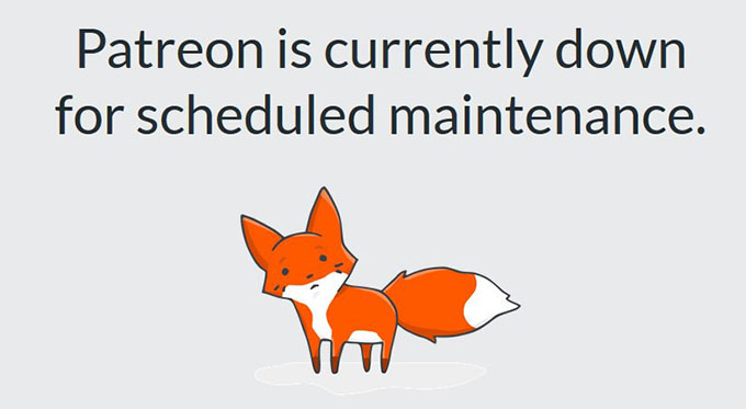
Similarly, Patreon used their mascot, and if you look closely, you’ll notice that the little fox has had a small accident.
This indicates that there is some issue with the website, but it will be fixed soon.
Another example of a witty maintenance page is the popular makeup brand Nykaa, which displays a message that the site has gone to the spa for a beauty upgrade.
The message is funny and simple, and it resonates with the brand’s target audience, making it a great example.

Another popular example is Flickr, which uses this image for its maintenance page.
The humor and creativity of this maintenance page help make downtime less frustrating for the website users.

4. Familiar Look and Feel
Using your brand’s logo, colors, and style makes a maintenance page more effective, as users who are familiar with your site’s look and feel will be less confused when they see it.
This helps reduce irritation and promotes brand awareness. It can also help keep users engaged even when your website is unavailable.
A great example of this is Apple, which uses the same design for its maintenance page as the regular website.

5. Countdown for Return
Adding a countdown timer to your maintenance page makes it look more alive. It also builds anticipation among your users.
However, if you don’t want to add a timer, you can still enter the expected time your site will be back online.
A great example of adding a countdown timer is Meetanshi’s website, which uses a simplistic design along with a countdown timer on its maintenance page.

This helps reduce visitor frustration by providing an estimated time when the site will return online.
6. Progress and Updates
Many popular websites use X (formerly Twitter) to keep their users updated during scheduled maintenance.
However, you can also add status updates directly on the maintenance page to keep users informed. This tactic encourages users to keep checking your website while it’s under maintenance, helping them stay updated and feel included.
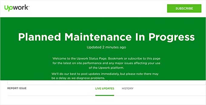
Here’s an example of how Upwork adds live updates to its maintenance page.
Find the Best Day for Scheduled Maintenance on Your Website
When you’re working on a live site, you lose visitors and potential customers every minute your website is down. Here are some tips that will help you handle scheduled maintenance more effectively.
First, check your Google Analytics reports to find the least-busy days on your site, and then use a slow day for maintenance. You can also use MonsterInsights, which is the best Google Analytics plugin for WordPress, to find these reports.
We use this tool on our own website and have always been big fans of it. To learn more about the analytics plugin, check out our detailed MonsterInsights review.
To get started, you’ll first need a MonsterInsights account. On the MonsterInsights website, click the ‘Get MonsterInsights Now’ button, choose a plan, and complete the checkout process.

📝 Note: MonsterInsights also has a free version. However, you will need the pro plan of the plugin to unlock the ‘Custom Dates’ feature.
After checkout, you’ll have access to your MonsterInsights account dashboard. From there, you can download the MonsterInsights Pro plugin ZIP file and copy your license key.
Next, you’ll need to install and activate the MonsterInsights plugin on your WordPress site.
In your WordPress admin area, you can head over to Plugins » Add New Plugin.

Then, simply use the search bar and type “MonsterInsights” to quickly locate the plugin.
Click ‘Install Now,’ and when it’s finished, click ‘Activate.’ For detailed instructions, see our beginner’s guide on how to install a WordPress plugin.
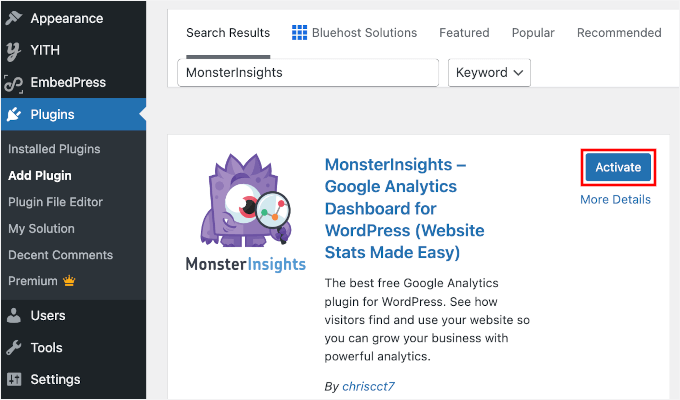
Upon activation, you will have to connect the plugin with Google Analytics. For more details, please see our tutorial on how to install Google Analytics in WordPress.
Once you’ve done that, visit the Insights » Reports page from the WordPress admin sidebar and switch to the ‘Overview’ tab at the top.
Next, you can view the traffic for specific dates by clicking on the date picker in the right corner of the screen.
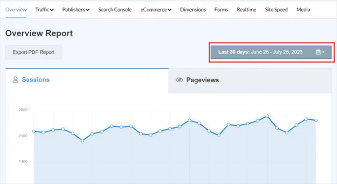
For example, if you want to know the least busy days over the past month, then you can select the ‘Last 30 days’ option from the dropdown menu.
You can also select a custom time range to find the least busy days on your website by clicking the ‘Set Custom Date Range’ button in the dropdown menu on the right.
Now, if you already have Google Analytics data, MonsterInsights will show you site traffic for the chosen period, so you can make an informed decision from the graph.
For instance, if you generally get less traffic on Tuesdays, it could be worth scheduling your maintenance for a Tuesday.
But if you are starting from scratch, you will need to wait a few weeks to gather enough data to identify your slowest days.
More Tips for Scheduled WordPress Site Maintenance
Another good tip when planning to put your website into maintenance mode is to send an email to your list about the maintenance schedule in advance. This way, your regular users will not be taken by surprise.
You will want to make sure that your maintenance page provides users with easy ways to contact you, such as through X (formerly Twitter), Facebook, or a contact form.
Finally, and most importantly, you’ll need to make sure your website is back online as soon as possible. That way, visitors can keep using your website, reading your content, and buying your products. 🙌
FAQs: WordPress Maintenance Page
Before we wrap up, here are some common questions about WordPress maintenance pages to help you feel more confident as you set one up:
What is a maintenance page?
A WordPress maintenance page is a temporary screen that visitors see when your website is being updated or worked on. It helps you avoid showing broken pages or unfinished content, keeping things professional while your site is offline.
Why should I use a maintenance page on my WordPress site?
A maintenance page lets visitors know what’s happening and when you’ll be back. It prevents confusion, reassures users, and helps maintain your site’s credibility during downtime.
How can I create an effective maintenance page?
A good maintenance page includes a clear message, a simple design, and helpful elements like countdown timers or call-to-action buttons. SeedProd lets you build one easily with drag-and-drop features – no coding needed, just follow our quick tutorial in this guide.
Can I use plugins to create a maintenance page in WordPress?
Yes! Page builders like SeedProd and Beaver Builder make it easy to create a custom maintenance page that matches your brand. They’re beginner-friendly and don’t require any technical knowledge.
Does having a maintenance page affect my SEO?
Not if it’s handled correctly. Plugins like SeedProd automatically send a ‘503 Service Unavailable‘ signal to search engines. This tells Google your site is only down temporarily and preserves your SEO rankings. Just avoid leaving your site in maintenance mode for too long.
Additional Resources for WordPress Maintenance
We hope this article helped you find inspiration for your maintenance page.
Next, you may also want to see our tutorials on:
- Best Website Maintenance Services for WordPress
- WordPress Maintenance vs Managed Hosting
- Crucial WordPress Maintenance Tasks to Perform Regularly
- How Long Does WordPress Maintenance Take?
- How to Fix WordPress Stuck in Maintenance Mode
- How to Fix Briefly Unavailable for Scheduled Maintenance Error in WordPress
- WordPress Maintenance – Ultimate Guide for Beginners
If you liked this article, then please subscribe to our YouTube Channel for WordPress video tutorials. You can also find us on Twitter and Facebook.



Jiří Vaněk
I used a separate maintenance mode plugin for maintenance mode. However, thanks to Seed Prod in the paid version, I was able to finally remove this plugin. The big positives I see mainly lie in the fact that with the original plugin, the pages were predefined without the possibility to customize them. Seed Prod gives me a huge opportunity to customize the maintenance page exactly to my liking and tailored to the users of my website. From the article, I take a great tip, which is the counter. I haven’t used it before, but I must admit that just the information about maintenance itself is frustrating. However, if there is a countdown here, it will give users clear feedback on when they can return. It’s a great tip.
Just a quick question, if I activate maintenance mode in Seed Prod, I assume that search engine robots will correctly understand that the website is temporarily disabled for maintenance and it won’t harm my SEO, right?
WPBeginner Support
It should, yes unless there has been a recent change that has happened with search engines that has not been reported.
Admin
Jiří Vaněk
Thank you for the response. I have one more question, which might be very basic. Is there a limit on how long I can have my website in maintenance mode before search engines start removing my indexed links? I’m asking to get an idea of whether I need to complete maintenance within a week or if I only have a few days. This is relevant for situations where, for example, I’m redesigning the website (not the content). Such changes can sometimes take several days.
WPBeginner Support
There is no specific date limit but it is normally best to keep a maintenance page up for as short as possible
Moinuddin Waheed
I have used seedprod mainly for landing and maintenance mode page.
infact this plugin has come to serve initially these two need only and has turned into a full fledged page builder as it seems.
But I am not sure and have not explored all the page building functionality as is available is page builders like elementor.
can we use seedprod for complete website development with some basic and free theme like Astra ?
or do we need premium theme as well along with seedprod?
WPBeginner Support
You certainly can use SeedProd to design your site with a free theme.
Admin
Jiří Vaněk
Seed Prod is a classic page builder, just like Elementor, for example. You can use it to build an entire website and, of course, as a full replacement for the block editor Gutenberg. Compared to Gutenberg, it has a huge advantage in that websites are created easily and intuitively in it. Additionally, it now also has artificial intelligence support, for example, for image generation, which brings a great advantage in that you often don’t even have to search for images and graphics to use on the website. Seed Prod will generate them for you. I’ve been using it for some time now, and it’s great. So, if you want to create a whole website using Seed Prod and the Astra template, it’s just as possible and easy as with Elementor, for example.
Moosa lubega
This is wonderful. Thanks for your efforts. Its easy to setup!
Neale
One suggestion: Include a “Notify me when it’s ready” sign-up box on the maintenance page to add subscribers to your email list. This is already part of the WP Maintenance Mode plugin which WP Beginner recommended in another article.
Peter Hall
Excellent article, thank you. Your timing is impeccable. I am about to start a major maintenance exercise next week. This is exactly what I need.
WPBeginner Support
Hi Peter,
Glad you found the article useful. You may also want to subscribe to our YouTube Channel for WordPress video tutorials.
Admin