You know what we used to do back when we first started WPBeginner? Just slap a basic contact form on a page and call it a day.
But here’s what’s interesting: after analyzing thousands of websites through our work at WPBeginner, we discovered something game-changing. A well-designed contact form can make a huge difference in how many leads you actually get.
Contact forms are often the first real conversation between you and your potential customers. When you nail the WordPress design, you’ll get better leads and stronger customer relationships. But mess it up, and you might as well be showing visitors the exit door.
That’s why we put together this guide packed with contact us page design best practices and real examples you can use right away. We’re excited to show you exactly how to build contact forms that don’t just look good – they actually bring in results.
Why Is an Effective Contact Us Page So Important?
A contact form page is a must-have for all websites. Whether you are running a personal blog or a business website, a contact form page helps users reach out to you anytime while visiting your website.
Unlike social media, a contact form allows users to communicate with you privately, which builds confidence and can close sales.
Many website owners often don’t pay much attention to their contact page. Most people just add a contact form and then forget about it. Or worse, they just display their contact information and expect people to follow through.
If you are not getting enough leads from your website’s contact page, then continue reading. We will show you how to optimize your contact page for conversions.
How to Create a Contact Form Page in WordPress 💡
WordPress does not come with a built-in contact form page. You will need a contact form plugin to create a form and then add it to your contact page.
We recommend using WPForms. Our team created it to be the most beginner-friendly contact form plugin for WordPress. Plus, the free version of WPForms is available on the official WordPress.org plugin directory.
For complete step-by-step instructions, see our guide on how to create a contact form in WordPress and our complete WPForms review.
🚨 Don’t have time to design your own contact form page? Let WPBeginner help! Our WordPress Website Design services offer quick, professional solutions tailored to your needs.
Skip the hassle and get a beautifully designed contact form page that engages and converts. Click here to learn more and get started today!
Now that you have created a contact form, here’s a quick look at some best practices of contact form page designs that can help you boost your conversions:
- Make Sure Your Contact Form Is Working
- Avoid Unnecessary Fields in Contact Form
- Explain Why Users Should Contact You
- Provide Alternative Ways to Contact You
- Add Social Media Profiles
- Provide Address and Map
- Create an FAQs Section and Link to Resources
- Optimize Your Form Confirmation Page
- Ask Users to Join Your Email List
- Use Photos of Your Team
- Make Your Contact Form Page Engaging
- Be Creative With Your Contact Page Design
- Make Sure to Reduce Form Abandonment
Ready? Let’s dive right in!
1. Make Sure Your Contact Form Is Working
WordPress hosting providers often have a poorly configured mail function that stops contact form emails from reaching the inbox. Instead, they often end up in the spam folder or don’t arrive at all.
If you use the pro version of WPForms, then you can still see form entries in your WordPress admin area. But with a free plugin, you might not even know that your form isn’t working.
After adding a contact form to your WordPress site, it’s important to test it by sending a form submission.
If you’re not getting email notifications, then you might want to follow our guide to fix the WordPress not sending email issue.
Additionally, you might want to familiarize yourself with form errors so you know the best approach to troubleshooting them.
Sometimes, forms don’t send notification emails because of issues with the plugin or SMTP settings. Validation errors can happen when form fields are misconfigured, and you may also deal with spam even with anti-spam measures in place.
For more details, you can refer to our guide on what to do when your WordPress form does not work.
2. Avoid Unnecessary Fields in Contact Form
You can add many fields to your contact form, but each extra field will take longer to complete.
That’s why we recommend keeping your contact form fields to a minimum and only adding ones that help you understand the user’s question.
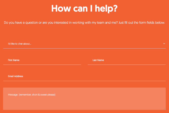
(Source: Neil Patel)
If you need a longer form, then you might want to check out the last tip at the end of this article to help reduce form abandonment.
3. Explain Why Users Should Contact You
Your contact form page should feel inviting. You can start with a greeting and a welcome message to make it polite and helpful.
Then, you can also tell users what kinds of questions you can help with, like in the example below:
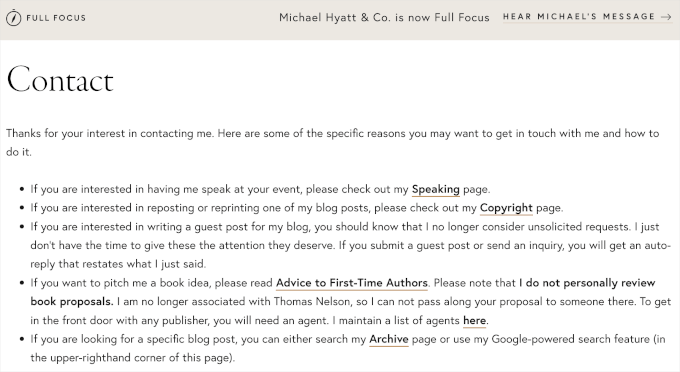
(Source: Michael Hyatt)
If you have different pages for different departments, then directing users to the right one is very helpful.
For example, you can send existing customers to support and guest bloggers to a write-for-us form.
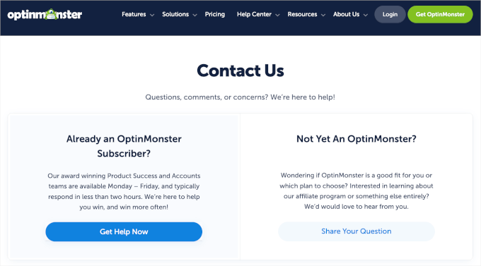
(Source: OptinMonster)
4. Provide Multiple Contact Methods
Adding a form to your contact page makes it easy for users to send you a message. However, offering other contact options can help users choose what works best for them.
Live chat and chatbots are great options to provide instant responses to user inquiries, increasing engagement and satisfaction. These features can handle common questions efficiently and escalate more complex issues to a human representative.
If you want to add live chat or a chatbot to your WordPress site, then you can refer to our guide on how to add LiveChat to your WooCommerce store (and boost sales).
In addition to the form and a live chat, you can include your business email address, WhatsApp, or phone number as alternative contact methods.
For example, Accenture’s contact page offers users several ways to get in touch. It has phone numbers for quick responses to urgent questions.
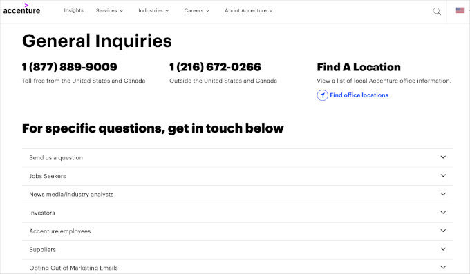
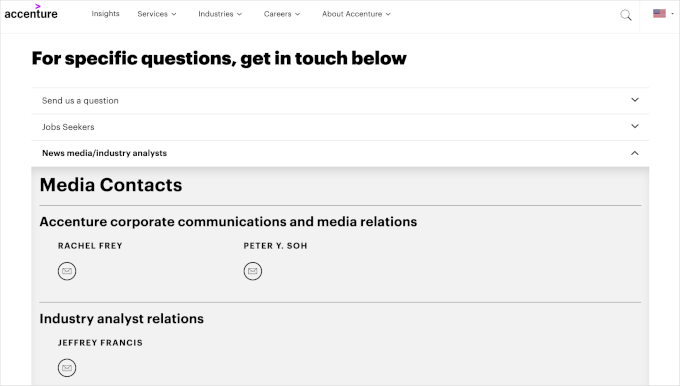
Plus, the dropdown menu lets you find contact forms and email addresses for different needs.
For instance, if you expand the ‘News media/industry analyst’ menu, you’ll find the representatives’ email addresses. This setup makes it easy to choose the best way to reach the right department or service.
(Source: Accenture)
5. Add Social Media Profiles
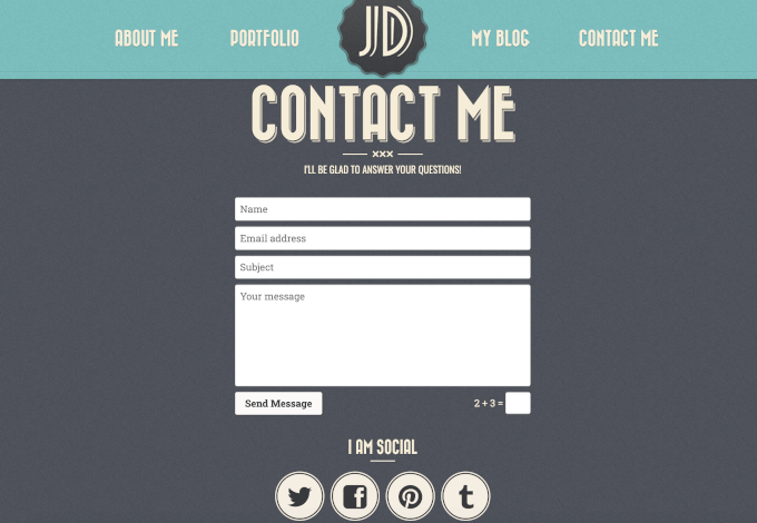
While most users will want to contact you privately, some may prefer to get in touch on Facebook or Twitter.
So, you can add social media buttons to your contact form page as an alternative way for users to contact you.
(Source: Retro Portfolio)
6. Provide Address and Map
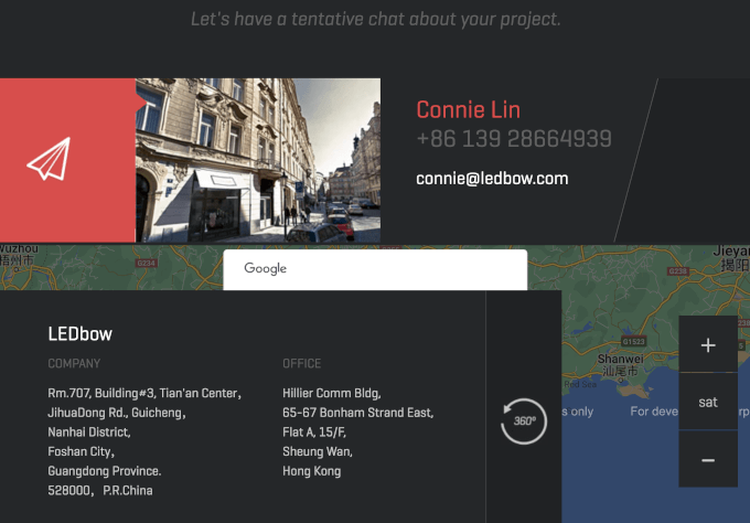
Adding an address and physical location for your business (even better, embedding a Google Maps map) helps boost user confidence. It shows that you have a physical presence, which can make your business seem more trustworthy.
Even if you don’t have a physical store or office, users find comfort in knowing where you are located.
(Source: LEDbow)
If you have multiple locations in different cities or countries, then adding them all makes your contact form page much more useful.
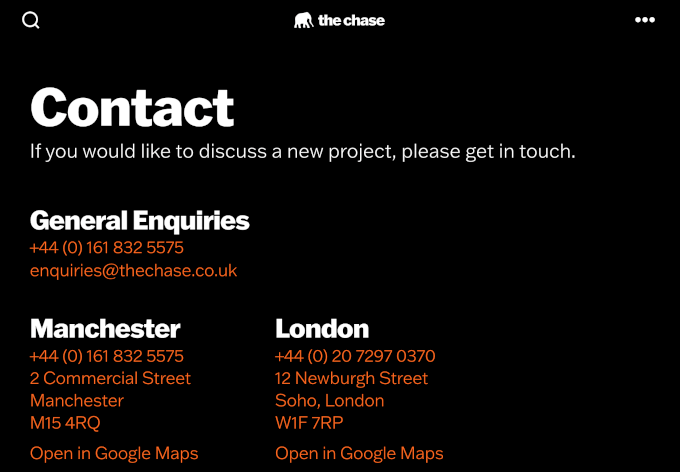
(Source: The Chase)
7. Create an FAQs Section and Link to Resources
After a while, you will realize that many of your users ask similar questions.
You can help them save some time and answer those questions directly on your contact page by adding an FAQs section.
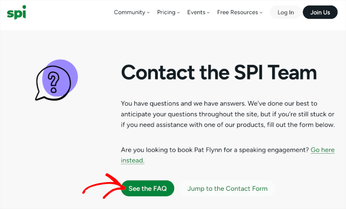
(Source: Smart Passive Income)
8. Optimize Your Form Confirmation Page
Most contact form plugins allow you to show users a confirmation message upon submission or redirect them to a different page.
Redirecting users gives you a chance to show them your most helpful resources, such as your most popular content or offering a discount code.
Another way to optimize your form confirmation page is to follow up with possible next steps. For example, you can ask visitors to subscribe to your newsletter or follow your social media accounts.
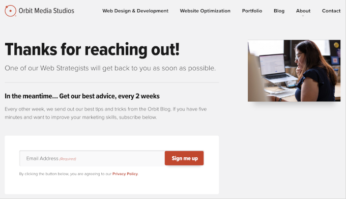
(Source: Orbit Media)
9. Ask Users to Join Your Email List
When creating a contact form, you can ask users for their email addresses. If you do, we recommend adding a checkbox to invite them to join your email list.
And if you’re not building an email list yet, then you might want to see our guide on why it is so important to build an email list.
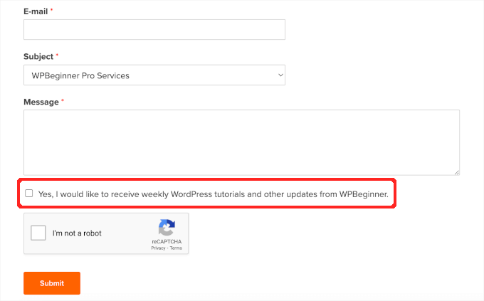
(Source: WPBeginner)
For details on how to do this, you can see our tutorial on how to do lead generation in WordPress like a pro.
10. Use Photos of Your Team
Adding photos of your team members to the contact page makes it more personable and welcoming. It reassures visitors that real people are behind the contact page, ready to answer their questions.
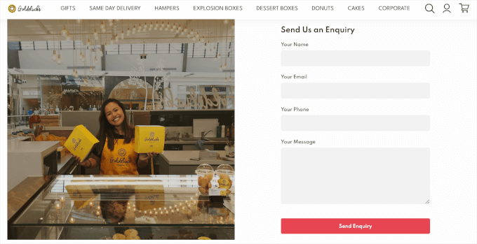
(Source: Goldelucks)
11. Make Your Contact Form Page Engaging
Your contact form page doesn’t need to be plain. Adding photos of your office, store, products, or team can reflect your company’s personality.
You can also make it fun by adding design elements, such as icons, illustrations, or animations, and using your brand colors.
For details on how to do this, see our tutorial on how to create a custom page in WordPress.

(Source: Omsom)
12. Be Creative With Your Contact Page Design
You may have noticed that a lot of contact pages on different websites follow a simple and very predictable layout. While it serves the purpose, you can use your page as an opportunity to stand out.
Many premium WordPress themes come with built-in styles for forms. You can customize those styles by adding custom CSS or using a plugin like CSS Hero.
You can also use a drag-and-drop page builder plugin like SeedProd to create your contact form page layout. This will allow you the flexibility to be more creative without writing any code.
It has starter templates that can help you set up a website in just a few clicks, not just a single page. As these templates have included a ready-made contact page, all you need to do is adjust the content to suit your brand or business.
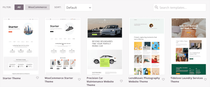
(Source: SeedProd)
13. Make Sure to Reduce Form Abandonment
When you create a multi-page form or a form with a lot of fields, then you risk reducing your conversion rate. Often users get form fatigue and leave before completing the entire form.
We often call this form abandonment, and it can happen with any form, including email newsletter signup, WooCommerce checkout, or contact form.
To fight form fatigue, many advanced form builders like WPForms come with form abandonment addons. This helps you capture partial entries from your forms.
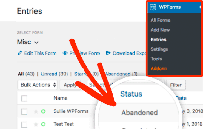
By tracking form abandonment, you can identify which forms are often left incomplete. This allows you to make the necessary improvements to encourage more submissions and reduce abandonment rates.
For more detailed information, you can see our guide on how to track and reduce form abandonment in WordPress.
Expert Guides on WordPress Contact Forms and Pages
Now that you know the best practices for creating a contact page, you may like to see some other guides related to contact forms and pages in WordPress:
- How to Create a Contact Form in WordPress (Step by Step)
- How to Create a Secure Contact Form in WordPress
- How to Create a Contact Form with Multiple Recipients
- How to Add a Contact Form Popup in WordPress
- How to Add Slide Out Contact Form in WordPress (Easy Tutorial)
- How to Embed a Google Map in Contact Forms (With Map Pin)
- How to Use Contact Form to Grow Your Email List in WordPress
- How to Block Contact Form Spam in WordPress
We hope this article helped you learn the best practices of great contact form page designs. Next, you may also want to see our step-by-step guides on how to add autocomplete for address fields and how to set up WordPress form tracking in Google Analytics.
If you liked this article, then please subscribe to our YouTube Channel for WordPress video tutorials. You can also find us on Twitter and Facebook.




Lauren
Thanks, very useful.
magnaa
Excellent article – some great tips about contact form pages that I’ll be implementing! I think sounding more human is key. Gives everything a more authentic and enjoyable experience.
natalie
Thanks for the article, I would like to do your point number 9, see my attachment; Can you explain how to add that tick box please.
thanks
natalie
WPBeginner Support
Hi Natalie,
It depends on which email service provider you are using. If you are using MailChimp, then you can follow these instructions.
Admin
Graham
Great article guys, and I appreciate the example you have shared as well. Having created plenty of contact pages over the past 10 years, some fresh inspiration and good ideas are always welcomed!
Sven Kox
Nice article, thanks. I added a few new ones to my knowledge.
One more tip: keep the field for the message big enough.
It is not inviting if you have to write your message in a tiny window.
Keely Worth
Excellent article – some great tips about contact form pages that I’ll be implementing! I think sounding more human is key. Gives everything a more authentic and enjoyable experience.