In our opinion, one of the most underrated elements of a WordPress website is the 404 error page.
When visitors land on a 404 page, they’re at a crossroads. They might be frustrated, confused, or ready to leave your site. However, with the right design and content, you can keep visitors on your site longer, encourage them to explore further, and even lead to conversions.
In this article, we’ll share some of the best 404 error page designs we’ve come across. These examples showcase creativity, functionality, and effective user guidance.

Why You Need to Optimize Your 404 Design
A 404 error happens when the server can’t reach the page someone is trying to visit. Instead of showing them a blank screen, the server displays a 404 page instead.
Most WordPress themes come with a basic 404 template, but these designs are usually basic and simple.

They also won’t show any content from your website, such as popular posts that the visitor may want to read, or your site’s navigation menu.
If you show visitors a boring, unhelpful 404 page, then they are more likely to leave your website, which will increase your bounce rate and hurt your WordPress SEO.
Ideally, you would want to reduce the number of 404 errors on your website by redirecting users to similar content.
However, it is not possible to always do that. Sometimes, a 404 error may occur due to a misspelled URL or link.
With that in mind, it’s smart to create a custom 404 page that has your own branding and content. You can also help visitors find what they are looking for by adding search bars, menus, links, and other helpful content.
The easiest way to create a custom 404 design is by using the SeedProd plugin. It is the most popular drag-and-drop landing page builder, so you can create a custom 404 page without writing any code.
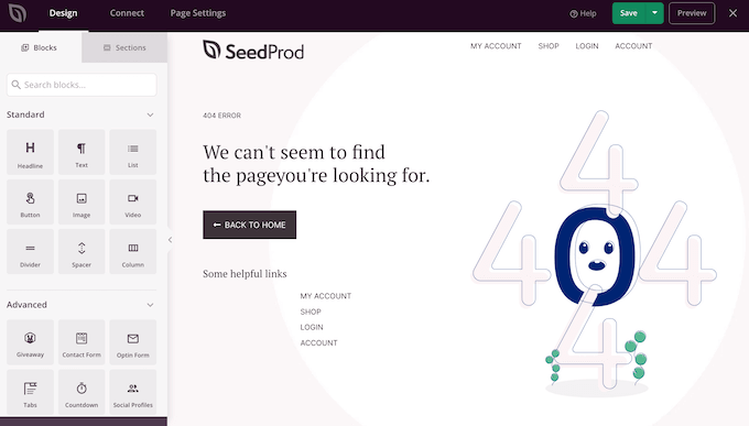
SeedProd also has lots of professionally-designed 404 templates to help you create a beautiful error page, fast.
Once you have installed SeedProd, it’s a good idea to turn to your competitors for inspiration. With that in mind, we have collected the best 404 error page designs for you to look at.
1. DFY
Many websites use timers to create a sense of urgency and get more conversions using FOMO. However, DFY made the unusual decision to add a countdown timer to their 404 page.

This timer counts down the seconds until the visitor is automatically redirected to the home page.
By creating a time limit, DFY immediately makes their 404 page more engaging and pushes visitors to make a decision before time runs out. It’s also an unusual design choice, so it’s guaranteed to grab the visitor’s attention.
The 404 page’s messaging adds to this sense of urgency, making this a very dramatic and compelling page design.
2. OptinMonster
OptinMonster is one of the best email capture plugins for WordPress used by over 1.2 million websites. It has everything you need to turn visitors into subscribers and customers.
Unsurprisingly, OptinMonster uses their 404 page as a lead generation tool with an eye-catching animation and clear call to action.
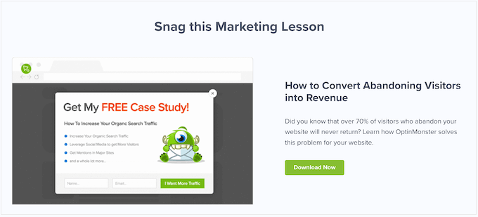
Even better, their pitch relates to the visitor’s situation.
When someone lands on a 404 page, there’s a big chance they will give up and abandon your website, since they can’t find what they are looking for.
OptinMonster’s pitch plays into this, by asking: ‘Did you know that over 70% of visitors who abandon your website will never return?’
Since the visitor is already thinking about website abandonment, they are more likely to act on this statistic. The call to action then offers visitors a free ebook that promises to convert abandoning website visitors into subscribers.
Clicking on the ‘Download Now’ button opens a popup where the person can type in their email address and get their free download.
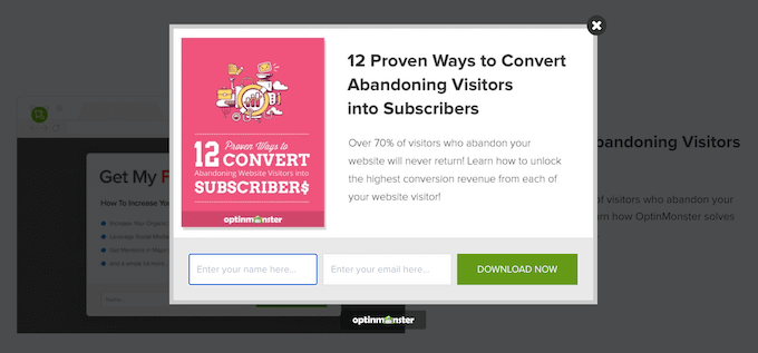
As we can see, OptinMonster uses the 404 error to their advantage by creating a pitch that feels very relevant and timely.
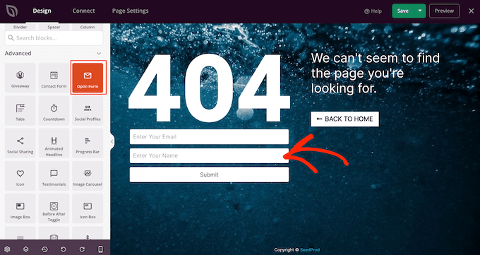
If you want to use your own 404 page for lead generation, then you can collect email addresses using SeedProd’s Giveaway, Contact Form, or Optin Form blocks.
3. Kualo
Many websites use gamification to build customer loyalty and keep people coming back.
Kualo has taken this one step further and gamified their 404 page.
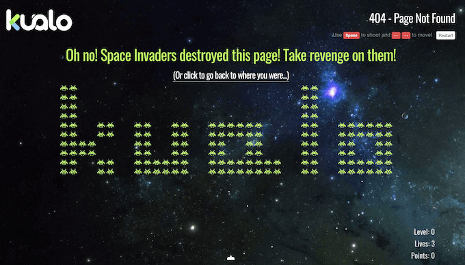
Instead of helping visitors find their way back to the main Kualo website, the 404 page challenges them to a Space Invaders game.
This turns a frustrating error message into a fun surprise. Even better, when you run out of lives, Kualo gives you an incentive to carry on playing.

The popup offers players a discount on website hosting if they manage to score over 1000 points. This is a perfect example of a 404 page that keeps visitors on your website for longer and adds value to the user experience.
4. TripAdvisor
TripAdvisor’s 404 page is fun and functional, and opens with a joke that’s specific to the travel industry.
When someone lands on your 404 page, they may be frustrated with their experience. Humor can be a great way to re-engage these people.
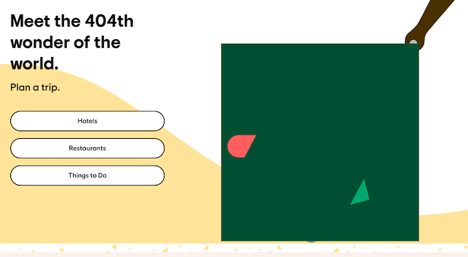
Even better, the jokes always tie into the TripAdvisor brand.
Branding is one of the major benefits of replacing the standard WordPress 404 page with a custom design, and TripAdvisor’s page shows that branding isn’t just custom logos and images. The words on your 404 page are just as important as the graphics.
The 404 page also highlights all the major areas of the TripAdvisor website, which helps visitors find what they are looking for.
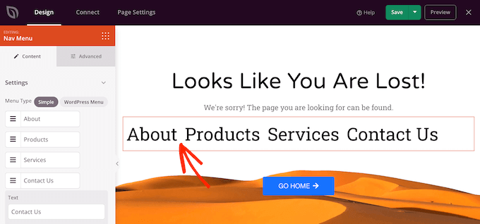
Since navigation is so important, we recommend looking at SeedProd’s Nav Menu block. It lets you build all kinds of menus directly inside the page editor. This makes it easy to add helpful menus to your WordPress website.
5. Brett Terpstra
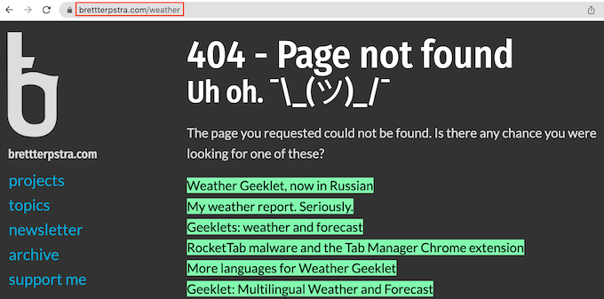
At first glance, Brett Terpstra’s 404 page may look basic, but the real power lies in its list of suggested posts.
Brett Terpstra’s 404 page shows a list of posts containing keywords related to the link the visitor was trying to access when they got the 404 error.
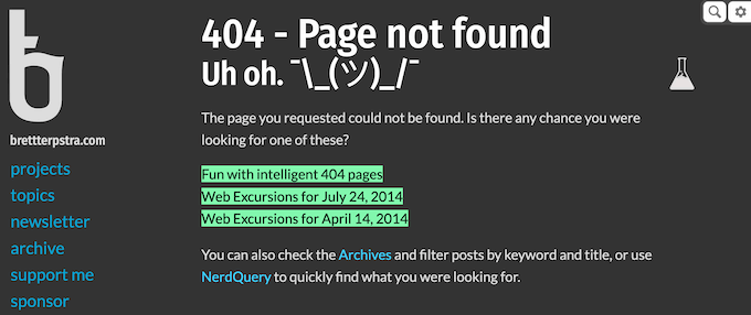
It’s a simple trick that adds a lot to the visitor experience.
Dynamic content can make your site more useful, engaging, and appealing, so it makes sense to extend this to your 404 page.
6. Constant Contact
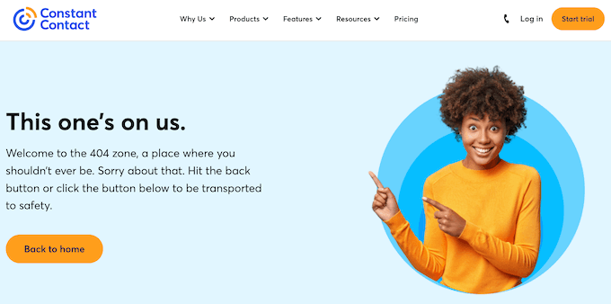
Constant Contact is another 404 page that uses humor to win over frustrated visitors. The email service provider uses informal language to appeal to their target audience, while also giving visitors an easy route back to the homepage.
If you scroll down the page, then you will find links to some other important areas of the Constant Contact website.
However, what we really like is the short hover animation that plays every time you move the mouse over one of the blue blocks.
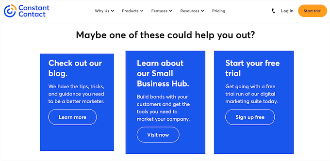
Animation can make a page more engaging, and the multiple hover effects and animations create a storytelling element as the visitor moves around the 404 page.
There are a few different ways to animate your 404 page, including highlighting and rotating your text using the SeedProd Animated Headline block.
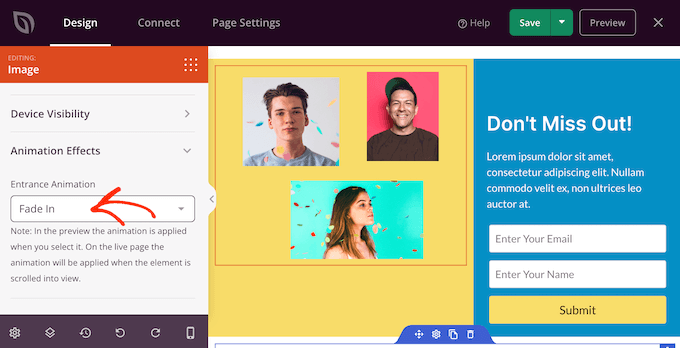
SeedProd also comes with over 40 entrance animations that you can add to any block, including images, text, buttons, videos, and more.
For more information, please see our guide on how to add CSS animations in WordPress.
7. IMDb
Most people will encounter your 404 page when looking for something else entirely. Since the 404 error is unexpected, it’s important to reassure visitors that they are still on your site by maintaining brand familiarity.
IMDb does this in a very subtle and light-hearted way by showing a famous quote from a movie or TV show.

They also include a link to learn more about the TV show or movie that they’re quoting.
In this way, IMDb’s 404 page reinforces their brand while also giving visitors a fun way to explore their content.
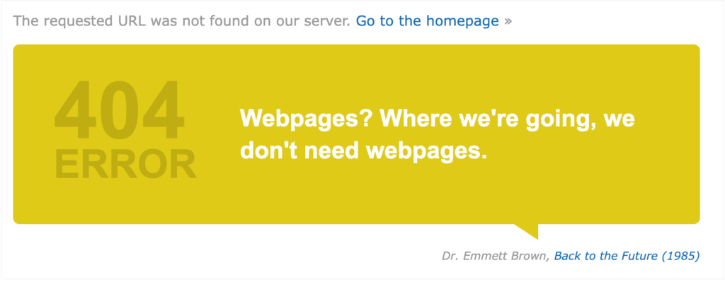
Showing random quotes on your 404 page can be fun and engaging. However, it’s still a good idea to provide links to your site’s most important content, just in case the visitor isn’t interested in the link that you’ve chosen at random.
This is exactly what IMDb does, by adding a link to their homepage.
8. Steve Madden
Steve Madden tries to turn an error message into sales by showing their best-selling products on the 404 page.

Even better, they have added filters, so customers can browse the different products directly from the 404 page.
If you run an online store, then you can easily display your most popular products by adding the Best Selling Products block to your 404 page.
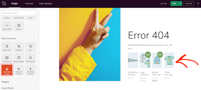
SeedProd also has WooCommerce blocks that you can use to show products that are on sale, top-rated products, recent products, and more.
When designing your own 404 page, it’s a good idea to use the same header and footer as the rest of your website. This will reinforce your branding and stop visitors from wondering whether they are in the right place.
This is exactly what we see with Steve Madden’s 404 page, but we particularly like how much content they manage to fit into these two small areas.

The header and footer help visitors jump straight to any part of the Steve Madden store, or even third-party sites such as the company’s Twitter and Facebook pages.
They even provide access to interactive areas, including a smart product search bar.

9. Apartment Therapy
This 404 design from Apartment Therapy immediately catches the visitor’s attention with a big hero image.
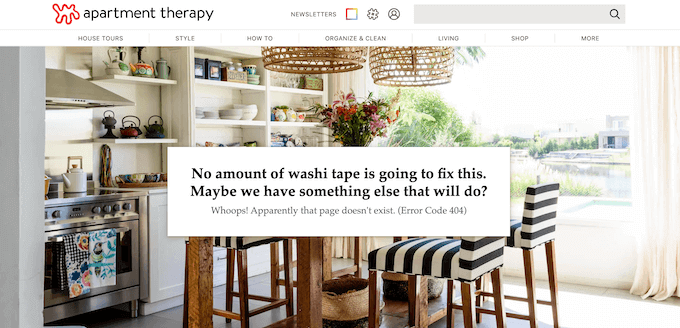
Apartment Therapy also uses this space to reinforce their brand identity by showing a stylish photo of a kitchen along with a joke about washi tape.
If you want to add a hero image to your design, then SeedProd has lots of ready-made hero sections. These are collections of images, calls to action, and even simple lead collection forms that you can add to your 404 design with a click of a button.
There’s even a section that would look right at home on the Apartment Therapy website.

10. Screaming Frog
Similar to some of the other 404 pages on this list, Screaming Frog uses humor to try and engage with visitors.
However, unlike the other businesses on this list, Screaming Frog creates a tool that helps website owners find and fix broken links. Their 404 page wastes no time pointing out the irony of the Screaming Frog website having a broken URL.
By poking fun at themselves, Screaming Frog delivers a memorable 404 page that doesn’t take itself too seriously.
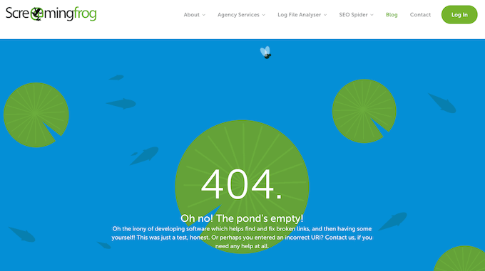
The animated background also helps this 404 design stand out from the crowd.
Videos and animations are a great way to make your 404 page more engaging. However, they can add to the 404 page’s loading times.
With that in mind, we recommend following our tips to speed up WordPress performance, particularly if you’re using lots of large or high-resolution videos in your 404 design.
You should also never upload videos directly to WordPress, as this can have a big impact on your site’s performance.
Instead, we recommend uploading the file to a video hosting site and then embedding the file on your site.
For detailed instructions, please see our guide on how to easily embed videos in WordPress.
11. MonsterInsights
MonsterInsights is the best WordPress plugin for Google Analytics. It allows you to easily install Google Analytics in WordPress and shows helpful reports in the WordPress dashboard.
MonsterInsights is a good example of a branded page. As soon as visitors arrive on the 404 page, they will see a unique graphic based on the MonsterInsights logo.
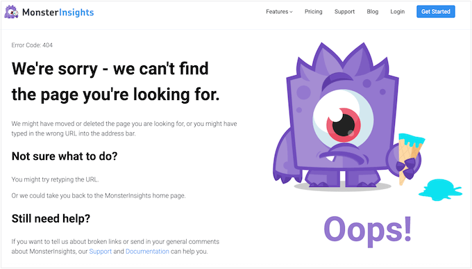
This is a fun way to let visitors know that they are still on the MonsterInsights website, even if they have followed a broken link.
This page also explains what a 404 error is and suggests some things the visitor can do to fix the error. Helping people solve the 404 error themselves can improve the visitor experience, so it’s a good idea to include this information on your own 404 page.
Even if you encourage visitors to fix the problem themselves, it’s still important to add links to your site’s most important content.
The MonsterInsights 404 page gives people a few options by including links to the support page, the MonsterInsights knowledge base, the pricing page, and more.
12. MAD
MAD has created a simple but highly interactive page by using toggles to create a 404 error message. You can remove this message by turning all the toggles off, or even create your own message by activating the toggles.

It’s a very straightforward but enjoyable experience that’s designed to get lots of interaction from visitors. It’s also a very unique 404 page that visitors will remember, and perhaps even share with other people on social media.
This striking design proves that you can build a memorable and entertaining 404 page from a simple idea.
13. Southwest
Southwest’s 404 page tries to help visitors get back on track by explaining what a 404 is and why they may be seeing the error. They even suggest some possible fixes, which might be helpful if your target audience isn’t very familiar with 404 errors.
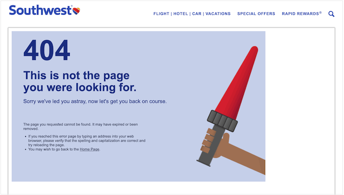
Where this design really stands out is how many links it manages to display in a neat and organized way.
If you scroll to the bottom of the screen, then you will notice social media links, contact information, a link to join their email list, and many other URLs, all arranged in clear and user-friendly categories.

The Southwest 404 page is a great example of how much information you can pack into a page without overwhelming the visitor.
Here, the right layout is key, and Southwest does a great job of using categories, lists, and different sections to create a 404 page that’s information-packed but still easy to read.
If you want to copy Southwest’s layout, then it’s easy to display WordPress widgets in columns. Some WordPress themes even come with multiple widget-ready areas in the footer by default.
14. Polo Garcia

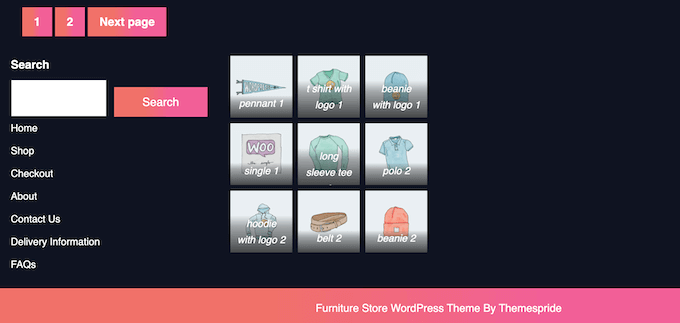
Another way to make your 404 page design unique is by using a full-screen animated GIF or video background.
Designer Polo Garcia’s website is a great example of that. It uses a full-screen GIF of a squirrel on water. This creates a visually engaging and immersive experience, even for an error page.
This tactic can capture the visitor’s attention and make them less frustrated about landing on a non-existent page.
15. Dribbble
One of the best practices for improving your 404 page is to recommend resources or add a search form to it to keep users on your website. This is good and all, but there’s room to push the boundaries for a truly unique experience.
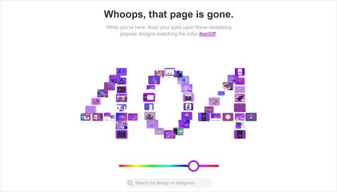
Take Dribbble’s 404 page, for instance. Instead of a static list, they’ve created an interactive element where the 404 error message itself is populated with images that match a specific color scheme.
Users can then click on these interactive images to explore further. This adds a layer of interactivity that not only keeps users engaged but also reinforces Dribbble’s focus on visual content.
Frequently Asked Questions About 404 Error Page Design
Now that we have gone over the best 404 page design examples, let’s look at some frequently asked questions about this error page.
Do 404 pages affect SEO?
While 404 errors themselves won’t directly hurt your SEO, they can indirectly impact it by frustrating users and causing them to leave your site quickly. A well-designed 404 page can actually help your SEO by offering helpful resources and keeping visitors engaged.
What should a 404 page look like?
The key to a 404 page is to be clear and helpful. Include a friendly message explaining the page can’t be found, alongside suggestions for getting back on track. This could be links to your homepage, popular content, or a site search bar.
How do you make a cool 404 page?
You can use a page builder like SeedProd to easily create a good-looking 404 page. It already has tons of 404 page templates you can use so that you won’t have to start from scratch.
Another page builder you can try is Thrive Theme Builder, which is also easy to use to design a 404 page.
Do 404 pages have footers?
Footers are not mandatory for 404 pages. However, including a basic footer with essential links like your contact information or sitemap can maintain a sense of consistency and offer additional ways for users to navigate your site.
We hope this article has helped you find the best 404 error page design examples. You may also want to check out our guide on how to create a viral waitlist landing page in WordPress and our expert picks of the best landing page templates for WordPress.
If you liked this article, then please subscribe to our YouTube Channel for WordPress video tutorials. You can also find us on Twitter and Facebook.




Olaf
I always say that even a web developer has to think creatively and be a bit of a marketer, so they can make a page like the 404, which usually frustrates people, bring a smile instead. I love 404 pages that have humor and can even laugh at themselves. I always say that the developer here wasn’t just a good programmer but also a good creative mind. Some of these examples are really well-done pages, and I wouldn’t even mind if one of them appeared for me.
Moinuddin Waheed
404 error is a very common error and having an optimized and beautiful 404 is a must for keeping the visitors interest continued.
Seeing some the most interesting 404 error page, it feels like having those creativity and out of the box approach at my own 404 page.
utilising seedprod to make awesome 404 error page for my websites.
Jiří Vaněk
People’s creativity is amazing. I was particularly captivated by Pixar’s 404 page, and I let myself be a bit inspired by it for my website too. I believe it’s very important to make the 404 page somewhat humorous to lighten the frustration for a user who encounters content they weren’t looking for. It brings a smile, eases emotions, and might even draw them towards exploring more content on the website.
Damian
Instead of configuring a 404 error page, I prefered set up a full sitemap page, better for our visitors.
Nure
Just awesome i like it
thanks to share
PatREllery
Here’s a cool one: http://www.bookofzeus.com/404/
Bhavesh
@PatREllery Its really cool one…..
Bruce
Thanks for this informative information. I like:
9. Catswhocode
17. Retard Zone
Dennis
Nice one!
My favourite is #6 CSS
Thanks for sharing.
penthius
After reading this I too decided to give it a go.
It’s my first 404 , it will get better with practice I am sure ;
http://ghostwhisperer.me/404
Zach Hornsby
After reading this article, I created one.
http://netjelly.com/404
Editorial Staff
It looks great
Admin
Viidar
How about this one? (in Norwegian, but you´ll get the picture):
http://www.powertech.no/404
Text: “Ups, Mari, has been down in the server-room again…” (mari works in the finance-department )
)
Michelle
these are really great, thanks for sharing
Dave
This page also pretty good, and very funny…
[Link Removed because the site did not use WordPress]
Editorial Staff
Except your site is not using WordPress for that 404 page.
Admin
Niche Website Builder
Very creative indeed! Of course, my favorite has to be the 404 error pages featuring Homer Simpson and his infamous “D’Oh!”
Phaoloo
Nice examples, they inspire me for the next project.
Rent Apartment in Kuala Lumpur
Excellent collection of 404 page design!
Andrew Yates
Nice collection, how about this one… http://www.383project.com/404 ?
Editorial Staff
Very nice We will surely include it in our next collection.
Admin
arfandhia
wow, nice colection,thanks for this list
Johnson Koh
Interesting collection. Thanks for the effort
abrcity
very nice article,very helpful
Arif
really nice designs, thanks for sharing
Klim
Some pages are really cool! Thanks for collecting them!
Dave Sparks
love the cats who code one, brilliant.
Website Design UK
Excellent showcase, my friend!! Well worthy of a Digg.
Jeffro
I like the catswhocode one. Works well with the site name! hah
G.Han
Beautiful post, very inspiring!
Hans
I really like the illustration on Catalyst Studios’. That on Carsonified is also very nice (all of them are)
I like this one to
http://jayj.dk/404
Editorial Staff
Very nice find there. That one is good.
Admin
Honour Chick
lol, very funny 404 pages.
Shahriar Hyder
Very nice post. Please do check out the following article as well which is a compilation of:
Custom 404 error pages that are cool, funny yet creative
http://technosiastic.wordpress.com/2009/09/01/custom-404-error-pages-that-are-cool-funny-yet-creative/
Asif Iqbal
Very neat and clean options.. I am going to choone one of the best for my website.
Michigan Fur Coats
Very clever and unique.
vq
I wanted to throw two of mine in there:
http://weare.clickpopmedia.com/404
http://www.clickpopmedia.com/404
Both Wordpress. Let me know what you think.
Editorial Staff
Love your weare page. The second one can still use some work.
Admin
Tobbi
Great collection. My favorites a #2 and #6
GailGrannum
Wow, you have really expanded my concept of the 404 page alternatives. Thank you for sharing very creative examples that will assist me in reducing my bounce rate. BTW – I have tweeted this article to my peeps.
Gail
Editorial Staff
We appreciate all the support on twitter If you ever have any questions or need help with WordPress feel free to ask us either via twitter or email.
Admin
Teddy
Thanks for the showcase! I always find a lot of inspiration in 404 pages – basically, a good 404 page will have to appease the possibly frustrated user as well as make a good impression so that the visitor will continue probing the site instead of navigating away almost immediately.
Oh, and thanks for the tutorial too! I find it very useful and detailed for those who are still new to WordPress and PHP awesome job!
p/s: Some shameless self-promotion here: http://www.teddy-o-ted.com/wp-admins (to trigger a 404 page) and http://www.teddy-o-ted.com/demo/ (not strictly a 404 page but I’m thinking).
Editorial Staff
Love your Hot Dog idea. Also Oh God Dammit is pretty good too. Tough choice eh.
Admin
Teddy
Kind of a tough choice. I think I’ll most probably be porting the hot dog idea over to my main site’s 404 template, heh.
Speaking of which, what inspired you to make the 202 + 202 = 404 title? That’s an interesting one
Editorial Staff
The idea of WPBeginner <<< Beginner and the whole number idea because I like numbers. Simple addition.
werthers
B3ta once ran a competition a long time ago for 404 images and they blew all these out of the water. One featured a map of the internet and an arrow and you are here to 404, it also had porn and the rantings of nerds among other areas.
It’s going a long time back so I don’t know if many of the images are still hosted
subcorpus
awesome …
need to think of kewl way to do that on my blog … hehe …
j2brown
I’m biased, since it’s my own site, but I think it’s rather creative:
http://www.sterlingfire.org/?error=404
Michel
Another excellent resource for 404s:
http://simplebits.com/notebook/2007/11/03/404.html
See all comments in this blog post by Dan! (not WP blogs) (but still the collection is impressive)
Oleg
Yeah! Nice Ideas! I have my custom 404 Error page too: http://www.xtraboy.com/some-error
Take a look at it. It’s funny Thanx
Thanx 
Editorial Staff
That is surely a memorable one. Had we known about it before, we would’ve added it. Will consider for our next showcase
Admin
Oleg
Thank You! I’m glad to hear your words
Simran
Awesome collection. Thanks for sharing
Robert
Some of these are great!
I run a coffee blog in Vancouver and I used a split coffee cup as a my 404 page.
http://coffeevancouver.ca/error
Editorial Staff
Very nice use of the image. Love your other posts.
Admin
Mike
techkultura from Polish:
404 The Way of the Samurai Codex
“If the searched page doesn’t exist,
Immediately fulfill Seppuku.”
ilmu komputer
they all very creative design.
Good.
TalkVietnam
Nice collection. Thanks.
Chris Berry
Here’s a good WordPress example.
http://roanoketweetup.com/404
lipelip
Nice collection, here is mine
http://www.lipelip.be/micou
I’m a fan of chuck norris
Editorial Staff
Your page is funny and good looking. Keep up the great work, and we love Chuck Norris as well.
Admin
lipelip
héhé thanks, chuck rocks !
joyoge bookmark
nice 404 designs, thanks for the tut
Michel
Mmm, and how about this one? >
http://www.optimiced.com/en/404
100% WP powered, 100% custom designed;-)
Thomas
I’m pretty sure putting Adsense on a 404 error page is against Google’s terms of service, don’t you think?
Michel
My WordPress theme uses standard templates, so the 404 page simply has a small adsense block at the top, as most of the pages of my blog have it, too. I wouldn’t worry about it, nor do I care much if this page shows (or not) adsense at all. I was showing the design of the page, not the adsense block — looks like you were looking elsewhere;-)
Michel
Plus, if there’s content on the 404 page, Google allows to show ads on it — this is not against their TOS (this info could be useful to others, too)
Dave Bowker
How about this one? Can’t go wrong with Oompa Loompas!
http://quoterelish.com/err
Editorial Staff
It’s good, but we only listed sites that were powered by WordPress.
Admin
Vidimonkey
missed out on http://freetubetv.net/404
it’s a tv blog/app so the 404 page is pretty brilliant considering the execution.
Editorial Staff
Once again, it is not powered by WP.
Daniel
http://www.gowatv.com/error-404.php also