At WPBeginner, we’ve helped thousands of users customize their WordPress websites, and one question keeps coming up: “How do I make my sidebar more effective?”
While it might not be the flashiest element, we’ve found that a well-designed sidebar can significantly impact your site’s success. Through our experience, we’ve learned exactly what works and what doesn’t when it comes to sidebar design.
In this article, we’ll share our tried and tested WordPress sidebar tricks to help you get maximum results, whether you’re using a classic theme or the new block editor.
🚨 Need professional help customizing your website? Skip the hassle and get a stunning website with a customized sidebar, fast. You can free up your valuable time and let our WordPress design experts create a personalized website just for your needs.
Why Customize the WordPress Sidebar?
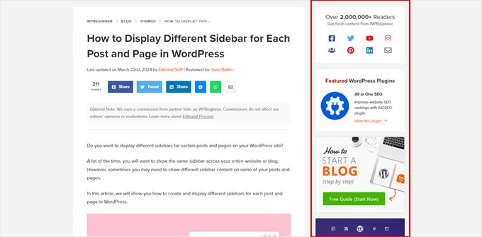
The sidebar, also known as a widget area in classic themes, is a designated section on your WordPress blog or site layout. It is typically positioned to the left or right of your main content area.
You can use it to display additional information that complements your primary content. This might include things like recent blog posts, social media links, search bars, email signup forms, and more.
While sidebars come pre-built with most themes, their default functionality might not always fit your specific website goals. Here’s where customization comes in.
A well-crafted sidebar can benefit your website in several ways:
- Improved user experience – A strategically designed sidebar can help visitors navigate your site, find relevant information, and ultimately increase your pageviews.
- Increased conversions – Strategic call-to-action buttons, email signup forms, or social media icons can encourage visitors to take desired actions.
- Enhanced brand awareness – You can use the sidebar to showcase your brand logo, social media profiles, or other visual elements that reinforce your brand identity.
By taking control of your sidebar, you can tailor it to enhance your web design and user experience.
With that in mind, we’ve listed the best WordPress sidebar tips and tricks for you to enhance your sidebar. You can use the table of contents below to navigate through the tutorial:
- Create a Sidebar Template Part (Block Themes)
- Display Different Sidebars on Different Pages and Posts
- Create Custom Sidebars for Each Category
- Change the Default Sidebar Side
- Hide Specific Sidebar Widgets on Mobile
- Use Your Sidebar as a Vertical Navigation Menu
- Make Sidebar Widgets Sticky
- Enhance Your Sidebar with Eye-Catching Images
- Boost Conversions with Clear Calls to Action (CTAs) in Your Sidebar
- Grow Your Audience with an Email List Signup Form in the Sidebar
- Enhance User Experience with a Sidebar Search Bar
- Connect with Your Audience with Social Media Sidebar Icons
- Engage Visitors with Recent or Related Posts in the Sidebar
- More Beginner-Friendly Tips to Fine-Tune Your WordPress Sidebar
1. Add a Sidebar Template Part (Block Themes)
This tip is mainly for block theme users. If you use a classic theme, your theme developer usually has included a WordPress widget area for your sidebar, and you don’t need to do anything else.
If you use a block theme, then you won’t see the Appearance » Widgets menu in your WordPress dashboard. This is because your theme no longer uses the WordPress customizer anymore and now relies completely on blocks in the full-site editor.
On one hand, this can make website customization a lot easier. At the same time, things may get confusing if you are used to classic themes.
Let’s break down how sidebars work in block themes. Sidebars and other elements like headers and footers are now called ‘template parts,’ which are pieces of layout that you can reuse throughout your website.
Now, most block themes include a header and a footer template part as they are a must-have in a website. Some block themes also have templates with a sidebar, like the Twenty Twenty-Four default theme.
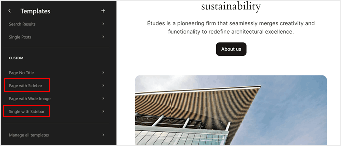
That said, not all block themes have this part, which may be frustrating if sidebars are important for your website. So, you will have to create one yourself.
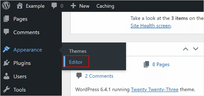
Thankfully, the process is pretty simple, and we will show you how step by step. First, go to Appearance » Editor to open the full-site editor.
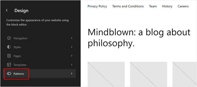
You will now see several menu options to customize your theme.
Go ahead and click ‘Patterns‘ to create a new template part.
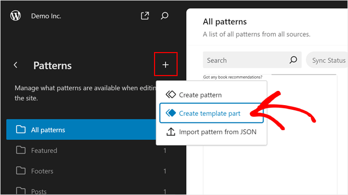
Here, click the ‘+ Create pattern’ button in the left panel.
Then, select ‘Create template part.’
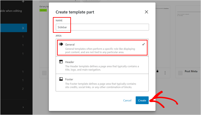
Now, give your new template part a name. It can be something simple like ‘Sidebar.’
As for the Area, choose ‘General.’
Once that’s done, go ahead and click ‘Create.’
You are now inside the WordPress block editor, where you can start adding blocks to your sidebar.
In our example, we’ve added a block for showing our latest posts and latest comments. We’ve also added heading tags to encourage visitors to check out these sections in our sidebar.
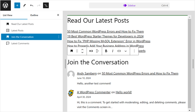
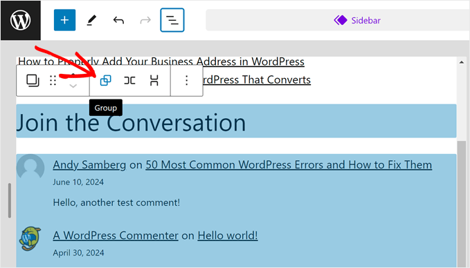
As you can see, the sidebar doesn’t look super neat. So it’d be a good idea to use a Group block to group elements that relate to each other. This way, when you need to move these elements around, they can be rearranged as a single unit.
All you need to do is select the blocks you want to group together. Then, in the block toolbar, click the ‘Group’ icon.
You can learn more about using the Group block in our article on how to select and use nested blocks in WordPress.
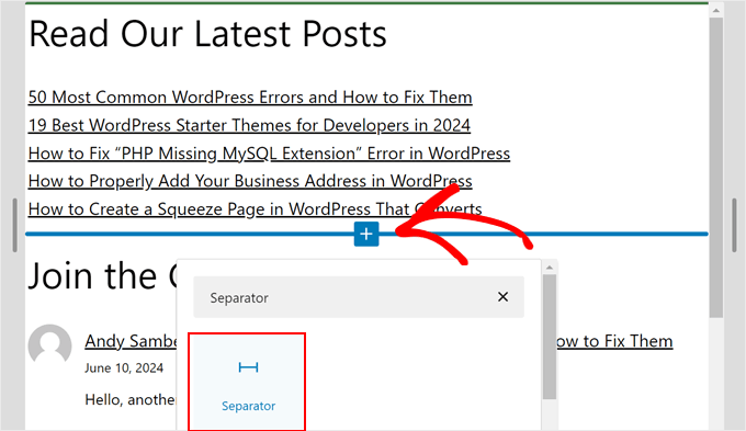
You also want to add an element, like the Separator block, to space out one group of blocks from another.
This block can add a shape divider between your groups of blocks.
Simply click the ‘+ Add Block’ button anywhere and select the ‘Separator’ block. You can also customize how the horizontal line looks.
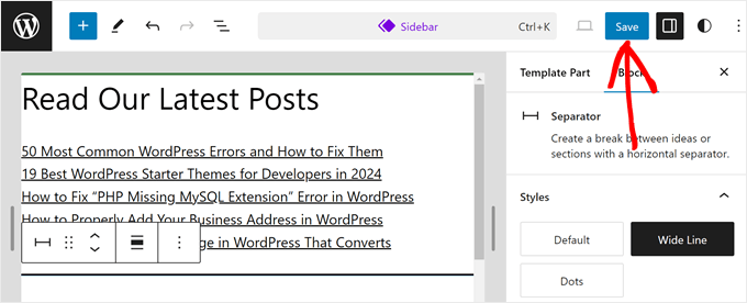
Once you are happy with your sidebar, just click ‘Save.’
Now, you can add your sidebar element to any template of your theme.
Let’s try adding it to your single post template.
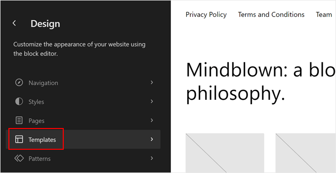
To do this, just go back to the main menu of your full-site editor and select ‘Templates.’
Then, find your theme’s single post template.
It may be named ‘Single Posts’ or something similar.
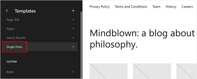
Next, just click the pencil ‘Edit’ button.
This will open the block editor for this template.
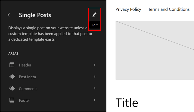
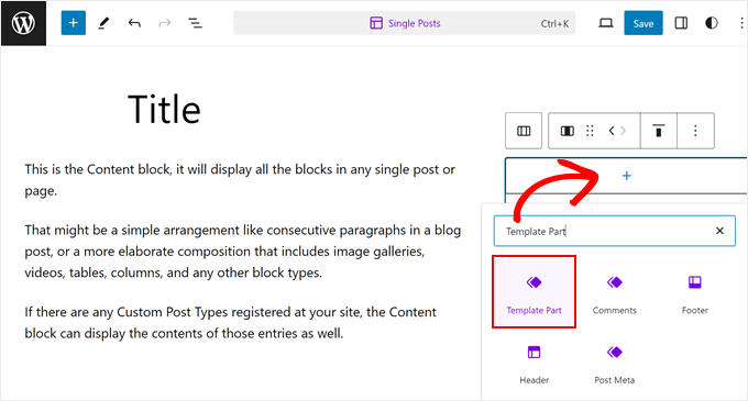
Go ahead and click the ‘+ Add Block’ button anywhere in the template.
Select the ‘Template Part.’
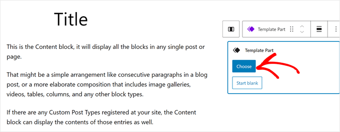
Next, you will see two options: ‘Choose’ or ‘Start Blank.’
Pick the first option.
You should now see your theme’s existing template parts.
Go ahead and click the one you just created.
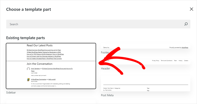
Now, you can rearrange the template’s layout to fit the new sidebar.
Once that’s done, click ‘Save.’
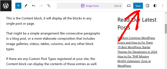
When you preview a blog post on your website, it should now have the sidebar template part there.
2. Display Different Sidebars on Different Pages and Posts
Typically, your WordPress theme only allows you to display one sidebar across your entire website. That said, creating multiple sidebars and displaying them on specific pages or posts is possible.
Let’s say you have a website with a blog section and a contact page. Your blog sidebar might be ideal for displaying recent posts and category listings. On the other hand, your contact page may benefit more from a map and a contact form.
The good news is that displaying different sidebars on different pages and posts in WordPress is quite easy with the help of WordPress page builders.
There are many page builders that can do this, including Elementor, but our favorite pick is SeedProd.
SeedProd is a page builder plugin that lets you build custom pages and themes using a user-friendly drag-and-drop editor. It offers over 50+ professional website kits and 350+ landing page templates to choose from, so you can find the best one for your needs.
With SeedProd, you can create custom web pages with different sidebars.
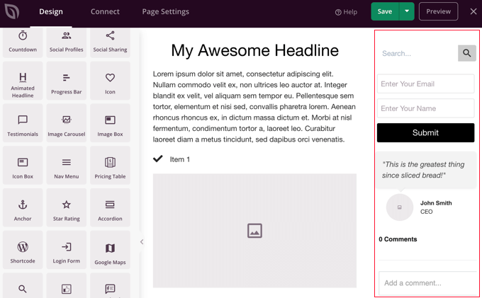
For instance, on a product page, you might showcase related products or customer reviews in the sidebar. Meanwhile, your landing page could have a prominent call-to-action button or an email signup form.
For a detailed guide on how to do this, check out our step-by-step tutorial on how to display different sidebars for posts and pages in WordPress.
3. Create Custom Sidebars for Each Category
Maybe you run a food blog with a vast collection of recipes categorized by cuisine. A general ‘Recipes’ sidebar could list all your latest dishes.
However, wouldn’t it be more helpful for visitors exploring Italian recipes to see a sidebar with popular Italian ingredients, cooking techniques, or even related Italian restaurants in their area?
This is where creating custom sidebars for each category can be useful. By tailoring the sidebar content to specific categories, you can offer a more targeted and valuable experience for your visitors.
Let’s say you’re a travel blogger with dedicated pages for different destinations. You could create a custom sidebar for your North American category page that showcases internal links only to content related to those destinations.
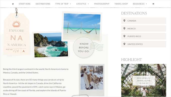
There are several ways to create custom sidebars for each category in your WordPress theme:
- WordPress sidebar plugins – Numerous user-friendly plugins allow you to create custom sidebar areas and then assign them to specific categories.
- Theme builders – If you are using a powerful theme builder like SeedProd, it likely has built-in functionalities for creating custom sidebars and assigning them to categories.
- Custom code – This approach requires some coding knowledge, but it gives you ultimate control over your sidebar customization. That said, you would need to know the right PHP file to add the code to.
For a detailed guide, check out our guide on how to easily add a custom header, footer, or sidebar for each category in WordPress.
4. Change the Default Sidebar Side
At times, you may need to change the sidebar side. For example, maybe your website caters to languages that are written and read from right to left. Having the sidebar on the left side will align better with the natural reading flow for your users.
Similarly, you might want to improve user experience based on visitor behavior. Maybe you run an eCommerce site and notice that potential customers often scan your web pages in a certain way, like starting from the top left and moving down.
By strategically placing the sidebar on the right, you can accommodate that behavior. This can make visitors more comfortable browsing your products.
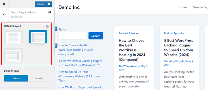
There are several ways to change the default sidebar side in WordPress. If you’re using a block theme, then you can simply use that to switch the sidebar placement on your page templates.
Some classic themes like Astra may also include an option within their theme settings to change the sidebar side.
Be sure to check your theme’s documentation or explore the theme options panel within your WordPress dashboard.
If your theme doesn’t offer a built-in option and you’re comfortable with a little code, you can edit the theme’s stylesheet (style.css) instead.
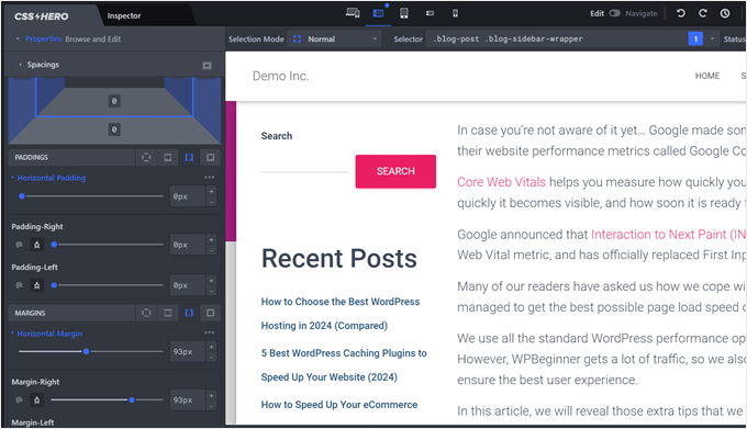
Or, if you’re not comfortable editing code directly, a user-friendly plugin like CSS Hero can be a great alternative. CSS Hero allows you to visually customize your website’s CSS styles without needing to write any code yourself.
For a detailed breakdown of the various methods, head over to our in-depth guide on how to change the sidebar side in WordPress.
5. Hide Specific Sidebar Widgets on Mobile
Most likely, a significant portion of your website traffic comes from mobile devices. Search engines also prioritize mobile-friendly user experiences, so you will want to ensure that your website looks good on smaller screens.
This is where strategically hiding specific WordPress sidebar widgets on mobile devices becomes a valuable trick.
A sidebar with forms, lengthy text widgets, or image banners can indeed be useful. That said, while these elements might work well on desktop screens, they can clutter the user interface on mobile devices.
By selectively hiding specific widgets on mobile, you can create a clean sidebar that improves readability.
To learn more, check out our detailed tutorial on how to easily hide a WordPress widget on mobile devices.
6. Use Your Sidebar as a Vertical Navigation Menu
This tip is a great fit for websites with a lot of content or navigational elements that feel overwhelming.
Think about websites with tons of product categories or complex information structures. A horizontal navigation bar at the top can get cluttered and tricky to navigate.
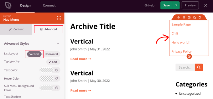
Here’s where a vertical navigation menu in your sidebar comes to the rescue. A vertical menu takes up less space than a horizontal menu, so it’s simpler for users to scan and find what they’re looking for, especially on mobile and tablets.
Plus, using the sidebar instead of the top of the page can free up valuable space for other important elements like your logo, call-to-action buttons, or a search bar.
If you’re interested in creating this type of WordPress sidebar menu, you can read our guide on how to create a vertical navigation menu in WordPress.
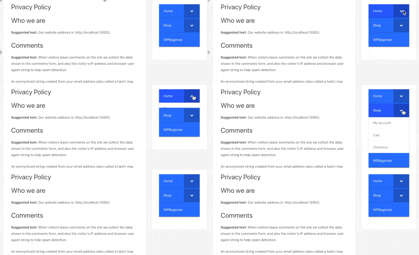
For websites with more complex structures, or if you want to save even more space on small screens, consider using a collapsible sidebar menu.
This type of menu lets you include a number of navigation links, but they’ll stay hidden until a user clicks on the menu button.
7. Make Sidebar Widgets Sticky
Many website visitors tend to scroll down a page to read content. A traditional sidebar stays fixed in one place, and as users scroll, they might lose sight of the valuable information or calls to action it contains.
A sticky sidebar widget solves this problem. It essentially sticks to the screen as users scroll down so that it is constantly visible.
By keeping your sidebar widget in view, you can increase the chances of visitors noticing and interacting with the content within it.
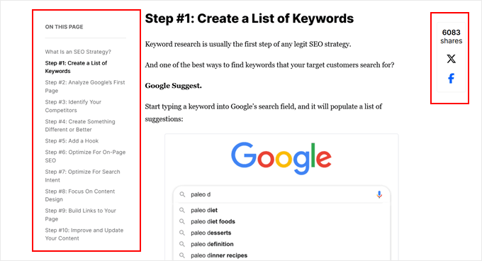
If the sidebar widget is an important element like an ‘Add to Cart’ button, making it sticky can also lead to a higher conversion rate. This is because it keeps that CTA constantly visible throughout the visitor’s journey on the page.
Also, on long blog posts, a sticky table of contents allows users to jump to specific sections easily.
Check out our guide on how to create a sticky sidebar widget in WordPress to learn more.
8. Enhance Your Sidebar with Eye-Catching Images
Images are powerful tools for grabbing attention and adding visual interest to your website.
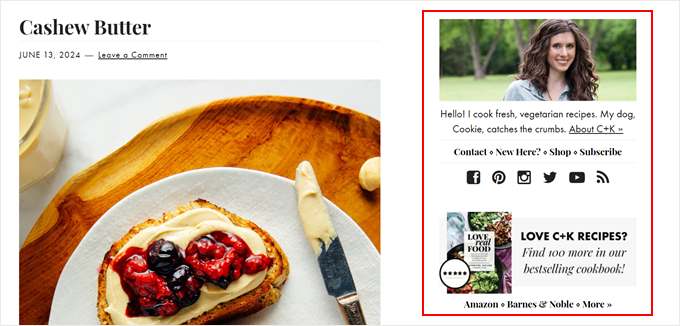
There are several ways to use images in your sidebar:
- Banner ads – Promote your own products or services or partner with other businesses for targeted advertising.
- Promotional content – Highlight upcoming events, webinars, or special offers with visually appealing graphics.
- Social proof – Showcase customer testimonials or logos of well-known brands that trust your business to build trust and credibility with your audience.
Adding an image to the sidebar is pretty easy. Block theme users can just add an image block to the sidebar template part in your theme and upload the image to your media library.
If you have a classic theme, then you can just use the block-based widget editor to drag and drop the image block to your sidebar.
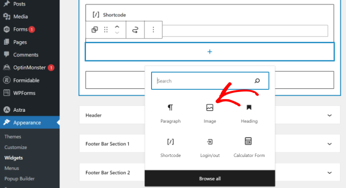
For a step-by-step guide, read our tutorial on how to add an image to a WordPress sidebar widget.
9. Boost Conversions with Clear Calls to Action (CTAs) in Your Sidebar
Whether it’s subscribing to your email list, purchasing a product, or contacting you for a service, a compelling call-to-action button can significantly boost conversions.
The sidebar is a prime location for a CTA. Sidebars are typically positioned strategically on your website layout, so your CTAs are constantly visible as users scroll through your content.
Plus, if you have different sidebars for different pages, you can tailor specific CTAs to the content of your pages.
For instance, a blog post sidebar might feature CTAs to the site’s affiliated partners, while a product page sidebar might have a ‘Buy Now’ CTA.

If you want to take your CTAs to the next level, check out our article on CTA best practices for landing page conversions.
Alternatively, if you run a business website that allows potential leads to contact you by phone, consider adding a click-to-call button to your sidebar. This way, you make it easy for future customers to connect with you.
10. Grow Your Audience with an Email List Signup Form in the Sidebar
An email list signup form strategically placed in the sidebar allows interested readers to easily opt-in to your email list. This way, you can keep them informed about new blog posts, exclusive content offers, or upcoming events.
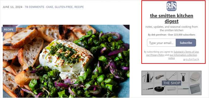
If you use different sidebars for different pages, then you can tailor the signup form and its message to the specific content on each page.
For instance, a blog post sidebar might offer a free digital product in exchange for signing up. Meanwhile, an eCommerce product page sidebar could highlight exclusive discounts for new subscribers.
Our guide on how to add email subscriptions to your WordPress blog can help you get started.
11. Enhance User Experience with a Sidebar Search Bar
When you have a big library of content, navigating it can become overwhelming for visitors. A well-placed search bar in the sidebar lets users find the information they need quickly and efficiently.
Instead of scrolling through lengthy menus or browsing countless pages, users can simply type in their specific search term in your sidebar and instantly find the content they’re looking for.
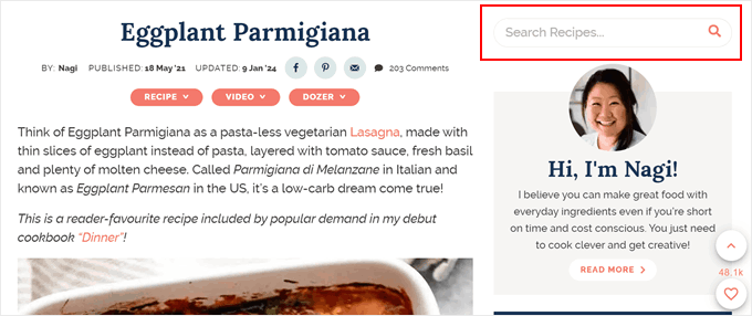
Plus, a readily available search bar encourages visitors to go deeper into your content and explore topics that interest them. This can lead to higher engagement and longer browsing sessions.
Thankfully, the block-based widget editor and the full-site editor for block themes make it easy to add the search bar block in your desired area.
That said, if you want to create a search form tailored to your website’s needs, we recommend using SearchWP. This WordPress plugin lets you set up a much more advanced search algorithm than the default search.
Our guide on how to create a custom WordPress search form shows you how to do just that and add the search bar to a widget section.
12. Connect with Your Audience with Social Media Sidebar Icons
Eye-catching social media icons in your sidebar allow visitors to easily connect with you on their preferred platforms.
By making it easy for visitors to follow you on social media, you can steadily grow your audience and build stronger relationships with them.
What’s more, a consistent social media presence across multiple platforms reinforces your brand identity and increases overall brand awareness.
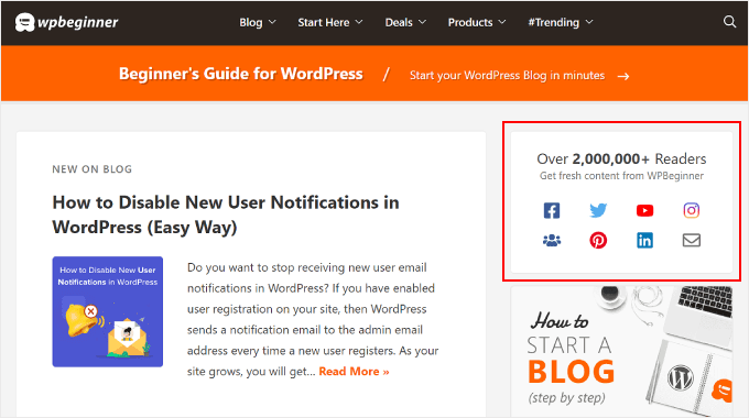
You can easily add social media icons to your sidebar using the widget editor or the full-site editor. The built-in Social Icons block has the features needed to design a set of social icons that match your website design.
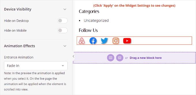
That said, if you want more customization options, then we recommend creating a custom page with a sidebar using SeedProd. This page builder plugin also has a Social block, plus many more customization options and social media symbols you can use.
13. Engage Visitors with Recent or Related Posts in the Sidebar
A well-curated selection of recent or related posts in your sidebar can keep visitors browsing longer.
Think about it. By showcasing related or recent posts in your sidebar, you provide visitors with an enticing glimpse of your latest content. This can lead them to explore more articles they might find interesting.
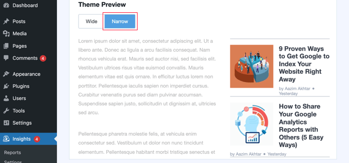
For people who want to show featured posts with thumbnails, we recommend using MonsterInsights.
The default WordPress editor allows you to add featured posts using the List block. That said, MonsterInsights lets you display these posts using their thumbnails to grab users’ attention.
Our guide on how to add featured posts in the WordPress sidebar explores both the built-in and the MonsterInsights methods.
More Beginner-Friendly Tips to Fine-Tune Your WordPress Sidebar
The tips we have explored so far provide a solid foundation for customizing your WordPress sidebar. But wait, there’s more!
Here are some more ways to leverage your sidebar’s potential:
- Showcase recent comments – Encourage conversation by displaying your most recent comments within the sidebar.
- Show off your top commenters – Inspire users to join the conversation by displaying your most active commenters.
- Display your subscriber counts – Boost social proof by displaying subscriber counts from various platforms like email or social media.
- Customize your archive display – Fine-tune how your archive categories or monthly archives appear in the sidebar for a more polished look.
We hope this article has helped you learn the best tricks for customizing sidebars in WordPress. You may also want to check out our ultimate guide to essential WordPress design elements and our guide on how to add custom styles to WordPress widgets.
If you liked this article, then please subscribe to our YouTube Channel for WordPress video tutorials. You can also find us on Twitter and Facebook.




Zia Khan
Really helpful article! One thing I’d add is how sidebars can also be optimized for SEO, like placing related posts or a search bar can really help with better visibility and making content more accessible for visitors. It’s small tweaks like these that can actually boost site performance.
Moinuddin Waheed
Thank you Zia khan for your valuable tip.
Indeed sidebars can enhance the seo and visibility by placing the popular posts and related posts in the sidebar.
It will also help reduce the bounce rate and will help increase the user engagement.
kzain
Wow, I had no idea there were so many creative ways to use WordPress sidebars! This article is a treasure trove of inspiration and practical tips. I’ve been stuck in a sidebar rut, but now I’m excited to try out some of these tricks and take my site to the next level. The tip on using sidebars for targeted advertising is pure genius – I can already think of how I can apply it to my own site. Thanks for sharing your expertise
WPBeginner Support
You’re welcome
Admin
Jiří Vaněk
I thought for a long time about how to make the sidebar engaging and interesting. In the end, I completely resolved it using Elementor, which seemed like the perfect solution to me. But what is a perfect sidebar without perfect content? In this article, I found great inspiration and immediately noted down a few ideas. I was particularly intrigued by the Sticky Sidebar widget because that’s exactly the issue I’m dealing with on my blog. A page with 5 or more articles in excerpt form, and then an empty sidebar. And that doesn’t look good at all. This could be a great solution.
Nathan
Hi guys!
I know it’s not the exactly topic of this post, but I’m having a problem with sidebars since yesterday that I don’t have idea to fix. I’m wondering If someone could help me…
When I try to add HTML code to the sidebar or header, no matter with which plugin (i’ve tried enhanced text, wordpress ad widget or even the standart “text” option), I hit the “save” button and it keeps loading forever, never finishs…
When I refresh the page the code it’s not there… I realized this start happening yesterday, but I updated to version 4.5 last week…
Someone could help me? I need to place my ads…
Thanks!!
WPBeginner Support
When this happens, try right clicking anywhere on the page and select Inspect from browser menu. This will open developer tools. Click on the Console tab to see if it is reporting any errors. You can also Try deactivating all WordPress plugins and switching to a default theme. Now try adding the code in widget again. If this works then figure out which plugin or theme was causing the conflict by activating them one by one.
Admin
Tariq Kamal
Hi
I need to know if I am using widgets on my blog with the options set in the visibility mode where I set a certain criteria for certain widgets to appear (or be hidden) on some categories or pages. This obviously means that I will use more widgets, some will appear in one category the others in other categories. Is it an extra load on my blog? Is my blog loading all the widgets at startup or it will only load the widgets when the desired category is visited.
I hope you guys understand what I want to say and give me some feedback.
Thank you
Tony N
Great article! Is there a plug in that is similar to the recent posts widget, but will let you select only certain specific post categories to show, and perhaps style the text and head?
Johnathan
I think it’s all dependent on who your visitors are and where they are coming from, but I am seeing that mobile devices are ruling my traffic sources. Which made me take a closer look and think harder about what my blog looks like on mobile devices. Of course, always use a theme that works well with mobile.
The problem I am seeing, at least with the theme I’m using, is that on mobile it pushes my sidebar to the bottom of scrolling. I’m looking into ways of getting my CTAs into every post rather than depending on the sidebar to d it for me.
In the past, I’ve used a plugin that put whatever I wanted at the beginning and end of every post, but for the life of me I can find anything like it again.
Any suggestions?
RW
Excellent point Johnathan. I agree completely. It’s becoming a reality, that on some sites, sidebars aren’t all that necessary.
Nata
Excellent list. My sidebars were a total mess. I just wish there were one plugin that would do it all!