Creating bars, graphs, and pie charts on your WordPress site can improve your content by making data more accessible. It helps you present information in a way that is visually appealing and easy for users to understand.
The good news is you don’t need any technical experience to do this. You can use a plugin like Visualizer. We have tested this tool ourselves, and we loved how straightforward it made the process.
With Visualizer, you can create stunning, custom bars and charts, easily pulling data from a variety of sources. This way, you can improve your content and the overall user experience.
In this article, we will show you how to create bars and charts in WordPress with Visualizer.

The Problem With Bars and Charts in WordPress
There are many plugins to add bars, charts, and graphs to your content. However, the most common complaint we have heard from our users is that these plugins are usually too complicated to use.
Some of these plugins even expect users to add data inside a shortcode in extremely complicated formats.
Instead of using those plugins, many users end up creating charts in their office applications and converting them into an image for their WordPress websites.
This could work if you plan to never change it. However, an image is no substitute for an interactive chart in which helpful data appears when the user clicks over a particular section.
An ideal charts and graph solution would allow you to:
- Add data from a data source on your computer or the web.
- Populate charts, pies, graphs, and bars using your data.
- Create beautiful, interactive, colorful, and mobile-friendly charts.
- Most importantly, it should let you update the data whenever you want.
Adding a chart with the Visualizer will help you increase user engagement and even make your data easy to understand.
Having said that, let’s see how to easily add bars and charts to your WordPress site.
How to Create Bars and Charts in WordPress with Visualizer
You can easily create bars and charts with WordPress using the Visualizer plugin. It is the best WordPress data visualization plugin on the market that lets you create interactive data visualizations for your site.
It even has a free plan that you can use to create bars and charts.
First, you need to install and activate the Visualizer: Tables and Charts Manager for WordPress plugin. For more details, see our step-by-step guide on how to install a WordPress plugin.
Note: This tutorial will use the free version of the plugin. If you want to unlock the pro features, then you can buy a paid plan.
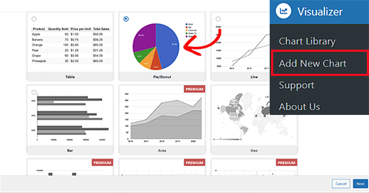
Upon activation, you must visit the Visualizer » Add New Chart page from the WordPress dashboard.
Once there, choose the type of chart you want to create, such as a table, pie, line, or bar chart. Then, click the ‘Next’ button.
This will take you to the next step, where you must click the ‘Choose File’ button to import your Excel spreadsheet data from the computer.
If you have saved your Excel or Google spreadsheet as a CSV file, then you can import it by expanding the ‘Import data from URL’ tab.
Once you have done that, click the ‘Import from CSV’ button. Then, you can enter your CSV file URL to embed the file.
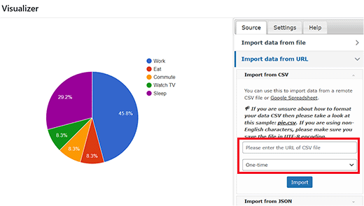
Keep in mind that your CSV file must have column names in the first row and data types in the second row. The plugin supports the following data types: string, number, boolean, date, time, and time of day.
Please take a look at this example file we have created in Google Sheets.
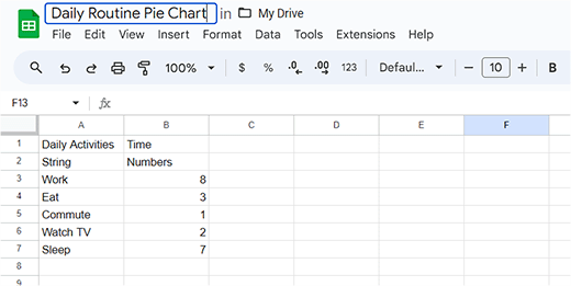
If you are creating a CSV file using a text editor, then take a look at this example CSV file:
Daily Activities,Time
 string,numbers
 Work,8
 Sleep,7
 Eat,3
Watch TV,2
Commute,1
However, if you have your chart data saved as a spreadsheet on Google Drive, then you can add it to your chart without exporting it.
First, open your data file in Google Spreadsheets and then click on the File » Share » Publish to the web link.
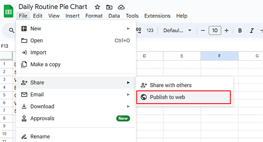
This will bring up a popup where you must choose how to publish this document.
Simply select the Comma Separated Values (.csv) option from the dropdown menu and click on the ‘Publish’ button.
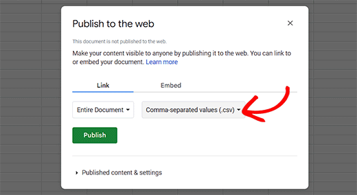
You will now see the publicly available URL of your sheet as a CSV file. Here, copy this URL and go back to the Visualizer chart.
You will have to add this URL in the ‘Import from CSV’ field.
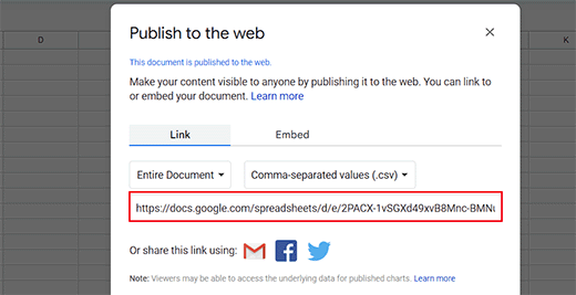
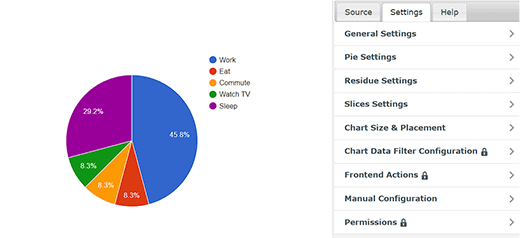
When you enter the URL, the plugin will fetch your CSV file and show a live preview of your chart.
Now, you can switch to the ‘Settings’ tab from the top to configure the general settings like font styles, number format, size and placement, size settings, and so much more.
Once you are done, click the ‘Create’ button at the bottom of the prompt.
Adding a Chart or Graph in WordPress Posts/Pages
Adding a chart or graph to your WordPress posts and pages is as simple as adding images.
First, open a new or old page/post where you want to add the pie chart. Once you are there, click the ‘Add Block’ (+) button at the top left corner of the screen.
This will open the block menu from where you have to find and add the Visualizer Chart block.
Once you do that, click the ‘Display an Existing Chart’ button in the block itself.
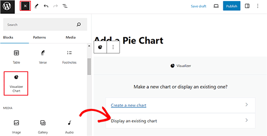
This will open a new prompt in the block where you have to select the pie chart that you just created.
Finally, click the ‘Publish’ or Update’ button to store your settings.
Now, you can visit your WordPress site to view the pie chart in action.
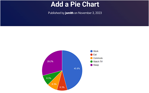
Editing Your Visualizer Charts in WordPress
You can edit and change your charts anytime. Simply visit the Visualizer » Chart Library page from the WordPress dashboard.
From there, you can clone a chart, delete it, or edit its visual settings using the icons under the chart name.
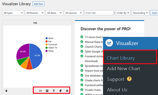
Updating data for an existing chart without changing the chart is also quite easy with Visualizer.
If you added data from a Google spreadsheet, then you need only update the data in your spreadsheet, go to the File » Share » Publish to the web option, and republish your spreadsheet.
Your changes will automatically be reflected in your chart.
On the other hand, if you uploaded a CSV file, then you need to update the CSV file on your computer. Once done, select the chart that you want to update and click on the edit link below the chart.
In the ‘Import CSV file’ section, simply upload your new CSV file. Changes in the data will automatically reflect in posts or pages where you have inserted that chart.
Bonus: Create a Company Org Chart in WordPress
If you have a small business site, you can also add a company org chart in WordPress. This chart will show how your company is structured, from the CEO to the different teams and individual employees within each team.
An org chart helps potential customers learn more about your business and makes it easier for teams to communicate with each other.

To create a chart, just install and activate the Organization Chart plugin. For details, see our tutorial on how to install a WordPress plugin.
Upon activation, visit the Wpdevart Chart » Charts page and click the ‘Add New’ button. This will take you to a new screen where you can add a name for the chart.
After that, add the image and title for the CEO of your company in the element on the screen. Then, click the arrow icon.

This will add another element where you can add a title and image for the person who comes after the CEO. Then, click the element again to view the multiple arrow icons in different directions.
Doing this will help you create a company structure with multiple branches or teams.
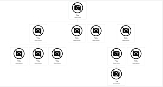
Once you are done, just click the ‘Save’ button to store your settings.
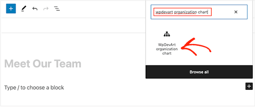
Now open the page where you want to add the Org chart and add the ‘WpDevArt organization chart’ block. Then, select the chart you created from the dropdown menu within the block itself.
Finally, click the ‘Publish’ or ‘Update’ button to store your settings. For more information, see our tutorial on how to create your company Org chart in WordPress.
We hope that this article helped you add bars and charts to your WordPress site. You may also want to see our beginner’s guide on how to customize colors on your WordPress website and our expert picks for the best WordPress fun plugins you are missing out on.
If you liked this article, then please subscribe to our YouTube Channel for WordPress video tutorials. You can also find us on Twitter and Facebook.




Adam
I am able to generate the chart and publish it on my site, but how to I edit the height and width once the shortcode?
zulfi
thxs dude it help a lot
Judith Hollies
Thank you so much for this clear tutorial. I’m trying to create a pie chart in wordpress and have successfully activated the visualizer plug-in. But when I copy the info over from either excel or google drive (following your steps) both times the first row of stats is omitted in the pie chart. I’ve tried re-ordering the stats, placing them in different locations, but it’s always the first row that gets omitted! Can you help me! Judith
mandeep
How we comparison between two app like app A and app B and now for i want to make a graph chart both of them in blog of wordpress?How i do it?Can you tell me here?
Felix
Thanks for the review. How do you handle values with a comma eg. 2.232,42 if you have to use commata as a seperator for the Visualizer?
david
Hi Great plugin, I solved all my problems except one.
How do you edit a chart in the visualizer library, when I click on the edit icon all I get is a blank screen, is this just me – plugin conflict or something, or is there a problem with the Visualizer plugin
Any ideas?
Thanks
David
david
Hi, I’m trying to replicate your example above from “Adding a Chart in WordPress using a CSV file”, but when I click “From Computer” in “Upload csv file” and select the file I copied from your example I get: “CSV file is broken or invalid. Please, try again”
Any ideas what the problem may be, any help greatly appreciated.
Thanks
David
Richard G
Hello
Thank you for this post
However maybe you can help me for one of my client. He has a group of students, each one have a private area
My client wants to integrate somes customs fields. Basicly each student will enter his datas into this custom fields, and these datas will be convert into a chart or a curve (tracking weight loss or mass gain for exemple)
Any idea?
Thank you
Richard
Chad
Thanks for the great tutorial. When I drop down the “upload CSV file” I am unable to click on the button for “From Web”, as it is not highlighted in blue. So I must add the data “from Computer”. I noticed that in the screen shot above the “from Web” button is also not highlighted. Has anybody else had this problem and figured out a solution?
Thanks Again
Artur
Thanks a lot !!!!!!
I love you guys, you solve my very long issue.
Thanks for this excellent plugin.
Recommended to all.
Tom Horn
I use charts on my blog often so this really comes in handy. Thanks alot.
Jeff
How do you make the bars thicker?
Editorial Staff
You have to tweak the CSS.
Admin
Franco Castillo
I just downloaded the Visualizer plugin, and I opened it in Winrar. Can anyone tell me how to activate the plugin in Winrar?
Editorial Staff
Use this guide on how to install a plugin in WordPress
https://www.wpbeginner.com/beginners-guide/step-by-step-guide-to-install-a-wordpress-plugin-for-beginners/
Admin
Richard
Hello
Yes very interesting indeed thanks!
I have the same question (and sorry for my english), i need to create personnal charts from datas feed by a user thrue a table on the website(and insert the final chart in the profil page of the user). Do you think it can be done? do you have any clues?
Thanks
Husien Adel
thanks a lot
Ted
Really helpful.
Stephen
Great looking plugin. Have been waiting for something like this for ages.
How feasible is it to be able to read data from custom fields, instead of a CSV file or a Google Drive spreadsheet?
Is this a feature that you may consider implementing?
That way, data could be kept in the WordPress database, and be updated from the front end of the website.
For me, that would be really useful!
– Stephen
Eugene
Hi Stephen,
your idea is good and I will keep in mind it for future release. Could you, please, re post your request at the forum on support site? It will help us to keep all requests in one place.
Post it here: http://visualizer.madpixels.net/forums/forum/official-forums/feature-request/
– Eugene
Jotpreet Singh
hey, Awesome. Can this be done via google docs or any other online method. I’m running a blog on wordpress.com. Hope something, would come out. Do you have any ?