Have you ever visited a large, complex website and felt lost trying to find what you need? We’ve noticed this problem on several major sites like news publications or online stores, even if they already have a handy navigation menu 😅
The good news is we’ve discovered an easy solution to this problem: a visual sitemap. This is a user-friendly guide that helps visitors navigate through a site’s structure.
In this post, we’ll show you how to create a visual sitemap in WordPress with an easy-to-use plugin.

Does My Website Really Need a Visual Sitemap?
A sitemap is like a roadmap for your website, showing all the important pages and how they’re connected.
If you’re familiar with WordPress SEO principles, then you probably already know the term XML sitemaps. These are designed for search engines, helping them find and understand your content.
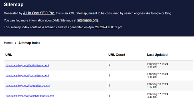
On the other hand, there is also the HTML sitemap.
In this post, we’re going to focus on visual sitemaps, which are a type of HTML sitemap that displays your site’s structure in a more visually appealing and easy-to-understand format than an XML sitemap.
If you have a website that caters to different types of users, a visual sitemap can help guide each visitor to the page or post most related to their interest. It’s like having a friendly guide that shows everyone where to go.
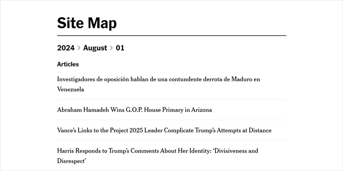
Visual sitemaps can also be great for educational websites or online courses. They can show the learning path and help students understand how different topics are connected.
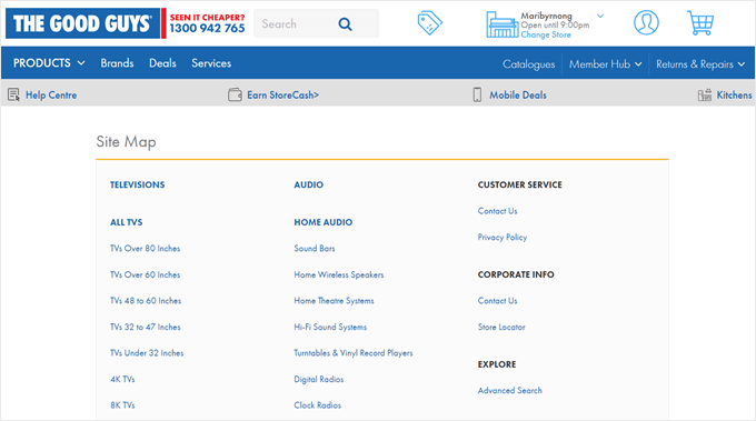
For online stores with many product categories, a visual sitemap can help shoppers understand your product range at a glance and find the categories they’re interested in more easily. Here’s a great example we’ve found on The Good Guys website:
With that in mind, let’s look at how to create a visual sitemap in WordPress.
How to Create a Visual Sitemap in WordPress Without Code (Beginner-Friendly) 🗺️
We used to suggest the Slick Sitemap plugin for making visual sitemaps, but it hasn’t been updated in a long time. And when we tested it recently, we found it doesn’t work as well as it used to.
We also tried using Gutenberg and some custom CSS to make a sitemap. This worked at first, but as we added more pages to our site, the sitemap started to look strange because the CSS couldn’t keep up with the changes.
We like to find easy solutions that save you time and don’t make things complicated here at WPBeginner. And thankfully, we found a great plugin replacement called Simple Sitemap that does the job well.
To get started, you’ll need to install and activate the WordPress plugin on your website. Once that’s done, you can go ahead and create a new post or page for your sitemap. Or, you can open an existing one using the Gutenberg block editor.
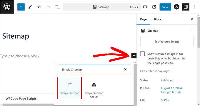
In our case, we decided to create a new page called ‘Sitemap.’
With the block editor open, click the ‘+’ button anywhere on the page and select the ‘Simple Sitemap’ block.
By default, the plugin creates a sitemap of your pages and their subpages but not your posts.
If you want to add posts to the sitemap, then you can go to the ‘General Settings’ in your ‘Block’ tab. Here, type in ‘Post’ in the ‘Select post types to display’ field.
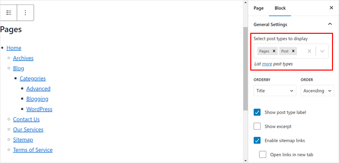
Once you do, you will find all of your posts displayed below the pages section on the sitemap.
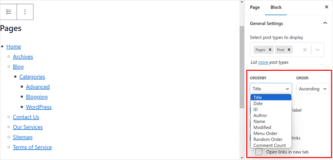
Next, let’s customize the order in which the pages and posts are listed. You can choose between title, date, ID, author, name, modified, menu order, random order, or comment count. You can also pick between ‘Ascending’ or ‘Descending’ order.
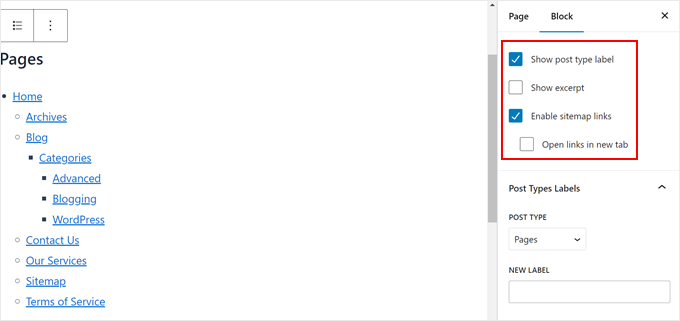
Scrolling down, you can choose to:
- Show the post type label to clearly differentiate between pages and posts in the sitemap.
- Show the excerpts of the posts and pages. We decided to disable this option because it may make the sitemap lengthy.
- Enable sitemap links. If you disable this option, then users won’t be able to click on the links in the sitemap.
- Have every link open in a new tab every time they’re clicked so that users don’t leave the sitemap page.
Whichever setting you choose depends on your preferences and website needs, so be sure to think of these options carefully. Also, you can always enable or disable these settings if you ever change your mind.
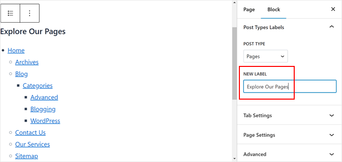
Below that section is ‘Post Types Labels.’ Here, you can replace the default label for the post type with another text.
In our example, we’ve decided to replace the label ‘Pages’ with ‘Explore Our Pages’ as a call to action.
Finally, you can open the ‘Tab Settings.’
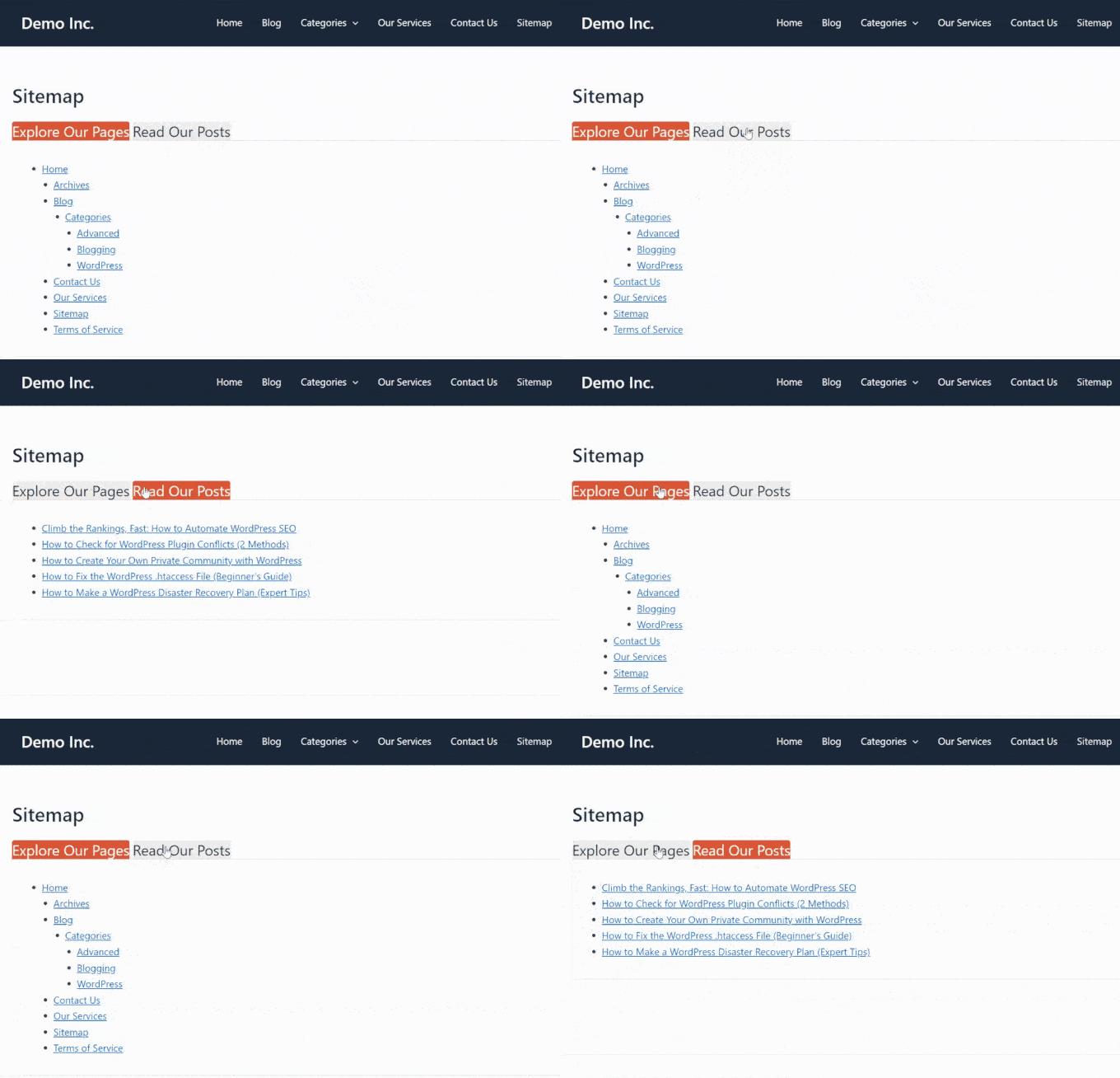
This is where you can enable tabs to display your sitemap links. By default, your sitemap links will be divided based on their post type. This can be a great option if you don’t want to make your sitemap page too long.
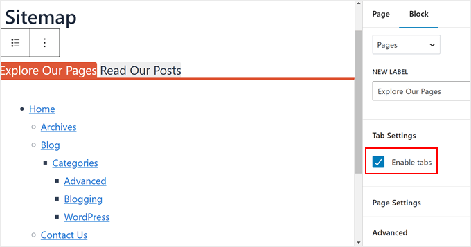
Once you’re happy with how the sitemap page looks, you can continue customizing the page to your liking. If you need help, here are some guides for you to get started:
- How to Edit a WordPress Website (Ultimate Guide)
- How to Add Custom Fonts in WordPress
- How to Add Custom Scrollbar to Any Element in WordPress (if the sitemap block is a bit lengthy)
When you’re ready, just click Save, Update, or Publish.
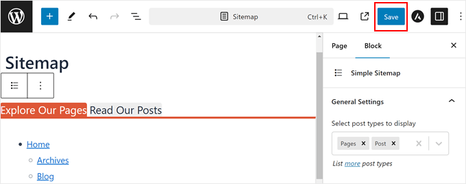
Make sure to view your new page on mobile, desktop, and tablet to see if it looks good on all devices or not.
Here’s what our visual sitemap looks like:
Bonus Tips to Improve Your Website Navigation
Want to make your website even more user-friendly? Check out these guides below:
- How to Add a Fullscreen Responsive Menu in WordPress – Learn to create a menu that looks great on all devices.
- How to Display Breadcrumb Navigation Links in WordPress – Help visitors understand where they are on your site.
- How to Add Arrow-Key Keyboard Navigation in WordPress – Make your site more accessible for keyboard users.
- How to Make a Staff Directory in WordPress (with Employee Profiles) – Organize your team information effectively.
- WordPress Sidebar Tricks to Get Maximum Results – Optimize your sidebar for better navigation and engagement.
We hope this article has helped you learn how to create a visual sitemap in WordPress. You may also want to check out our expert picks of the best WordPress drag-and-drop page builders and our ultimate on the most effective WordPress design elements.
If you liked this article, then please subscribe to our YouTube Channel for WordPress video tutorials. You can also find us on Twitter and Facebook.


Clay Ravin
The Slick Sitemap plugin hasn’t been updated for 4 years. Is there an alternative we could use?
WPBeginner Support
While we don’t have a specific alternative to recommend at the moment, we will certainly keep an eye out
Admin
Trapti
I read both articles; xml sitemap & HTML sitemap. I already created xml sitemap in Google webmaster. Xml sitemap for crawling & HTML sitemap for users according to the article. So which sitemap should I put in my WordPress footer? I saw lot of websites put sitemap in WordPress footer.
WPBeginner Support
That would be a question of personal preference for which you would want
Admin
Mohd Amir
Why visual sitemap is not working with current version of word press.
amit
have other plugin? the slick have problem in rtl lang
Hemang Rindani
Nice article. Sitemap is still important for a website and can help to boost the search results. WordPress, a powerful enterprise web content management service, allows users to create sitemap easily by implementing plugins like Simple Sitemap, as mentioned in the article. This can be implemented by implementing a shortcode on a post, page, custom post type or text widget. There are various attributes in this plugin that allows to set values for type of page, label, links etc..
It is important to ensure that sitemap is updated each time any page or link in added or removed from a site. For this purpose I feel Google XML sitemap is a better plugin for WordPress sites.
Matija
While it can look nice I dont see much benefits of this feature.
Also you are recommending using plugin which is last updated 8 months ago.
mahmood
Hi…
Thank you so much.
Bobby
Neat article. Just a couple of quick questions.
Is there any really good reason to do an html sitemap on a page for your site? I don’t recall really seeing those anymore like I used to years ago.
Is it better for larger websites? I only have approximately 20 pages total on my main navigation menu.
Or would it simply be a personal choice for website layout?
Adrienne
Very nice feature. I will try this out! Cheers,