Want to showcase your videos and images in a way that grabs attention without cluttering up your page? Sliders are a fantastic tool for that!
These features let you highlight important content, all while keeping your WordPress site looking sleek and professional.
We’ve worked with WordPress sliders a lot, so we’re here to make sure you get it right from the start. ✅
In this guide, we’ll walk you through how to easily create a video and image slider using Soliloquy.

Why Create a Video and Image WordPress Slider?
💡 Let’s face it: content sliders are awesome. When done right, they conserve precious screen real estate and help engage visitors immediately upon landing on your page.
A video and image slider contains both media types. Sometimes, you will want videos and images in one slider rather than creating sliders for one or the other.
Let’s say you have a real estate website for various home listings. You can add pictures of the home along with a video walkthrough inside, giving users a more interactive experience.

Or you can use your content slider to add user testimonials or portfolio items. Some plugins may even offer an auto-play function so visitors will see the video immediately.
Beyond that, a slider is a great way to group content in one place. Rather than spacing your videos and images vertically, you can categorize them all in one slider.
If you want to showcase testimonials on your landing page, then it’s much better to have them in a slider so that visitors can watch them all at once rather than scrolling down.
You could also use a slider to showcase featured content so that you can direct traffic to your most important pages.
With that in mind, we’ll show you how to create a video and image WordPress slider for your website. Here are all the steps we’ll cover in the next sections:
Ready? Let’s get started!
Step 1: Install a WordPress Slider Plugin
The easiest way to create a video and image slider is with Soliloquy, one of the best WordPress slider plugins.
You can easily create simple sliders using images from the media library along with videos hosted on third-party platforms like YouTube.
To learn more about the tool, you can check out our full Soliloquy review.
When added to your website, the slider will look great on all devices, including laptops, desktops, tablets, and smartphones.
That’s why many websites use Soliloquy sliders on their most important pages, such as the home page, sales page, and landing page.
Best of all, you don’t have to write a single line of code to do it.
To get started, all you have to do is install and activate the Soliloquy plugin on your website. If you need help with installation, feel free to check out our guide on how to install a WordPress plugin.
☝ Note: You can use the free version of Soliloquy for this tutorial. That said, you may want to consider the Pro version if you need more functionality.
Upgrading to the premium version unlocks the lightbox feature, password protection, and featured content. You’ll also be able to integrate into Instagram, Pinterest, and WooCommerce.
Step 2: Create Responsive Video Slides in WordPress
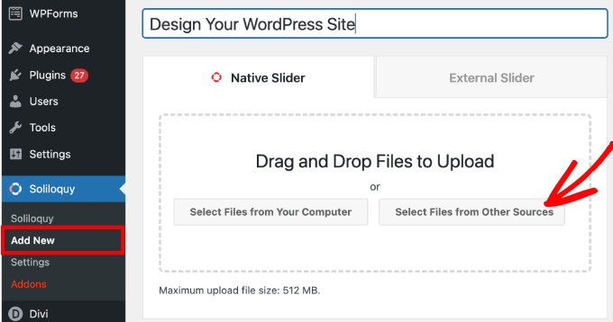
Upon activation, you’ll need to head over to Soliloquy » Add New in the WordPress admin area. From there, you can give your slider an appropriate title so you can easily refer back to it later.
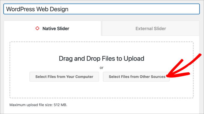
Now, you are ready to add all the media content to your slider. Go ahead and click on ‘Select Files From Other Sources.’
☝ Note: While you could upload videos from your computer to WordPress, we don’t recommend it since it will slow down your site. Instead, you should embed videos from YouTube or another video hosting platform.
Check out our list of the best tips to speed up WordPress performance to learn more strategies.
You will then see a popup window appear with options to insert media files.
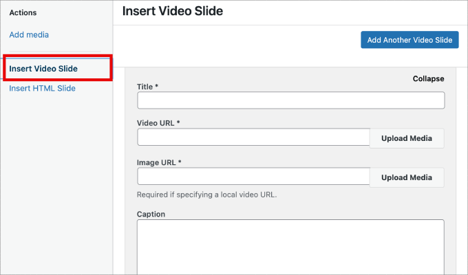
Let’s start by heading to the ‘Insert Video Slide’ tab to add video to the slides.
Simply give your video slide a title, video URL, image URL, alt text, and caption. Also, let’s make sure you grab the video URL from a third-party hosted platform like YouTube.
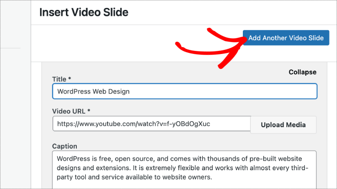
If you want to add more slides, all you need to do is simply click on the ‘Add Another Video Slide’ button.
Then, you will add the information you need for this slide.
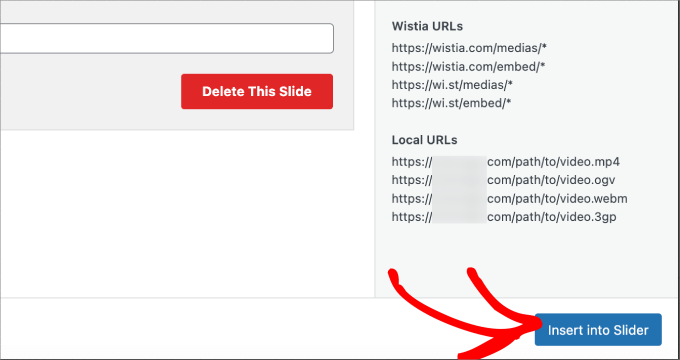
Once you’ve added all the video slides, go ahead and click on the ‘Insert into Slider’ button.
Your slides will appear at the bottom of the page for editing later if needed.
Step 3: Add Image Sliders in WordPress
Now that you’ve got all your video slides in place, you are ready to add image slides.
With image slides, you can just drag and drop pictures from your computer, which is the easiest way to add these files.
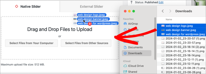
That said, you can also use the media library to add slides as well.
To add from your media library, simply click on ‘Select Files from Other Sources.’
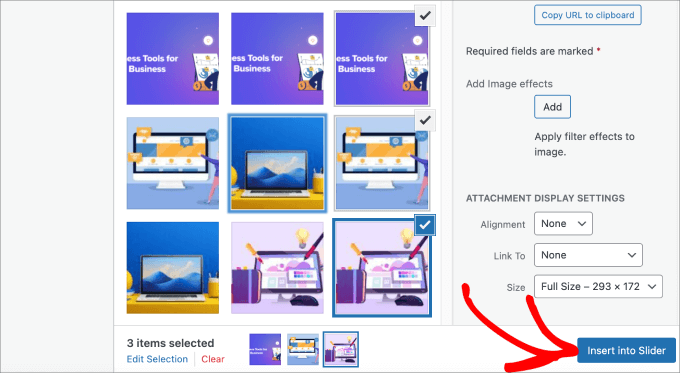
This will open the ‘Add Media’ popup window.
Go ahead and select the images you’d like to add. Then, simply hit the ‘Insert into Slider’ button.
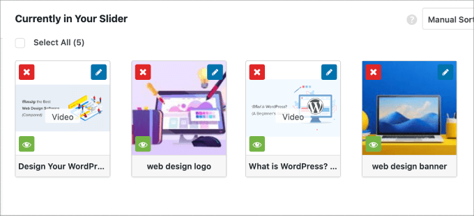
Once you are done adding image slides, you should see all of the slides in the bottom section of the slider.
Feel free to rearrange them in the appropriate order to fit your needs.
Step 4: Edit the Slider Settings
In this step, you can make minor adjustments to customize how the slider will appear to visitors. You can scroll down and head over to the ‘Configuration’ tab to access the settings.
From here, you can edit options such as the slider theme, image size, slider dimensions, and more.
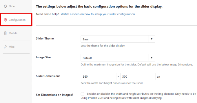
The slider theme affects the slide’s layout, so you can toggle the various options.
If you have access to the Pro version of Soliloquy, then you can also install the Slider Themes addon for more customization options.
Down the page, you’ll find the ‘Autoplay Video’ option. You can check the box to enable autoplay so that the video automatically starts before the user can continue down the page.
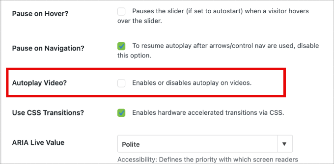
Autoplay can be great for product explainer videos or sales pages to engage users, reducing the chances they will click away.
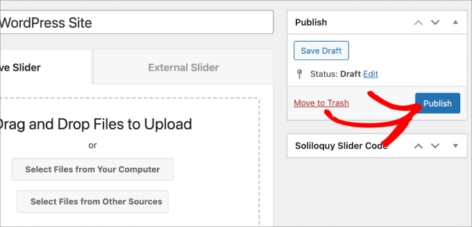
After you’ve finished adjusting the settings, you just need to hit the ‘Publish’ button.
Step 5: Display Your Slider in Pages or Posts
Now, all that’s left to do is publish your slider on a page or post. You could easily copy and paste the shortcode if you still use the WordPress Classic Editor.
For more information, you can follow our tutorial on how to add a shortcode in WordPress.
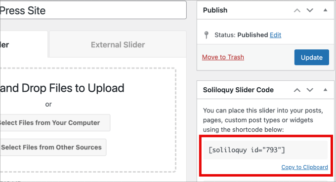
But if you are using the newer Gutenberg block editor, then Soliloquy has a block you can use that directly links to all of your sliders.
Just head over to Pages/Posts » Add New or edit an existing page or post.
Next, you can click on the ‘+’ icon, find the Soliloquy block, and select the video and image slider you just created.
Once you are done, simply hit ‘Publish’ or ‘Update.’
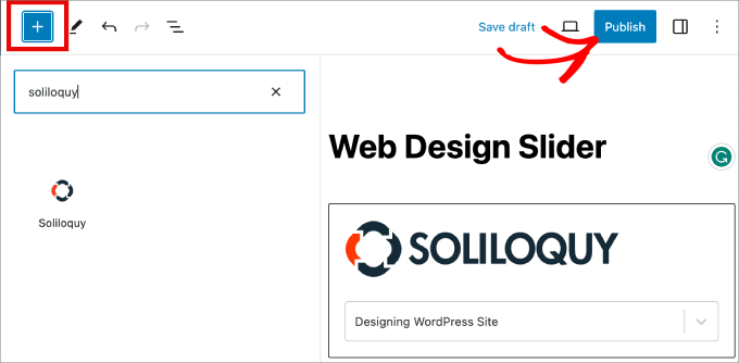
If you want, you can preview your slider to make sure it looks good.
Here’s what it might look like:

Bonus: Add a Lightbox to Your WordPress Sliders
Soliloquy has a wide range of add-ons that can enhance your sliders and provide a more interactive experience for visitors.
For example, if you are adding a slider, then there’s a good chance you will want to add a lightbox as well.
By adding the lightbox effect to your sliders on your WordPress website, you can showcase your content more professionally. So, when users click on your images or videos, it will open in a popup window on your site – a lightbox.
Lightboxes create a more immersive viewing experience for your visitors, letting them view the content in greater detail. They can even download the media files on their computers or share the images on social media.
If you run a photography website, the lightbox effect lets visitors view your images without distracting other elements on your site, boosting engagement.
For online stores, lightboxes will help to create more engaging product galleries.
To add a lightbox to your slider, you’ll want to go to Soliloquy » Addons. Then, scroll down to the Lightbox Addon and click on ‘Install Addon.’
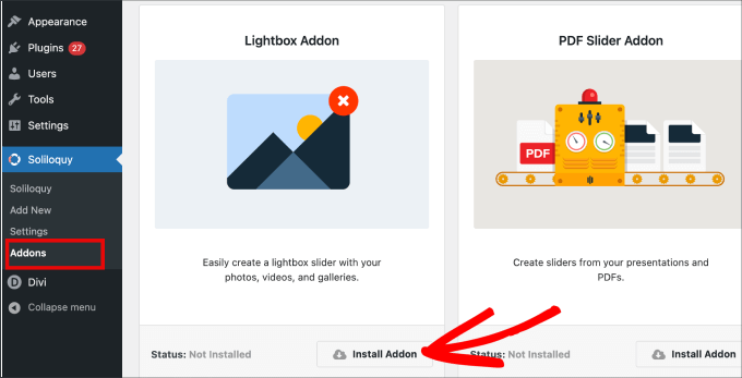
Once installed, it will appear in the settings for your slider.
From here, you will be able to adjust the effects and layouts, add navigation arrows, the theme of the lightbox, and more.
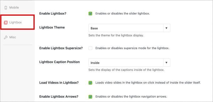
Once enabled, the lightbox should work automatically.
Now, you might want to preview your slider, and it should look something like this:

🤔 Having a hard time designing your WordPress site? Our WordPress Website Design service can transform your site into a visually stunning and user-friendly experience. Don’t let design challenges hold you back. Book our WordPress Website Design service today!
We hope this article helped you learn how to create a video and image WordPress slider. You may also want to check out our guide on how to easily add interactive 360-degree images and how to add MP3 audio files to level up your WordPress site’s multimedia game.
If you liked this article, then please subscribe to our YouTube Channel for WordPress video tutorials. You can also find us on Twitter and Facebook.


Pete Kici
I just want to say this site is the best….
The content on WP the info I have found here connects a lot of dots/blank spaces
Things I was mostly guessing on now I get.
The main point is if your starting out new to WP less is more, not to many moving parts and learn the next new skill.
Thank you for all the great content
Maggie Shnayerson
Hi Syed,
Actually, I was taking issue with SlideDeck eliminating a feature for existing customers for which they’d already paid, not with business decisions they make for future customers. I agree Digital Telepathy has every right to make those, whether I like them or not. I also wasn’t complaining about your piece.
To your point about pricing, yes, with their June update they cut the price for their personal license from $79 to $49, but, as their terms of service declare, those of us who bought it between their launch in March and June shouldn’t expect a refund. Fair enough certainly, if they kept the feature set intact. They implemented an automatic license upgrade for those customers, but unfortunately, it doesn’t do much to tell us to be grateful we’re not paying full-freight for licenses that still carry a lesser feature set than the ones we’d purchased to begin with. Even at the new $49, SlideDeck makes the alternative sliders I mentioned, and yes, obviously the free Nivo slider, seem like attractive options. I like SliderPro because it’s nice to support individual developers and it’s got an easier UI for my users than Nivo.
You didn’t answer whether you’re an affiliate. Are you? I don’t think it should matter, but I like knowing those things upfront.
SlideDeck is absolutely worth giving a try and I agree that they seem to have an engaged forum response team.
Thanks,
Maggie
Editorial Staff
Hi Maggie,
I did answer your question about the affiliate program. If you read my response to your earlier comment, it clearly has the answer in the first 3 lines.
-Syed
Admin
Adrian
Hello, I just installed SlideDeck 2 Developers License to my site. Installation and activation all said successful. However, I can not find an options screen for Slide Deck 2 anywhere. Am i missing it somewhere or do you think there’s interference from another plugin, etc? Thx!
Editorial Staff
Probably best to contact SD support for this. Not sure what is going on there.
Admin
Adrian
Thanks for the quick response. Where would the options screen normally be? In the left side menu under Settings, or a button of its own?
Editorial Staff
It’s a button of its own.
Adrian
Got Slidedeck 2 to work properly, it was a stupid mistake. When I was downloading the purchase, I didn’t realize you had to install all the zip files, I just chose the one that looked like the version I purchased. Very, very pleased with Slidedeck 2 and I absolutely hated Slidedeck 1. They definitely revolutionized their old user interface. I especially like the option to turn on and off iframes. I also really like the admin area – the font, lens, color scheme, etc. selectors are very intuitive and user friendly.
I think a really helpful tutorial that you might want to do would be to go over the basics of building a custom lens for Slidedeck 2…
Maggie Shnayerson
Oh and “Editorial Staff,” especially given that you’re respond to commenters using the personal pronoun, who wrote this piece please? I’d like to ask if WPBeginner is a part of SlideDeck’s new affiliate program and if you could acknowledge ties like that in future posts regardless. Thanks for the site, I’ve always enjoyed it.
Editorial Staff
Hey Maggie,
All comments were responded by myself (Syed Balkhi). The article itself was written by David. Is WPB a part of their “NEW” aff. program. NO. We were part of their OLD affiliate program way before it was even publicized to this extent. Like I said, I have known the DTelepathy team for a while now.
There is a FTC Disclosure link on every single page on our site (look in the footer). – https://www.wpbeginner.com/wpbeginner-disclaimer/
That will explain to users how they can tell if a specific link on WPBeginner is an affiliate link or not (It’s also not Legal Jargon either, fairly easy to read).
Lastly, we don’t promote just about anything that exist. We are actually using this plugin and have been for a while. It was in use in our last design as well. I personally believe that this is by far the BEST slider plugin for WordPress that exists. Because it’s an opinion, you are more than welcome to disagree with it. I’m using it in all of my projects, and I will continue to use it until I truly find a better solution.
-Syed
Admin
Gautam Doddamani
i normally dont use plugins for creating slider…couple months back i created my own image slider from scratch and i liked it very much…but i didnt find time to optimise the code and it was causing a drag when loading pages so removed it. if i use a cdn service in future i will deifinitely put it up back or use slidedeck instead..thanks for the tut
Brian Krogsgard
Slidedeck’s UI is terrible.
As is plainly obvious in your screenshots. It doesn’t even attempt to follow a standard WordPress structure. It is a usibility nightmare for an admin.
Not to mention the top level menu item label it adds. Why can’t it just say “Sliders” or something subtle (Gravity Forms does this without sacrificing marketing – a simple “Forms” title and subtle icon).
And when I tried Slidedeck 1, it hijacked the top spot on the side metabox on EVERY post type in the edit screen to insert a stupid slider. And it was super branded even on that page.
There are better solutions that are less obtrusive. I would never want my clients to be bombarded with all of their garbage marketing in the WordPress dashboard.
Editorial Staff
Comment regarding the UI is simply your “purist” opinion, which you are entitled to. You are assuming that the available WP UI “the standard WP structure” is great for everything which it’s not. I can’t imagine how ugly and complicated the UI would be if they used the built-in styles. Everything would have to be a custom meta box. Currently, it is laid out in a much more “user-friendly” way. Metabox UI is great for simpler things. But when it starts to get this complex, it just starts looking UGLY and old.
I agree with the marketing comment. The logos and such can definitely be toned down.
As for the comment regarding SD taking over the side meta box. Yes, it did use to that in the old version. They have come out with this NEWER version. It no longer does that. You can check it out in their Live Demo. They are now using the little icon next to Upload/Insert just like Gravity Forms.
There are better WordPress slider plugins that let you add dynamic external content, blog posts, custom HTML content, custom skins etc from the WP admin panel? I am NOT aware of any that provides all of this. If there are any, then please let me know. I would be happy to take a look at them. From a developer’s standpoint sure there are jQuery plugins that will let you do all of this, but that requires code knowledge. For your clients, sure give them what you like. If you don’t want any marketing, then probably best NOT to use any popular free plugin that ask for donation (Yoast SEO, W3 Total Cache etc).
From a user’s standpoint, this is by far the BEST solution that exist. It lets you have all the options you want without the coding know-how.
Admin
Brian Krogsgard
There’s no doubt that it’s got loads of options. Depending on who you ask, that could be good or bad. And you’re right, I speak from a developer mindset.
However, even for your average user that needs an average slider, a product like Meteor Slides is far cleaner and leaner and totally sufficient for a large percentage of use cases http://wordpress.org/extend/plugins/meteor-slides/screenshots/
For more advanced functionality, yes, I roll my own. And I use a couple of different tools for it, but largely Flex Slider can get that job done. Soliloquy appears to be a pretty good solution for people that don’t want to code that themselves, and it’s a much nicer UI than Slidedeck. http://soliloquywp.com/ Might not have every option, but it’s got a lot. And Slidedeck could learn from its interface.
Pippin Williamson
I’d be inclined to agree with Brian completely here.
In response to “I can’t imagine how ugly and complicated the UI would be if they used the built-in styles. Everything would have to be a custom meta box.”, I’d just tell you to look at Soliloquy. It uses 98%-ish pure WP styles in meta box layouts and it is very effective and easy to use.
I haven’t used Slidedeck in a really, really long time, so I can’t say anything else about it, just my two cents on the UI.
Editorial Staff
Pippin, I have seen screenshots of Soliloquy, that is why I made that comment. It cannot compare with the UI of SlideDeck. First because it doesn’t have nearly as much features as SD. Second, even without all the features, the UI looks crowded. Like I said, the Meta Box UI looks good when there are NOT as many options. But as you start adding more and more options, it can get pretty clunky. A tab based UI like SD and other commercial themes should be adapted and standardized (to match the admin look and feel) for more complex options panel.
Pippin Williamson
Looks like we agree to disagree
Brian Krogsgard
If they insist on vertical tabs, why not something more subtle like the Upthemes Framework? It’s the same kind of panel without the cheesy and obtrusive faux-mac-app stuff that has no place in the WP admin.
And I disagree that the WP UI can’t handle it. If you’ve seen the WooCommerce settings pages, you know that it can do pretty well. It’s not perfect, and a vertical tab structure could be introduced for these type heavy-settings plugins. But if you’re to that point, I’d argue you have too many settings ; )
Editorial Staff
Brian, I agreed with you about the marketing comment. I definitely like what UpThemes have done in terms of UI for users.
As for WooCommerce, sure it handles it. But it is pretty darn complicated. I am in favor of introducing a vertical tab-based structure for better UI for such things. As for your argument about too many settings, we can have that another day because theoretically we can argue on just about everything
Maggie Shnayerson
There are indeed: SliderPro (sliderpro.net) will cost you about $25 and gives you far more functionality, customization and documentation. I just deleted SlideDeck from a client’s site in favor of SliderPro because of the way they handcuff their customers. See the discussion on their blog here: http://bit.ly/MXQUx6 I stand by my points there.
SlideDeck’s backend is pretty if resource-heavy but it’s hard to justify $80 for the casual WordPress user who wouldn’t feel limited by their entry-level license and lack of customizability and even harder to justify the $200 price tag for the developer license when far cheaper alternatives exist for those who know even just a little about HTML.
CodeCanyon sells a lot of great premium sliders—my favorite is SliderPro (http://bit.ly/MXSijs) but I also like the $20 uBillBoard (http://bit.ly/MXS2AM) and the $25 RoyalSlider (http://bit.ly/MXS2AM). They have different strengths and limitations, but luckily you can buy all three for less than the price of entry to Slidedeck.
Editorial Staff
I read your comment there. It seems that you are complaining about not having a feature reserved for the higher plan. It’s like me complaining to Gravity Forms that they should have Authorize.net or PayPal add-on as a Basic add-on rather than developer. Integration of that is fairly simple (so it should be qualified as a Basic Level add-on). Why did they decide to make it a developer level add-on. Heck why don’t they just give us all for $19 instead? The same can be argued with a lot of other products (clothing brands, cars etc). This is a business decision by the company who owns the product. Some users are ok paying for it while others aren’t. If it doesn’t suit your pocket, then you don’t have to pay for it.
It doesn’t cost $80. The basic plan is $49 and with >> WPB-SD2 << coupon u get 20% off making it $40. As for cheaper alternatives for those who know a little about HTML, I wouldn't even bother paying anything to SliderPro, uBillbloard, or Royal Slider. Might as well just use Nivo Slider and get it over with. It's FREE and pretty well written. They also have good documentation. This article was written specifically for beginners focusing on Video and Images (as stated in the title). I personally haven't tried the 3 cheaper plugins you mentioned in the past. Because like I said above, if I had to code it all without paying a dime, then I would just go with Nivo. Lose the backend functionality (because I know HTML). I have known the folks from SD for a while now. I have seen the development of the product, and it has come a long way. SD2 has tons of new features. I know when I talked to them in the very early stages, documentation initiative was something that we talked about. I agree with you that the documentation is limited as of now, and I'm sure they will get to that soon. However, in my experience, the support has been more than helpful whenever anyone in our team has asked questions. -Syed