You know your product is great, but for some reason, your landing page just isn’t converting visitors into customers. It’s frustrating, isn’t it?
I’ve designed and analyzed tons of landing pages across my career. And I’ve seen first-hand how many website owners and marketers struggle to actually convert their users.
But what if I told you that with a few strategic tweaks, you could transform that underperforming landing page into a conversion powerhouse? That’s exactly what we’re going to explore today.
Note: This is a guest post by John Turner, the co-founder of SeedProd, a popular drag-and-drop page builder plugin for WordPress. This is an expert column where we invite a WordPress expert to share their experiences with our readers.
There’s no better way to learn than from real-world examples, and I’ve found some true gems for you. Here’s a list of landing page examples we are going to look at today:
1. WPForms
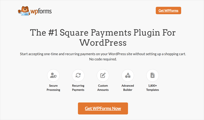
If you are looking to create a Google ad landing page, then I’ve found a great example to take inspiration from.
WPForms ran a PPC ad campaign for the search keyword ‘Square payments plugin’, and they saw a massive 36% increase in conversions.
Here’s why their landing page works so well. First, the design is crisp and sharp, and the copy is straight to the point.
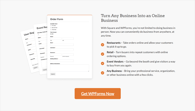
It’s exactly what you want for a PPC landing page. They understand that visitors from ads are often ready to take action, so they’ve removed any unnecessary information that might slow down the decision-making process.
What stands out to me is how well they’ve aligned their keywords and landing page content. When a visitor clicks on an ad for a ‘Square Payments plugin,’ that’s exactly what they see on the landing page. No confusion, no wasted clicks.
They’ve also placed the ‘Get WPForms Now’ call-to-action button throughout different parts of the page. This is a smart move to make sure that no matter where a visitor is on the page, they’re never far from the next step.
What you can learn from WPForms: With PPC, you’re spending money for every click. Make sure to match your content to your ad keywords and keep your call to action within easy reach to maximize your return on investment.
Other than that, I recommend tracking your ad performance using a tool like Google Analytics. You don’t want to make improvements on your landing pages blindly. Instead, use data to focus on efforts that are most likely to boost conversions.
2. Hostinger
Converting visitors is important, but you also want people to feel comfortable and confident when buying from you. I’ve found that overselling is a surefire way to make potential customers skeptical.
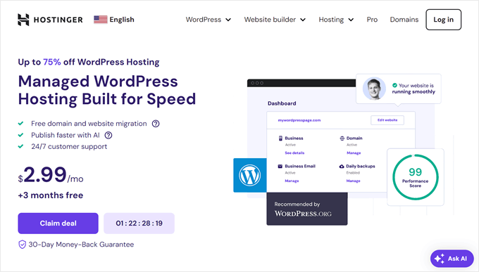
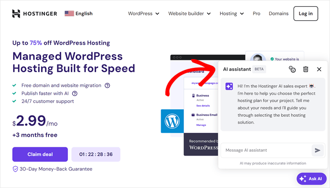
Hostinger‘s landing page strikes a great balance between selling and building trust.
First, let’s talk about the ‘Ask AI’ chatbot button. This is a smart way to give quick answers to visitors’ questions, making it easier for them to decide. The 30-day money-back guarantee also helps people feel safer about trying the service.
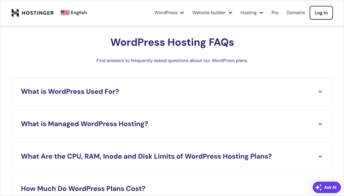
The FAQ section also addresses common questions upfront, which is important for eliminating hesitation.
From WordPress usage to pricing details, they’ve covered all the bases.
What you can learn from Hostinger: Businesses selling technical services should focus on building trust alongside their sales pitch. You will want to anticipate questions and address them on your landing page to remove any doubt about buying your product.
3. Surfshark

Keeping things simple on your landing page can be incredibly effective. In fact, one study shows that when a page goes from 400 to 6,000 elements (like text, titles, and images), the chances of people converting can drop by 95%.
Surfshark’s affiliate landing page is a great example of simplicity.
The top part of the page is clean and uncluttered, with no distracting navigation menu to pull visitors away from the main message. The bright call-to-action button is impossible to miss because it contrasts well enough with the rest of the design.
What really catches my eye is how they’ve personalized the page. By mentioning Mrwhosetheboss, the channel where this affiliate link appears, they instantly create a connection with visitors who have come from that source.
As you scroll down, you’ll find a slider showcasing rotating testimonials from popular YouTubers. This clever use of social proof quickly builds trust and credibility.
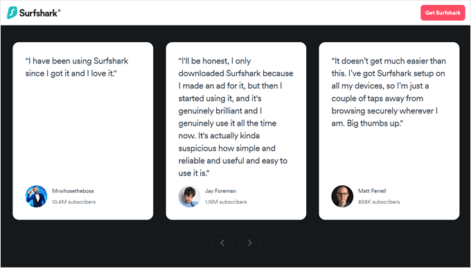
Social proof is a powerful tool to persuade potential customers, which is why page builders like SeedProd have a similar rotating testimonials feature. It’s an effective way to show off positive feedback while saving valuable space on your landing page.
What you can learn from Surfshark: Tailoring content to your visitors can make them feel seen and create an instant connection with them. When that happens, they’re more likely to engage with your page and trust your brand.
Personalization isn’t as complicated as you might think. If you want to implement this strategy, WPBeginner has a guide on how to add dynamic content in WordPress (including personalized campaigns).
4. Trainwell
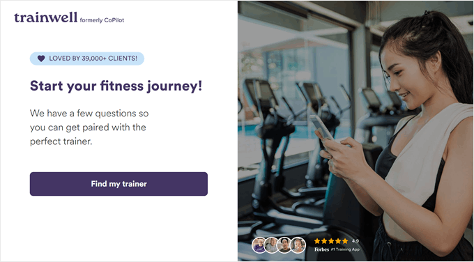
While looking at landing page examples, I’ve seen countless long, scrolling pages packed with information. In reality, that’s not always a good practice, and Trainwell proves that less can be truly more.
They’ve fit everything important onto a single screen so that no scrolling is needed. It’s a bold move that pays off because users can just focus on the essential information without distractions.
Even in this limited space, they’ve managed to include powerful social proof. They’ve prominently displayed ‘LOVED BY 39,000+ CLIENTS!’ along with a 4.9-star rating.
When the ‘Find my trainer’ button is clicked, it leads to a simple survey that will match users with the right personal trainer. The 14-day free trial banner at the top of the survey is a smart way to address potential hesitation.
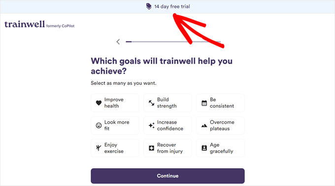
What you can learn from Trainwell: Make the most of a limited space with a clear call to action and social proof elements. Also, perks like a free trial can ease customers into signing up, making them feel like there’s less risk in purchasing from you.
5. PushEngage
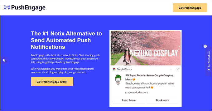
In digital marketing, timing is key. If you strike at the right moment, then you could turn a simple campaign into a big success. PushEngage‘s landing page for Notix users shows how to do this well.
They made this page knowing Notix was closing down, targeting users who needed a new service fast.
What’s great about this landing page is they used ‘Notix alternative’ in their main headings. This best practice can help your landing page show up in relevant searches and improve your ad quality scores.
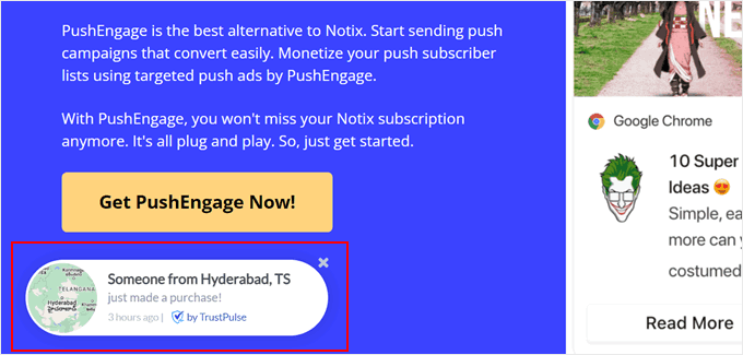
Another aspect I want you to take note of is how they use social proof. They display live notifications with TrustPulse, showing recent purchases from various locations. This clever tactic creates a sense of ‘If others are buying, maybe I should too!’
To top it off, they also share customer case studies with real metrics.
Case studies provide concrete, measurable results that potential customers can relate to. They are more credible than using testimonials alone because they show real-world applications and outcomes for your product or service.
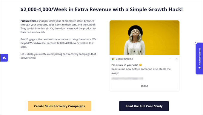
What you can learn from PushEngage: When making a competitor landing page, use their name in your headings where relevant, but don’t just stuff keywords. Also, I recommend thinking outside the box and finding ways to present measurable social proof rather than just users’ opinions.
6. Scentbird
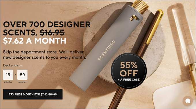
Did you know that one brand boosted its conversion rates by over 300% just by adding a countdown timer? This feature taps into a powerful psychological principle called scarcity.
When we see time ticking away, our brain tells us the opportunity is limited. This creates a sense of urgency that can push us to make decisions faster, and Scentbird uses this tactic brilliantly.
It’s not just about the time running out, though. They’ve paired it with a significant discount: 55% off. This combination of time pressure and perceived value is a powerful mix for driving conversions.
We’re naturally wired to avoid missing out on good deals, and this setup tells our brain, ‘Act now, or you’ll regret it later!’
What’s clever is how they balance this urgency with clear information about how their service works. This addresses potential hesitations without distracting from the main call to action.
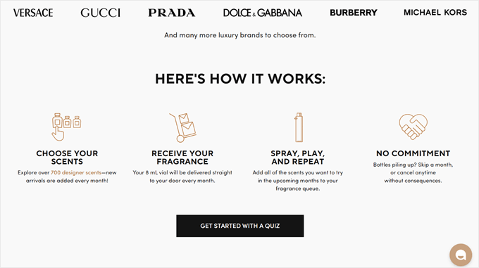
What you can learn from Scentbird: Urgency tactics like countdown timers are powerful for limited-time offers. By creating a sense of FOMO (fear of missing out), you can motivate visitors to act quickly and increase conversions.
7. OptinMonster
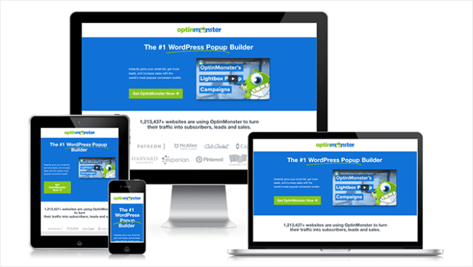
OptinMonster is a powerful lead-generation software that helps businesses turn website visitors into subscribers and customers. But even as a lead generation tool, they still needed help with their landing page.
My team worked on improving their landing page with SeedProd. With our page builder, the OptinMonster team was able to create a new landing page for their PPC campaign in less than 30 minutes, and the results were impressive.
The new page is pretty simple but includes several key features designed to engage and convert visitors. An animated headline grabs attention quickly, while an embedded video explains the product more in detail.

They also use multiple forms of social proof, including statistics, brand logos, and a testimonial carousel, to build trust with potential customers. These changes make the page more compelling and credible.
The results? OptinMonster reduced their cost per acquisition by 47.20%, increased conversions by a whopping 340%, and improved their click-through rate by 13.30%.
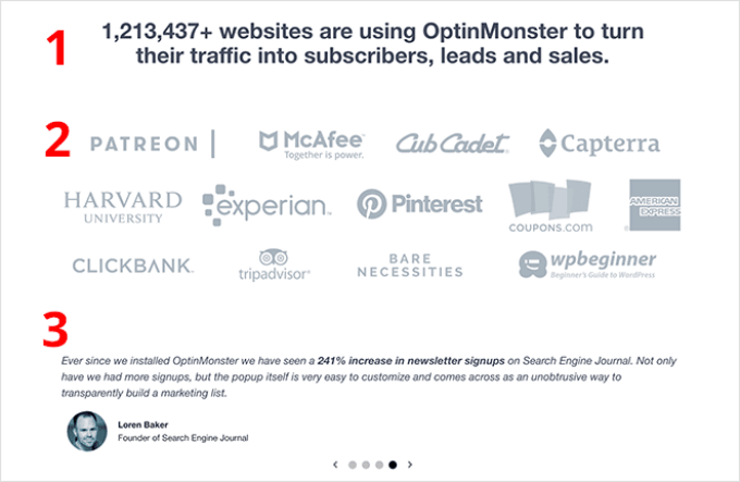
What you can learn from OptinMonster: Sometimes, you can ditch the fancy features and just stick to the basics. So long as you include an attention-grabbing element, explain your product clearly, and build trust with social proof, you’re on the right track.
I actually broke down the formula for a successful landing page in another WPBeginner article. If you want to read my take on it, check out the anatomy of a high-converting landing page.
8. Bellana
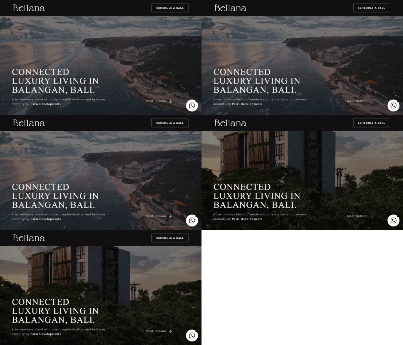
Bellana’s landing page is the perfect example of how to create a strong first impression. Their full-screen video background instantly showcases the beauty of Bali, which is a great way to sell high-end real estate investments.
Instead of pushing for a quick sale, they let visitors imagine themselves in this luxurious setting with the immersive visual. The clean design has a subtle logo and a noticeable but not pushy ‘Schedule a Call’ button.
I’ve found that this emotional connection is crucial for big-ticket purchases. When customers can picture the lifestyle or benefits of a high-value service, they’ll feel more emotionally invested and motivated to take the next step in the buying process.
At the bottom, you’ll find a form to contact the business owner. This smart placement lets visitors build desire before they’re asked to take action.
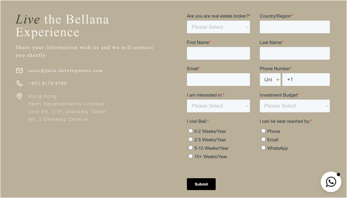
What you can learn from Bellana: Remember, your landing page doesn’t always need to convert immediately. Sometimes, it’s about making a lasting impression that leads to big sales later.
A visually stunning, immersive experience can be more persuasive than a page cluttered with text and calls to action. Don’t be afraid to let your product speak for itself before asking for the sale.
9. All in One SEO (AIOSEO)
Let’s say you run a SaaS company that sells a project management tool. To promote it, you might run a search ad campaign to target keywords like ‘project management software’ or ‘project management tool.’
Here’s an idea I want you to try: create separate landing pages for each of your core product features.
This approach broadens your reach because many people search for specific solutions such as ‘easy task assignment’ or ‘time tracking for teams’ rather than a complete software suite.
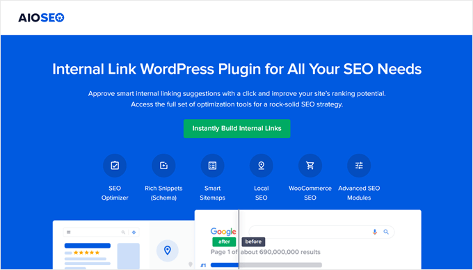
All in One SEO (AIOSEO) is a WordPress SEO plugin that nails this strategy. Their headline and above-the-fold call-to-action focus on internal linking, which is one of the many features this plugin offers.
This works because it meets users where they are in their journey. Someone looking for an internal linking tool might not be ready for a full SEO suite, but you can capture their interest with a targeted solution.
What’s more, it opens the door for upselling. Once users see how well your feature works, they might be interested in exploring your full software package.
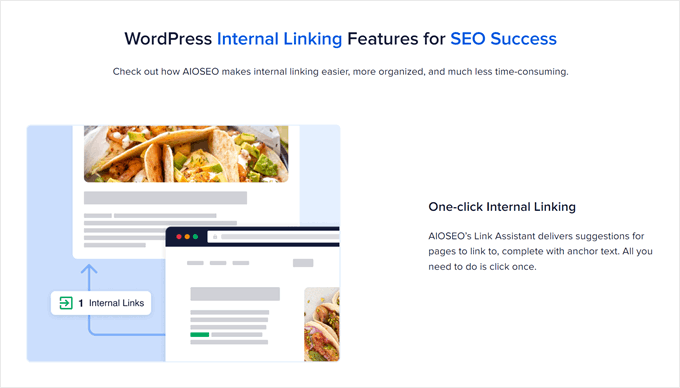
That’s exactly what AIOSEO does. After explaining their internal linking tool in detail, they go on to show the other SEO features the plugin comes with. Since this part is slightly text-heavy, the team uses feature boxes with icons to make it more readable.
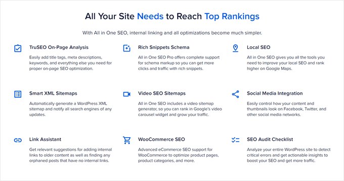
What you can learn from AIOSEO: Creating targeted landing pages for each of your product’s features helps you capture a broader audience. Then, you can meet their specific needs and potentially convert users who might not have initially considered your full package.
10. HelloFresh
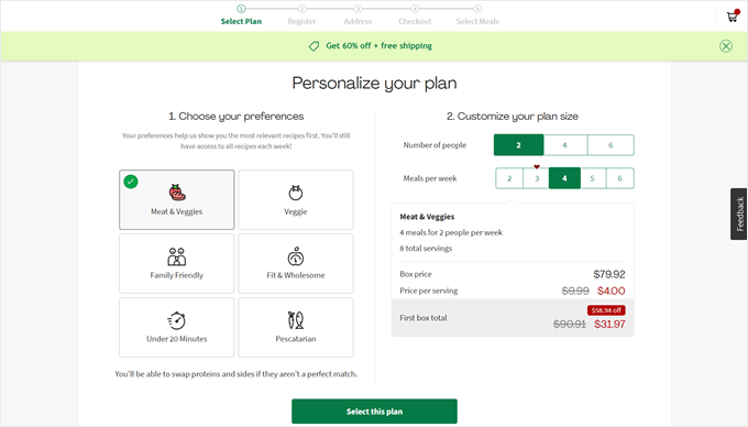
I love how HelloFresh’s landing page immediately starts the signup process when someone opens it. This smart approach keeps people interested and immediately shows what the users can get from their service.
The page breaks down the signup into multiple steps, which is a great practice to increase form completion.
Also, notice how they show the discount offer in the floating banner. It’s an excellent way to remind people that they’re getting a good deal and encourage them to sign up.
What you can learn from HelloFresh: Sometimes, you can show users what they will get by buying from you instead of telling them in your own words. HelloFresh does this well by immediately involving visitors in the signup process.
11. Lead Guru
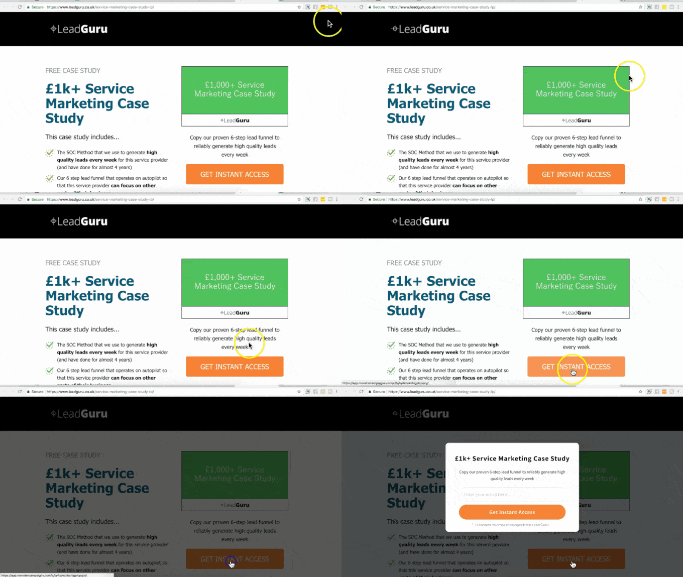
Lead Guru optimized their squeeze landing page with just one small change.
Using OptinMonster, they swapped out a regular form for a special button called a MonsterLink. This button, when clicked, opens a lightbox popup with the opt-in form.
It’s a clever use of the Zeigarnik Effect, which is a psychological principle that suggests people are more likely to complete tasks they’ve already started.
The results paid off big time. Before, 55% of visitors would sign up, but with the popup opt-in form, 81.8% of people who clicked it signed up. That’s a 26% increase overall!
They also added an exit-intent popup to capture organic traffic that might otherwise leave without converting. In my experience, this is a smart move to maximize the value of every visitor. It gives you one last chance to turn a lost opportunity into a lead.
What you can learn from Lead Guru: Try breaking your signup process into two steps. Instead of showing a full form right away, you could use a button that opens a lightbox popup form when clicked. This can make your page less scary and get more people to sign up.
12. Visser Labs
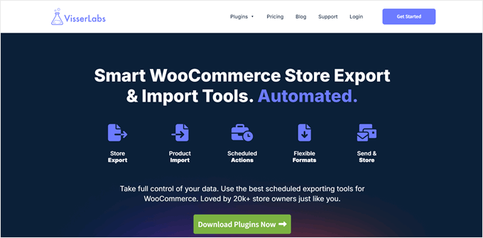
Visser Labs‘ success story demonstrates the power of a well-designed pricing page. My team recently talked with them about how overhauling this element with SeedProd increased conversion rates by over 10%.
The new page has a more updated, modern design and is much more informative about the WooCommerce extension they sell. It guides customers with a ‘Best Value’ tag on one plan and clearly details the differences between the options.
To build trust, they’ve included a 14-day money-back guarantee, SSL security assurance, and social proof mentioning ‘20,000+ store owners’. They’ve also addressed potential concerns with a pre-sales question form and an FAQ section.
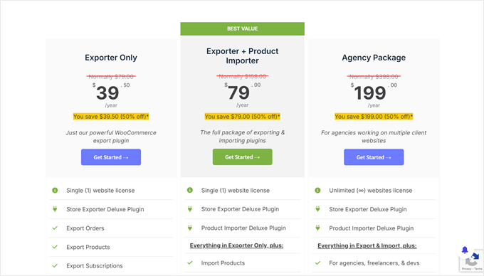
What you can learn from Visser Labs: Make your pricing page clear and trustworthy. Show people exactly what they’re getting and why it’s a good deal. This can really help more people decide to buy, especially if you’re selling something complicated or expensive.
Want to get the same results as Visser Labs? Check out this WPBeginner guide on how to add a beautiful pricing table in WordPress.
I hope these high-converting landing page examples have inspired you for your next marketing campaigns. You may also want to see these guides on how to improve the organic click-through rate in WordPress and the top reasons why your visitors aren’t converting into customers.
If you liked this article, then please subscribe to our YouTube Channel for WordPress video tutorials. You can also find us on Twitter and Facebook.


Jiří Vaněk
I would like to sincerely thank Mr. John Turner for the excellent examples of truly effective landing pages. I’m currently tasked with creating a landing page for an e-book I’ve published, but I’m not a marketing expert and don’t really know how to design such a page to make it truly effective. Here, I have a wealth of great examples from a professional in the field. I’ll definitely go through all of them and hope to draw inspiration from them. So, once again, thank you, Mr. Turner.
Moinuddin Waheed
These are the landing pages that we have been witnessing to for a long time and never stopped there to analyse th science behind their huge conversion.
I think it is very important to think like a buyer’s perspective. why would I buy something and what I look for while purchasing.
This make us feel the right contents for the landing pages.
Thanks John Turner for putting all these converting landing pages together with the lessons learned.
Jiří Vaněk
Thinking like a buyer — now that’s an interesting point. When I was creating my last landing page, I was thinking more like myself rather than like a potential customer. Since I’m a fan of technology, I included a lot of technical elements on the page, but they ended up being distracting, and the conversion rate wasn’t what I had hoped for. So, sometimes it’s crucial to do exactly what you said—think like a stranger who’s visiting the page. What might they be looking for? Where will their eyes go? Where will they expect to find the call-to-action button? It’s challenging, but stepping out of your own perspective, as you mentioned, can really make a big difference.