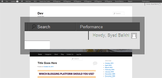
If you have been playing around with WordPress 3.3 (Live Demo included) like us, then you have probably adapted to the new admin bar. Quite honestly, we love the new admin bar design. It is very clean looking (until plugin authors break it). As a plugin author, you have a lot of freedom, but you also have a huge responsibility. There are hooks available for plugin authors to add dashboard widgets, admin bar menus etc. But what happens when a lot of plugin authors start adding their items into the admin bar? We end up with utter chaos for users with smaller resolution (not mobile). Majority of us developers are using screen sizes over 1600px. But there are still users that are on 1200px or 1024px resolutions. Heck even with 1600 resolutions, all it takes is 10 plugins to break the admin bar. Take a look at the screenshot below:

O and if you have 10 plugins adding to the admin bar on a resolution like 1200px or so. You will have the menus drop to the second line as well along with the Howdy area.
So what do we propose?
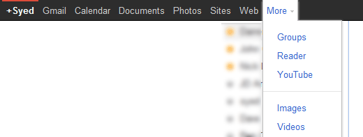
We need to have an admin bar menu called “More” as a drop down. Similar to how Google has it.

In this more drop down, all plugins will be dropped there. This would allow plugin authors to stick to a specific user-interface (UI) which will deliver a better user experience. This will also prevents any inconsistency. If you notice in the first screenshot above W3 Total Cache plugin is shown after the search. That is just inconsistent. Frederick probably had his permission level to be 1000 or something to ensure that his plugin ends up on the last spot (which will guarantee it more exposure). Up until WordPress 3.2, it was great. But with WordPress 3.3, the search is no longer floated right, which makes it look weird for beginners.
All we are saying is that we need a more consistent user-interface.
Next issue is how do we prevent abuse with the more dropdown? Plugin authors are just adding their items to the admin bar thinking it is important. But it doesn’t matter what they think. Users should have a choice in this matter. Just because we are using the plugin WP-Bitly doesn’t mean that all of our editors have to see “Shortlink” menu in the admin bar. There should be a way to remove a menu item from the admin bar if the user doesn’t want it there.
What do you think? Do we need a more dropdown for the WordPress admin bar? Would love to hear your thoughts.


senlinonline
so basically what you’re saying with the article is that the new adminbar was “pushed through” by some people who thought it great, but that little to no thought went into the consequences?
So until your solution becomes the standard I know that I will completely disable that bloody bar for all users, probably even including myself…
Japh
This is certainly an interesting proposal. I’m not sure if it belongs in core WordPress, but certainly there’s a plugin for for managing the way other plugins are added to the various menus. There are already plugins out there to help sort problems like this out in the side menu, like Mark Jaquith’s “Menu Humility” plugin. Something for the admin bar too would be great.
Zach Levine
I use dual monitors so I avoid using the thing altogether
ssjaime
I think that the admin bar should have a more dropdown and that by default all plugin elements are added to the dropdown. Then, there should be a new “menu” type structure allowing a maximum of 3 of those to be given top level.
I use Headway Themes and am grateful that the Visual Editor is integrated in the admin bar. It would be a huge dis-service for me to have this buried in the dropdown…
LewAyotte
I don’t think so… but it could easily be a plugin, customizable according to a administrators needs.
LewAyotte
I don’t think so… but it could easily be a plugin, customizable according to a administrators needs.