Less than a month ago, WordPress 3.7 made its debut. A lot of under the hood features were added like automatic updates, but nothing that the user could see. WordPress 3.8 which is expected to be released in December will be different. This release is focused on improving the user interface for WordPress admin area meaning a lot of visual improvements. In this article, we will show you what’s coming in WordPress 3.8 and how you can try some of these features right away.
Many of the proposed features for WordPress 3.8 are already available for testing and development purposes as plugins. This features-as-plugin approach allowed contributors and developers to work on their projects simultaneously. You can try these plugins in a development environment. However, since most of them are highly experimental, it is not recommended to use them on a production site.
New User Interface For WordPress Admin
We wrote about how MP6 could become the future of WordPress. It is official now. The MP6 plugin will become part of WordPress core in 3.8. It is already in use on WordPress.com sites, and you can give it a try by installing the plugin. It gives WordPress admin interface a modern, optimized, and polished new look that it deserves.
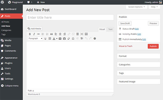
MP6 features a streamlined and improved admin user interface with flattened icons and beautiful color schemes. You can choose a color scheme from Users » Profile.
The current default admin interface comes with only two default color schemes which makes it feel ancient, so these new refreshing colors will be a nice change. MP6 uses Open Sans font which will be shipped with WordPress 3.8. MP6 also brings great improvements to buttons, forms, and the overall appearance of the admin interface making it prettier and user friendly.
A New Less Bloated Dashboard
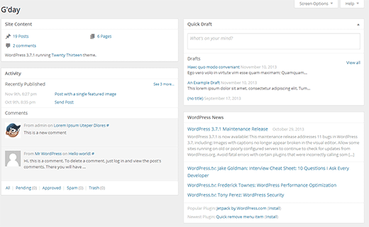
The dashboard screen will also get a face lift in WordPress 3.8. Based on the Dashboard plugin by @lessbloat and the team, the new WordPress dashboard will have fewer and more relevant widgets.
For example, the incoming links widget will be removed. ‘Right now’ widget will be replaced by ‘Activity’ widget. QuickPress on the dashboard screen will be renamed to Quick Draft and will be much simpler.
Better Live Previews of Themes
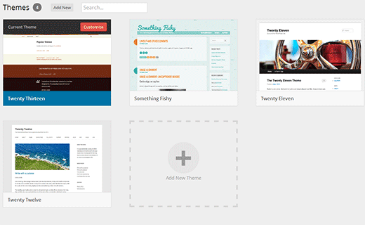
Themes screen in current WordPress has too much text. WordPress 3.8 will bring theme experience plugin (codename Thx38) into core. This will transform the theme screens in WordPress admin area. It has larger theme screenshots and a clutter free user interface. Theme search is moved to the top right corner of the screen. To try this as a plugin on WordPress 3.7 or earlier, you would need to install MP6 plugin first.
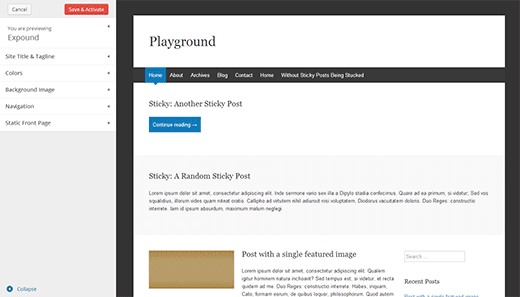
The new theme experience will greatly improve the theme preview experience. You can still see theme previews in WordPress 3.7 without activating a theme. However the new theme experience will provide a better user interface to do that. You can completely collapse the sidebar and see the full screen theme previews. It is also much faster and prettier than previous theme screen.
A Friendlier and Easier Widget Area Chooser
Widgets are an easier way for users to drag-drop elements into their sidebars and other widget ready areas. This allows theme developers to build themes with multiple widget ready areas, so the users can create their own website layouts. With multiple widget ready areas and tons of widgets to choose from, sometimes it becomes difficult to drag and drop a widget into the right sidebar.
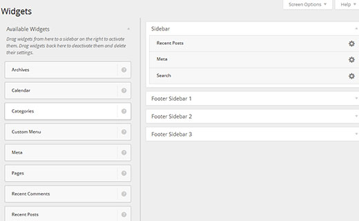
With WordPress 3.8, this problem will be solved with a new User Interface for the widgets screen. The new Widgets screen will allow users to easily choose the sidebar they want to add a widget to without dragging it across different sidebars. The new widget interface will be cleaner, clutter free, and visually appealing.
A New Default Theme – Twenty Fourteen
Twenty Fourteen will be the new default theme for next year which is expected to be released in WordPress 3.8. It is a magazine style theme with support for featured content to be prominently displayed across the site. If your site does not use featured images, Twenty Fourteen makes sure that it looks pretty out of the box without featured images as well.
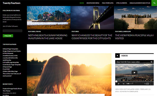
Twenty Fourteen will allow users to customize the featured content area. They can choose to have a grid style layout or a slider. Users can choose which content to be featured by adding a tag in the theme customizer. Twenty Fourteen will then look for posts with the tag and display them in the featured content area.
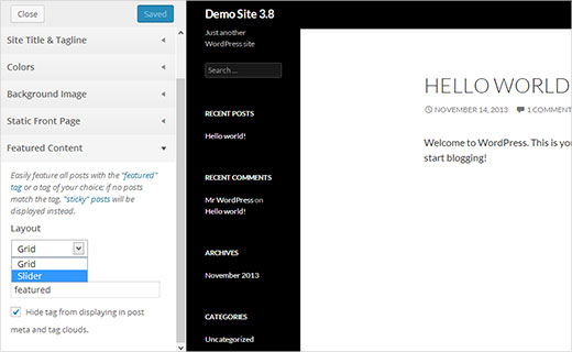
You can see a demo of currently under development version of the theme here.
We’re not huge fans of this left aligned layouts, but we’ll see if it starts to grow on us. From the current looks, this theme looks extremely crowded.
Other Features
Another much anticipated feature is Omnisearch. It is a global admin search feature that you can use to search for media, posts, pages, content, files, plugins and themes on your WordPress site. It is under development and will not be shipped with 3.8.
These were some of the top features coming in WordPress 3.8 that we’re looking forward to. Which one of these features are your favorite? What would you like to see in a future WordPress release? Let us know by leaving a comment below.
If you liked this article, then please subscribe to our YouTube Channel for WordPress video tutorials. You can also find us on Twitter and Facebook.



vahid
hi guys
tanks for your nice and tricky blog…
if possible pls make demo for every post and tutorial to find out better result.
mukesh saini
it’s superb…..thnx
sajib mannan
Nice i like it….!!. Carry it on
Sivaprabu Ganesan
In 3.8 in browser use Ctrl + – Reduce screen the alignment not fit………
adam
I think that dark interface makes my eyes tired…
Dave Navarro
I think I read somewhere that the core was being split up in such a way that different teams can updates parts of the core without having to wait for a major update. That way we can get updates from teams that move quicker.
Did that actually happen? Did core get re-arranged?
Cheryl Gnad
Thank you for this post! I have the new WP loaded and have found that the widgets area doesn’t work! Have have moveable widgets and have aren’t moveable at all! How do I fix it? Uninstall and install the new WP version again?
Faysal Shahi
Themes Panel is Looking gr8
Praveen Prasad
Thanks for the Information
igor
Well hello Syed Balkhi and team whilst its great news to hear about further improvements to WordPress what I would really love to see is a way to manage revisions.
For instance once we publish an article why not automatically, or manually purge all the revisions which for a complicated post or page can run into double digits which of course clutters the database.
As Dave has pointed out there are far more important tweaks to be made than simply creating new themes and adding a splash of color to the dashboard! This lack of ambition is one reason why the there is a growing discussion about the merits of switching to alternatives with greater ambition
igor Griffiths
WPBeginner Support
@igor We totally agree with you that there should be a better way to manage revisions, as well as over all editorial workflow. At WPBeginner we user Editflow but there are many things that can be integrated right into core. The core development team is aware of these things and in fact there is work under progress to address these things.
Admin
Mary
Thank you for this post. I would have been very confused with the next update. So far, the updates have kept the interface the same with no learning curve. So this really helps.
I don’t know what my favorite is, because I have not had problems since they fixed the bug that lost work when updating.
Other than that, its hard to imagine that this free platform is so comprehensive. Thanks Mary
Sumeet Chawla
The new 2014 theme looks amazing ! It will serve a lot of purposes out of the box
John Parkinson
Thanks for the info Syed! I agree with DAVE NAVARRO about the image gallery. Maybe 3.9?
Greg
The omnisearch idea sounds brilliant. What a better way for the new users to find what they read about and talk about quickly without having someone show them in person.
ConnieM
I hope the admin-interface will provide a more visible look for input-fields… these tiny highly grey borders are really a pest for people whose eyes not as sharp as they were once, ;=(
Danny
Definitely will welcome the new Dashboard and 2014 theme. And I do hope they’ve made the user experience better for adding widgets to sidebars, especially if you’ve a lot of widgets and had to scroll.
Dave Navarro
I’m still disappointed that they’re not addressing the image gallery. It’s extremely difficult to browse images in the gallery if your site has hundreds or thousands of images. They need to add an image taxonomy for organizing images into categories.
adolf witzeling
Looking very promising. Lots of improvements on the visual experience site, I like that. I don’t know about the new 2014 theme-aims more towards a specific target group like photographers, portfolios etc. My favorite theme of all time is definitely the FREE Responsive theme-Easy to customize.
I’ve been using the MP6 plug-in for a little while now and I love it-it was overdue to amp up the dashboard with a more up-to-date look.
One thing though I’m missing is that the media gallery interface is still as clumsy and un-intuitive as can be. Would be great if it had some contents organizing tools build in, to help group contents into folders based on different criteria-sort of like Adobe Bridge.
I’m using the Media Grid plug-in right now and it makes the browsing through images a lot easier.
Overall I’m excited about the new release. Thanks for this great review of the upcoming release.
Leona Martin
Interesting features, but nothing really exciting. May hold off on updating for awhile longer to see if Wordpress needs to work out any kinks.
Praveen Prasad
When Is the WordPress 3.8 Expected to be released?
Ajay K Meher
December 12 is the target date for release of WordPress 3.8.
Editorial Staff
First 2 weeks of December. No exact date set yet.
Admin
Remco van Harten
December 12 is the target date for release WP 3.8.
http://make.wordpress.org/core/version-3-8-project-schedule/
Jon Täng
12 Dec is preliminar release date.
TheDesignCreative
Been using the mp6 since the begining. Love that it is now being introduced in WordPress full time. Love the 2014 theme as well. Didn’t like the 2013 theme at all.
Geoffrey Gordon
Looks exciting. I like the new look of the dashboard interface. 2014 theme looks interesting but I like my genesis theme.
Thanks Syed
Editorial Staff
Yeah MP6 definitely is different. It is also very easy to customize. My personal blog will probably rock a purple theme
-Syed
Admin