Reviewing the mobile version of your WordPress site in a desktop preview is a simple but essential task. It lets you check how your site looks on smaller screens, helping you spot layout issues or design flaws you might miss otherwise.
Over the years, we’ve worked with many website owners to make sure their sites look great and function well on mobile devices. We also prioritize mobile-friendly designs whenever we create new pages and posts on the WPBeginner site.
One challenge we’ve noticed is that checking the mobile version on a desktop can be tricky without the right tools. Without an easy preview option, you might end up making changes without knowing how they affect mobile users.
Luckily, WordPress’s Theme Customizer and Google Chrome’s DevTools Device Mode allow you to quickly preview and make adjustments. In this guide, we’ll walk you through both methods to view the mobile version of WordPress sites from the desktop.
Why You Should Preview Your Mobile Layout
More than 50% of your website visitors will access your site using their mobile phones, and around 3% will use a tablet.
This means having a site that looks great on mobile is very important.
In fact, mobile is so important that Google now uses a mobile-first index for its website ranking algorithm. This means that Google will use your site’s mobile version for indexing. You can learn more by reading our ultimate guide to WordPress SEO.
Even if you use a responsive WordPress theme, you still need to check how your site looks on mobile. You might want to create different versions of key landing pages that are optimized for mobile users’ needs.
It’s important to remember that most mobile previews will not be completely perfect because there are so many different mobile screen sizes and browsers. Your final test should always be looking at your site on a mobile device.
In the following sections, we’ll look at how you can view the mobile version of your WordPress website on a desktop.
We are going to cover 2 different methods for testing how your site looks on mobile using desktop browsers. You can click the links below to jump to any section:
Let’s get started!
Method 1: Using WordPress’s Theme Customizer
You can use the WordPress theme customizer to preview the mobile version of your WordPress site.
Simply log in to your WordPress dashboard and go to the Appearance » Customize screen.
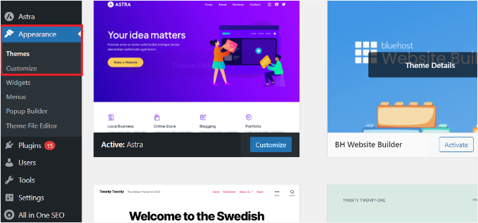
This will open up the WordPress theme customizer.
Depending on what theme you are using, you may see slightly different options in the left-hand menu.
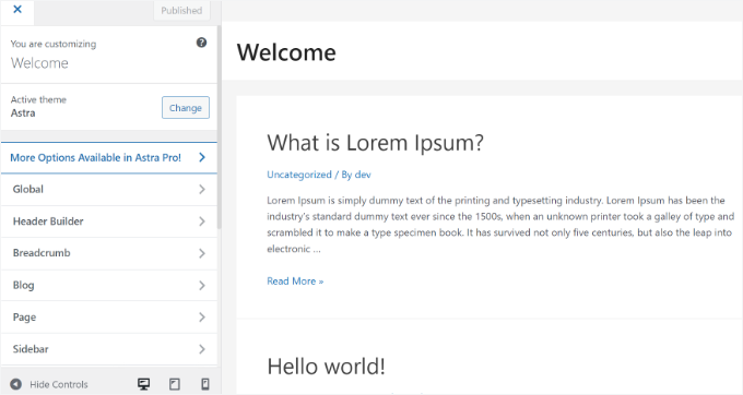
At the bottom of the screen, simply click the mobile icon.
You will then see a preview of how your site looks on mobile devices.
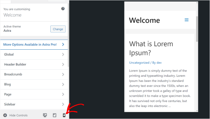
This method for previewing the mobile version is particularly useful when you haven’t finished creating your blog or when it’s in maintenance mode.
You can now make changes to your website and check how they look before you push them live.
Method 2: Using Google Chrome’s DevTools Device Mode
The next method for how to view the mobile version of the website is using the Google Chrome browser.
The Google Chrome browser has a set of developer tools that let you run various checks on any website, including previewing how it looks on mobile devices.
Simply open the Google Chrome browser on your desktop and visit the page you want to check. It could be a preview of a page on your site or even your competitor’s website.
Next, you need to right-click on the page and select the ‘Inspect’ option.
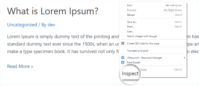
A new panel will open up on the right-hand side or at the bottom of the screen.
It will look something like this:
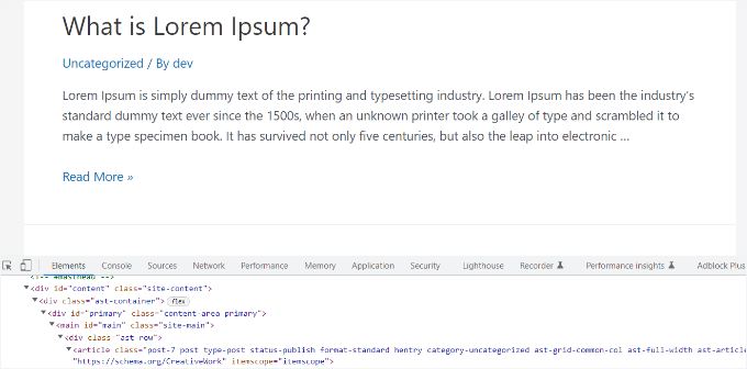
In the developer view, you will be able to see your site’s HTML source code, CSS, and other details.
Next, you need to click the ‘Toggle Device Toolbar’ button to change to the mobile view.
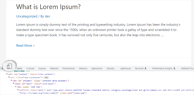
You will see the preview of your website shrink to the mobile screen size.
Your website’s general appearance will also change in the mobile view. For instance, the menus will collapse, and additional icons will move to the left instead of the right of the menu.
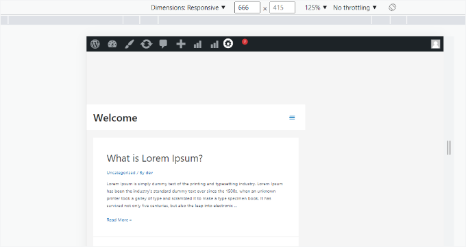
When you hover your mouse cursor over the mobile view of your site, it will become a circle. You can move this circle with your mouse to mimic the touchscreen on a mobile device.
You can also hold down the ‘Shift’ key, then click and move your mouse to simulate pinching the mobile screen to zoom in or out.
Above the mobile view of your site, you will see some additional options.
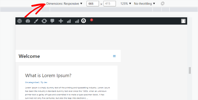
These settings let you do several extra things. You can check how your site would look on different types of smartphones.
For example, you can select a mobile device like an iPhone and see how your site appears on it.
You can also simulate your site’s performance on fast or slow 3G connections. Using the rotate icon, you can rotate the mobile screen.
Bonus Tip: Creating Mobile-Specific Content in WordPress
It’s important that your website has a responsive design so that mobile visitors can easily navigate your website.
However, simply having a responsive site may not be enough. Users on mobile devices often look for different things than desktop users.
Many premium themes and plugins let you create elements that display differently on desktop versus mobile. You can also use a page builder plugin like SeedProd to edit your landing pages in mobile view.
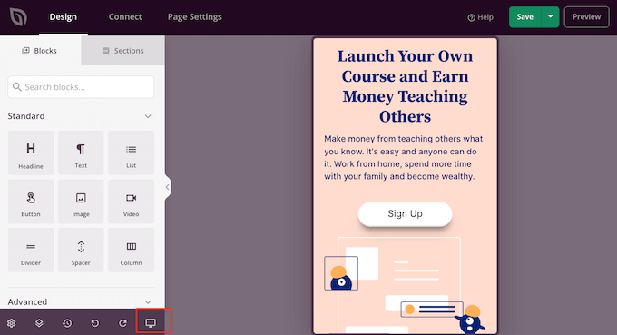
You should consider creating mobile-specific content for your lead generation forms. On mobile devices, these forms should ask for minimal information, ideally just an email address. They should also look good and be easy to close.
For more details, you can see our guide on how to create a landing page in WordPress.
Another great way to create mobile-specific popups and lead-generation forms is with OptinMonster. It is the most powerful WordPress popup plugin and lead-generation tool on the market.
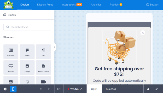
OptinMonster has specific device-targeting display rules that allow you to show different campaigns to mobile users vs. desktop users. You can combine this with OptinMonster’s geo-targeting feature and other advanced personalization features to get the best conversions.
You can see our guide on how to create mobile popups that convert for more information.
Video Tutorial
Before you go, you might want to check out our video tutorial on how to view the mobile version of WordPress sites from the desktop.
We hope this article helped you learn how to preview the mobile layout of your site. You may also want to see our expert picks for the best plugins to convert a WordPress site into a mobile app and learn ways to create a mobile-friendly website.
If you liked this article, then please subscribe to our YouTube Channel for WordPress video tutorials. You can also find us on Twitter and Facebook.


Dayo Olobayo
This is a really timely article for me. I’m in the process of redesigning my website, and I want to make sure it looks good on both mobile and desktop. I’ll definitely be trying out the methods you described in this post.
Dennis Muthomi
This post couldn’t have come at a better time!
I’ve been looking for ways to preview my WordPress site on various mobile devices without having to manually check on a bunch of different phones and tablets. I had no idea that the Google Chrome DevTools had a built-in device mode – definitely going to be using that from now on.
WPBeginner Support
Glad we could show the easy way to test this
Admin
Dennis Muthomi
I have just also discovered that I can take screenshots of the different device views in Chrome DevTools, there’s alot of useful tools to test
Mrteesurez
That’s good, I don’t even know of this, thanks for sharing your what you discovered. In these day where larger percentage of users are using mobile to visit and browse website, it’s important to optimize one’s website for mobile and knowing how to preview it on different screens making it easier to adjust site’s elements.
Mrteesurez
I normally used page builder for this, now I just discovered we can use theme customizer, it’s even shows the three screens size to switch between different devices screen. Thanks.
Ralph
On my website I have even 75-77% mobile traffic every single month. My theme is responsive but article preview (mobile) in wordpress itself never looks like a post on my phone. Nor on my wifes phone.
With my new website I’m making from scratch I even think about building it 100% for mobile users.
Is SeedProd ok for that? Or I should look up for specific builder?
WPBeginner Support
SeedProd will allow you to create a responsive theme for your site
Admin
Moinuddin waheed
This is very important aspect as most of the traffic comes from the mobile itself and having a good user interface will definitely help in good visual experience.
I have used generateblocks pro and generatepress and it has also the same feature to tweak the mobile version appearance of the website.
Almost all the themes and page builders now a days include this feature.
WPBeginner Support
It is definitely a good feature to have
Admin
Jiří Vaněk
Elementor also offers a similar function for those building websites using this builder. At the bottom of the left-hand menu, there’s a toggle feature to display the layout. Here, you can switch between desktop, tablet, and mobile views. You can also add your own breakpoints and create custom resolutions for testing purposes. Personally, I’ve found it very useful to check the website’s appearance across multiple devices because, surprisingly, due to the responsive template, the article layout, especially with Elementor, can look dramatically different.
WPBeginner Support
Thank you for sharing, page builders have started adding this view toggle for their users
Admin
Moinuddin Waheed
I think almost all the page builders are now making this option to make the mobile version look and appearance to be as good as the desktop version.
I have been using seedprod and found it to be very smooth in testing mobile version.
the best thing about seedprod is that we don’t need to make much changes to have good mobile appearance rather a small tweak does the job in most of the cases.
Mrteesurez
I just started experiencing Seedprod not too long. I use Elementor to preview my website in different screen sizes and it ok for me. But I discovered something from Seedprod that want to make switch so having such testing functionality is an additional benefit for me.
ilham ilmam aufar
hello wpbeginner,
what if i want make mobilw view permanent on desktop view?
thanks
Sakirah
Hello, I have a problem with loading my site on mobile. It displays as Mobile Site view, classic version without theme. I have to click View Full Site at the bottom to display the responsive theme. I want to force View Full Site so that the responsive theme is auto display to any mobile.
WPBeginner Support
You would want to check your site to see if you have a plugin that would be enabling that mobile view as that should not be default WordPress behavior.
Admin
daniel
there’s a much easier way to do this just by clicking the inspect tool and enable mobile mode ( button on the yop left with a phone icon ).
WPBeginner Support
That is method 2 in this article.
Admin
Larissa mokom
Hello, Thank you for all the information you are sharing on here i am able to follow your guides step by step to be able to come up with my blog my question is how would i be able to fix the problem of my widgets ( home,about, contact us) not displaying when my website is pulled on a mobile device but on a computer everything is looking good.
WPBeginner Support
You would want to reach out to your theme’s support to ensure this isn’t a choice based on the theme’s styling.
Admin
Samson Onuegbu
Whoa!
WPbeginner always give the best hacks that many never know existed.
We will be launching our site soon and you have just made my responsive site building job easier.
Thanks a lot!
WPBeginner Support
You’re welcome, glad you found our recommendations helpful
Admin