Landing pages are designed to turn website visitors into customers, subscribers, and leads. However, there is always room to improve their conversion rates.
Over the years, we have experimented with plenty of landing page strategies to improve conversions on our websites. We are always testing new techniques and tips to generate more leads. From using attractive layouts to adding social proof and large call-to-action buttons, we have tried it all.
Through this hands-on experience, we now have a solid understanding of what it takes to create a successful landing page that actually converts.
In this article, we will share some of proven tips to increase your landing page conversion rate by up to 300%.
Here is a quick overview of the topics we will cover in this beginner’s guide. You can use the links below to jump to specific sections:
- Creating a Conversion Oriented Landing Page Design
- Choose One Call to Action for Your Landing Page
- Use Simplicity in Landing Page Design
- Use Colors and Contrast to Drive Action
- Use Urgency For Higher Landing Page Conversions
- Add Social Proof to Your Landing Page
- Using Live Chat to Answer User Questions
- Make It Easier for Users to Contact You
- Convert Abandoning Visitors with Timely Prompts
- Optimize Your Landing Page for SEO
- Improve Page Load Speed for Higher Conversions
- Track Conversions to Optimize Your Landing Pages
Ready? Let’s get started.
1. Creating a Conversion Oriented Landing Page Design
First, you need to make sure that your landing page is designed for conversions.
As a small business owner, you may not have the skills to design a landing page for higher conversions or code the design from scratch.
This is where SeedProd comes in.
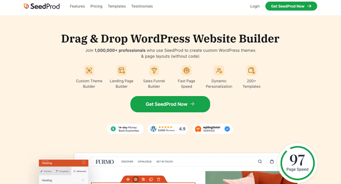
It is the best landing page builder for WordPress and allows you to easily create beautiful landing page layouts that are professionally designed and optimized for conversions and sales.
SeedProd works with essential third-party tools that you may already be using. This includes top email marketing services, WooCommerce, Google Analytics, and more.
First, you need to install and activate the SeedProd plugin. For more details, see our step-by-step guide on how to install a WordPress plugin.
Upon activation, you must enter your license key. You can find this information in your account on the SeedProd website.
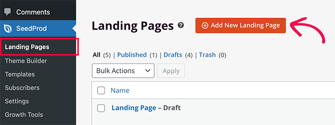
After that, you can simply go to the SeedProd » Landing Pages screen and click the ‘Add New Landing Page’ button.
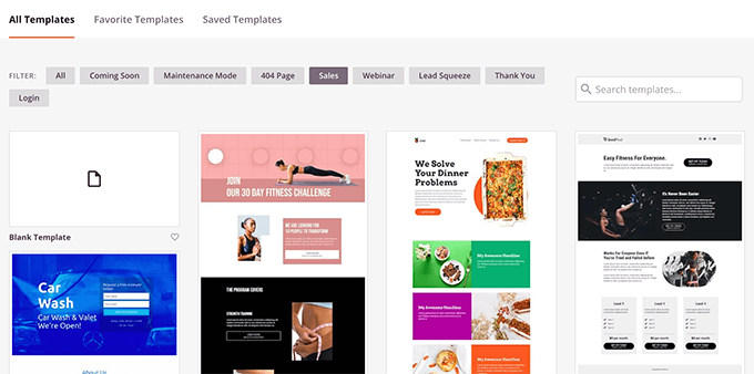
Next, you’ll be asked to choose a template.
You can start with a blank template or choose from one of several pre-made landing page templates that are already optimized for conversions.
You can then provide a title and URL slug for your page.
Once you do that, SeedProd’s intuitive drag-and-drop builder will load on the screen.
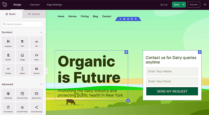
You can now point and click on any item on the page to edit it. You can also add commonly used landing page design blocks from the left column.
For example, you can add testimonials, optin forms, FAQ accordions, and more.
Once you are satisfied with the design, you can switch to the ‘Connect’ tab to integrate with popular email marketing platforms or more than 3000 third-party apps via Zapier.
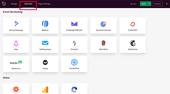
After that, you can switch to the ‘Page Settings’ tab.
From here, you can change the SEO settings, add Google Analytics tracking, and add header or footer scripts.
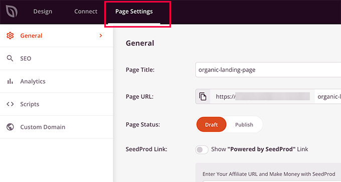
You can also connect your page to a custom domain name. This comes in handy for users creating multiple landing pages targeting different regions.
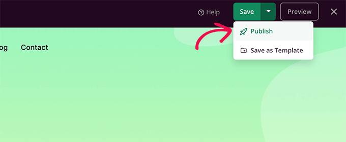
Finally, you can go ahead and save or publish your landing page.
You can now see your landing page live in action by opening it in a new browser tab.
For more detailed instructions, you may want to see our tutorial on how to create landing pages in WordPress.
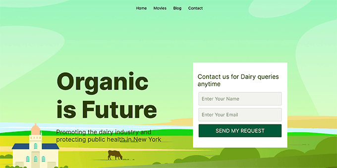
Creating a beautiful landing page is not the end of conversion optimization. In fact, there is a lot more you can do to boost conversion rates even further.
Let’s take a look at some of these tried and tested landing page best practices.
2. Choose One Call to Action for Your Landing Page
One of the most common landing page mistakes is not setting a proper goal for your campaign.
For instance, having multiple calls to action on the same page can distract or confuse your visitors, and they end up leaving without taking action.
The best practice is to set one course of action for users to take. For instance, if your goal is to capture email leads, then your optin form should be the only action to take on your landing page.
That can mean removing navigation menus and other links from the page or making them stand out less.
Similarly, if you want users to make a purchase, then this should be the only course of action users are directed to.
Following are a few landing page examples with clearer calls to action.
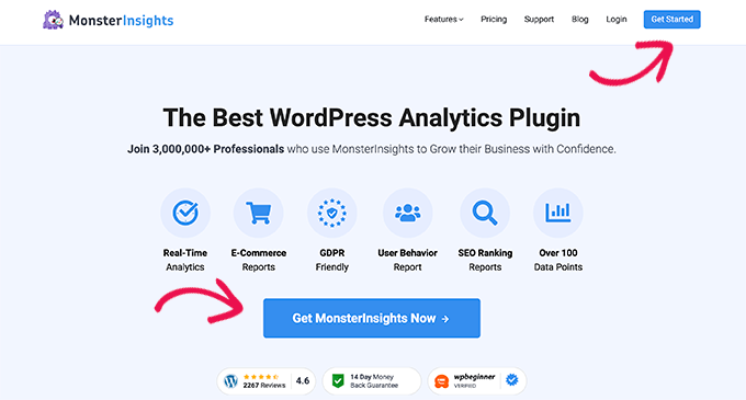
The MonsterInsights landing page has two very clear call to action buttons that lead users to make a purchase.
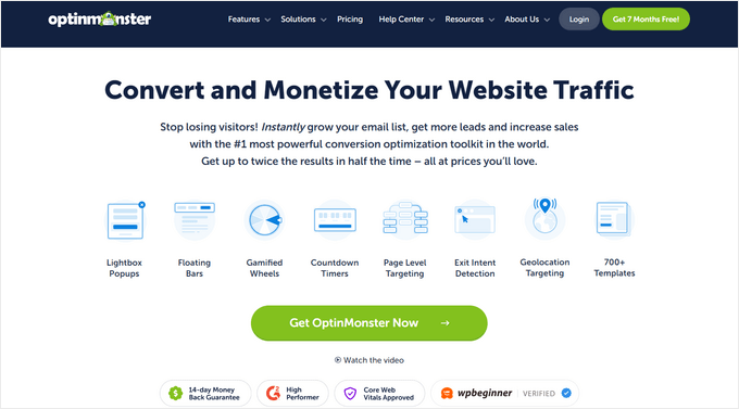
OptinMonster is a conversion optimization and lead generation software, and they have several landing pages for different use cases. Each one of them is targeted to different audiences.
3. All in One SEO for WordPress
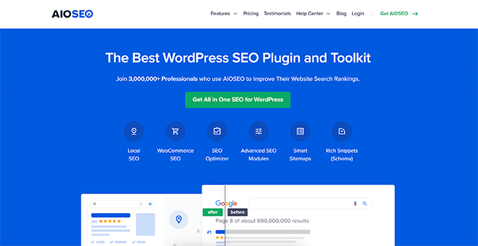
All in One SEO is the best WordPress SEO plugin on the market. For their landing page, they use a similar strategy. Under the features tab, you can view more landing pages for each feature, all of which lead users to make a buying decision.
As you can see, all of these pages have a clear call to action that is designed to stand out from the rest of the page.
3. Display Simplicity in Landing Page Design
For higher conversion rates, you want users to focus on the call to action and not get distracted.
A cluttered landing page design can easily distract users away.
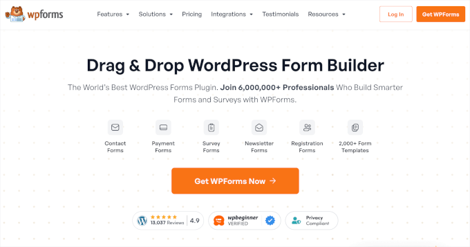
To avoid this, make sure that you keep your landing page layout clean and simple. Using lots of empty space, color contrast, and large fonts can help you easily achieve that simplicity.
Here is an example of the WPForms landing page that uses a light background to make the CTA button stand out.
4. Make Use of Colors and Contrast to Drive Action
It’s smart to make your call to action more prominent than other sections of your landing page so that it draws the eyes of your visitors.
The easiest way to do this is by using bright, contrasting colors.
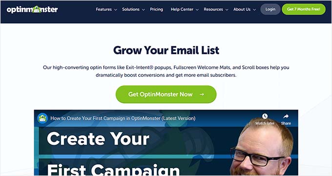
You can also use this technique to keep less significant information distracting users from main conversion goals. Simply choose a color that is similar to the colors on the rest of the page.
5. Showcase Urgency For Higher Landing Page Conversions
Limited offers are an effective marketing technique you’ll see everywhere.
That’s because the scarcity adds urgency to an offer, which makes it harder for users to ignore.
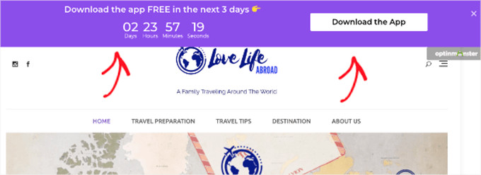
You can use the same marketing principles on your landing page by adding a countdown timer to your landing page layout.
6. Add Social Proof to Your Landing Page
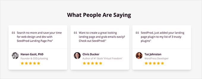
People are more likely to buy a product if they see other people buying or recommending it. This concept is called social proof, and there are many different ways you can add it to your landing page to boost conversions and reduce bounce rates.
The most common type of social proof is customer testimonials. SeedProd comes with a built-in testimonials block to easily add testimonials to your landing page.
For details, you can see our tutorial on how to add a customer reviews page in WordPress.
Another way to add social proof is by using TrustPulse on your landing page, which is the best WordPress social proof plugin on the market.
It allows you to easily show small popup banners with live notifications of customer activity on your website.
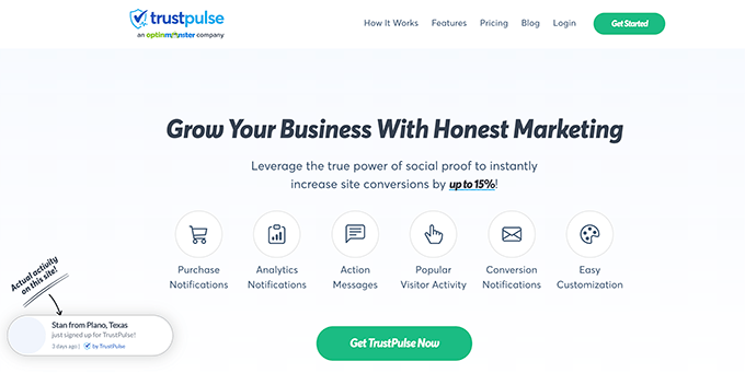
This adds a FOMO effect to your landing page, encouraging more users to convert.
TrustPulse also works with all popular eCommerce platforms and can automatically detect your visitors’ actions on your website. It can show email conversions, user sign-ups, and many other notifications as well.
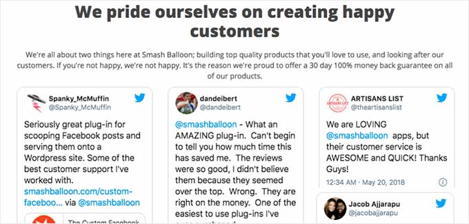
Lastly, you can also embed actual tweets and social media posts from your customers to your website as social proof. Smash Balloon’s Twitter Feeds Pro allows you to create a custom feed of user tweets that you can then embed on your landing page.
7. Using Live Chat to Answer User Questions
Most of the time, customers abandon a landing page simply because they can’t find the information they need.
A lot of time, they need that information instantly. Luckily, there are easier ways to help your customers without setting up a dedicated team.
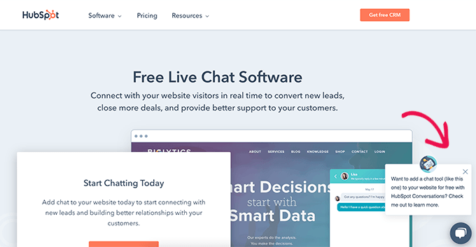
First, you can add a live chat bot to your website that can help users find the answers they are looking for right there on your landing page.
You can also set up a business phone number that allows customers to reach out to your sales or support team directly from your landing page. You could even use an auto attendant service so you don’t have to answer the calls yourself.
8. Make It Easier for Users to Contact You
Some of your customers may not have time to make a phone call or interact with live chat. Often, customers just want to leave a message.
That’s why it’s important to make sure that it’s easy for users to reach out by adding a contact form to your website.
WPForms is the best contact form plugin for WordPress. It allows you to easily add a contact form to your website.
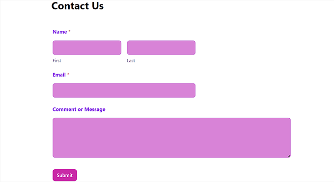
Plus, it is a full-fledged form builder that you can use to capture leads and improve user experience by adding a request a quote form, an order form, a user registration form, and more.
For details, you can see our tutorial on how to create a contact form in WordPress.
9. Convert Abandoning Visitors with Timely Prompts
Showing users a personalized message just when they are about to leave your website has proven to be a successful technique in capturing abandoning users.
OptinMonster allows you to easily create exit intent popups that automatically detect when a user is about to leave your landing page and display a popup.
For example, Easy Digital Downloads shows this popup when a visitor is about to abandon the checkout page.
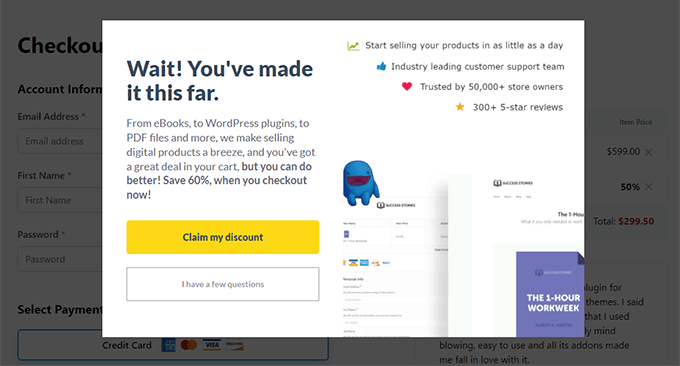
You can display a popup with custom coupons, time-limited offers, buy 1 get 1 free offer, and other promotional tools to convert those customers.
OptinMonster also allows you to create personalized campaigns. You can modify your popup based on the user’s geographic location, pages they have seen, or products they have looked at.
10. Optimize Your Landing Page for SEO
Search engines are the main source of free traffic to any website. Optimizing your landing page for SEO helps you rank higher in search engines, which brings more traffic for you to convert.
All in One SEO for WordPress is the best SEO plugin on the market. It allows you to easily optimize your website for SEO.
For more details on using it, see our tutorial on how to properly install and set up All in One SEO for WordPress.
Another benefit of this is that it ensures that your landing page shows the right title and image on Facebook and other social networks.
11. Improve Page Load Speed for Higher Conversions
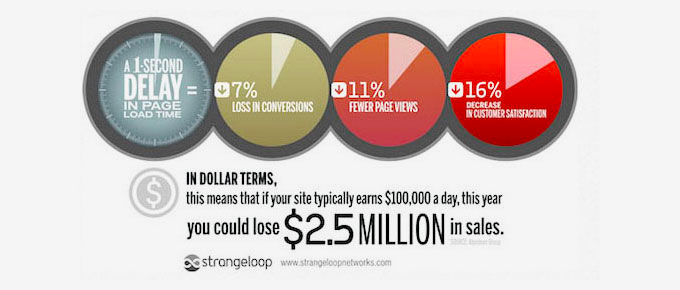
No one likes a slow website. In fact, studies show that a second delay in page load can cause a 7% loss in conversions, 11% fewer page views, and a 16% decrease in customer satisfaction.
You can see how much time your landing page takes to load by testing it with an online speed test tool.
For speed optimization, see the ultimate guide on how to improve WordPress speed and performance with step-by-step instructions.
12. Track Conversions to Optimize Your Landing Pages
We believe that you can’t improve what you can’t measure.
To optimize for higher conversions, you need to first make sure that you properly set up conversion tracking for all your landing pages.
This helps you see how your landing page is performing and check its load time. If you have multiple landing pages, then you can also see which ones are performing best.
The easiest way to set up conversion tracking is by using MonsterInsights. It allows you to easily install Google Analytics in WordPress.
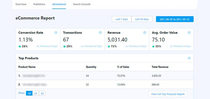
It also comes with enhanced eCommerce tracking, which allows you to see your eCommerce conversion rate inside the WordPress admin area.
For more details, see our ultimate guide on conversion tracking in WordPress to learn how to set it up and how to track different conversion goals on your website.
Once you have baseline data, then you can set up A/B test campaigns to further optimize your landing pages.
We hope this article helped you find ways to improve your landing page conversions. You may also want to see these bonus tips on capturing abandoned cart sales or see these proven tips to increase your website traffic.
If you liked this article, then please subscribe to our YouTube Channel for WordPress video tutorials. You can also find us on Twitter and Facebook.



Jiří Vaněk
Great article full of interesting tips. Some of them caught my attention because I designed my landing page on my own, and according to the article, I placed some things incorrectly. For example, I had several calls to action on the page. I’ll need to review it and make some changes because I want it to have a greater impact. There are many ideas and suggestions here that I can apply. Thank you for sharing your know-how and valuable experience.
kzain
I’ve been struggling to improve my landing page conversion rates. The tips on simplifying design and creating strong CTAs are really helpful. I’m excited to start implementing these changes. Thanks for sharing!
Moinuddin Waheed
This blog post is very informative and useful. I have been planning to use landing page for my computer institute to enroll as many students as I can.
Now I can implement all these with the help of this guide and I can ensure that maximum students get enrolled to courses listed.
Thanks wpbeginner for this wonderful post as usual.
Amisha Parmar
I am a regular reader of wpbegginer articles. All blogs and articles on WordPress help a lot the users. and This article’s The easiest ways & proven tips are amazing. Keep sharing the wonderful posts.
WPBeginner Support
Glad you found our article helpful!
Admin
Td Hunt
As usual, very informative content! You and your team do an excellent job of delivering useful information, tips and tricks to help people improve their websites. It’s always of great value to read your articles. So, thank you for doing what Ya’ll do, and please keep it coming!
WPBeginner Support
Glad you found our guides helpful
Admin