A seamless user experience (UX) encourages website visitors to stay and explore. But if it’s clunky, they might immediately leave, taking potential sales with them.
Running a UX audit can uncover hidden obstacles on your site. At WPBeginner, we routinely audit our sites to stay ahead and connect better with our users, and we’ll show you how to do the same.
Don’t worry, though, you don’t need to be a tech wizard to do it!
In this article, we’ll guide you through conducting a UX audit of your WordPress site.

What Is UX, and Why Is It Important?
User experience or UX describes users’ feelings and opinions while using your WordPress website.
A pleasant user experience means users find your website easy to use and helpful. By contrast, a poor user experience means users find your website difficult to use and can’t do what they want to do.
🌟 Here’s the big advantage: Creating a great user experience helps users get the most out of your website. This eventually leads to more conversions, sales, and business growth.
On the other hand, a negative user experience can cause visitors to leave your website without signing up or buying anything in your online store. This can cause you to lose potential sales and customers.
How to Perform a UX Audit of Your Website
If you run a website, be it a WordPress blog, eCommerce store, or membership site, you should regularly check it to ensure a good user experience.
This practice is called a UX audit.
You can perform a UX audit by yourself using a combination of tools (you may already be using some of them).
During this process, you will look for any website issues that may negatively affect user experience. When you find a problem, you can document it and then start fixing it.
In the following sections, we’ll share 9 steps to perform a UX audit of your website. Here’s a quick overview of all the steps we’ll cover:
- Step 1: Define User Goals and Objectives
- Step 2: Test Your Website for Usability Issues
- Step 3: Find the Pages Performing Poorly
- Step 4: Ask For User Feedback
- Step 5: Optimize Your Website Speed & Performance
- Step 6: Evaluate Website Navigation
- Step 7: Test Conversion Elements
- Step 8: Test User Flows to Find Bottlenecks
- Step 9: Evaluate Website Content Quality
Ready? Let’s get started.
Step 1: Define User Goals and Objectives
First, you need to put yourself into users’ shoes to understand what they are looking for when they reach your website.
For instance, if your website is an online store selling pet toys, your audience’s goal is likely to look at pet toys, read customer reviews for those products, and make a purchase.
Similarly, if you run a how-to blog, then your audience’s goal would be to read a tutorial and learn how to do something.
Understanding what your users want to achieve will allow you to help them better.
The easiest way to do this is by creating user personas for your target audience.
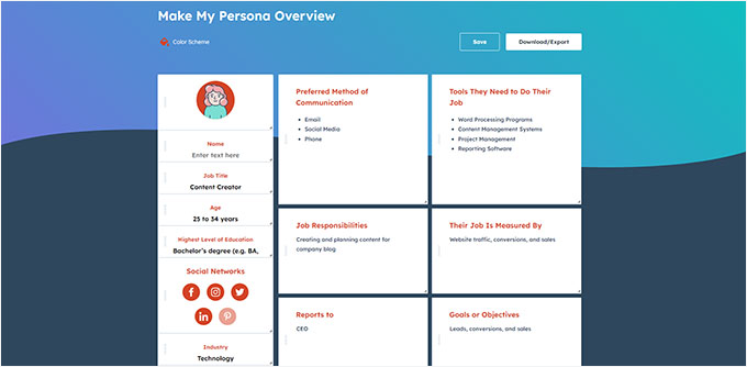
This exercise allows you to better understand users and their expectations of your website. Most importantly, it helps you figure out the goals and objectives of your target audience.
You can then analyze your website using these personas to see how quickly your content, products, and services can help those users.
Step 2: Test Your Website for Usability Issues
Testing your website for usability helps you quickly find problems that could destroy the user experience.
However, many issues might go unnoticed until a user reports them. Users are also more likely to switch to a competitor’s website than to tell you about problems on your site.
Luckily, there are plenty of excellent tools you can use to detect potentially harmful usability issues on your website quickly.
PageSpeed Insights (Free)
Google’s PageSpeed Insights tool lets you quickly examine a URL for performance and usability issues.
So, after entering your site’s URL, and it will run tests on your website. Once done, the tool will present the results for both mobile and desktop devices and assign each one a score.
This score is given in 4 categories:
- Performance
- Accessibility
- Best Practices
- SEO
It also tests for Core Web Vitals, which are a set of website performance metrics that Google considers essential to a website’s overall user experience.
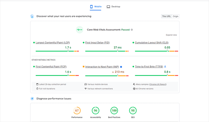
When you run the test, the language may initially sound too technical.
However, you will also find links to resources explaining these concepts in beginner-friendly terms with tips on resolving each issue. You can also read our guide on how to optimize your website for Google’s Core Web Vitals.
Google Search Console
PageSpeed Insights is a handy tool to look up URLs quickly.
However, you will have to run the tests manually, and you can’t find which pages on your website are having issues until you specifically test them.
So, what if you could automate this process, quickly find the pages with usability issues, and get alerts when a new problem is detected? 🤔
This is where Google Search Console comes in. It’s a free tool by Google that helps website administrators see how their websites perform in search results.
To do this, you must visit Google Search Console and add your website as a property. For detailed instructions, you can follow our tutorial on how to add your website to Google Search Console.
Once you have added your website, it may take a while for Google to collect some data and start showing reports.
After that, you will see your site’s performance and usability reports in the ‘Experience’ section.
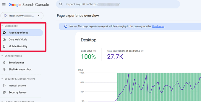
You can click on each report and find the pages where usability issues are detected.
For example, you might want to check the ‘Mobile Usability’ section. The screenshot below shows that we had 4 pages with issues on our demo site.
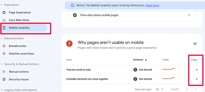
From here, you can click on each row to find the exact pages where the issues were detected.
Google Search Console will also alert you by email when a new crawling or usability issue is detected.
Besides usability and crawling issues, Google Search Console is a treasure trove of valuable data. To learn more, you can see our expert tips on using Google Search Console to get more traffic.
Step 3: Find the Pages Performing Poorly
Automated tools can help you catch many problems. However, they are not perfect and may not be able to identify many common UX problems.
If you have a small website, you can manually review each page. However, this method can be very time-consuming for medium to large websites.
So, how do you find pages with poor UX?
One easy way to find these pages is to use MonsterInsights.
It’s the best Google Analytics plugin on the market that allows you to see where your users are coming from and how they interact with your website. In fact, we use it on our website for conversion tracking, collecting general website statistics, and more!
Need a full feature breakdown? Check out our detailed MonsterInsights review!
First, you need to install and activate the MonsterInsights plugin. For more details, see our tutorial on how to install a WordPress plugin.
Note: You can also try a free version of MonsterInsights. However, we recommend upgrading to the paid version to unlock the plugin’s full potential.
Upon activation, the plugin will run the setup wizard and help you connect WordPress with your Google Analytics account.
For more details, you can see our tutorial on how to install Google Analytics in WordPress.
Once you are connected, MonsterInsights will start tracking your website visitors. The next step is to set up the plugin to track conversions.
Enable eCommerce Conversion Tracking
If you use an eCommerce platform on your WordPress website, MonsterInsights can help you easily track conversions.
Google Analytics comes with enhanced eCommerce tracking, which works for most eCommerce websites, including WooCommerce, Easy Digital Downloads, MemberPress, and more.
However, you will need to enable it manually for your website.
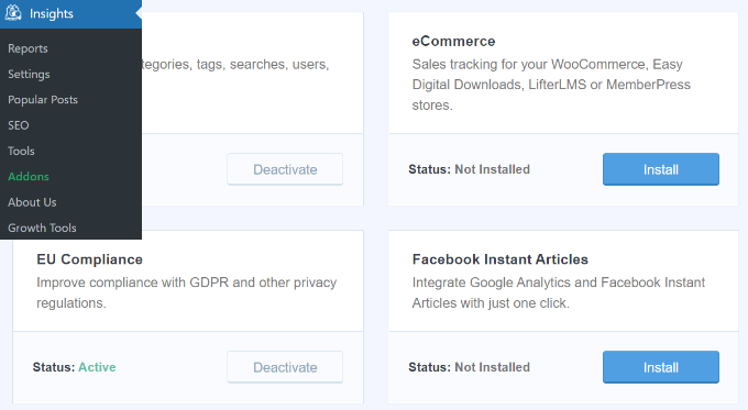
You can start by visiting the Insights » Addons page in your WordPress admin dashboard to install and activate the eCommerce addon.
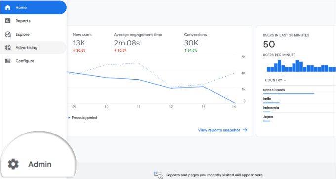
Next, you’ll need to enable enhanced eCommerce tracking in your Google Analytics account. Simply go to your Google Analytics dashboard and select your website.
From here, let’s click on the ‘Admin’ button in the bottom left corner.
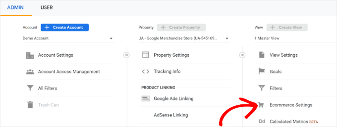
On the next screen, you will see different Google Analytics settings.
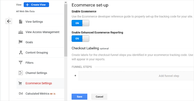
Under the ‘View’ column, just click the ‘Ecommerce Settings’ link.
On the next screen, simply turn on the toggles next to the ‘Enable Ecommerce’ and ‘Enable Enhanced Ecommerce Reporting’ options.
Don’t forget to click the ‘Save’ button when you are done.
Check Low Conversion Pages for UX Issues
Poor user experience is one of the main reasons for low conversions, abandoned carts, and high bounce rates.
You can view your conversion tracking reports in MonsterInsights to find pages with low conversions and higher bounce rates.
Simply go to Insights » Reports from the WordPress admin area and switch to the ‘eCommerce’ tab.
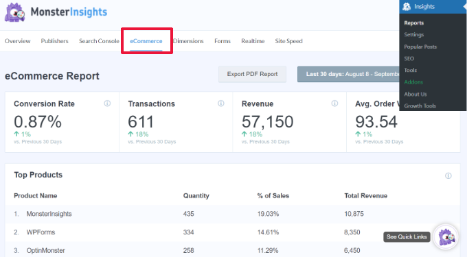
You can now see an overview of your top-performing products and conversion sources.
For advanced reports, you’ll need to switch to your Google Analytics account and go to Engagement » Pages and screens.
From here, you can sort the pages by conversion rate to see the pages with the least conversions.
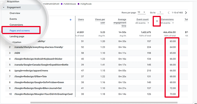
Using Google Analytics, you can also track pages with the highest bounce rates, the least amount of time spent on them, and more.
For more conversion tracking options, you can see our complete guide on WordPress conversion tracking. It will also show you how to track form conversions, affiliate link conversions, and more.
Step 4: Ask For User Feedback
As you can see, many UX audit activities involve automated tools, analytics reports, and manual testing.
The entire point of the UX audit exercise is to improve user experience. So, why not just ask your users what they think?
Asking for user feedback can get you accurate input from real visitors about your website. It can help you find specific problems and fix them more easily.
This is where UserFeedback comes in.
It’s the best WordPress user feedback plugin on the market, and it allows you to set up surveys and collect user feedback on your website quickly.
At WPBeginner, we had a great time using UserFeedback to create interactive web design surveys. Want to know more? Then check out our full UserFeedback review for all the details on its features.
Note: You can also try UserFeedback Lite for free. However, we recommend upgrading to the Pro version to unlock the plugin’s full potential.
UserFeedback lets you show the surveys to the right users at the right time.
For example, you can show surveys to users on pages with fewer conversions or display a feedback form on mobile devices.
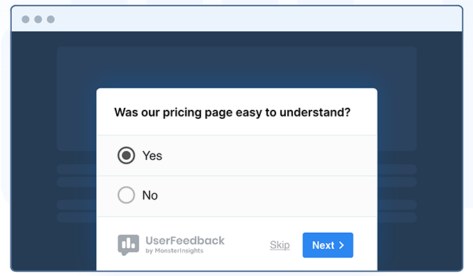
Plus, UserFeedback now includes powerful heatmap tracking that shows exactly how visitors interact with your website.
You can see where users click, how far they scroll, and which content areas get the most attention, all from your WordPress dashboard.
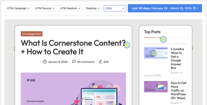
When combined with feedback surveys, you’ll get a complete picture of your users’ behavior and preferences.
For instance, if you notice users aren’t scrolling past a certain point on your page, you can target those visitors with specific feedback questions to understand why.
To get started, you can see our expert list of user experience feedback questions to ask website visitors.
Then, we also have a guide on how to get website design feedback for detailed step-by-step instructions.
Step 5: Optimize Your Website Speed & Performance
Website speed is a major contributor to user experience. Slow sites cause poor UX and prevent users from moving forward and accessing your content.
The tools we mentioned earlier, such as PageSpeed Insights and Core Web Vitals, can help you evaluate your website’s performance.
That said, if you are using MonsterInsights, then you can also run a website speed test inside your WordPress admin area.
Simply switch to the Insights » Reports page and then open the ‘Site Speed’ tab.
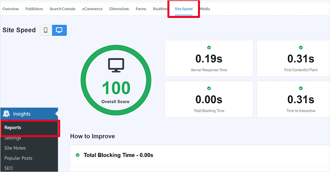
The report will run the same tests as PageSpeed Insights and show you a report. It will also give you practical tips to improve website performance.
Fixing Performance and Speed Issues
The easiest way to fix most performance issues is by installing a WordPress caching plugin.
We recommend using WP Rocket. It’s the best WordPress caching plugin, and it lets you easily optimize your WordPress website without learning the technical stuff.
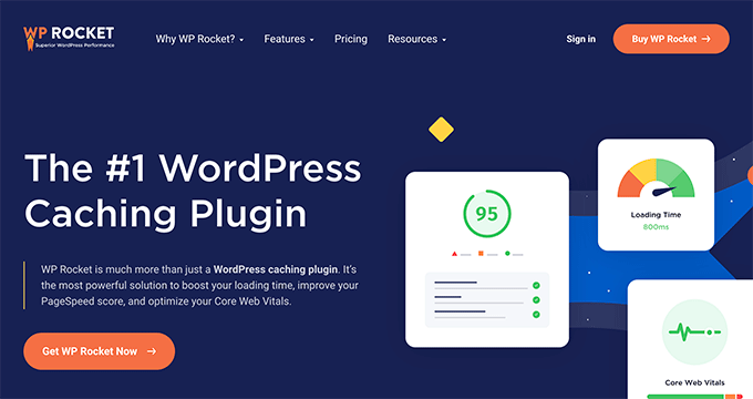
First, let’s install and activate the WP Rocket plugin. For details, see our tutorial on how to install a WordPress plugin.
Upon activation, WP Rocket will start caching your website’s content.
Unlike other caching plugins that generate a cache when a user visits your website, WP Rocket automatically creates a cache in the background.
This means each new user on your website will see a cached version that loads much quicker and improves user experience.
You can learn more by reading our tutorial on setting up WP Rocket, which has more detailed instructions.
If caching doesn’t immediately improve your website speed, we recommend following our complete WordPress speed and performance guide. It includes step-by-step instructions on how to optimize your website speed.
Step 6: Evaluate Website Navigation
Users expect your site to have a navigation menu with the links they need to find the information they want.
On the other hand, we noticed that many websites still don’t have a navigation menu that helps users find their desired pages. This can lead to a poor user experience, and visitors might decide to leave and try another website.
With that in mind, you need to make sure that your website has a straightforward navigation menu that takes users to the important areas of your website.
Adding a search bar to your website’s header or navigation menu can also improve user experience. If users can’t find a link quickly, then they can try searching on your website.
But here’s the thing – the default WordPress search is not very good.
Instead, we recommend using SearchWP. It’s the best WordPress search plugin that can help you quickly improve the search experience on your website.
SearchWP lets you make everything on your website searchable, including custom fields, eCommerce attributes, tables, categories, tags, and more.
You can read our full SearchWP review for more details!
To do this, you’ll need to install and activate the SearchWP plugin. If you need help, feel free to see our tutorial on how to install a WordPress plugin.
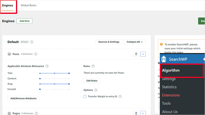
Upon activation, you’ll want to navigate to SearchWP » Algorithm and switch to the ‘Engines’ tab.
From here, you can adjust the search engine settings for the different content types by scrolling to the ‘Posts,’ ‘Pages,’ and ‘Media’ sections.
You can also choose which attributes are searchable on your website and their relevance.
Don’t forget to click the ‘Save’ button to store your settings. SearchWP will now replace your default WordPress search feature with its own custom search engine.
For more details, you can see our tutorial on how to improve WordPress search with SearchWP.
Step 7: Test Conversion Elements
A lot of the time, poor user experience is caused at the end of a conversion path.
💡 For instance, you might have users who are trying to submit your lead capture form but are being prevented from doing so by something.
So in this case, you can run split tests and manually test elements on your website to identify and fix problems.
Run A/B Split Tests to Figure Out UX Issues
An easy way to test your conversion elements is by running A/B split tests.
An A/B split test allows you to create 2 or more versions of a page with slight differences. It then randomly shows users a different version. By comparing the results, you can find out which variation of the page performed the best among your users.
The easiest way to run these tests on your WordPress website is by using Thrive Optimize. It lets you quickly create and run A/B tests on your WordPress website.
For more information about the plugin, you can check out our complete Thrive Themes review.

First, you’ll need to install and activate the Thrive Optimize plugin. You can purchase the plugin with Thrive Architect or get it with the Thrive Suite bundle.
The next step is to install and activate the Thrive Product Manager plugin on your website. You can download it from your Account Dashboard on the Thrive Themes website.
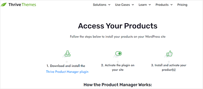
Upon activating the plugin, let’s head over to the ‘Product Manager’ page in the WordPress admin area.
Then, you’ll need to check the ‘Install Product’ box under the Thrive Optimize and Thrive Architect products.
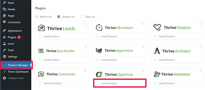
You can click the ‘Install Selected Products’ button to continue.
After installing the plugins, you’ll need to create or edit a post/page and then click the ‘Launch Thrive Architect’ button at the top.

This will show a popup where you can choose how to edit the page.
You have 2 options – to edit the page as a regular page using your theme template or as a landing page with a custom template.
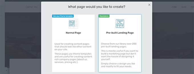
If you choose a pre-built landing page, then you will be asked to choose a template.
Thrive Architect comes with dozens of beautiful templates for various niches.
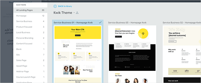
After choosing a template, you will be able to edit your page in Thrive Architect’s page builder.
Thrive Architect has an intuitive design tool where you can point and click on any element to edit it or click on the ‘+’ button to insert new elements.
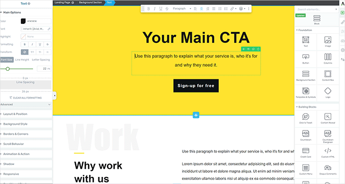
Once you have finished editing your page, don’t forget to click the ‘Save Work’ button to keep your changes.
After that, go ahead and click on the ‘A/B’ button in the right column to create a new A/B test.
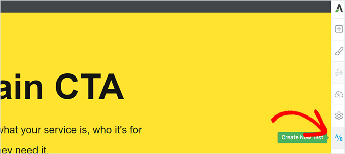
To run your A/B test, you need to have at least 2 versions of a page.
On the next screen, you’ll want to click the ‘Add New Variation’ button to create a new version of your landing page.
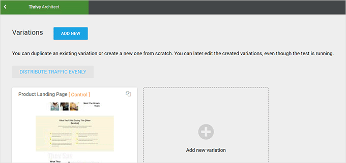
It will now create a new variation, and you can start editing it using the Thrive Architect builder.
Now, note that you’ll want to make the changes to the page you think will work better than the previous version.
Once done, simply click the ‘Save Work’ button to store your changes. Then, go ahead and click the ‘A/B’ button again.
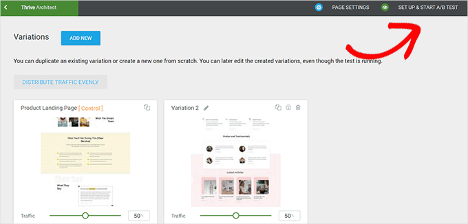
You can choose how much traffic you want to send to each page variation and then click on the ‘Set Up & Start A/B Test’ button at the top.
This will bring up a popup where you can configure the A/B test settings.
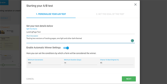
From here, you’ll need to give your test a title and description. After that, you can turn on the ‘Automatic Winner’ settings and set minimum requirements for a variation to win.
Go ahead and click the ‘Next’ button to continue.
You will then be asked to choose a goal for the test. For example, if it is a product page, then you may want to choose ‘Revenue.’
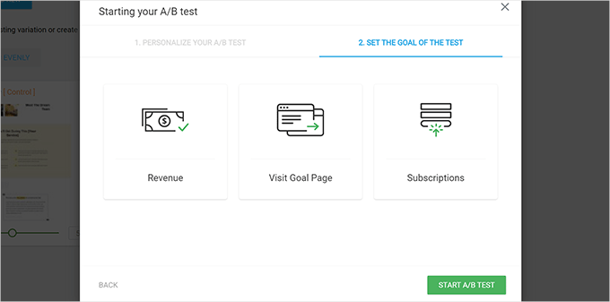
Finally, you can click the ‘Start A/B Test’ button to finish the setup.
Thrive Optimize will now start showing the 2 variations of the page to your users and keep track of their interactions on the page.
You can view the test results anytime by visiting the Thrive Dashboard » Thrive Optimize page.
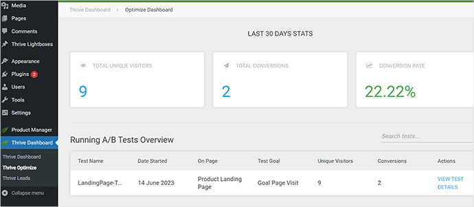
Once the test has run its duration, you can see which page has performed better for conversions or the goals you set during the test. You will then be able to make changes to improve the UX on your website.
For more details, you can see our guide on how to run A/B tests on your WordPress website.
Manually Test Conversion Elements
Now, you may be unable to run A/B split tests for all your pages for a long time. Luckily, there are other ways to test whether conversion elements on your pages are working.
Website owners often just look at their website’s static representation and do not interact with it like a real user would. That’s why many interactive failures go unnoticed for a long time.
This is when you will need to do some manual work.
To complete a conversion, you can try to imitate a user journey as best you can.
For instance, if you run an eCommerce store, you can start from the page where your users usually land. Afterward, you’ll want to look at product pages, try to add items to the cart, and complete the checkout.
In other words, you must test all your forms, cart functionality, and checkout experience by interacting with those elements like a customer.
Plus, don’t forget to test these elements on both mobile and desktop environments.
Step 8: Test User Flows to Find Bottlenecks
The user flow represents the visitor or customer’s journey through your website. Users usually follow a predictable path to different areas of your website until they buy something or submit a form.
The best way to track user flows is to use MonsterInsights. It comes with a ‘User Journey’ add-on that allows you to see every step of a customer’s journey throughout your site, including the pages and products they looked at and how long they spent there.
Simply install and activate the MonsterInsights plugin. If you need help, then you can refer to our guide on how to install a WordPress plugin.
After setting up MonsterInsights, you’ll want to go to Insights » Addons. From here, you can locate the ‘User Journey’ addon and then install and activate it.
✋ Note: You will need at least the plugin’s Pro plan to use the ‘User Journey’ add-on.
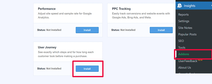
Next, you’ll also need to install and activate the eCommerce add-on.
This will help you track customer journeys on popular eCommerce platforms for WordPress, like WooCommerce, Easy Digital Downloads, MemberPress, and more.
Now, MonsterInsights will show the user’s journey on individual orders. For example, you can go to WooCommerce » Orders and click on an individual order.
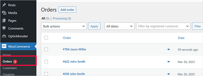
On the order details page, scroll down to the ‘User Journey by MonsterInsights’ section.
This will show you all the user interactions on your site, as well as the times and durations.
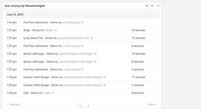
For more details, you can see our guide on how to enable customer tracking in WooCommerce.
If you are not using an eCommerce platform, it’s a good idea to track the user journey for your WordPress forms.
And if you are using WPForms to capture leads, then it comes with user journey tracking that helps you track which path a user took to submit the form.
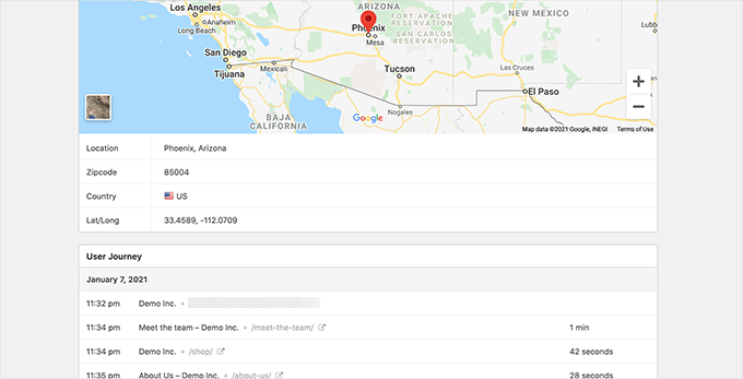
Like conversion elements, other areas of your website could disrupt user flow and block the path that leads them to become customers.
You will need to manually evaluate user paths in Google Analytics to see where their journey abruptly ends. You can also simulate the user paths to see if you can find a usability issue preventing the user from going forward.
Step 9: Evaluate Website Content Quality
Visual elements are not the only things that create a good or bad user experience.
Your website content plays a significant role in convincing users to stay on your website and look around. It also helps search engines find your content more easily and send more visitors to your site.
We recommend performing a complete SEO audit of your website and optimizing your content for SEO.
To do that, you will need All in One SEO for WordPress, the best WordPress SEO plugin on the market. This plugin allows you to easily improve your content for search rankings and user experience.
We use AIOSEO for a lot of SEO tasks on our website and love how it helps us optimize our content easily. Learn more about it in our detailed AIOSEO review!
With All in One SEO, you can take advantage of the built-in SEO analysis, a headline analyzer, and site-wide SEO audit tools.
You can also want to evaluate your content. For example, if a page is not ranking or converting well, then consider making it more comprehensive by adding more helpful content.
For more details, you can see our guide on how to fix content decay in WordPress.
Additionally, don’t forget to check your content for spelling and grammar mistakes. They could make your website seem unprofessional and create a bad user experience.
We recommend using Grammarly, which is one of the best AI-powered writing tools that can help you automatically correct spelling and grammar mistakes.

Grammarly also has a free forever plan with spelling and grammar checks. However, we recommend buying a paid plan to unlock more powerful features.
We hope this article helped you learn how to do a UX audit of your WordPress website. Next, you may also want to see our guide on how to create user chat rooms or our expert tips for creating a mobile-friendly WordPress site.
If you liked this article, then please subscribe to our YouTube Channel for WordPress video tutorials. You can also find us on Twitter and Facebook.


Samuel
I’ve seen significant improvements in conversion rates and user retention after conducting thorough UX audits for clients following the many of the steps in this guide. For example, simplifying the navigation and improving page load times often lead to a noticeable drop in bounce rates.
Thanks for gifting this articles to the community
Moinuddin Waheed
Thanks for the comprehensive list of checklists for ux/ui audits of the website.
I have done ux audits before but randomly shooting in the dark with no proper checklist.
This ensures not only comprehensive auditing but also meaningful improvement in the user experience.
Absalom Singagwari
This is certainly one of the most critical yet over looked audits we all need to do on our sites as developers. Thank you wpbeginner.com for bringing this to our attention.
Mrteesurez
Absolutely agree! I’ve learned the hard way how crucial regular audits are for site performance. Overlooking them can lead to bigger issues down the line. The guide is indeed a good reminder and eye opener me as the talked of finding the pages that are performing poorly and check the elements which convert most, the insights will be useful for informed decision and to adjust my site optimization for better conversion.
Mrteesurez
There is no doubt that user experience contributes to the revisitation of website by users, it’s all based on the first impression, that’s why usability is really important to test.
In addition, one should check how contents are display on different screen size, make use of accessibility tools and appropriate use of colours for text and other elements. thanks for the guide, it is necessary for all bloggers to read and implement these tips.
Jiří Vaněk
That’s right, my first beginner’s mistake was also not testing the website on multiple devices. However, I noticed in Google Analytics that many users were visiting my site via mobile devices, and at one point, my metrics were dropping significantly, and I couldn’t figure out why. It turned out that after an update, my website displayed poorly on mobile devices, and people were leaving. Website metrics really highlight when something is wrong, and since then, I’ve made it a habit to test more on mobile devices, with the browser console being incredibly helpful for this purpose.
Ralph
For beginner bloggers, I have 1 more tip: less is more.
At the beginning, we want to use every single function and tool we have, as it all seems cool.
Watch, calendar, tag cloud and more. But think like a visitor! When was the last time you used such things on someone else’s site? Probably never.
Don’t waste space for something that is only a distraction and lowers the chance of achieving your goal – reading next article, going to a landing page, or buying a product.
Dennis Muthomi
you make an excellent point!!
yeah…as website owners, we sometimes get carried away with all the bells and whistles, when what really matters is providing a focused, distraction-free experience for our visitors.
stripping away unnecessary elements allows people to easily find what they’re looking for and takes them one step closer to our desired outcome, whether that’s reading more content, signing up, or making a purchase.
Jiří Vaněk
Anyone who enthusiastically started building a website and later began to wonder why it’s slow or why people aren’t visiting will reach a similar conclusion. I experienced this myself. My personal problem was that I felt bad when some area of the website was underutilized. Specifically, the right menu. The article was long, and after a certain point, the menu was empty. So, I filled it with all sorts of things, which made the website slow. Over time, one learns various techniques like sticky widgets and so on. So yes, I’m currently going in the exact opposite direction, and when I recently created a new portfolio using WordPress, I had a clear goal: a clean design without distracting elements and content that provided clear information without overwhelming the user. The result is really noticeable.
Mrteesurez
Well, you make sense. As a beginner, it will be tempting to include all necessary and unnecessary features due to the enthusiasm especially if you also have some technical knowledge, this is what happened to my for first 2 years of my experience with WordPress, I tested and tried to use all features and functionalities I see or found in any plugin, I later learnt to make things simple and straight forward for visitors.
The fact is users experience is very important and once you are ready to take your blog as a business, you have to learn to make things easier and faster for users to navigate.
Thanks for your observation and advice.
Jiří Vaněk
Occasionally, I also use GTmetrix along with PageSpeed Insight. In my opinion, GTmetrix offers a bit more detailed analysis. Additionally, from time to time, I use surveys at the end of articles to learn what users would like to improve. I used to use hotjar.com for a while as well, where you can identify where your users encounter issues, what they often view, or where they get stuck and what troubles them.
Mrteesurez
Thanks for your recommendation on Hotjar and the insight on what it does. I have once used Hotjar but that was about 3 to 4 year ago, I didn’t know what it really does as I just found it online but couldn’t get it to work properly. I will try to use it again, now that I have aquired more knowledge about it.
Jiří Vaněk
Hello MrteeSurez,
since this is an older comment of mine, I no longer use Hotjar because I discovered it was slowing down my website. I can recommend a great alternative called Microsoft Clarity. It does exactly what Hotjar does, and even more, and better. Connecting to MS Clarity is very simple, either through AIO SEO or via a plugin. Microsoft Clarity is quite similar to Google Analytics but also offers heatmaps and records user sessions like Hotjar. So if I may recommend, try using MS Clarity instead.
Mrteesurez
Thanks for your concern, I really appreciate your reply and the recommendation made on Microsoft Clarity, I will definitely check it out to experience it.