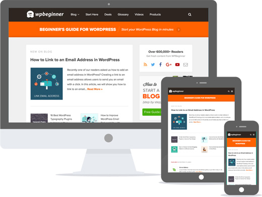
If you’re loading up WPBeginner today, then you might have noticed that we have a new website design. Considering our last design was from 2012, a lot of you would say that it’s about time that we gave WPBeginner a refresh. I wanted to share with you some insights from our redesign process, what we learned, why it took so long, and most importantly what’s new in the new design.
A Little Background
I started WPBeginner in 2009. In the first 3 years, WPBeginner went through 4 redesigns. That takes up a lot of resources which could have been better spent on our core mission:
Help small businesses grow and compete with the big guys through our tools, team, and training.
After WPBv4, I made it a point to focus on our core mission and the results are astonishing.
In the last four years:
- We created over a thousand free WordPress tutorials on WPBeginner blog.
- We added over 500+ new video tutorials on our YouTube Channel.
- We added over 100 terms in our WordPress Glossary.
- We launched OptinMonster – a tool that converts abandoning website visitors into subscribers. Our optin forms are viewed several billion times a month.
- We launched Envira Gallery, the most powerful WordPress gallery solution, to help our users easily create photo & video galleries without slowing down their websites.
- We launched Soliloquy an easy to use responsive WordPress slider plugin that makes performance and user experience it’s #1 priority.
- We launched WPForms, the most beginner friendly WordPress form plugin based on your feedback and suggestions.
- Earlier this year, we acquired Yoast Analytics and rebranded it to MonsterInsights. We are in the process of rewriting the entire plugin to make Google Analytics easy for beginners.
Collectively our plugins have been downloaded over 13 million times and are actively being used on over 2 million websites.
While all of those are great accomplishments, we have a new set of challenges that need to be addressed if we want to continue to improve and serve our mission.
This brings me to WPBeginner v5.
Design with Data
In the last few years, the usage of mobile devices has gone up quite significantly for most websites. That’s why we always recommended everyone to choose a mobile-friendly responsive WordPress theme when starting a blog.
This was a bit ironic because our own website was not responsive. We got a lot of criticism on social media from other WordPress designers and developers in the community.
Occasionally we would get comments from readers asking why WPBeginner was not responsive.
While I understand the importance of responsive design, it’s even more important that you make data-driven decisions when it comes prioritizing tasks in your business.
In 2012 when we launched WPBv4 design, less than 2% of our audience was on mobile.
Today in 2016, that number has increased to about 7%.
This is still very low compared to my other websites like List25 where over 50% of users are on mobile.
But it makes sense because most folks don’t install plugins on their WordPress websites via mobile device. Most folks don’t make code changes on mobile. Most folks don’t try to fix common WordPress errors on mobile.
That’s why making WPBeginner responsive wasn’t our top priority. However once the mobile usage passed 5%, we started planning for the redesign that addressed other challenges as well.

Another challenge we faced was usability on site. As we added more content, it became harder for users to find what they were looking for. For example, we had 8 articles talking about speeding up WordPress, but no comprehensive step by step solution.
We looked at the top typed search queries in WPBeginner search form to create comprehensive step by step tutorials that are now promptly highlighted in the design.

We also made searching WPBeginner easier with a full screen search overlay in the header and an additional search bar in the sidebar.
Going forward, we will be making it easier for users to find what they’re looking for by creating content portals that creatively leverage WordPress tags.
What’s New in WPBv5
The core functionality of the site has stayed the same. Here are few notable changes on the website:
New Start Here Page
If you’re new to WPBeginner, then you would appreciate the new Start Here page
Responsive Website Design
WPBeginner website is now 100% responsive, so it looks great on all devices.
We’ve chosen to stick with the popular Genesis framework to build our custom child theme.
Comprehensive Guides
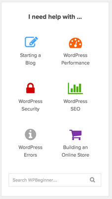
If you look in the sidebar of every page, you will see a new section “I need help with…” which highlights comprehensive guides like how to speed up WordPress, how to improve WordPress security, how to optimize WordPress SEO, and more.
Better Visibility for Our Products
In the WPBeginner census, one of the questions I asked was name a product that we own. It was quite surprising how many people didn’t know about our products. In the new design, we’re going to do a better job of highlighting the products we own.
This starts with a new premium WordPress plugins page.
We will also be rotating the products in our sidebar as well as in our newsletter ads.
FontAwesome and New Font
You might notice the use of icon font in the new designer. It’s called FontAwesome, and I’m a huge fan of Dave Gandy’s work.
We use his work on all of our products, and are proud supporters of FontAwesome.
Fun fact, you can actually add the WPBeginner logo as a font if you use FontAwesome as well as our other properties.
In the new design, we’re now using Proxima Nova font through Typekit.
New Share Plugin
In the past, we used a variation of the Floating Social Bar plugin.
After the changes from Twitter, Facebook, and others – I felt it was time to create a new sharing plugin for WPBeginner.
It accurately pulls the Twitter count, but more importantly it now has a total shares count.

I chose to stop the floating behavior and rather the share buttons are now added at the beginning and at the end of each post. This will help with a better user experience on smaller screen sizes.
New eBook and Optin Forms
At the bottom of each post, you will see a new optin form to download my WordPress toolkit. This eBook shares the exact tools that we use across our websites.
It is different from the WPBeginner blueprint because that only shows you what we use on WPBeginner.
The toolkit eBook is more comprehensive.
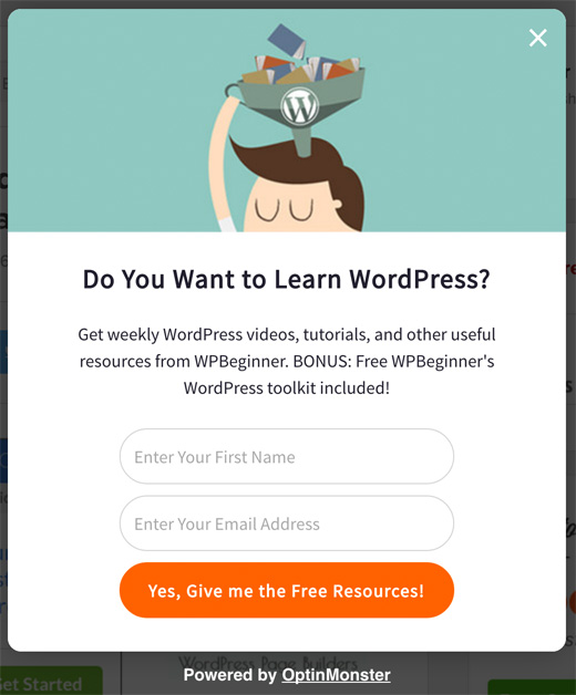
I also replaced the sidebar optin form with MonsterLinks, a 2-step optin process. The sidebar optin form didn’t convert at a high enough rate to justify the real-estate. So now if you want to subscribe via email, you can do so by clicking on the email icon in the sidebar.

What’s Next
Aside from the front-end changes, we made a lot of back-end changes that will make it easy for the WPBeginner team to create more comprehensive guides in the coming months.
The WPBeginner videos membership site will be getting an overhaul. Currently it’s still using the old theme.
We will be turning that into a LMS system that will bring together the beginner videos course and our 500+ YouTube videos in a centralized place.
The goal with that site would be to offer more organized courses to make it easy for users to learn WordPress fast.
I want to thank you all for your support and feedback.
Yours Truly,
Syed Balkhi
Founder of WPBeginner


Vipin
Hi,
The design looks awesome.
Actually I also wanted to same look for my website that is also related to deal and coupon business. I have also setup genesis framework and genesis-simple child theme but I don’t know how you achieve header toggle option and deal post can you guide me
Thanks
Vipin Singh
Shola
well, i did not know the old design but any way i love the new design. when ever i come to this site, it fills like, my site design can be like this. thanks wpbeginner theme. you guys are doing a grate job. have a good day.
WPBeginner Support
Hey Shola,
Thanks for the kind words.
Admin
Atul
This flat design looks pretty good in all the devices. Looks much better now.
Aaditya Sharma
I m regular reader of your website, new site design well improvement than the previous one but not feeling coming like OMG.
Maybe site width can increase.
Ekesmall
Wow, am so glad to see the responsive design because it’s quite difficult viewing the website on mobile phone before but now is now good.
Srivalli
Congrats Syed, the new layout looks very neat and nice. btw is your new Share Plugin available for other users?.looks very neat and meaningful.
Editorial Staff
Hi Srivalli,
No the new share plugin is not public yet
Admin
Srivalli
Thanks, hope you will make it public soon…:)
Businge Brian
This is really amazing. I like the new design. Was hear last day, I wake up, check my favorite wordpress tutorial website and it was refreshing what I saw. Really great guys.
Editorial Staff
Glad you liked it Businge
Thanks for the kind words.
Admin
LH Louis
Love this share floating bar. Mashable got a great one too!
P.S love to have backlinks here …
Editorial Staff
Thanks.
If you mean backlinks in comments – we removed that because that attracted way too much spam.
Admin
Muhammad Imran
Great design, congrats WB team
M Imran
Editorial Staff
Thanks Imran
Admin
Diane
Love the redesign. Just out of interest, what do you think of Google’s announcement on pop ups and rankings? For once I’m with Google on this. I hadn’t been on your site more than a couple of seconds before a pop up appears asking me to subscribe (I do already). I’ve not had time to even check out the content and see if I like it and I’m being asked to subscribe. It’s become a constant irritant online. Is there a way you can add tracking to opt in monster, so that if I’m clicking through from one of your newsletters, the subscribe pop up doesn’t appear? Now, that would be a selling point.
Anyway I digress (couldn’t help it, the pop was REALLY annoying!!) – your site looks great and your content is really fabulous. Ask visitors if they want to subscribe after they’ve had time to read your content and you may find you get a higher opt in rate….
Editorial Staff
Hey Diane,
Thanks for your feedback.
I wrote about the new Google Mobile Friendly rules for popup here:
http://optinmonster.com/the-new-google-mobile-friendly-rules-for-popups/
Admin
Herwig
I love the new design! Just a question: Is your new sharing plugin available anywhere? It really looks great!
Editorial Staff
Hi Herwig,
Thanks for the kind words. The sharing plugin is not available at this time because it was custom coded for WPBeginner. We may release it in the future, but it’s not ready for public release just yet.
Admin
Betty Johnston
…OK! excellent!.. Following you from long long time… this update is fast … super UX-UI… clear… (except your logo…little fuzzy)… Love the contrasting colors… and easy instructions… I agree with you; I do not use my Note5 to fix anything….personally i read all when i am not in my office and then i apply whatever i need from my desktop/laptop… I am eager to check a lot of things where i need help… Thank you and Congratulations…!!
Editorial Staff
Thanks for the feedback Betty. We appreciate it
Admin
Salman
The site looks great. Better than the previous version.
Can you make a list of all the tools and technologies you’ve used in making this website and publish them? That would be wonderful. Thanks.
Editorial Staff
Hi Salman,
We do have a list of everything we use on WPBeginner here: https://www.wpbeginner.com/blueprint/
Admin
TeQuan Douglas
Hi, Syed!
Wow… WPBeginner is actually much faster than it has always been, I must say that I love this new design. I use WPBeginner at least 5 times a day, keep the good work up..
Editorial Staff
Thank you TeQuan
Admin
Brin Wilson
Well done: looks fab – simple, clean and well thought out. Impressive.
Editorial Staff
Thanks Brin
Admin
Lisa
Very nice – congrats to Syed and team and StudioPress!
Editorial Staff
Thanks Lisa
Admin
Neil Forrester
Hi Syed,
Great job on the new design and thank you for all the WordPress tutorials. I refer to your site on a regular basis and believe it is a invaluable resource.
Best wishes,
Neil Forrester | pixelfire.com.au
Editorial Staff
Thanks Neil – we appreciate your support.
Admin
Henri Lotin
Hello, at WPBeginner!
Congratulations to all the team.
I’ve complained months ago that the site wasn’t responsive. Now I’m served, and well served.
All thumbs up, form Cameroon!
Editorial Staff
Thank you for patience and continued support Henri. We really appreciate it.
Admin
Izham
I like the new design. At first I too feel weird why WPB has no responsive design.
After reading this now I understand why.
Great job WPB!
I stumbled upon your blog and it has a lot improve my wp experience.
I like the way you guys explained. The insights mereka true showing that your team really test it before writing about it. Not some blog who just copy paste and edit it just to rank on gogle.
I will follow you guys.
Editorial Staff
Thank you Izham.
Admin
Mike
Like the new design. While it is true that when I am working on my sites, I am not on mobile. I do receive your emails on my mobile, and quite often I save them to read at my local coffee house to read. This will make things a lot better. Good luck with the new design.
Editorial Staff
Thanks Mike – yup that was the most common use-case. People read emails via phone and then come to our site. Hopefully it will be a much better UX now
Admin
Adrienne
About “” time! Lol I read your stuff on the train and it was madening having to size the page.
Adrienne
No really, I love you guys!! Keep it up!!
Ben
Hi Syed,
A great new look for a great resource on all things WordPress.
Really like what you have done and with clear messaging throughout.
Thanks for letting us all know the process and how you went about things.
Might inspire some to have a refresh!
All the best
Ben
OBINNA DURU
Hello, WP Beginner, I recently started working with wordpress cms and found it very easy because I use most (if not all) of your site materials. I build websites for clients and I have my a free host company I use. I browse through your site, at least, not less than 8 times a day, looking for solutions to solve my clients’ problems. I was browsing through your site when it suddenly changed from the old design to this new one! I loved the former one than this because the former design displayed a full-width navigation menu on my small phone, making it very easy to navigate through, but this new design shrinks the whole navigation items into a “MENU” I must click on before the rest are displayed! I would love to use this opportunity to ask, “how can I remove the responsiveness from a wordpress theme and make it display a full width navigation menu even on smart phones. One of my clients have been asking for it, and I can’t solve that problem. Thanks and God bless.
OBINNA DURU
I use a theme from the wordpress theme directory and the name of the theme is WP knowledge base. how can i remove the responsiveness from the particular theme, and from all themes in general, making it display a FULL WIDTH NAVIGATION MENU even on small phone screens, exactly as your former design was. God bless.
WPBeginner Support
Hi Obinna,
Thanks for the feedback. Most users find the collapsed navigational menu easier to use on smaller screens. It is easier to tap, and more items can be displayed in the menu.
If you would like to use full-width menu, then you can start with a WordPress theme that is not fully responsive. You can also set width using CSS.
Admin
Mitch
Great to see the update and all that it brings.
I have to say, I had NO idea that you were the owners of those plugins!
Quite frankly, I thought someone with less than desirable scruples had taken over Yoast Analytics so it is great to now know that someone as reputable as WPBeginner is the owner!
Scott Buehler
Looks great and fast.
Editorial Staff
Thank you
Admin
Josalone Wordsworth
I’ve been quietly following this site for the past 4 years, am glad that your new changes are practical to what you teach novice like me when building wp sites (mobile first).
Please keep up your great work you and your team.
Editorial Staff
Thanks for the kind words Josalone. We appreciate your support
Admin
Ahmad Awais
Congrats to WPB team! The new design looks pretty good. “About time”!
Editorial Staff
Thanks Ahmad for the kind words.
Admin
Sidah
Looking great.
Might want to make the wpbeginner in a higher resolution? Looking bad on my iphone 6.
Regards
Editorial Staff
The current site is not retina because we want to make sure it’s fast all across the world (even on slower connections).
Admin
Dick Motta
Looking forward to the updates. I want to make changes to website, but somehow get distract. Hopefully, I can spend more time learning wp procedures.
Editorial Staff
Thank you
Admin
Parvez Afshar
It’s nice and creative – try to make it the most beautiful and user friendly . Totally awesome now congrats.
Carlito Thomas
Love the new design! Your main logo is a little blurry, though.
Arief Mardianto
I always do what WPB do. Life WPBv5
Stephen
The new design is simple but powerful.
Kudos to you and your team Syed.
Editorial Staff
Thanks Stephen
Admin
Ajay
Astonishingly executed upgrade ! Thank you for what you are doing to WP community
Editorial Staff
Thanks Ajay
Admin
Dawn Groves
Nice job, Syed. Especially the how-you-did-it description. Another value-added offering for sure.
Dawn
Editorial Staff
Thanks Dawn
Admin
Gayle Hardy
Great job! Congrats, the site looks great and all your upgrades make perfect sense. I appreciate all the tips, tricks, and easy-to-follow instructions you’ve shared through the years and I look forward to learning more about WP for years to come.
Editorial Staff
Thank you Gayle for your continued support.
Admin
Herb Trevathan
Nice job. I love Genesis : ) I use your snippets often.
Editorial Staff
Thanks Herb – appreciate your support
Admin
Suman Gaudel
Glad to see the WPB in a responsive design.
Editorial Staff
Cheers
Admin
Sowmay
Where can I get your new Social Share Plugin?
WPBeginner Support
Hi Sowmay,
It is a custom plugin we have developed for our own use.
Admin
Pat Fleck
I agree with Adeel. It looks like you have put a lot of thought into the re-design. Also good to see that the site is now responsive
Editorial Staff
Thanks Pat
Admin
Dallas
I love the new look of the site. Nice job! It appears that your total width is around 940px. Was there any specific reason for going with the narrow width?
Editorial Staff
Because most of our content images are 520px wide. We want to make sure that we keep our site fast because a lot of our users don’t have fast internet. Going with bigger content width and uploading larger size images further slows down the site.
This is not noticeable in the western part of the world, but a lot of other countries have very slow internet.
Admin
Wesley Banks
If you weren’t as considered about existing image sizes or slow internet speeds, would you have changed the width? I always struggle when creating new sites what is the best content width. So, I’d love to hear any insights. Thanks!
Editorial Staff
Would’ve designed it at 1140 at that point because bigger images definitely look nicer.
Doug
Nice job Syed.
Editorial Staff
Thanks Doug
Admin
Andre
Amazing, simply amazing!
Editorial Staff
Thanks Andre
Admin
Teresa Maslonka
Congratulations on the new redesign, and thank you for your thoughtful changes. Really excited to explore the site!
Editorial Staff
Thank you Teresa for the kind words.
Admin
Sowmay
Syed, found this design more adorable than past one.
Editorial Staff
Thank you
Admin
Banna
The design look nice.
But while i scroll down through article i miss the sidebar. Look like we have lot of space.
Editorial Staff
Thanks for the feedback Banna. In the coming days, we will add scroll boxes to add relevant content for some articles.
Admin
Adeel Sami
Hello, Syed!
This design is simply awesome — clean, simple and elegant!
Congrats!
Neal Umphred
Very nice, indeed …
kharid
thank you so much for this article