Like we did with WordPress 3.1, we are here again to keep you updated with what might be coming ahead in WordPress 3.2. After the delayed release of WordPress 3.1, the goal in the future is to have faster release cycles. Mark Jaquith has taken command to make sure that everyone stays focused to get the job done as fast as possible. So lets check out what is exciting in WordPress 3.2.
Note: The screenshots below are very new and not even alpha version yet. Chances are that they will be changed, improved, upgraded etc by the time the full release comes out.
New Admin Layout
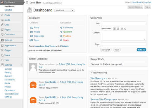
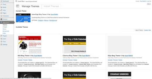
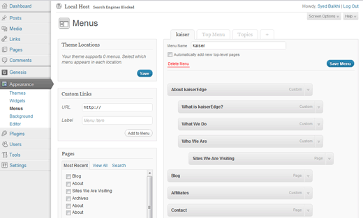
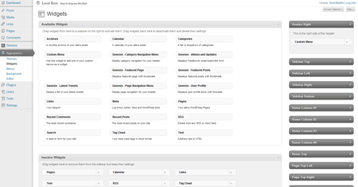
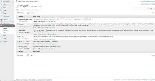
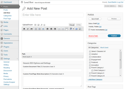
Through out the past, WordPress user interface has evolved (Check out our article that shows you the evolution of WordPress user interface from 2003 – 2009). In this release, we are finally seeing another major refresh of the design. The goal behind this is to make everything much more simpler and cleaner. So check out some of the images below:
Note: You can click on the image to make it bigger ![]()
Dashboard View
Themes View
Menus View
Widgets View
Plugins View
New Post View
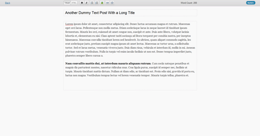
Distraction Free Writing
This has been part of the plan for quite some time now. In WordPress 3.1, the writing interface was cleaned up a little by hiding Custom Fields and such by default. In WordPress 3.2, a new distraction Free write panel is coming along that lets you make your writing interface full screen, so you can focus just on the content rather than other tidbits on the screen. The goal is to make the writing experience more lightweight and calming.
Twenty Eleven Theme
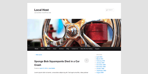
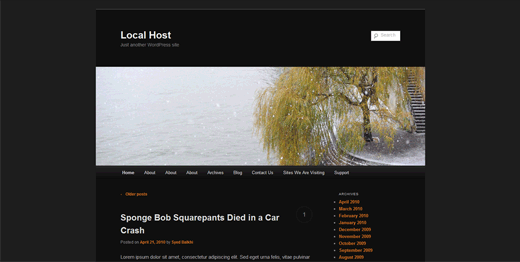
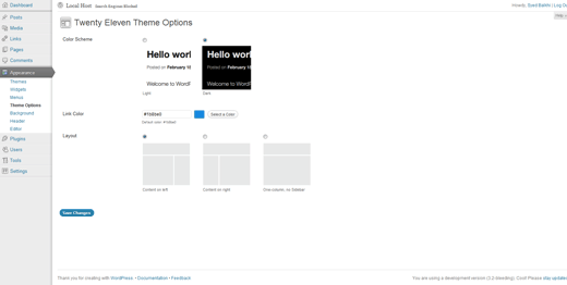
Did you remember with WordPress 3.0, a new theme was introduced known as Twenty Ten? Well in WordPress 3.2, plans are to release a new theme called Twenty Eleven. The goal is to have new and fresh default designs for WordPress more frequently rather than repeating the Kubrick theme situation all over again. For those who don’t know, Kubrick was the default theme for a very very long time. This theme comes with two color schemes:
This new Twenty Elven theme also comes with a Theme Options page that lets you pick color schemes and layout. (Hmm, sounds like a Paid Theme but FREE, WOOT!!) – Mad Props to the WordPress UI team.
There is also new templates that are added for pages. By default the page templates are with No-Sidebar. There is a Sidebar version, and also a very interesting Showcase option that has a slider built-in. It was a little buggy on the local host, so we are not posting screenshots of it just yet.
One of the most wanted feature is added in the Twenty Eleven Theme’s Header Images area which lets you show Random Images on each page. Many users wanted to see that feature previously. This looks like a very neat feature.
Upgrade Improvements
While the upgrade system right now is not bad, it can certainly be improved. In WordPress 3.2 and further, when an upgrade is available, only the changed files will be upgraded thus cutting down slow upgrade times for some users.
Speed Improvements
WordPress still support some of the older technologies in the CORE which will be dropped in this version to make it load FASTER! Nacin is looking at PHP lazy loading. A patch is in the work to make the admin menu load faster as well as making the FTP improvements that would upgrades a lot faster.
New PHP and MySQL Requirements
WordPress 3.2 will require PHP 5.2.4+ and MySQL 5. So if you want to upgrade to this version, then make sure your host is using it already. Quality WordPress Hosts are already using the latest technology. We recommend HostGator. If you want to check if your host is compatible with WordPress 3.2, then download the plugin called WordPress Requirements Check. This plugin will let you know whether your host is on latest technology. If they are not, then we would suggest asking them to upgrade, or switch hosts.
You can start testing yourself by downloading the Nightly Builds. It is fun and exciting to see the new features. According to the Roadmap, WordPress 3.2 is expected to be released around June 30, 2011.
Live Demo for WordPress 3.2
Upon popular request, we are creating this Live Demo site for you to get the look and feel of WordPress 3.2 admin panel, and the twenty eleven theme. Live WordPress 3.2 Demo
Let us know what you think about it.





JeremyWhitman
I like the new twenty eleven theme I hope weaver uses it to update their theme.
dustinporchia
@dustinporchia nevermind…just realised it was my css
dustinporchia
Just notice that the admin interface’s header & footer are broken in chrome.
Mercer
Awesome share. I think the cleaner writing layout is going to be a MASSIVE plus for WP. It won’t scare off so many newbies. Looking forward to it!
calli
Looks neat but I don’t see significant changes in appearance. I like the fullscreen writing though and the additional themes. Hope they can have nicer themes.
Sylvie Di Cola
I am ready!
Alfonso Brodsho
SWEET. I can’t wait to update; again.
HwangC
It looks nice:) Thanks for the summary
Stefan
Really like the admin look. Makes it look cleaner.
Duncan
It really is maturing into the powerful CMS that it’s destined to be. Looking forward to the faster admin area and new UI.
Satire News
First of all Thanks a lot Team WPBeg for providing us all these info.. when i try to update my wordpress ti 3.1 it askes me to have a backup does updating it causes data or website loss? like how much % chances?
Editorial Staff
Chances are very slim, but you should always have backup to be on the safe side.
Admin
sanji
Cool updates, the admin nav looks great! can’t wait to try it out on localhost. Thanks for this guys!
AJ Clarke
WP 3.2 is going to be awesome. I can’t wait to start messing with the beta. It’s nice to see the improved twenty eleven theme, it looks great!
Nikunj
3.2 looks pretty cool John Nolon did a pretty cool job
Saurabh
3.0 Was am amazing experience.. Looking forward to 3.2 Now.
Michael Lajlev
Hi guys great work on beautifying the admin interface. I still think you should make an official wordpress framework theme like roots but less obtrusive. Addaptable with 960gs, blueprint jQuery ect. with a nice documentation
Michael Aulia
I couldn’t really care less about the admin’s new interface (except for the nice full screen editor). I still prefer my Fluency Admin plug-in I’d also still stick with my Thesis theme
But the performance improvements are definitely something to wait for!
Keith Davis
Wow – something to look forward to.
I love the custom menus.
I’ve been messing around with Genesis and wordpress custom menus – so easy to produce menus, dropdowns etc.
Speed improvements has got to be a winner – so slow at present.
I know – use W3 total cache. LOL
Thanks for the pre release info.
Ileane
Hi guys, thanks for the screenshots. For my next blog post I planned to do a tour of the current WordPress dashboard. But I think I’ll wait for 3.2 and find something else to blog about for now instead
Moshe
Thanks – the new admin looks good.
ReTox
widgets look like crap, there are some css isues
Jenny
not really digging those DEFAULT layouts. I guess the dashboard is nicer though Can’t wait to play with it!
PixelR3AP3R
Awesome.
Looks like there will be some really useful stuff in the next update!
JhezeR
WP 3.2 please coming soon, i can’t wait until june.
WP is very very the best CMS
Sylvie
I am ready
Chris
I am glad to see that the admin panel is getting cleaned up more. Twenty Eleven looks pretty nice for a starter theme but you should really buy a premium theme to make your blog stand out.
Thanks for sharing!
Joe Fanai
Just download and setup on my local XAMPP server, one thing confuse me – The Twenty Eleven, it look alot like Duster theme (http://theme.wordpress.com/themes/duster/). When I activate the theme and preview the site, I thought ‘why am I seeing Duster theme, when i’m installing Twenty Eleven theme?’
Overall, I love the new UI – delicious.com-look-like-arrow-kinna graphics that actually ‘points’ to what the context ‘means.’
I want 3.2 to be a stable release as fast as possible. Am waiting for it, hope you guys do it too
abdelhafid
awesome .. but please for one time make us a nice theme
the Twenty Eleven Theme is awful … thanks anyway
budiastawa
So, Welcome back the new Kubrick! I can not wait for the arrival of Wordpress 3.2.
Dean Saliba
It is probably some way off but 3.2 is looking very good. I wonder if they will do something about the thousands of us who can’t schedule posts?
gnorimies
Wordpress going in the right way to be better. I’m waiting june to test new version
Muhammad
I wish they add some common plugins features internally. eg cache, minify and seo etc.
Sajib
Everything is okay; but I didn’t like the Duster — or so called twenty eleven theme at all. Twenty Ten was much better than this and after that we expected something much better. Plus wordpress just adopting it, not designing it by their own I guess (I’m not sure, though).
Khang Minh
Are you judging the new theme based on design or codes? In my opinion Twenty Ten is not good at all… (It’s good for showing you the new features of 3.0, though.)
Devin Walker
Can’t wait until the new version, looks pretty sweet.
Rob
Looks great! I am excited, the speed improvements are always welcomed.
Alan
Ugh, you can always tell when a screen shot was taken on a PC, fonts are rendered so jagged and nasty.
wayne
@Alan: And what do you use, a tablet? Because, technically a Mac is a PC, unless you don’t consider it a Personal Computer.
Alan
You know what I mean
mitch
Ugh, you can always tell when someone doesn’t get the main point, they always make comments on unnecessary things.
Alan
You’re right, quality doesn’t matter.
Danny Foo
Kinda reminds me a little more like Kubrick’s layout. And it would’ve been really awesome if they allowed theme designers to use that as template selectors.